
效果图如图所示:
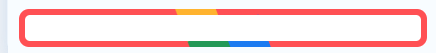
<div class='box'>你好</div>

<style lang='scss'>
    .box {
            position: relative;
            border-radius: 10px;
            overflow: hidden;
            width: auto;
            height: auto;
            z-index: 0;
            &:before {
                content: "";
                position: absolute;
                z-index: -2;
                left: -50%;
                top: -50%;
                width: 200%;
                height: 200%;
                background-color: #399953;
                background-repeat: no-repeat;
                background-size: 50% 50%, 50% 50%;
                background-position: 0 0, 100% 0, 100% 100%, 0 100%;
                background-image: linear-gradient(#399953, #399953),
                    linear-gradient(#fbb300, #fbb300),
                    linear-gradient(#ff4f4f, #ff4f4f),
                    linear-gradient(#377af5, #377af5);
                -webkit-animation: rotate 4s linear infinite;
                animation: rotate 4s linear infinite;
            }
            &::after {
                content: "";
                position: absolute;
                z-index: -1;
                left: 6px;
                top: 6px;
                width: calc(100% - 12px);
                height: calc(100% - 12px);
                background: #fff;
                border-radius: 5px;
            }
        }
</style>
