import unittest
import matplotlib.pyplot as plt
class MyTestCase(unittest.TestCase):
def test_demo3(self):
"""简易线性图"""
plt.style.use('seaborn-whitegrid')
# 一个能够容纳各种坐标轴、图形、文字和标签的容器
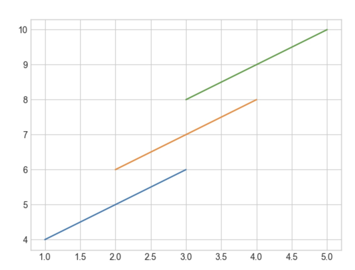
fig = plt.figure()
# 一个带有刻度和标签的矩阵
ax = plt.axes()
ax.plot([1, 2, 3], [4, 5, 6])
plt.plot([2, 3, 4], [6, 7, 8])
# 重复调用plot
plt.plot([3, 4, 5], [8, 9, 10])
plt.savefig('test_demo3.png')
def test_demo4(self):
"""线条的颜色与风格"""
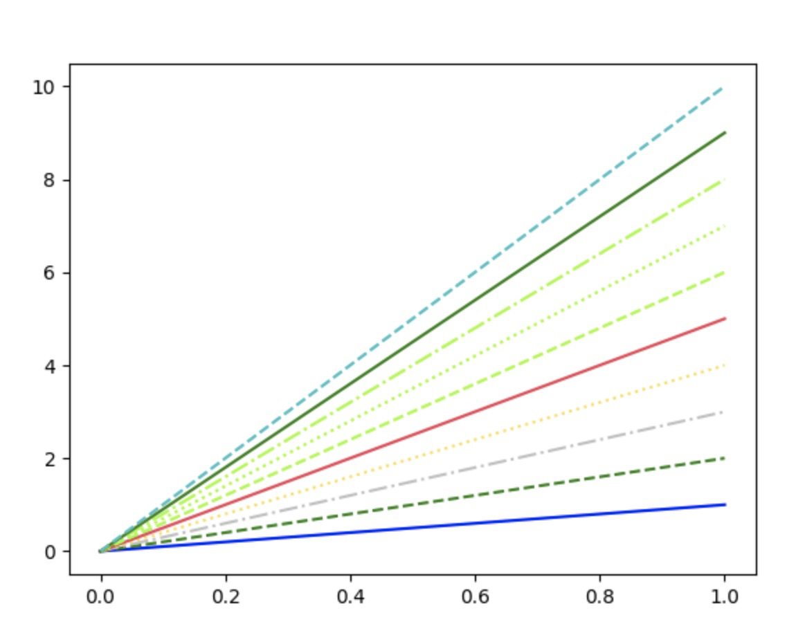
plt.figure()
plt.plot([0, 1], [0, 1], color='blue', linestyle='solid')
plt.plot([0, 1], [0, 2], color='g', linestyle='dashed') # 颜色缩写
plt.plot([0, 1], [0, 3], color='0.75', linestyle='dashdot') # 0~1的灰度值
plt.plot([0, 1], [0, 4], color='#FFDD44', linestyle='dotted')
plt.plot([0, 1], [0, 5], color=(1.0, 0.2, 0.3), linestyle='-') # RGB元组,范围在0~1, 实线
plt.plot([0, 1], [0, 6], color='chartreuse', linestyle='--') # html颜色名称
plt.plot([0, 1], [0, 7], color='chartreuse', linestyle=':') # html颜色名称 ,实点线
plt.plot([0, 1], [0, 8], color='chartreuse', linestyle='-.') # html颜色名称 ,点划线
plt.plot([0, 1], [0, 9], '-g') # 绿色实线
plt.plot([0, 1], [0, 10], '--c') # 绿色实线
plt.savefig('test_demo4.png')
def test_demo5(self):
"""坐标轴上下限"""
plt.figure()
plt.plot([1, 2, 3], [4, 5, 6])
plt.xlim(0, 4)
plt.ylim(0, 10)
plt.savefig('test_demo5.png')
def test_demo6(self):
"""使用 axis 设置坐标轴上下限 收紧"""
plt.figure()
plt.plot([1, 2, 3], [4, 5, 6])
plt.axis('tight')
plt.savefig('test_demo6.png')
def test_demo7(self):
"""使用 axis 设置坐标轴上下限 轴单位相等"""
plt.figure()
plt.plot([1, 2, 3], [4, 5, 6])
plt.axis('equal')
plt.savefig('test_demo7.png')
def test_demo8(self):
"""设置图形标签"""
plt.plot([1, 2, 3], [4, 5, 6], '-g', label='a')
plt.plot([2, 4, 6], [4, 5, 6], ':b', label='b')
plt.title('title:a_b')
plt.xlabel('x')
plt.ylabel('y')
# 设置图例
plt.legend()
plt.savefig('test_demo8.png')
def test_demo9(self):
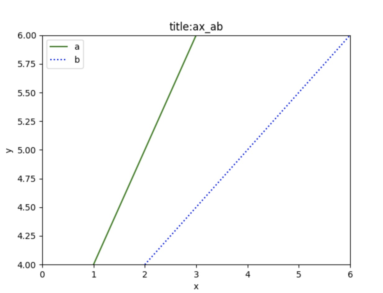
"""ax 设置图形标签"""
ax = plt.axes()
ax.plot([1, 2, 3], [4, 5, 6], '-g', label='a')
ax.plot([2, 4, 6], [4, 5, 6], ':b', label='b')
# ax.set_xlim([0, 6])
# ax.set_ylim([4, 6])
# ax.set_title('title:a_b')
# ax.set_xlabel('x')
# ax.set_ylabel('y')
# # 设置图例
# plt.legend()
# 一次性设置所以的属性
ax.set(xlim=(0, 6), ylim=(4, 6), xlabel='x', ylabel='y', title='title:ax_ab')
ax.legend()
plt.savefig('test_demo9.png')
if __name__ == '__main__':
suite = unittest.TestSuite()
suite.addTest(MyTestCase(methodName='test_demo3'))
unittest.TextTestRunner().run(suite)
test_demo3.png
![]()
test_demo4.png
![]()
test_demo9.png
![]()

 浙公网安备 33010602011771号