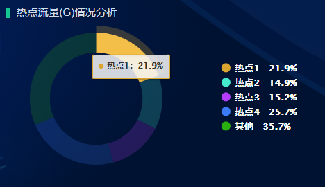
highcharts中的环形图
环形图如下效果:
代码:
that.options = {
            chart: {
                type: 'pie',
                backgroundColor: 'transparent',
                color: '#fff',
                // height: that.torem(500)
            },
            title: {
                text: null
            },
            subtitle: {
                text: null
            },

            plotOptions: {
                pie: {
                    colors: ['#dba630', '#46ebce', '#b43cfc', '#3b7af8', '#29b00f'],
                    borderColor: 'transparent',
                    dataLabels: {
                        // 环形图内部展示
                        enabled: false
                    },
                    cursor: 'pointer',
                    showInLegend: true
                }
            },
            legend: {
                layout: 'vertical',
                align: 'right',
                verticalAlign: 'middle',
                padding: that.torem(80),
                itemStyle: {
                    color: '#fff',
                    fontSize: that.torem(28)
                },
                itemDistance: that.torem(100),
                lineHeight: that.torem(140),
                labelFormatter: function() {
                    return `${this.name}\xa0\xa0\xa0${this.y}%`;
                }
            },
            tooltip: {
                headerFormat: '',
                pointFormat: '<span style="color:{point.color}">\u25CF</span> <b> {point.name}:</b>' + '<b>{point.y}%</b>'
            },
            series: [
                {
                    innerSize: '70%',
                    zMin: 0,
                    data: dataArr
                }
            ]
        };

 浙公网安备 33010602011771号