搬家第11天-151.Wincc V7.3 OWC Chart控件初步使用13-图表的修饰美化
前面介绍过使用OWC Chart做统计图表的一些基本方法,但是做出来的图表显得有些死板。我们可以通过一些设置让图表个性化一点。本文以混合图表为例,介绍如何“个性化”生成图表。假设画面上有了一个ListView控件,才级了一些数据如下图:

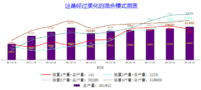
我希望生成的图表有以下特点:
1. 由于各个装置产能差异较大,我希望生成的曲线能够清晰地反映各自变化趋势。
2. 四个装置的产量使用曲线图,总产量使用bar图。
3. 每一个曲线使用自定义的颜色,不是用系统默认制定的颜色。
4. 每一个曲线的数字标注自定义是显示在曲线上方、下方还是中间。
5. 每一个曲线的数字标注能够根据数值大小加粗或者放大字体。
6. 图示区(lengend)能够显示每一个装置各自几天的总产量。
7. 隐藏掉纵坐标轴。
在画面上放一个OWC Chart控件,名字修改成chart,放置一个按钮用于执行代码,按钮的鼠标点击事件中添加以下vbs代码:
Sub OnClick(ByVal Item)
Dim LV,Chart,cht,c,cst,xValue()
Dim y1Value(),y2Value(),y3Value(),y4Value(),Sum(),Sum1,Sum2,Sum3,Sum4
Dim y2Axes,y3Axes,y4Axes,y5Axes,count,i
Dim sc1,sc2,sc3,sc4,sc5
Dim dl1,dl2,dl3,dl4,dl5
'Dim Selection
Set Chart=ScreenItems("Chart")
Set LV=ScreenItems("LV")
count=LV.listitems.count
Redim xValue(count),y1Value(count),y2Value(count),y3Value(count),y4Value(count),Sum(count)
Set c=Chart.constants
Chart.Clear '先清空
Set cht=Chart.Charts.Add
Chart.HasChartSpaceTitle=True
Set cst=Chart.ChartSpaceTitle
sum1=0
sum2=0
sum3=0
sum4=0
'定义横纵坐标内容数组
For i=1 To count
xValue(i)= CStr(LV.Listitems.item(i).listsubitems.item(1).text)
y1Value(i)=LV.Listitems.item(i).listsubitems.item(2).text
y2Value(i)=LV.Listitems.item(i).listsubitems.item(3).text
y3Value(i)=LV.Listitems.item(i).listsubitems.item(4).text
y4Value(i)=LV.Listitems.item(i).listsubitems.item(5).text
Sum(i)=LV.Listitems.item(i).listsubitems.item(6).text
Next
For i=1 To count
sum1=sum1+y1Value(i)
sum2=sum2+y2Value(i)
sum3=sum3+y3Value(i)
sum4=sum4+y4Value(i)
Next
'初始化图表内容
With Cht
.type=c.chChartTypeSmoothLine
.HasLegend =True
With .Axes
.Item(0).Scaling.Minimum=1
.Item(0).Scaling.Maximum=count
.Item(0).HasTitle=True
.Item(0).Title.Caption ="时间"
.Item(1).Scaling.Minimum=0
.Item(1).Scaling.Maximum=50
'.Item(1).HasTitle=True
'.Item(1).Title.Caption ="产量"'
'有主网格线
.Item(0).HasMajorGridlines=False
.Item(0).HasTickLabels=True
.Item(0).HasAutoMajorUnit=False
.Item(1).HasMajorGridlines=False
.Item(1).HasTickLabels=False
.Item(1).HasAutoMajorUnit=False
'坐标轴颜色
.Item(1).Line.Color=vbWhite
End With
'绘图区边框颜色
.PlotArea.Border.Color ="white"
'绘图区背景颜色
.PlotArea.Interior.Color="White"
'装置1
Set sc1=.SeriesCollection.Add
sc1.caption="装置1产量-总产量:" & CStr(sum1)
sc1.Ungroup True
'x轴数据
.SetData c.chDimCategories,c.chDataLiteral,xValue
'Y轴数据
sc1.SetData c.chDimValues,c.chDataLiteral,y1Value
Set dl1 = sc1.DataLabelsCollection.Add
dl1.HasValue = True
dl1.Font.Size = 9
dl1.Font.Color = vbred
sc1.Line.Color="red"
'数字标注是在曲线什么位置
dl1.Position=c.chLabelPositionBottom '下方
'根据数值大小判断是不是需要加大字体和加粗字体
For i=0 To count-1
If y1Value(i)>15 Then
dl1.Item(i).Font.Bold=True
dl1.Item(i).Font.Size=12
Else
dl1.Item(i).Font.Bold=False
dl1.Item(i).Font.Size=8 '不显示小数值
End If
Next
'装置2
Set sc2=.SeriesCollection.Add
sc2.caption="装置2产量-总产量:" & CStr(sum2)
sc2.Ungroup True
Set y2Axes = .Axes.Add(.SeriesCollection.Item(1).Scalings(c.chDimValues))
y2Axes.Position = c.chAxisPositionRight
y2Axes.Scaling.Minimum=0
y2Axes.Scaling.Maximum=500
y2Axes.HasTickLabels=False
y2Axes.HasMajorGridlines=False
y2Axes.HasAutoMajorUnit=False
y2Axes.Line.Color=vbWhite
'Y轴数据
sc2.SetData c.chDimValues,c.chDataLiteral,y2Value
Set dl2 = sc2.DataLabelsCollection.Add
dl2.HasValue = True
dl2.Font.Size = 9
dl2.Font.Color = "aquamarine"
sc2.Line.Color="aquamarine" '碧绿色
'根据数值大小判断是不是需要加大字体和加粗字体
For i=0 To count-1
If y2Value(i)>300 Then
dl2.Item(i).Font.Bold=True
dl2.Item(i).Font.Size=12
Else
dl2.Item(i).Font.Bold=False
dl2.Item(i).Font.Size=8
End If
Next
'装置3
Set sc3=.SeriesCollection.Add
sc3.caption="装置3产量-总产量:" & CStr(sum3)
sc3.Ungroup True
Set y3Axes = .Axes.Add(.SeriesCollection.Item(2).Scalings(c.chDimValues))
y3Axes.Position = c.chAxisPositionRight
y3Axes.Scaling.Minimum=0
y3Axes.Scaling.Maximum=5000
y3Axes.HasTickLabels=False
y3Axes.HasMajorGridlines=False
y3Axes.HasAutoMajorUnit=False
y3Axes.Line.Color=vbWhite
'Y轴数据
sc3.SetData c.chDimValues,c.chDataLiteral,y3Value
Set dl3 = sc3.DataLabelsCollection.Add
dl3.HasValue = True
dl3.Font.Size = 9
dl3.Font.Color = "cadetblue" '军蓝色
sc3.Line.Color="cadetblue"
'根据数值大小判断是不是需要加大字体和加粗字体
For i=0 To count-1
If y3Value(i)>4000 Then
dl3.Item(i).Font.Bold=True
dl3.Item(i).Font.Size=12
Else
dl3.Item(i).Font.Bold=False
dl3.Item(i).Font.Size=8
End If
Next
'装置4
Set sc4=.SeriesCollection.Add
sc4.caption="装置4产量-总产量:" & CStr(sum4)
sc4.Ungroup True
Set y4Axes = .Axes.Add(.SeriesCollection.Item(3).Scalings(c.chDimValues))
y4Axes.Position = c.chAxisPositionRight
y4Axes.Scaling.Minimum=0
y4Axes.Scaling.Maximum=50000
y4Axes.HasTickLabels=False
y4Axes.HasMajorGridlines=False
y4Axes.HasAutoMajorUnit=False
y4Axes.Line.Color=vbWhite
'Y轴数据
sc4.SetData c.chDimValues,c.chDataLiteral,y4Value
Set dl4 = .SeriesCollection.item(3).DataLabelsCollection.Add
dl4.HasValue = True
dl4.Font.Size = 9
dl4.Font.Color = "sienna" '褐色
sc4.Line.Color="sienna"
dl4.Position=c.chLabelPositionBottom '数字标注在下方
'根据数值大小判断是不是需要加大字体和加粗字体
For i=0 To count-1
If y4Value(i)>37000 Then
dl4.Item(i).Font.Bold=True
dl4.Item(i).Font.Size=12
Else
dl4.Item(i).Font.Bold=False
dl4.Item(i).Font.Size=8
End If
Next
'总产量
Set sc5=.SeriesCollection.Add
sc5.caption="总产量:" & CStr(sum1+sum2+sum3+sum4)
sc5.Ungroup True
Set y5Axes = .Axes.Add(.SeriesCollection.Item(4).Scalings(c.chDimValues))
y5Axes.Position = c.chAxisPositionRight
y5Axes.Scaling.Minimum=0
y5Axes.Scaling.Maximum=60000
sc5.Type=c.chChartTypeColumnClustered
y5Axes.HasTickLabels=False
y5Axes.HasMajorGridlines=False
y5Axes.HasAutoMajorUnit=False
y5Axes.Line.Color=vbWhite
'Y轴数据
sc5.SetData c.chDimValues,c.chDataLiteral,y4Value
Set dl5 = .SeriesCollection.item(4).DataLabelsCollection.Add
dl5.HasValue = True
dl5.Font.Size = 9
dl5.Font.Color = "yellow"
dl5.Position=c.chLabelPositionCenter '数字标注在中间
End With
With cst
.Caption="这是经过美化的混合模式图表"
.Font.Color =vbBlue
.Font.Name="微软雅黑"
.Font.size=20
End With
End Sub
保存运行,点击按钮,生成的统计图表如下:

我们还可以对legend的边框、位置、文字大小做一个自定义。在with cht……end with中.HasLegend =True语句后面添加以下语句。
With .legend
.Border.Color=vbWhite
.Font.Size=14
.Position=c.chLegendPositionBottom
End With
这样就去掉了legend的边框,并且把legend放到了图表的下方如图所示。