echars 图形
前提 引入 echars.min.js 文件
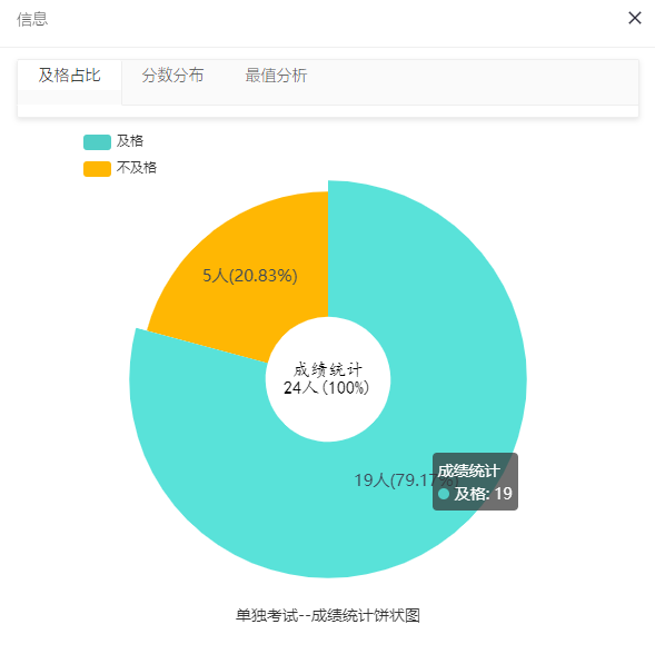
1 饼状图
1.1 代码
<html> <head> <meta http-equiv="Content-Type" content="text/html; charset=UTF-8"> <title>饼状图</title> </head> <body> <div id="main" style="width: 450px;height:450px; margin:0 auto;"></div> <script type="text/javascript"> var myChart = echarts.init(document.getElementById('main')); myChart.clear();//清除画图 myChart.setOption({ title:{ text:examTypeName+'-'+planName+'-成绩统计饼状图', top:'bottom', left:'center', textStyle:{ fontSize: 14, fontWeight: '', color: '#333' }, },//标题 tooltip:{ trigger:'item'//鼠标放在图上,进行提示 }, legend: {//列表标题栏 orient: 'vertical', left: 'left', data: ['及格', '不及格'] }, graphic:{ type:'text', left:'center', top:'center', style:{ text:'成绩统计\n'+total+'人(100%)', //使用“+”可以使每行文字居中 textAlign:'center', font:'bolder 16px cursive', fill:'#000', width:30, height:30 } },//此例饼状图为圆环中心文字显示属性,这是一个原生图形元素组件,功能很多 series : [ { name: '成绩统计', radius: ['25%', '75%'],//设置中心环和外环的比例 type: 'pie', // 设置图表类型为饼图 itemStyle: { normal:{ label:{ show:true, position:'inner', textStyle:{color:'#3c4858',fontSize:"15",font:'bolder'}, formatter:'{c}'+'人'+'({d}%)', },//饼图图形上的文本标签,可用于说明图形的一些数据信息,比如值,名称等。可以与itemStyle属性同级,具体看文档 labelLine:{ show:true, lineStyle:{color:'#3c4858'} }//线条颜色 },//基本样式 }, /* radius: '55%', */ // 饼图的半径,外半径为可视区尺寸(容器高宽中较小一项)的 55% 长度。 data:[ // 数据数组,name 为数据项名称,value 为数据项值 {value:isPassCount, name:'及格'}, {value:isNotPassCount, name:'不及格'}, ], color: ['#51CEC6','#FFB703'],//各个区域颜色 } ] }) </script> </body>
1.2 效果图
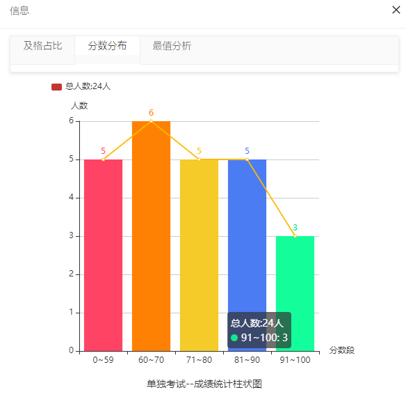
2 柱状图
2.1 代码
//str是json数组,str=[{"classname": xxx,"employmentrate":xx}, // {"classname": yyy,"employmentrate":yy}] //循环取得json数组中的值 var classNames = [];//班级名 var employmentRate = [];//就业率 $.each(str, function (index, item) { classNames.push(item.classname); employmentRate.push(item.employmentrate); }); <html> <head> <meta http-equiv="Content-Type" content="text/html; charset=UTF-8"> <title>饼状图</title> </head> <body> <div id="main" style="width: 450px;height:450px; margin:0 auto;"></div> <script type="text/javascript"> var myChart = echarts.init(document.getElementById('main')); myChart.clear(); myChart.setOption({ grid:{ x2:60,//调整坐标轴离边框的距离 }, tooltip:{ trigger:'item'//提示 }, /* tooltip:{ //给提示信息加上单位 trigger:'item', formatter: function(params){ return params.name +":" +params.data +"(%)" } }, */ title:{ text:examTypeName+'-'+planName+'-成绩统计柱状图', top:'bottom', left:'center', textStyle:{ fontSize: 14, fontWeight: '', color: '#333' }, },//标题 legend:{ icon:'roundRect',//列表显示 itemWidth:15, itemHeight:10, barBorderRadius:5, orient: 'vertical', x: 'left', data: ['总人数:'+total+'人'] }, xAxis:{ type:'category', data:['0~59','60~70','71~80','81~90','91~100'], name:'分数段', }, yAxis:{ type:'value', name:'人数', }, series:[{ name:'总人数:'+total+'人', itemStyle:{ normal:{ color: function(params){//设置柱状图的颜色,如果数据多于这个,则循环遍历 var colorList = [ '#fe4365','#fe8104','#F4CB29','#4B7CF3','#12e78c' ]; return colorList[params.dataIndex]; }, } }, data:[lowScoreCount,middleScoreCount,goodScoreCount,highScoreCount,excellentScoreCount], type:'bar', label:{//柱状上面显示对应的数值 show:true, position:'top' } }, { data: //将每个数据连着一条线 [lowScoreCount,middleScoreCount,goodScoreCount,highScoreCount,excellentScoreCount], type:'line', color:'#FFB703', } ] }); </script> </body>
2.2 效果图
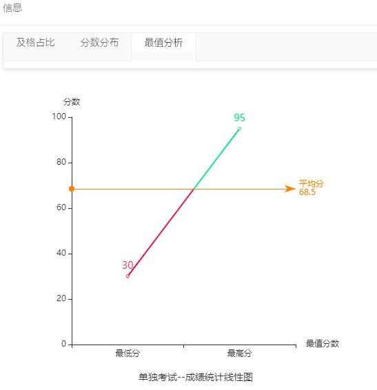
3 . 线性图
3.1 代码
<html> <head> <meta http-equiv="Content-Type" content="text/html; charset=UTF-8"> <title>饼状图</title> </head> <body> <div id="main" style="width: 450px;height:450px; margin:0 auto;"></div> <script type="text/javascript"> var myChart = echarts.init(document.getElementById('main')); myChart.clear(); myChart.setOption({ grid:{ x2:80, }, tooltip:{ trigger:'item' }, title:{ text:examTypeName+'-'+planName+'-成绩统计线性图', top:'bottom', left:'center', textStyle:{ fontSize: 14, fontWeight: '', color: '#333' }, },//标题 xAxis:{ type:'category', data:['最低分','最高分'], name:'最值分数', }, yAxis:{ type:'value', min:0, max:100, splitLine:{ show:false }, name:'分数', }, visualMap:{ show:false, pieces:[{ gt:0, lte:avgScore,//基线下为红色 color:'#e91642' },{ gt:avgScore,//基线上为绿色 color:'#12e78c' } ] }, series:[{ type:'line', smooth:true, data:[minScore,maxScore], label:{ show:true, position:'top', textStyle:{ fontSize: 14, fontWeight: '', }, }, markLine:{ silent:true, lineStyle:{ normal:{ type:'solid', color:'#fe8104'//基线颜色 橙色 } }, data:[ {yAxis:avgScore} ], label:{ normal:{ formatter:'平均分'+'\n'+avgScore } } }, }], }) </script> </body>
3.2 效果图
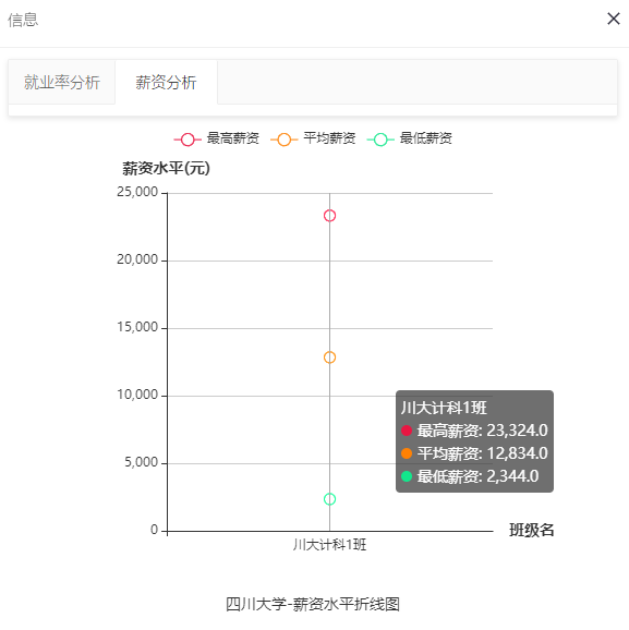
4 折线图
4.1 代码
//str是一个json数组 var classNames = [];//班级名 var maxSalarys = []; var minSalarys = []; var avgSalarys = []; $.each(str, function (index, item) { classNames.push(item.classname); maxSalarys.push(item.maxsalary); minSalarys.push(item.minsalary); avgSalarys.push(item.avgsalary); }); <html> <head> <meta http-equiv="Content-Type" content="text/html; charset=UTF-8"> <title>饼状图</title> </head> <body> <div id="main" style="width: 450px;height:450px; margin:0 auto;"></div> <script type="text/javascript"> var myChart = echarts.init(document.getElementById('main')); myChart.clear(); myChart.setOption({ grid:{ x2:60, containLabel:true }, title:{ text:schoolNameNum+'-薪资水平折线图', top:'bottom', left:'center', textStyle:{ fontSize: 14, fontWeight: '', color: '#333' }, },//标题 color:['#e91642','#fe8104','#12e78c'], legend:{ data:['最高薪资','平均薪资','最低薪资'] }, xAxis:{ type:'category', data:classNames, name:'班级名', nameTextStyle:{ fontWeight:600, fontSize:14 } }, yAxis:{ type:'value', name:'薪资水平(元)', nameTextStyle:{ fontWeight:600, fontSize:14 } }, tooltip:{ trigger:'axis' }, series:[ { name:'最高薪资', data:maxSalarys, type:'line', itemStyle:{ normal:{ lineStyle:{ color:'#e91642' } } } }, { name:'平均薪资', data:avgSalarys, type:'line', itemStyle:{ normal:{ lineStyle:{ color:'#fe8104' } } } }, { name:'最低薪资', data:minSalarys, type:'line', itemStyle:{ normal:{ lineStyle:{ color:'#12e78c' } } } } ], }) </script> </body>
4.2 效果图
岁月如歌,,,
本文作者:千夜ん
本文链接:https://www.cnblogs.com/fengpeng123/p/16923683.html
版权声明:本作品采用知识共享署名-非商业性使用-禁止演绎 2.5 中国大陆许可协议进行许可。


【推荐】国内首个AI IDE,深度理解中文开发场景,立即下载体验Trae
【推荐】编程新体验,更懂你的AI,立即体验豆包MarsCode编程助手
【推荐】抖音旗下AI助手豆包,你的智能百科全书,全免费不限次数
【推荐】轻量又高性能的 SSH 工具 IShell:AI 加持,快人一步