大二下学期之第一次结对作业(第一阶段)
昨日对flask微型python web框架有了一个基本了解,并实现了前端与后端数据库的链接。
并将累计确诊,累计治愈,累计死亡,现有确诊统计出来了。
今日主要完成对其他各个表的数据与前端的链接。
主要问题就是要明白对于echarts的柱状图,折线图,饼状图等要传什么类型的数据,不然会获取不了。
还有就是对于数据库查询语句的使用问题。
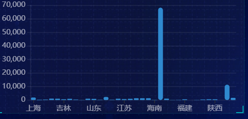
柱状图:要传两个数组,一个是x轴的值,一个是数据,这里要以省份为x轴展示各省的确诊人数。
需要将数据按省份相加,并按省份生成新表:
def get_c2_data():
    """
    :return:  返回各省数据
    """
    # 因为会更新多次数据,取时间戳最新的那组数据
    sql = "select province,sum(confirm),sum(heal),sum(dead) from details " \
          "where update_time=(select update_time from details " \
          "order by update_time desc limit 1) " \
          "group by province"
    res = query(sql)
    print(res)
    return res
柱状图样式的相关设定:
var bar1_myChart = echarts.init(document.querySelector(".bar .chart"));
        var bar1_data=[["河北"],[300]]
        var bar1_option = {
        color: ["#2f89cf"],
        tooltip: {
            trigger: "axis",
            axisPointer: {
                // 坐标轴指示器,坐标轴触发有效
                type: "shadow" // 默认为直线,可选为:'line' | 'shadow'
            }
        },
        grid: {
            left: "0%",
            top: "10px",
            right: "0%",
            bottom: "4%",
            containLabel: true
        },
        xAxis: [{
            type: "category",
            data: bar1_data[0],
            axisTick: {
                alignWithLabel: true
            },
            axisLabel: {
                textStyle: {
                    color: "rgba(255,255,255,.6)",
                    fontSize: "12"
                }
            },
            axisLine: {
                show: false
            }
        }],
        yAxis: [{
            type: "value",
            axisLabel: {
                textStyle: {
                    color: "rgba(255,255,255,.6)",
                    fontSize: "12"
                }
            },
            axisLine: {
                lineStyle: {
                    color: "rgba(255,255,255,.1)"
                        // width: 1,
                        // type: "solid"
                }
            },
            splitLine: {
                lineStyle: {
                    color: "rgba(255,255,255,.1)"
                }
            }
        }],
        series: [{
            name: "累计确诊",
            type: "bar",
            barWidth: "80%",
            data: bar1_data[1],
            itemStyle: {
                barBorderRadius: 5
            }
        }]
    };
        bar1_myChart.setOption(bar1_option);
        window.addEventListener("resize", function() {
        bar1_myChart.resize();
    });
ajax以及后台:
        function get_b1_data() {
            $.ajax({
                url: "/b1",
                success: function (data) {
                    bar1_option.xAxis[0].data=data.name;
                    bar1_option.series[0].data=data.value;
                    bar1_myChart.setOption(bar1_option);
                },
                error: function (xhr, type, errorThrown) {
                }
            })
        }
@app.route('/b1')
def get_b1_data():
    name=[]
    value=[]
    for tup ,v in utils.get_b1_data():
        name.append(tup)
        value.append(v)
    return jsonify({"name":name,"value":value})
效果:
基本每个图的结构都是:1.前台界面,2.进行前端与后台连接的服务层,3.数据库层。
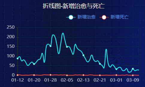
折线图:
        var line1_myChart = echarts.init(document.querySelector(".line .chart"));
        var line1_data = {
        year: [
            [24, 40, 101, 134, 90, 230, 210, 230, 120, 230, 210, 120],
            [40, 64, 191, 324, 290, 330, 310, 213, 180, 200, 180, 79]
        ]
    };
        var line1_option = {
        color: ["#00f2f1", "#ed3f35"],
        tooltip: {
            // 通过坐标轴来触发
            trigger: "axis"
        },
        legend: {
            // 距离容器10%
            right: "10%",
            // 修饰图例文字的颜色
            textStyle: {
                color: "#4c9bfd"
            }
            // 如果series 里面设置了name,此时图例组件的data可以省略
            // data: ["邮件营销", "联盟广告"]
        },
        grid: {
            top: "20%",
            left: "3%",
            right: "4%",
            bottom: "3%",
            show: true,
            borderColor: "#012f4a",
            containLabel: true
        },

        xAxis: {
            type: "category",
            boundaryGap: false,
            data: [
                "1月",
                "2月",
                "3月",
                "4月",
                "5月",
                "6月",
                "7月",
                "8月",
                "9月",
                "10月",
                "11月",
                "12月"
            ],
            // 去除刻度
            axisTick: {
                show: false
            },
            // 修饰刻度标签的颜色
            axisLabel: {
                color: "rgba(255,255,255,.7)"
            },
            // 去除x坐标轴的颜色
            axisLine: {
                show: false
            }
        },
        yAxis: {
            type: "value",
            // 去除刻度
            axisTick: {
                show: true
            },
            // 修饰刻度标签的颜色
            axisLabel: {
                color: "rgba(255,255,255,.7)"
            },
            // 修改y轴分割线的颜色
            splitLine: {
                lineStyle: {
                    color: "#012f4a"
                }
            }
        },
        series: [{
                name: "新增治愈",
                type: "line",
                stack: "",
                smooth: true,
                data: line1_data.year[1]
            },
            {
                name: "新增死亡",
                type: "line",
                stack: "",
                // 是否让线条圆滑显示
                smooth: true,
                data: line1_data.year[0]
            }
        ]
    };
        line1_myChart.setOption(line1_option);
        window.addEventListener("resize", function() {
        line1_myChart.resize();
    });
function get_l2_data() {
            $.ajax({
                url: "/l2",
                success: function (data) {
                    line1_option.xAxis.data=data.day;
                    line1_option.series[0].data = data.heal_add;
                    line1_option.series[1].data=data.dead_add;
                    line1_myChart.setOption(line1_option);
                },
                error: function (xhr, type, errorThrown) {
                }
            })
        }
@app.route("/l2")
def get_l2_data():
    data = utils.get_l2_data()
    day,heal_add,dead_add=[],[],[]
    for a,b,c in data:
        day.append(a.strftime("%m-%d"))
        heal_add.append(b)
        dead_add.append(c)
    return jsonify({"day":day,"heal_add":heal_add,"dead_add":dead_add})
def get_l2_data():
    """
    :return:返回每天新增确诊和死亡数据
    """
    sql = "select ds,heal_add,dead_add from history"
    res = query(sql)
    print(res)
    return res
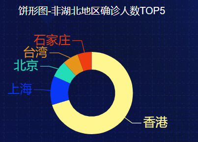
饼状图
        var bing1_myChart = echarts.init(document.querySelector(".pie .chart"));
        var bing1_option = {
        tooltip: {
            trigger: "item",
            formatter: "{a} <br/>{b}: {c} ({d}%)",
            position: function(p) {
                //其中p为当前鼠标的位置
                return [p[0] + 10, p[1] - 10];
            }
        },
        legend: {
            top: "70%",
            itemWidth: 10,
            itemHeight: 10,
            data: ["其他", "河北", "江苏", "吉林", "黑龙江"],
            textStyle: {
                color: "rgba(255,255,255,.5)",
                fontSize: "12"
            }
        },
        series: [{
            name: "治愈人数",
            type: "pie",
            center: ["50%", "60%"],
            radius: ["40%", "70%"],
            color: [
                "#FFF68F",
                "#0938F7",
                "#22DDB8",
                "#E6941A",
                "#EE3D11"
            ],
            label: { show: true,
            fontSize: "20"},
            labelLine: { show: true,
            fontSize: "20"},
            data: [
                { value: 2000, name: "其他" },
                { value: 5000, name: "河北" },
                { value: 5000, name: "江苏" },
                { value: 5000, name: "吉林" },
                { value: 15000, name: "黑龙江" }
            ]
        }]
    };
        bing1_myChart.setOption(bing1_option);
        window.addEventListener("resize", function() {
        bing1_myChart.resize();
    });
        function get_r1_data() {
            $.ajax({
                url: "/r1",
                success: function (data) {
                    //bing1_option.legend.data=data.name;
                    bing1_option.series[0].data=data.data;
                    bing1_myChart.setOption(bing1_option);
                },
                error: function (xhr, type, errorThrown) {
                }
            })
        }
def get_r1_data():
    sql='select city,confirm from'\
        '(select city ,confirm from details '\
        'where update_time=(select update_time from details order by update_time desc limit 1) '\
        'and province not in ("湖北","北京","上海","天津","重庆") '\
        'union all '\
        'select province as city , sum(confirm) from details '\
        'where update_time=(select update_time from details order by update_time desc limit 1) '\
        'and province in ("北京","上海","天津","重庆") group by province) as a '\
        'order by confirm desc limit 5'
    res=query(sql)
    print(res)
    return res
@app.route("/r1")
def get_r1_data():
    data = utils.get_r1_data()
    list=[]
    for a,b, in data:
        list.append({"name":a,"value":b})
    return jsonify({"data":list})