
uniapp vue3 实现自定义Switch效果
<template>
    <view class="container" @click="toggleSwitch">
        <label :class="isOn ? 'switch-checked' : 'switch-nochecked'">
            <view class="open">{{ activeText }}</view>
            <view class="close">{{ inactiveText }}</view>
        </label>
    </view>
</template>

<script setup>
    import {
        ref,
        watch,
        defineProps,
        defineEmits
    } from 'vue';

    const props = defineProps({
        value: {
            type: Boolean,
            default: false
        },
        activeText: {
            type: String,
            default: '开启'
        },
        inactiveText: {
            type: String,
            default: '关闭'
        },
        activeValue: {
            type: [Number, String, Boolean],
            default: true
        },
        inactiveValue: {
            type: [Number, String, Boolean],
            default: false
        }
    });

    const emit = defineEmits(['update:value', 'change']);

    const isOn = ref(props.value);

    watch(() => props.value, (newVal) => {
        isOn.value = newVal;
    });

    const toggleSwitch = () => {
        isOn.value = !isOn.value;
        console.log(isOn.value ? props.activeValue : props.inactiveValue)
        emit('update:value', isOn.value ? props.activeValue : props.inactiveValue);
        emit('change', isOn.value ? props.activeValue : props.inactiveValue);
    };
</script>

<style lang="scss" scoped>
    .container {
        width: 100rpx;

        label {
            position: relative;
            display: block;
            border-radius: 40rpx;
            height: 40rpx;
            width: 100%;

            &:before {
                content: " ";
                display: block;
                border-radius: 50rpx;
                height: 100%;
                background-color: #d5d5d5;
                transform: scale(1, 1);
                transition: all 0.3s ease;
            }

            &:after {
                content: " ";
                position: absolute;
                top: 10%;
                // margin-left: 5%;
                left: 2px;
                width: 32rpx;
                height: 32rpx;
                border-radius: 32rpx;
                background-color: white;
                box-shadow: 2rpx rgba(0, 0, 0, 0.08);
                transition: all 0.3s ease;
            }
        }

        %font-style {
            top: 0;
            color: #ffffff;
            font-size: 24rpx;
            height: 100%;
            line-height: 40rpx;
            position: absolute;
            transition: all 1s ease;
        }

        .switch-checked {
            &:after {
                // margin-left: calc(100% - 40rpx);
                left: unset;
                right: 2px;
            }

            &:before {
                background-color: #007aff;
            }

            .close {
                display: none;
            }
        }

        .switch-nochecked {
            .open {
                display: none;
            }
        }

        .open {
            left: 10rpx;
            @extend %font-style;
        }

        .close {
            right: 10rpx;
            @extend %font-style;
            color: #6b6b6b;
        }
    }
</style>
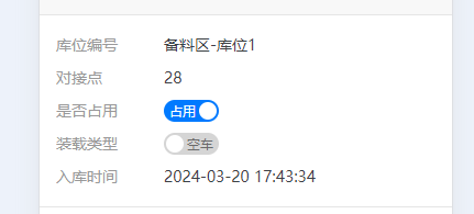
使用效果

 浙公网安备 33010602011771号