


012:前端学习-CSS动画
CSS动画
动画是使元素从一种样式逐渐变化为另一种样式的效果您可以改变任意多的样式任意多的次数
请用百分比来规定变化发生的时间,或用关键词"from"和"to",等同于0%和100%0%是动画的开始,100%是动画的完成。
@keyframes创建动画(animation)
1 2 3 4 5 6 7 8 9 10 11 12 13 14 15 16 17 18 19 20 21 22 | <!DOCTYPE html><html lang="en"><head> <meta charset="UTF-8"> <meta http-equiv="X-UA-Compatible" content="IE=edge"> <meta name="viewport" content="width=device-width, initial-scale=1.0"> <title>Document</title> <style> @keyframes myAnim(){ 0%{ CSS样式 } 50%{ CSS样式 } } </style></head><body> </body></html> |
animation执行动画的属性 :
https://blog.csdn.net/qq_40340943/article/details/100733638
animation: name duration timing-function delay iteration-count direction fill-mode;
animation:动画名称 动画的持续时间 动画效果速率 动画的开始时间 动画循环次数 动画播放方向 控制动画播放状态:animation-play-state(running代表播放,paused代表停止播放)
timing-function的值
ease 逐渐变慢
linear 匀速
ease-in 加速
ease-out 减速
ease-in-out 先加速后减速
direction值
normal 默认值为normal表示向前播放
alternate 动画播放在低偶数次向前播放,第奇数次反方向播放,
1.在style中编写动画执行
2.在body中创建div
3.再在style中编写div对应的样式

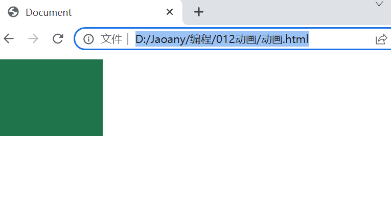
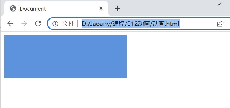
 1 <!DOCTYPE html>
 2 <html lang="en">
 3 <head>
 4     <meta charset="UTF-8">
 5     <meta http-equiv="X-UA-Compatible" content="IE=edge">
 6     <meta name="viewport" content="width=device-width, initial-scale=1.0">
 7     <title>Document</title>
 8     <style>
 9         /*设置div的样式*/
10         div{
11             width:60px;
12             height: 100px;
13             background-color: darkgreen;
14             animation: myAnim 3s linear 0s infinite ;
15         }
16         /*鼠标放div上其背景颜色改变
17         div:hover{
18             background-color: cornflowerblue;
19         }
20         */
21
22         @keyframes myAnim{
23             0%{
24                 /*设置初始宽度*/
25                 width: 200px;
26                 background-color:darkgreen;
27             }
28             50%{
29                 /*设置中间过程宽度*/
30                 width: 100px;
31                 background-color: cornflowerblue;
32             }
33             100%{
34                 /*设置最后宽度*/
35                 width: 200px;
36                 background-color: crimson;
37             }
38         }
39     </style>
40
41 </head>
42 <body>
43     <div> </div>
44 </body>
45 </html>
运行效果如下:
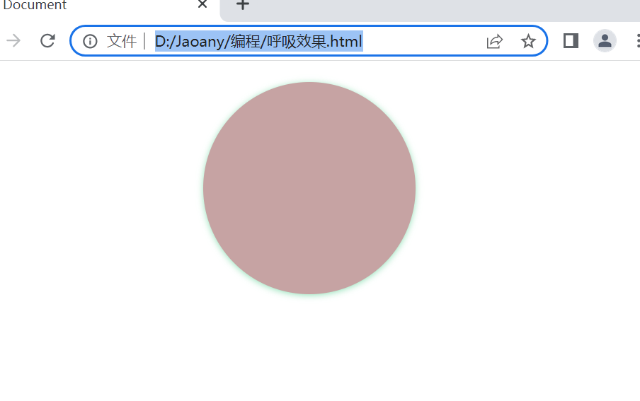
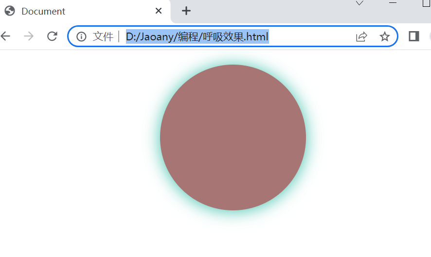
1 2 3 4 5 6 7 8 9 10 11 12 13 14 15 16 17 18 19 20 21 22 23 24 25 26 27 28 29 30 31 32 33 34 35 36 37 38 39 40 41 42 43 44 | <!DOCTYPE html><html lang="en"><head> <meta charset="UTF-8"> <meta http-equiv="X-UA-Compatible" content="IE=edge"> <meta name="viewport" content="width=device-width, initial-scale=1.0"> <title>Document</title> <style> .box{ width:200px; height: 200px; margin: 20px auto; background-color: rgb(156, 97, 97); /*设置圆角效果*/ border-radius: 50%; box-shadow: 0 1px 2px rgba(0,0,0,.3); /*设置动画执行,包括动画名称,动画执行时间,动画执行过程(infinite无限循环),偶数正向播放,奇数时反向播放*/ animation: breathe 2s ease-in-out infinite alternate; } @keyframes breathe{ 0%{ /*设置透明度*/ opacity: 0.2; box-shadow: 0 1px 2px rgba(255, 255, 255, 0.1); } 50%{ /*设置透明度为0.5*/ opacity: 0.5; /*设置阴影效果,让透明度也有变化*/ box-shadow: 0 1px 2px rgba(17, 192, 78, 0.76); } 100%{ /*设置透明度,1代表完全不透明*/ opacity: 1; box-shadow: 0 1px 30px rgb(23, 175, 175); } } </style> </head><body> <div class="box"></div></body></html> |
本文来自博客园,作者:Jaoany,转载请注明原文链接:https://www.cnblogs.com/fanglijiao/p/16869977.html


【推荐】国内首个AI IDE,深度理解中文开发场景,立即下载体验Trae
【推荐】编程新体验,更懂你的AI,立即体验豆包MarsCode编程助手
【推荐】抖音旗下AI助手豆包,你的智能百科全书,全免费不限次数
【推荐】轻量又高性能的 SSH 工具 IShell:AI 加持,快人一步
· TypeScript + Deepseek 打造卜卦网站:技术与玄学的结合
· 阿里巴巴 QwQ-32B真的超越了 DeepSeek R-1吗?
· 【译】Visual Studio 中新的强大生产力特性
· 10年+ .NET Coder 心语 ── 封装的思维:从隐藏、稳定开始理解其本质意义
· 【设计模式】告别冗长if-else语句:使用策略模式优化代码结构