Flex布局
1 弹性盒子概述
1.1 概述
使用弹性盒子布局,元素可以,拉伸以填充额外的空间,收缩以适应更小的空间。
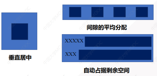
1.2 弹性盒子可以解决如下问题
- 元素垂直居中
- 元素间隙的平均分配
- 自动占据剩余空间
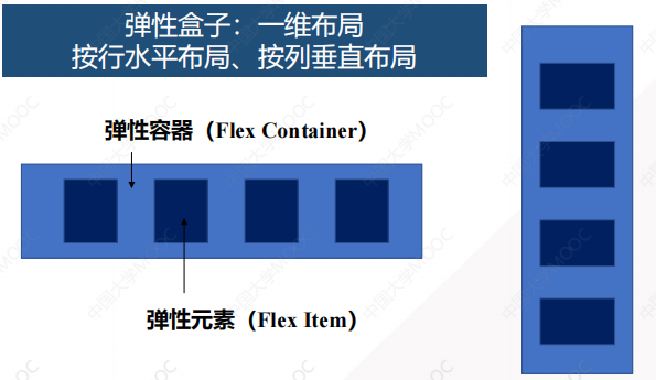
1.3 弹性盒子组成
弹性盒子:是一种一维的布局方式,只能按行水平布局或按列垂直布局。
弹性盒子包括弹性容器和弹性元素
2 弹性盒子样式
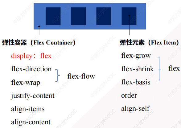
2.1 弹性容器样式
2.1.1 display属性(定义弹性容器)
<!DOCTYPE html>
<html lang="en">
<head>
    <meta charset="UTF-8">
    <meta name="viewport" content="width=device-width, initial-scale=1.0">
    <title>Flex布局</title>
    <style>
        .flex-container {
            display: flex;  // 定义弹性容器
        }
    </style>
</head>
<body>
    <div class="flex-container">
        <div class="flex-item">1</div>
        <div class="flex-item">2</div>
        <div class="flex-item">3</div>
    </div>
</body>
</html>
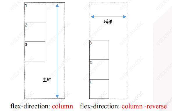
2.1.2 flex-direction属性(布局方向)
- 行布局
flex-direction: row;             // 行布局,从左到右
flex-direction: row-reverse;     // 行布局,从右到左
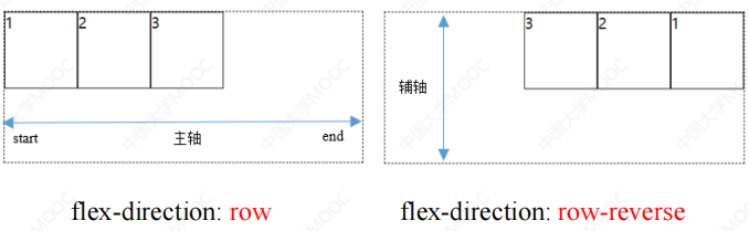
- 列布局
flex-direction: column;             // 列布局,从上到下
flex-direction: column-reverse;     // 列布局,从下到上
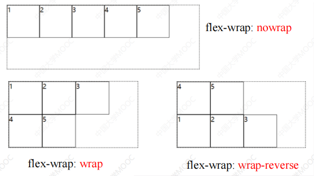
2.1.3 flex-wrap属性(是否换行显示)
flex-wrap: nowrap;          // 不换行
flex-wrap: wrap;            // 换行
flex-wrap: wrap-reverse;    // 倒序换行
<!DOCTYPE html>
<html lang="en">
<head>
    <meta charset="UTF-8">
    <meta name="viewport" content="width=device-width, initial-scale=1.0">
    <title>Flex布局</title>
    <style>
        .flex-container {
            display: flex;
            flex-direction: row;
            flex-wrap: wrap;        /* 当宽度不足以容纳所有子元素的时候,换行显示 */
            width: 250px;
            border: 1px solid skyblue;
        }
        .flex-item {
            width: 100px;
            height: 100px;
            background-color: red;
        }
    </style>
</head>
<body>
    <div class="flex-container">
        <div class="flex-item">1</div>
        <div class="flex-item">2</div>
        <div class="flex-item">3</div>
    </div>
</body>
</html>
2.1.4 flex-flow复合属性(布局方向和是否换行的缩写属性)
<!DOCTYPE html>
<html lang="en">
<head>
    <meta charset="UTF-8">
    <meta name="viewport" content="width=device-width, initial-scale=1.0">
    <title>Flex布局</title>
    <style>
        .flex-container {
            display: flex;
            /* flex-direction: row;
            flex-wrap: wrap;        当宽度不足以容纳所有子元素的时候,换行显示   */
            flex-flow: row wrap;        /* flex-direction和flex-wrap的缩写属性 */
            width: 250px;
            border: 1px solid skyblue;
        }
        .flex-item {
            width: 100px;
            height: 100px;
            background-color: red;
        }
    </style>
</head>
<body>
    <div class="flex-container">
        <div class="flex-item">1</div>
        <div class="flex-item">2</div>
        <div class="flex-item">3</div>
    </div>
</body>
</html>
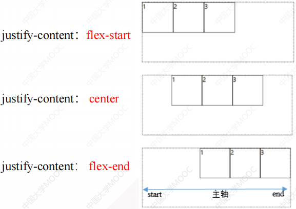
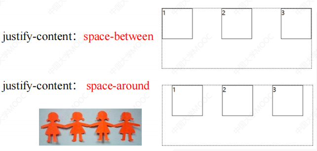
2.1.5 justify-content属性(子元素在主轴上的对齐方式)
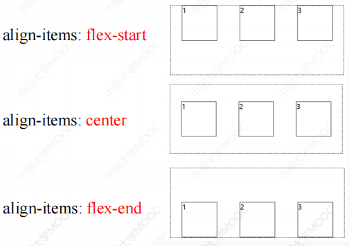
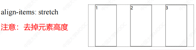
2.1.6 align-items属性(子元素在辅轴上的对齐方式)
<!DOCTYPE html>
<html lang="en">
<head>
    <meta charset="UTF-8">
    <meta name="viewport" content="width=device-width, initial-scale=1.0">
    <title>Flex布局</title>
    <style>
        .flex-container {
            display: flex;
            flex-direction: row;
            justify-content: space-around;  /* 子元素在主轴上平均分布,拉手模式 */
            align-items: stretch;           /* 子元素在辅轴上伸展,注意:子元素不能设置高度 */
            width: 500px;
            height: 200px;
            border: 1px dashed black;
        }
        .flex-item {
            width: 100px;
            background-color: red;
        }
    </style>
</head>
<body>
    <div class="flex-container">
        <div class="flex-item">1</div>
        <div class="flex-item">2</div>
        <div class="flex-item">3</div>
    </div>
</body>
</html>
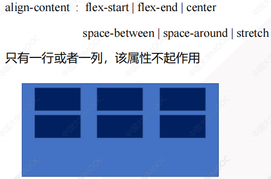
2.1.7 align-content属性(设置多行元素在容器中的整体对齐方式)
2.2 弹性元素样式
2.2.1 flex-grow属性(元素被拉大的比例,按比例分配容器剩余空间)
- 默认值为0,元素不占用剩余空间
- 取值为n,元素占据剩余空间中若干份中的n份
<!DOCTYPE html>
<html lang="en">
<head>
    <meta charset="UTF-8">
    <meta name="viewport" content="width=device-width, initial-scale=1.0">
    <title>Flex布局</title>
    <style>
        .flex-container {
            display: flex;
            flex-direction: row;
            align-items: stretch;
        }
        .flex-item {
            border: 1px dashed black;
        }
        .flex-item:nth-child(1) {
            flex-grow: 1;           /* 按照1:1:2的比例分配剩余空间 */
        }
        .flex-item:nth-child(2) {
            flex-grow: 1;
        }
        .flex-item:nth-child(3) {
            flex-grow: 2;
        }
    </style>
</head>
<body>
    <div class="flex-container">
        <div class="flex-item">1</div>
        <div class="flex-item">2</div>
        <div class="flex-item">3</div>
    </div>
</body>
</html>
2.2.2 flex-shrink属性(子元素被压缩的比例)
- 默认为1,表示弹性元素默认等比例压缩
- 0则表示不压缩
- flex 元素仅在默认宽度之和大于容器的时候才会发生收缩
2.2.3 flex-basis属性(元素在主轴上的默认尺寸,优先级高于width属性)
<!DOCTYPE html>
<html lang="en">
<head>
    <meta charset="UTF-8">
    <meta name="viewport" content="width=device-width, initial-scale=1.0">
    <title>Flex布局</title>
    <style>
        .flex-container {
            display: flex;
            width: 300px;   /* 父元素不能容纳3个120px时,此时flex-shrink压缩属性才会起作用 */
        }
        .flex-item {
            flex-basis: 120px;      /* 元素在主轴上的默认尺寸 */
            border: 1px dashed black;
            font-size: 20px;
        }
        .flex-item:nth-child(1) {
            flex-shrink: 0;     /* 不压缩 */
        }
        .flex-item:nth-child(2) {
            flex-shrink: 1;     /* 压缩60px的1/3 */
        }
        .flex-item:nth-child(3) {
            flex-shrink: 2;     /* 压缩60px的2/3 */
        }
    </style>
</head>
<body>
    <div class="flex-container">
        <div class="flex-item">1</div>
        <div class="flex-item">2</div>
        <div class="flex-item">3</div>
    </div>
</body>
</html>
2.2.4 flex属性(flex-grow、flex-shrink、flex-basis的缩写属性)
flex: flex-grow flex-shrink flex-basis;
2.2.5 order属性(子元素在弹性容器中的排列顺序,数值越小排名越靠前)
2.2.6 align-self属性(单个弹性元素在辅轴上的对齐方式)
align-self: auto | flex-start | flex-end | center | baseline | stretch

 浙公网安备 33010602011771号