

圆角边框
圆角框大概是CSS3中备受期待的一个属性,也有很多浏览器开始支持它了。但
大规模的应用它还需要不少的时间。在目前,广泛使用的方法还是应用图像了。
虽然这个东东已经被人写了无数遍了,不过为了加深记忆,我还是在写一遍了。
我想介绍一种比较灵活的圆角框,它可以水平和垂直扩展。需要使用四个图像: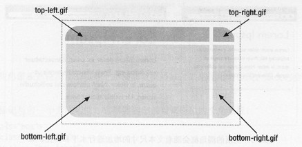
我使用的图像和上面有点不同,只是四个边框。当宽度变小时,右边的图像会覆
盖左边的图像。当高度变小时,上面的图像会覆盖下面的。所以图像的覆盖顺序
是这样的(从被覆盖到覆盖):
buttom-left <-- buttom.right <-- top-right <-- top.left
四个图像,需要四个Html元素,所以它的Html不可避免使用了额外的div,如下:
<div class="box">
<div class="box-outer">
<div class="box-inner">
<h2>Header</h2>
<p>Content</p>
</div>
</div>
</div>
<div class="box-outer">
<div class="box-inner">
<h2>Header</h2>
<p>Content</p>
</div>
</div>
</div>
分别把四个图像应用在四个元素上,代码如下:
.box {
width: 20em;
background: url(images/buttomleft.gif) no-repeat
bottom left;
}
.box-outer {
background: url(images/buttomright.gif) no-repeat
bottom right;
}
.box-inner {
background: url(images/topleft.gif) no-repeat
top left;
}
.box h2 {
background: url(images/topright.gif) no-repeat
top right;
}
.box h2 {
padding: 20px 0 0 20px;
margin: 0;
}
.box p {
padding: 10px 20px 20px 20px;
margin: 0;
}
最后的效果如下(在段落里面加了一些内容):
最关键的应用图像顺序问题,也就是图像覆盖的顺序。父元素背景总是覆盖子
元素的背景。
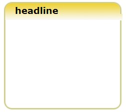
使用这种方法,只要使用适当的图像,就可以产生这种经常可以见到的效果:
使用的图像和效果图如下(把效果图四分,就是我使用的图像了):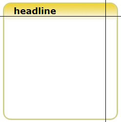
代码基本上上面的一样,唯一不同的是要指定h2背景的高度。
.box h2 {
background: url(images/topright.gif) no-repeat
top right;
height: 25px;
}
background: url(images/topright.gif) no-repeat
top right;
height: 25px;
}
为什么要指定高度呢?如果高度不够,很可能不足以覆盖右边的图像,导致
下面的结果:
扩展阅读:CSSmaster上有一节专门介绍各种圆角框(3.2.1)

