css42 CSS Units
https://www.w3schools.com/css/css_units.asp
CSS Units
CSS has several different units for expressing a length.
Many CSS properties take "length" values, such as width, margin, padding, font-size, etc.
Length is a number followed by a length unit, such as 10px, 2em, etc.
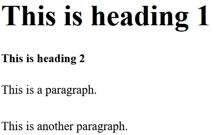
Example
Set different length values, using px (pixels):
h1 {
font-size: 60px;
}
p {
font-size: 25px;
line-height: 50px;
}
<!DOCTYPE html>
<html>
<head>
<style>
h1 {
  font-size: 60px;
}

p {
  font-size: 25px;
  line-height: 50px;
}
</style>
</head>
<body>

<h1>This is heading 1</h1>
<h2>This is heading 2</h2>
<p>This is a paragraph.</p>
<p>This is another paragraph.</p>

</body>
</html>
Note: A whitespace cannot appear between the number and the unit. However, if the value is 0, the unit can be omitted.
For some CSS properties, negative lengths are allowed.
There are two types of length units: absolute and relative.
Absolute Lengths
The absolute length units are fixed and a length expressed in any of these will appear as exactly that size.
Absolute length units are not recommended for use on screen, because screen sizes vary so much. However, they can be used if the output medium is known, such as for print layout.
* Pixels (px) are relative to the viewing device. For low-dpi devices, 1px is one device pixel (dot) of the display. For printers and high resolution screens 1px implies multiple device pixels.
| Unit | Description |
|---|---|
| cm | centimeters |
| mm | millimeters |
| in | inches (1in = 96px = 2.54cm) |
| px * | pixels (1px = 1/96th of 1in) |
| pt | points (1pt = 1/72 of 1in) |
| pc | picas (1pc = 12 pt) |
Relative Lengths
Relative length units specify a length relative to another length property. Relative length units scale better between different rendering mediums.
| Unit | Description | |
|---|---|---|
| em | Relative to the font-size of the element (2em means 2 times the size of the current font) | |
| ex | Relative to the x-height of the current font (rarely used) | |
| ch | Relative to width of the "0" (zero) | |
| rem | Relative to font-size of the root element | |
| vw | Relative to 1% of the width of the viewport* | |
| vh | Relative to 1% of the height of the viewport* | |
| vmin | Relative to 1% of viewport's* smaller dimension | |
| vmax | Relative to 1% of viewport's* larger dimension | |
| % | Relative to the parent element |
Tip: The em and rem units are practical in creating perfectly scalable layout!
* Viewport = the browser window size. If the viewport is 50cm
wide, 1vw = 0.5cm.
Browser Support
The numbers in the table specify the first browser version that fully supports the length unit.
| Length Unit |
|
|
|
|
|
|---|---|---|---|---|---|
| em, ex, %, px, cm, mm, in, pt, pc | 1.0 | 3.0 | 1.0 | 1.0 | 3.5 |
| ch | 27.0 | 9.0 | 1.0 | 7.0 | 20.0 |
| rem | 4.0 | 9.0 | 3.6 | 4.1 | 11.6 |
| vh, vw | 20.0 | 9.0 | 19.0 | 6.0 | 20.0 |
| vmin | 20.0 | 12.0 | 19.0 | 6.0 | 20.0 |
| vmax | 26.0 | 16.0 | 19.0 | 7.0 | 20.0 |


 浙公网安备 33010602011771号