css27 CSS Layout - width and max-width
https://www.w3schools.com/css/css_max-width.asp
CSS Layout - width and max-width
Using width, max-width and margin: auto;
As mentioned in the previous chapter; a block-level element always takes up the full width available (stretches out to the left and right as far as it can).
Setting the width of a block-level element will prevent it from stretching out to the edges of its container. Then, you can set the margins to auto, to horizontally center the element within its container. The element will take up the specified width, and the remaining space will be split equally between the two margins:

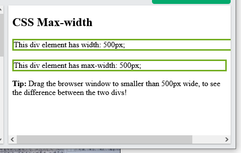
Note: The problem with the <div> above occurs when the browser window is smaller than the width of the element. The browser then adds a horizontal scrollbar to the page.
Using max-width instead, in this situation, will improve the browser's handling of small windows. This is important when making a site usable on small devices:

Tip: Resize the browser window to less than 500px wide, to see the difference between the two divs!
Here is an example of the two divs above:
Example
div.ex1 {
width: 500px;
margin:
auto;
border: 3px solid #73AD21;
}
div.ex2 {
max-width: 500px;
margin: auto;
border: 3px solid #73AD21;
}
<!DOCTYPE html>
<html>
<head>
<style>
div.ex1 {
  width: 500px;
  margin: auto;
  border: 3px solid #73AD21;
}

div.ex2 {
  max-width: 500px;
  margin: auto;
  border: 3px solid #73AD21;
}
</style>
</head>
<body>

<h2>CSS Max-width</h2>

<div class="ex1">This div element has width: 500px;</div>
<br>

<div class="ex2">This div element has max-width: 500px;</div>

<p><strong>Tip:</strong> Drag the browser window to smaller than 500px wide, to see the difference between
the two divs!</p>

</body>
</html>


 浙公网安备 33010602011771号