css21 CSS Fonts
https://www.w3schools.com/css/css_font.asp
Choosing the right font for your website is important!
Font Selection is Important
Choosing the right font has a huge impact on how the readers experience a website.
The right font can create a strong identity for your brand.
Using a font that is easy to read is important. The font adds value to your text. It is also important to choose the correct color and text size for the font.
Generic Font Families
In CSS there are five generic font families:
- Serif fonts have a small stroke at the edges of each letter. They create a sense of formality and elegance.
- Sans-serif fonts have clean lines (no small strokes attached). They create a modern and minimalistic look.
- Monospace fonts - here all the letters have the same fixed width. They create a mechanical look.
- Cursive fonts imitate human handwriting.
- Fantasy fonts are decorative/playful fonts.
All the different font names belong to one of the generic font families.
Difference Between Serif and Sans-serif Fonts
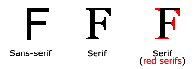
Note: On computer screens, sans-serif fonts are considered easier to read than serif fonts.
Some Font Examples
| Generic Font Family | Examples of Font Names |
|---|---|
| Serif | Times New Roman Georgia Garamond |
| Sans-serif | Arial Verdana Helvetica |
| Monospace | Courier New Lucida Console Monaco |
| Cursive | Brush Script MT Lucida Handwriting |
| Fantasy | Copperplate Papyrus |
The CSS font-family Property
In CSS, we use the font-family property to specify the font of a text.
Note: If the font name is more than one word, it must be in quotation marks, like: "Times New Roman".
Tip: The font-family property should hold several font names as a "fallback" system,
to ensure maximum compatibility between browsers/operating systems. Start with the font you want, and end with a generic family
(to let the
browser pick a similar font in the generic family, if no other fonts are
available). The font names should be separated with a comma. Read more about
fallback fonts in the next chapter.
Example
Specify some different fonts for three paragraphs:
.p1 {
font-family: "Times New Roman", Times, serif;
}
.p2 {
font-family: Arial, Helvetica, sans-serif;
}
.p3 {
font-family: "Lucida Console", "Courier New", monospace;
}
<!DOCTYPE html>
<html>
<head>
<style>
.p1 {
  font-family: "Times New Roman", Times, serif;
}

.p2 {
  font-family: Arial, Helvetica, sans-serif;
}

.p3 {
  font-family: "Lucida Console", "Courier New", monospace;
}
</style>
</head>
<body>

<h1>CSS font-family</h1>
<p class="p1">This is a paragraph, shown in the Times New Roman font.</p>
<p class="p2">This is a paragraph, shown in the Arial font.</p>
<p class="p3">This is a paragraph, shown in the Lucida Console font.</p>

</body>
</html>

https://www.w3schools.com/css/css_font_websafe.asp
CSS Web Safe Fonts
What are Web Safe Fonts?
Web safe fonts are fonts that are universally installed across all browsers and devices.
Fallback Fonts
However, there are no 100% completely web safe fonts. There is always a chance that a font is not found or is not installed properly.
Therefore, it is very important to always use fallback fonts.
This means that you should add a list of similar "backup fonts" in the font-family property. If the first font does not work, the browser will try the next one, and the next one, and so on. Always end the list with a generic font family name.
Example
Here, there are three font types: Tahoma, Verdana, and sans-serif. The second and third fonts are backups, in case the first one is not found.
p {
font-family: Tahoma, Verdana, sans-serif;
}
<!DOCTYPE html>
<html>
<head>
<style>
p {
font-family: Tahoma, Verdana, sans-serif;
}
</style>
</head>
<body>

<h1>CSS Fallback Fonts</h1>

<p>This is a paragraph.</p>
<p>This is another paragraph.</p>

</body>
</html>

Best Web Safe Fonts for HTML and CSS
The following list are the best web safe fonts for HTML and CSS:
- Arial (sans-serif)
- Verdana (sans-serif)
- Tahoma (sans-serif)
- Trebuchet MS (sans-serif)
- Times New Roman (serif)
- Georgia (serif)
- Garamond (serif)
- Courier New (monospace)
- Brush Script MT (cursive)
Note: Before you publish your website, always check how your fonts appear on different browsers and devices, and always use fallback fonts!
Arial (sans-serif)
Arial is the most widely used font for both online and printed media. Arial is also the default font in Google Docs.
Arial is one of the safest web fonts, and it is available on all major operating systems.
Example
Lorem ipsum dolor sit amet
Lorem ipsum dolor sit amet.
0 1 2 3 4 5 6 7 8 9
<!DOCTYPE html>
<html>
<head>
<style>
body {
  font-family: Arial, sans-serif;
}
</style>
</head>
<body>

<h1>Lorem ipsum dolor sit amet</h1>

<p>Lorem ipsum dolor sit amet.</p>
<p>0 1 2 3 4 5 6 7 8 9</p>

</body>
</html>

Verdana (sans-serif)
Verdana is a very popular font. Verdana is easily readable even for small font sizes.
Example
Lorem ipsum dolor sit amet
Lorem ipsum dolor sit amet.
0 1 2 3 4 5 6 7 8 9
<!DOCTYPE html>
<html>
<head>
<style>
body {
  font-family: Verdana, sans-serif;
}
</style>
</head>
<body>

<h1>Lorem ipsum dolor sit amet</h1>

<p>Lorem ipsum dolor sit amet.</p>
<p>0 1 2 3 4 5 6 7 8 9</p>

</body>
</html>

Tahoma (sans-serif)
The Tahoma font has less space between the characters.
Example
Lorem ipsum dolor sit amet
Lorem ipsum dolor sit amet.
0 1 2 3 4 5 6 7 8 9
<!DOCTYPE html>
<html>
<head>
<style>
body {
  font-family: Tahoma, sans-serif;
}
</style>
</head>
<body>

<h1>Lorem ipsum dolor sit amet</h1>

<p>Lorem ipsum dolor sit amet.</p>
<p>0 1 2 3 4 5 6 7 8 9</p>

</body>
</html>

Trebuchet MS (sans-serif)
Trebuchet MS was designed by Microsoft in 1996. Use this font carefully. Not supported by all mobile operating systems.
Example
Lorem ipsum dolor sit amet
Lorem ipsum dolor sit amet.
0 1 2 3 4 5 6 7 8 9
<!DOCTYPE html>
<html>
<head>
<style>
body {
  font-family: 'Trebuchet MS', sans-serif;
}
</style>
</head>
<body>

<h1>Lorem ipsum dolor sit amet</h1>

<p>Lorem ipsum dolor sit amet.</p>
<p>0 1 2 3 4 5 6 7 8 9</p>

</body>
</html>

Times New Roman (serif)
Times New Roman is one of the most recognizable fonts in the world. It looks professional and is used in many newspapers and "news" websites. It is also the primary font for Windows devices and applications.
Example
Lorem ipsum dolor sit amet
Lorem ipsum dolor sit amet.
0 1 2 3 4 5 6 7 8 9
<!DOCTYPE html>
<html>
<head>
<style>
body {
  font-family: 'Times New Roman', serif;
}
</style>
</head>
<body>

<h1>Lorem ipsum dolor sit amet</h1>

<p>Lorem ipsum dolor sit amet.</p>
<p>0 1 2 3 4 5 6 7 8 9</p>

</body>
</html>

Georgia (serif)
Georgia is an elegant serif font. It is very readable at different font sizes, so it is a good candidate for mobile-responsive design.
Example
Lorem ipsum dolor sit amet
Lorem ipsum dolor sit amet.
0 1 2 3 4 5 6 7 8 9
<!DOCTYPE html>
<html>
<head>
<style>
body {
  font-family: Georgia, serif;
}
</style>
</head>
<body>

<h1>Lorem ipsum dolor sit amet</h1>

<p>Lorem ipsum dolor sit amet.</p>
<p>0 1 2 3 4 5 6 7 8 9</p>

</body>
</html>

Garamond (serif)
Garamond is a classical font used for many printed books. It has a timeless look and good readability.
Example
Lorem ipsum dolor sit amet
Lorem ipsum dolor sit amet.
0 1 2 3 4 5 6 7 8 9
<!DOCTYPE html>
<html>
<head>
<style>
body {
  font-family: Garamond, serif;
}
</style>
</head>
<body>

<h1>Lorem ipsum dolor sit amet</h1>

<p>Lorem ipsum dolor sit amet.</p>
<p>0 1 2 3 4 5 6 7 8 9</p>

</body>
</html>

Courier New (monospace)
Courier New is the most widely used monospace serif font. Courier New is often used with coding displays, and many email providers use it as their default font. Courier New is also the standard font for movie screenplays.
Example
Lorem ipsum dolor sit amet
Lorem ipsum dolor sit amet.
0 1 2 3 4 5 6 7 8 9
<!DOCTYPE html>
<html>
<head>
<style>
body {
  font-family: 'Courier New', monospace;
}
</style>
</head>
<body>

<h1>Lorem ipsum dolor sit amet</h1>

<p>Lorem ipsum dolor sit amet.</p>
<p>0 1 2 3 4 5 6 7 8 9</p>

</body>
</html>
Brush Script MT (cursive)
The Brush Script MT font was designed to mimic handwriting. It is elegant and sophisticated, but can be hard to read. Use it carefully.
Example
Lorem ipsum dolor sit amet
Lorem ipsum dolor sit amet.
0 1 2 3 4 5 6 7 8 9
<!DOCTYPE html>
<html>
<head>
<style>
body {
  font-family: 'Brush Script MT', cursive;
}
</style>
</head>
<body>

<h1>Lorem ipsum dolor sit amet</h1>

<p>Lorem ipsum dolor sit amet.</p>
<p>0 1 2 3 4 5 6 7 8 9</p>

</body>
</html>
Tip: Also check out all available Google Fonts and how to use them.
CSS Font Fallbacks
Commonly Used Font Fallbacks
Below are some commonly used font fallbacks, organized by the 5 generic font families:
- Serif
- Sans-serif
- Monospace
- Cursive
- Fantasy
Serif Fonts
| font-family | Example text | Code |
|---|---|---|
| "Times New Roman", Times, serif |
This is a HeadingThis is a paragraph. |
| Georgia, serif |
This is a HeadingThis is a paragraph. |
|
| Garamond, serif |
This is a HeadingThis is a paragraph. |
Sans-Serif Fonts
| font-family | Example text | Code |
|---|---|---|
| Arial, Helvetica, sans-serif |
This is a HeadingThis is a paragraph. |
| Tahoma, Verdana, sans-serif |
This is a HeadingThis is a paragraph. |
|
| "Trebuchet MS", Helvetica, sans-serif |
This is a HeadingThis is a paragraph. |
|
| Geneva, Verdana, sans-serif |
This is a HeadingThis is a paragraph. |
Monospace Fonts
| font-family | Example text | Code |
|---|---|---|
| "Courier New", Courier, monospace |
This is a HeadingThis is a paragraph. |
Cursive Fonts
| font-family | Example text | Code |
|---|---|---|
| "Brush Script MT", cursive |
This is a HeadingThis is a paragraph. |
Fantasy Fonts
| font-family | Example text | Code |
|---|---|---|
| Copperplate, Papyrus, fantasy |
This is a HeadingThis is a paragraph. |
CSS Font Style
Font Style
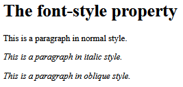
The font-style property is mostly used to specify italic text.
This property has three values:
- normal - The text is shown normally
- italic - The text is shown in italics
- oblique - The text is "leaning" (oblique is very similar to italic, but less supported)
Example
p.normal {
font-style: normal;
}
p.italic {
font-style: italic;
}
p.oblique {
font-style: oblique;
}
<!DOCTYPE html>
<html>
<head>
<style>
p.normal {
  font-style: normal;
}

p.italic {
  font-style: italic;
}

p.oblique {
  font-style: oblique;
}
</style>
</head>
<body>

<h1>The font-style property</h1>

<p class="normal">This is a paragraph in normal style.</p>
<p class="italic">This is a paragraph in italic style.</p>
<p class="oblique">This is a paragraph in oblique style.</p>

</body>
</html>
Font Weight
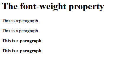
The font-weight property specifies the weight of a font:
Example
p.normal {
font-weight: normal;
}
p.thick {
font-weight: bold;
}
<!DOCTYPE html>
<html>
<head>
<style>
p.normal {
  font-weight: normal;
}

p.light {
  font-weight: lighter;
}

p.thick {
  font-weight: bold;
}

p.thicker {
  font-weight: 900;
}
</style>
</head>
<body>

<h1>The font-weight property</h1>

<p class="normal">This is a paragraph.</p>
<p class="light">This is a paragraph.</p>
<p class="thick">This is a paragraph.</p>
<p class="thicker">This is a paragraph.</p>

</body>
</html>
Font Variant
The font-variant property specifies whether or not a text should be displayed in a small-caps font.
In a small-caps font, all lowercase letters are converted to uppercase letters. However, the converted uppercase letters appears in a smaller font size than the original uppercase letters in the text.
Example
p.normal {
font-variant: normal;
}
p.small {
font-variant: small-caps;
}
<!DOCTYPE html>
<html>
<head>
<style>
p.normal {
  font-variant: normal;
}

p.small {
  font-variant: small-caps;
}
</style>
</head>
<body>

<h1>The font-variant property</h1>

<p class="normal">My name is Hege Refsnes.</p>
<p class="small">My name is Hege Refsnes.</p>

</body>
</html>
CSS Font Size
Font Size
The font-size property sets the size of the text.
Being able to manage the text size is important in web design. However, you should not use font size adjustments to make paragraphs look like headings, or headings look like paragraphs.
Always use the proper HTML tags, like <h1> - <h6> for headings and <p> for paragraphs.
The font-size value can be an absolute, or relative size.
Absolute size:
- Sets the text to a specified size
- Does not allow a user to change the text size in all browsers (bad for accessibility reasons)
- Absolute size is useful when the physical size of the output is known
Relative size:
- Sets the size relative to surrounding elements
- Allows a user to change the text size in browsers
Note: If you do not specify a font size, the default size for normal text, like paragraphs, is 16px (16px=1em).
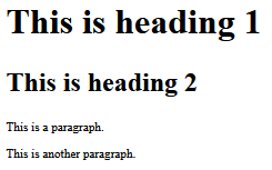
Set Font Size With Pixels
Setting the text size with pixels gives you full control over the text size:
Example
h1 {
font-size: 40px;
}
h2 {
font-size: 30px;
}
p {
font-size: 14px;
}
<!DOCTYPE html>
<html>
<head>
<style>
h1 {
  font-size: 40px;
}

h2 {
  font-size: 30px;
}

p {
  font-size: 14px;
}
</style>
</head>
<body>

<h1>This is heading 1</h1>
<h2>This is heading 2</h2>
<p>This is a paragraph.</p>
<p>This is another paragraph.</p>

</body>
</html>
Tip: If you use pixels, you can still use the zoom tool to resize the entire page.
Set Font Size With Em
To allow users to resize the text (in the browser menu), many developers use em instead of pixels.
1em is equal to the current font size. The default text size in browsers is 16px. So, the default size of 1em is 16px.
The size can be calculated from pixels to em using this formula: pixels/16=em
Example
h1 {
font-size: 2.5em; /* 40px/16=2.5em */
}
h2 {
font-size: 1.875em; /* 30px/16=1.875em */
}
p {
font-size: 0.875em; /* 14px/16=0.875em */
}
<!DOCTYPE html>
<html>
<head>
<style>
h1 {
  font-size: 2.5em; /* 40px/16=2.5em */
}

h2 {
  font-size: 1.875em; /* 30px/16=1.875em */
 }

p {
  font-size: 0.875em; /* 14px/16=0.875em */
}
</style>
</head>
<body>

<h1>This is heading 1</h1>
<h2>This is heading 2</h2>
<p>This is a paragraph.</p>
<p>Specifying the font-size in em allows all major browsers to resize the text.
Unfortunately, there is still a problem with older versions of IE. When resizing the text, it becomes larger/smaller than it should.</p>

</body>
</html>
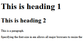
In the example above, the text size in em is the same as the previous example in pixels. However, with the em size, it is possible to adjust the text size in all browsers.
Unfortunately, there is still a problem with older versions of Internet Explorer. The text becomes larger than it should when made larger, and smaller than it should when made smaller.
Use a Combination of Percent and Em
The solution that works in all browsers, is to set a default font-size in percent for the <body> element:
Example
body {
font-size: 100%;
}
h1 {
font-size: 2.5em;
}
h2 {
font-size: 1.875em;
}
p {
font-size: 0.875em;
}
<!DOCTYPE html>
<html>
<head>
<style>
body {
  font-size: 100%;
}

h1 {
  font-size: 2.5em;
}

h2 {
  font-size: 1.875em;
}

p {
  font-size: 0.875em;
}
</style>
</head>
<body>

<h1>This is heading 1</h1>
<h2>This is heading 2</h2>
<p>This is a paragraph.</p>
<p>Specifying the font-size in percent and em displays the same size in all major browsers, and allows all browsers to resize the text!</p>

</body>
</html>
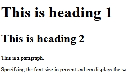
Our code now works great! It shows the same text size in all browsers, and allows all browsers to zoom or resize the text!
Responsive Font Size
The text size can be set with a vw unit, which means the "viewport width".
That way the text size will follow the size of the browser window:
Hello World
Resize the browser window to see how the font size scales.
Example
<h1 style="font-size:10vw">Hello World</h1>
<!DOCTYPE html>
<html>
<meta name="viewport" content="width=device-width, initial-scale=1.0">
<body>

<h1 style="font-size:10vw;">Responsive Text</h1>

<p style="font-size:5vw;">Resize the browser window to see how the text size scales.</p>

<p style="font-size:5vw;">Use the "vw" unit when sizing the text. 10vw will set the size to 10% of the viewport width.</p>

<p>Viewport is the browser window size. 1vw = 1% of viewport width. If the viewport is 50cm wide, 1vw is 0.5cm.</p>

</body>
</html>
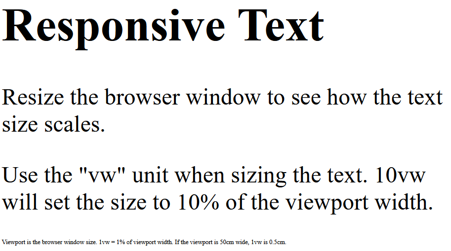
Viewport is the browser window size. 1vw = 1% of viewport width. If the viewport is 50cm wide, 1vw is 0.5cm.
CSS Font Property
The CSS Font Property
To shorten the code, it is also possible to specify all the individual font properties in one property.
The font property is a shorthand property for:
font-stylefont-variantfont-weightfont-size/line-heightfont-family
Note: The font-size and font-family values are required. If one of the other values is missing, their default value are used.
Example
Use font to set several font properties in one declaration:
p.a {
font: 20px Arial, sans-serif;
}
p.b
{
font: italic small-caps bold 12px/30px Georgia, serif;
}
<!DOCTYPE html>
<html>
<head>
<style>
p.a {
  font: 20px Arial, sans-serif;
}

p.b {
  font: italic small-caps bold 12px/30px Georgia, serif;
}
</style>
</head>
<body>

<h1>The font Property</h1>

<p class="a">This is a paragraph. The font size is set to 20 pixels, and the font family is Arial.</p>

<p class="b">This is a paragraph. The font is set to italic, small-caps and bold, the font size is set to 12 pixels, the line height is set to 30 pixels, and the font family is Georgia.</p>

</body>
</html>

All CSS Font Properties
| Property | Description |
|---|---|
| font | Sets all the font properties in one declaration |
| font-family | Specifies the font family for text |
| font-size | Specifies the font size of text |
| font-style | Specifies the font style for text |
| font-variant | Specifies whether or not a text should be displayed in a small-caps font |
| font-weight | Specifies the weight of a font |


 浙公网安备 33010602011771号