cs04 CSS Measurement Units
Values and units, in CSS, are significant as they determine the size, proportions, and positioning of elements on a web page.
Units, define the measurement system used to specify the values. CSS offers a number of different units for expressing length and measurement. CSS unit is used to specify the property size for a page element or its content.
There are a number of ways to specify and measure length in CSS. It is used to specify margins, padding, font size, width, height, border, etc.
For example- font-size: 50px, here number 50 has a suffix px i.e., pixel, it is a CSS measurement unit.
There should be no whitespace between the number and the unit. The unit can be left out when the value is 0.
Following table shows the different types of values and units that we mostly use in CSS styling:
| Data type | Description | Example |
|---|---|---|
| <integer> | Represents a whole number | 55, -55, etc. |
| <number> | Represents a decimal number. It may or may not have a decimal point. | 1.5, 234, -1.5, etc. |
| <dimension> | Represents a <number> with a unit attached to it. Also includes value types such as <length>, <angle>, <time> and <resolution> | 5px, 30deg, 2s, 2.5dpi |
| <percentage> | Represents a fraction of other value, that is, it is always relative to other value. | 80%, 25%, etc. |
Length Units
Length units can be categorized into two types:
-
Absolute units
-
Relative units
Absolute Length Units
These units are categorized as fixed-length units, which means that lengths specified with absolute units maintain an exact, unchanged size on the screen.
These units prove to be very effective when the browser has comprehensive information about the properties of the screen, the printer being used, or other appropriate user agents.
The following table contains all the types of absolute units:
| Unit | Description | Equivalent value | Example |
|---|---|---|---|
| mm | Refers to millimetre, it is used to specify the measurements in millimetres. | 1mm = 1/10th of 1cm | font-size: 10mm; |
| cm | Refers to centimetre, it is used to specify the measurements in centimetres. | 1cm = 37.8px = 25.2/64in | font-size: 5cm; |
| Q | Refers to Quarter-millimeters, it is used to specify the measurements in centimetres. | 1Q = 1/40th of 1cm | font-size: 5Q; |
| in | Refers to inches, it is used to specify the measurement in inches. | 1in = 2.54cm = 96px | font-size: 1in; |
| pt | Refers to point, it is used to specify the measurements in points. | 1pt = 1/72 of 1in | font-size: 20pt; |
| pc | Refers to picas, it is used to specify the measurement in picas. | 1pc = 1/6th of 1in | width: 6pc; |
| px | Refers to pixels, it is used to specify the measurement in pixels. | 1px = 1/96th of 1in | font-size: 15px; |
Absolute units prove valuable for projects where responsiveness is not a priority. However, they are less beneficial for responsive websites because they do not adjust when screen dimensions change.
CSS Measurement Units - Using mm, cm, in, Q
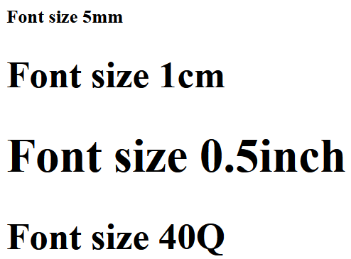
Here is an example of absolute units (mm, cm, in, Q):
<html>
<head>
<style>
   .unit-mm {
      font-size: 5mm;
   }
   .unit-cm {
      font-size: 1cm;
   }
   .unit-inch {
      font-size: 0.5in;
   }
   .unit-quarter {
      font-size: 40Q;
   }
</style>
</head>
<body>
   <h1 class="unit-mm">Font size 5mm</h1>
   <h1 class="unit-cm">Font size 1cm</h1>
   <h1 class="unit-inch">Font size 0.5inch</h1>
   <h1 class="unit-quarter">Font size 40Q</h1>
</body>
</html>
CSS Measurement Units - Using px, pt, pc
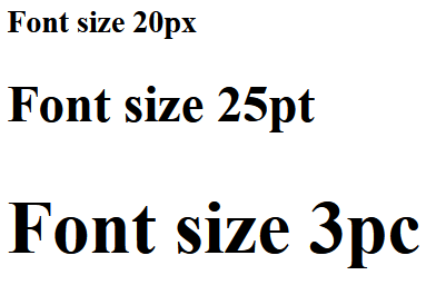
Here is an example of absolute units (px, pt, pc):
<html>
<head>
<style>
   .unit-px {
      font-size: 20px;
   }
   .unit-pt {
      font-size: 25pt;
   }
   .unit-pc {
      font-size: 3pc;
   }
</style>
</head>
<body>
   <h1 class="unit-px">Font size 20px</h1>
   <h1 class="unit-pt">Font size 25pt</h1>
   <h1 class="unit-pc">Font size 3pc</h1>
</body>
</html>
Relative Length Units
Relative length units are called such because they are measured in relation to other elements.
Relative units are great for styling responsive websites because they can be adjusted proportionally based on window size or parent elements. These units define lengths relative to other length properties.
The following table contains all the types of relative units:
| Unit | Description | Example |
|---|---|---|
| em | Relative to the font-size of the element. | font-size: 4em; |
| ex | Relative to the x-height of the current font. | font-size: 4ex; |
| ch | Relative to width of the "0". | font-size: 4ch; |
| rem | Relative to font-size of the root element. | font-size: 2rem; |
| lh | It is relative to the line height of the element. | font-size: 4lh; |
| rlh | It is relative to the line height of the root element. | font-size: 4rlh; |
| vh | It is relative to the height of the viewport. 1vh = 1% or 1/100 of the height of the viewport. | font-size: 4vh; |
| vw | It is relative to the width of the viewport. 1vw = 1% or 1/100 of the width of viewport. | width: 4vw; |
| vmin | It is relative to the smaller dimension of the viewport. 1vmin = 1% or 1/100 of the viewport's smaller dimension. | width: 4vmin; |
| vmax | It is relative to the larger dimension of the viewport. 1vmax = 1% or 1/100 of the viewport's larger dimension. | width: 4vmax; |
| vb | It is relative to the size of the initial containing block in the direction of the root element's block axis. 1vb = 1% of containing block's size (block axis). | font-size: 4vb; |
| vi | It is relative to the size of the initial containing block in the direction of the root element's inline axis. 1vb = 1% of containing block's size (inline axis). | font-size: 4vi; |
| svw, svh | It is relative to the width and height of the smaller viewport. 1svw = 1% or 1/100 of the smaller viewport's width and 1svh = 1% or 1/100 of the smaller viewport's height. | width: 40svw; height: 40svh; |
| lvw, lvh | It is relative to the width and height of the larger viewport. 1lvw = 1% or 1/100 of the larger viewport's width and 1lvh = 1% or 1/100 of the larger viewport's height. | width: 40lvw; height: 40lvh; |
| dvw, dvh | It is relative to the width and height of the dynamic viewport. 1dvw = 1% or 1/100 of the dynamic viewport's width and 1dvh = 1% or 1/100 of the dynamic viewport's height. | width: 40dvw; height: 40dvh; |
CSS Measurement Units - em Unit
This unit sets the size relative to the font-size of the element:
<html>
<head>
<style>
   div {
      font-size: 20px;
      border: 2em solid green;
   }
</style>
</head>
<body>
   <div>
      This div will have a border of 20 * 2 = 40 pixels.
   </div>
</body>
</html>

CSS Measurement Units - ex Unit
This unit sets the size relative to the x-height of the current font:
<html>
<head>
<style>
   div {
      font-size: 20px;
      border: 2ex solid green;
   }
</style>
</head>
<body>
   <div>
      This div will have a border of 2 * x-height of the line.
   </div>
</body>
</html>

CSS Measurement Units - ch Unit
This unit sets the size relative to width of the "0" (zero) character in the chosen font. It is primarily used to create responsive designs that scale with the font size:
In the following exmaple we set the input width to 10ch (which means it will show 10 characters). Try changing the font-size value and see how input still shows 10 charactes or numbers.
<html>
<head>
<style>
   input {
      font-size: 2em;
      width:10ch;
   }
</style>
</head>
<body>
   <div>
      <input type="text" name="id" id="userID" placeholder="enter PIN">
   </div>
</body>
</html>

CSS Measurement Units - rem Unit
This unit sets the size relative to font-size of the root element, typically the HTML element itself:
<html>
<head>
<style>
   html {
      font-size: 10px;
   }
   div {
      font-size: 2rem;
      margin: 1em;
      border: 5px solid black;
      background-color: beige;
      padding: 0.25em;
   }
   p {
      font-size: 3rem;
      border: 2px solid red;
   }
   .child-element {
      font-size: 1rem;
      border: 2px solid green;
   }
</style>
</head>
<body>
   <div>
      div with font-size 2rem i.e 2*root element (html) font size
      <br>
      <span class="child-element">This span resizes its font w.r.t to root element(html) </span>
   </div>
   <p>p with font-size 3rem  i.e 2*root element (html) font size   </p>
</body>
</html>

CSS Measurement Units - lh and rlh Unit
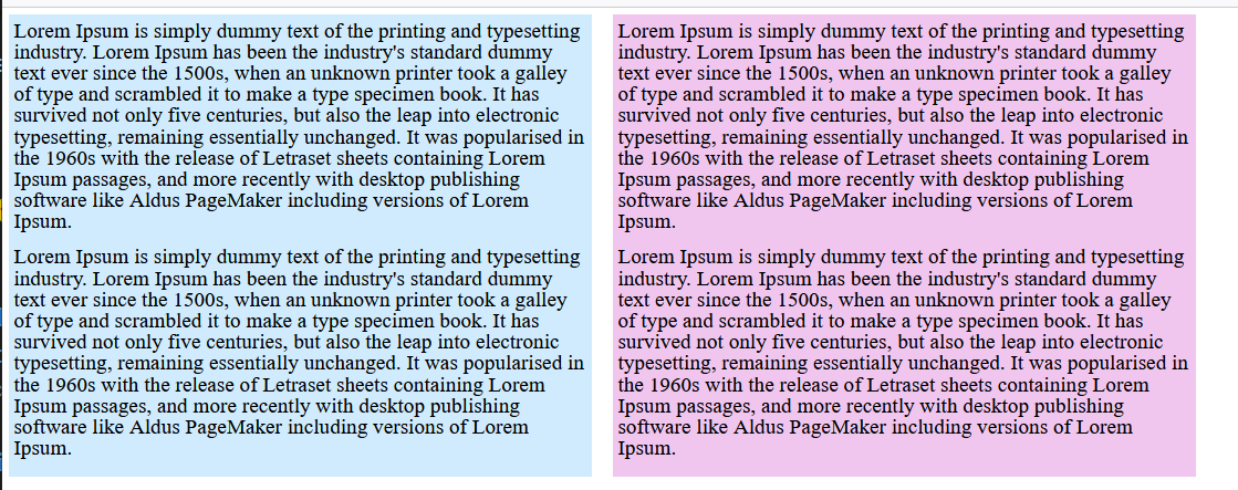
lh unit sets the size relative to the line height of the element.
rlh unit sets the size relative to the line height of the root element.
Following example demonstrates usage of both lh and rlh units (Try changing font-size to 10px, 2em, or 300%; in body > div:first-of-type):
<html>
<head>
<style>
   :root {
      font-size: 100%;
      /*
      Changing the value of line height also changes
      the used value for any declaration that uses
      line height units.

      In this case, it affects the entire document
      because this ruleset matches the root element.
      */
      line-height: 1;
   }
   body > div:first-of-type {
      /*
      Changing the font size here only affects the
      first two blocks of text. Those blocks of text
      use lh units.

      The last block of text use rlh or root
      line height units. Its text size gets calculated
      relative to the font size of the :root element.

      Try changing this to 10px, 2em, or 300%;
      */
      font-size: 1lh;
      display: grid;
      grid-template-columns: auto auto auto auto;
      gap: 24px;
      margin-block-end: 2rem;
   }
   .lh {
      font-size: 1.5lh;
      background: #87cefa66;
   }
   .rlh {
      font-size: 1.5rlh;
      background: #da70d666;
   }
   body > p {
      font-family: sans-serif;
      font-size: 1.5rem;
   }
   [lang] {
      padding: 5px;
   }
   [lang="en"] {
      font-family: "Lora", serif;
      align-self: start;
   }
   p {
      margin-block: 0 1rem;
   }
</style>
</head>
<body>
<div>
   <div lang="en" class="lh">
      <p>Lorem Ipsum is simply dummy text of the printing and typesetting industry. Lorem Ipsum has been the industry's standard dummy text ever since the 1500s, when an unknown printer took a galley of type and scrambled it to make a type specimen book. It has survived not only five centuries, but also the leap into electronic typesetting, remaining essentially unchanged. It was popularised in the 1960s with the release of Letraset sheets containing Lorem Ipsum passages, and more recently with desktop publishing software like Aldus PageMaker including versions of Lorem Ipsum.</p>

      <p>Lorem Ipsum is simply dummy text of the printing and typesetting industry. Lorem Ipsum has been the industry's standard dummy text ever since the 1500s, when an unknown printer took a galley of type and scrambled it to make a type specimen book. It has survived not only five centuries, but also the leap into electronic typesetting, remaining essentially unchanged. It was popularised in the 1960s with the release of Letraset sheets containing Lorem Ipsum passages, and more recently with desktop publishing software like Aldus PageMaker including versions of Lorem Ipsum.</p>
   </div>
   <div lang="en" class="rlh">
      <p>Lorem Ipsum is simply dummy text of the printing and typesetting industry. Lorem Ipsum has been the industry's standard dummy text ever since the 1500s, when an unknown printer took a galley of type and scrambled it to make a type specimen book. It has survived not only five centuries, but also the leap into electronic typesetting, remaining essentially unchanged. It was popularised in the 1960s with the release of Letraset sheets containing Lorem Ipsum passages, and more recently with desktop publishing software like Aldus PageMaker including versions of Lorem Ipsum.</p>

      <p>Lorem Ipsum is simply dummy text of the printing and typesetting industry. Lorem Ipsum has been the industry's standard dummy text ever since the 1500s, when an unknown printer took a galley of type and scrambled it to make a type specimen book. It has survived not only five centuries, but also the leap into electronic typesetting, remaining essentially unchanged. It was popularised in the 1960s with the release of Letraset sheets containing Lorem Ipsum passages, and more recently with desktop publishing software like Aldus PageMaker including versions of Lorem Ipsum.</p>
   </div>
</div>
</body>
</html>
CSS Measurement Units - vh Unit and vw Unit
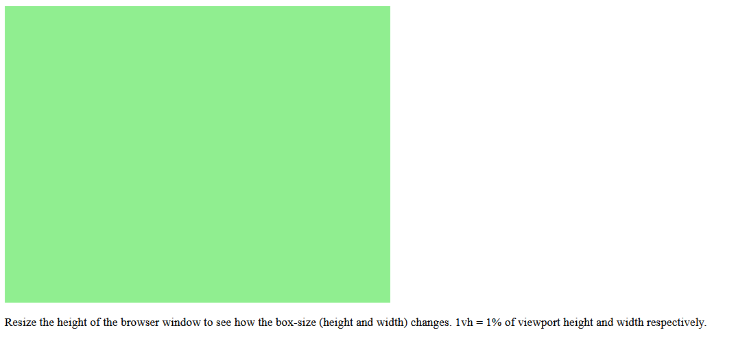
vh (viewport height) unit sets the size relative to the height of the viewport. 1vh = 1% or 1/100 of the height of the viewport.
vw (viewport width) unit sets the size relative to the width of the viewport. 1vw = 1% or 1/100 of the width of viewport.
For example, we set the width to 20vw and the height to 20vh. Say viewport width and height are respectively 1200px and 1000px. In this scenario, the value of 20vw will be 240px and that of 20vh will be 200px.
<html>
<head>
<style>
   body {
      height:500vh;
   }
   .container {
      display:flex;
   }
   .box-1 {
      background-color: lightgreen;
      height:50vh;
      width:50vw;
   }
</style>
</head>
<body>
   <div class="box-1"></div>
   <p>Resize the height of the browser window to see how the box-size (height and width) changes. 1vh = 1% of viewport height and width respectively.</p>
</body>
</html>
CSS Measurement Units - vmin (viewport minimum) and vmax (viewport maximum) Unit
vmin (viewport minimum) unit sets the size relative to the smaller dimension of the viewport. 1vmin = 1% or 1/100 of the viewport's smaller dimension. For example, if the viewport is 1000px wide and 800px high. If we set the width of an element to 30vmin, it will be 30% of the height. So 30% of 800px is 240px.
vmax (viewport maximum) unit sets the size relative to the larger dimension of the viewport. 1vmax = 1% or 1/100 of the viewport's larger dimension. For example, if the viewport is 1000px wide and 800px high. If we set the width of an element to 30vmax, it would be 30% of the width, or 300px.
<html>
<head>
<style>
   div {
      box-sizing: border-box;
      color: white;
      margin-bottom: 4px;
      padding: 4px;
      overflow: scroll;
   }
   .vwvh {
      background: lightcoral;
      width: 60vw;
      height: 70vh;
   }
   .vmin {
      color: black;
      background: lightblue;
      width: 80vmin;
      height: 20vmax;
   }
</style>
</head>
<body>
   <div class="vwvh">
      width = 50vw (50% of the viewport's width)<br />
      height = 30vh (30% of the viewport's height)
   </div>
   <div class="vmin">
      width = 80vmin (should be viewport's height)<br />
      height = 10vmax (should be viewport's width)
   </div>
</body>
</html>

CSS Measurement Units - vb Unit
This unit sets the size relative to the size of the initial containing block in the direction of the root element's block axis. 1vb = 1% of containing block's size (block axis):
<html>
<head>
<style>
   body {
      font-size:20px;
   }
   .container {
      height:80vb;
   }
   p {
      font-size:5vb;
   }
</style>
</head>
<body>
   <div class="container">
   <p>Resize the height of the browser window to see how the font changes.</p>
</div>
</body>
</html>

CSS Measurement Units - vi Unit
This unit sets the size relative to the size of the initial containing block in the direction of the root element's inline axis. 1vi = 1% of containing block's size (inline axis):
<html>
<head>
<style>
   body {
      font-size:20px;
   }
   .container {
      width:80vi;
   }
   p {
      font-size:5vi;
   }
</style>
</head>
<body>
   <div class="container">
   <p>Resize the height of the browser window to see how the font changes. 1vh = 1% of viewport height and width respectively.</p>
</div>
</body>
</html>

Following example demonstrates using <resolution> data type, where the image resolution is set as 500dpi:

<html>
<head>
<style>
   img {
      width: 300px;
      height: 200px;
      margin-right: 0.5in;
   }
</style>
</head>
<body>
   <h2>Image Resolution dots per inch</h2>
   <h3>500dpi</h3>
   <img style="image-resolution: 500dpi;" src="images/pink-flower.jpg" alt="500dpi">
</body>
</html>
Example - Percentages
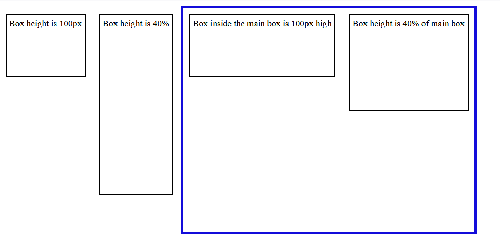
A percentage value is always set in relation with another value. For example, when a percentage value is passed as height or width of an element, it will be calculated as percentage of the height or width of the parent element.
Let us see an example to understand this better. Here a percentage value is passed to the height of an element:
<html>
<head>
<style>
   .main {
      height: 400px;
      border: 5px solid rgb(19, 12, 218);
      display: inline-block;
   }
   .box {
      border: 2px solid black;
      padding: 5px;
      margin: 10px;
      display: inline-block;
   }
   .length-value {
      height: 100px;
   }
   .percent-value {
      height: 40%;
   }
</style>
</head>
<body>
   <div class="box length-value">Box height is 100px</div>
   <div class="box percent-value">Box height is 40%</div>
   <div class="main">
   <div class="box length-value">Box inside the main box is 100px high</div>
   <div class="box percent-value">Box height is 40% of main box</div>
</div>
</div>
</body>
</html>
Let us see one more example of usage of percentage, where the nested values of a list are calculated based on the value of parent element font-size:
<html>
<head>
<style>
   .font-value {
      font-size: larger;
   }
   li {
      font-size: 60%;
   }
</style>
</head>
<body>
   <div>
      <h2>Beverages</h2>
      <ul>
         <li class="font-value">Tea
            <ul>
            <li>Assam tea</li>
            <li>Darjeeling tea</li>
            </ul>
         </li>
         <li class="font-value">Coffee
            <ul>
            <li>Hot coffee</li>
            <li>Cold Coffee</li>
            </ul>
         </li>
         <li class="font-value">Juices
            <ul>
            <li>Orange</li>
            <li>Mango</li>
            <li>Sweet Lime</li>
            </ul>
         </li>
      </ul>
   </div>
</body>
</html>

There are some properties that accept a length or a percentage value, some properties that only accept length. If the permitted value indicates <length-percentage>, the value passed can be either length or percentage; and when the permitted value indicates <length>, the value passed should be only length and not percentage.
Example - Numbers
There are some properties of CSS that accepts the value types as numbers, without any unit attached to it. Properties such as opacity, line-height, etc.
For instance, the value for opacity can range from 0 to 1.
Here is an example for opacity:
<html>
<head>
<style>
   .wrapper {
      display: flex;
   }
   #common-style {
      background-color: #d3360b;
      width: 150px;
      height: 100px;
      border: 3px solid black;
      margin: 5px;
   }
   p {
      text-align: center;
   }
   .decimal-opacity {
      opacity: 0.4;
   }
   .opacity-0 {
      opacity: 0;
   }
   .opacity-1 {
      opacity: 1;
   }
</style>
</head>
<body>
   <div class="wrapper">
      <div class="decimal-opacity" id="common-style">
         <p>CSS Opacity to 0.4</p>
      </div>
      <div style="border: 2px solid green">
         <p>CSS Opacity to 0</p>
         <div class="opacity-0" id="common-style"></div>
      </div>
      <div class="opacity-1" id="common-style">
         <p>CSS Opacity to 1</p>
      </div>
   </div>
</body>
</html>

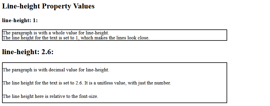
Here is an example for line-height:
<html>
<head>
<style>
   div {
      border: 2px solid black;
      width: 700px;
   }
   div.lh-integer {
      line-height: 1;
   }
   div.lh-decimal {
      line-height: 2.6;
   }
</style>
</head>
<body>
<h2>Line-height Property Values</h2>
   <h3>line-height: 1:</h3>
      <div class="lh-integer">The paragraph is with a whole value for line-height.<br>
      The line height for the text is set to 1, which makes the lines look close.
      </div>

      <h2>line-height: 2.6:</h2>
      <div class="lh-decimal">The paragraph is with decimal value for line-height.<br>
      The line height for the text is set to 2.6. It is a unitless value, with just the number.<br>
      The line height here is relative to the font-size.
      </div>
</body>
</html>


 浙公网安备 33010602011771号