h31 HTML Layout using CSS
Now we all have learned various techniques to design an HTML layout including tables and semantic elements. We are very much comfortable and efficient at creating layouts. In this tutorial, we are going to look at how CSS properties help in arranging different components of a web page to make an attractive layout structure. To understand this chapter properly, we must have a basic understanding of CSS.
HTML Layout - using CSS properties
The following properties of CSS are used to design an HTML layout −
-
CSS float
-
CSS display: flex
-
CSS display: grid
The CSS float property
The float property of CSS allows to control the positioning of the web page components. When an element is floated, it is taken out of the normal flow of the document and shifted to the specified position such as left or right.
Example
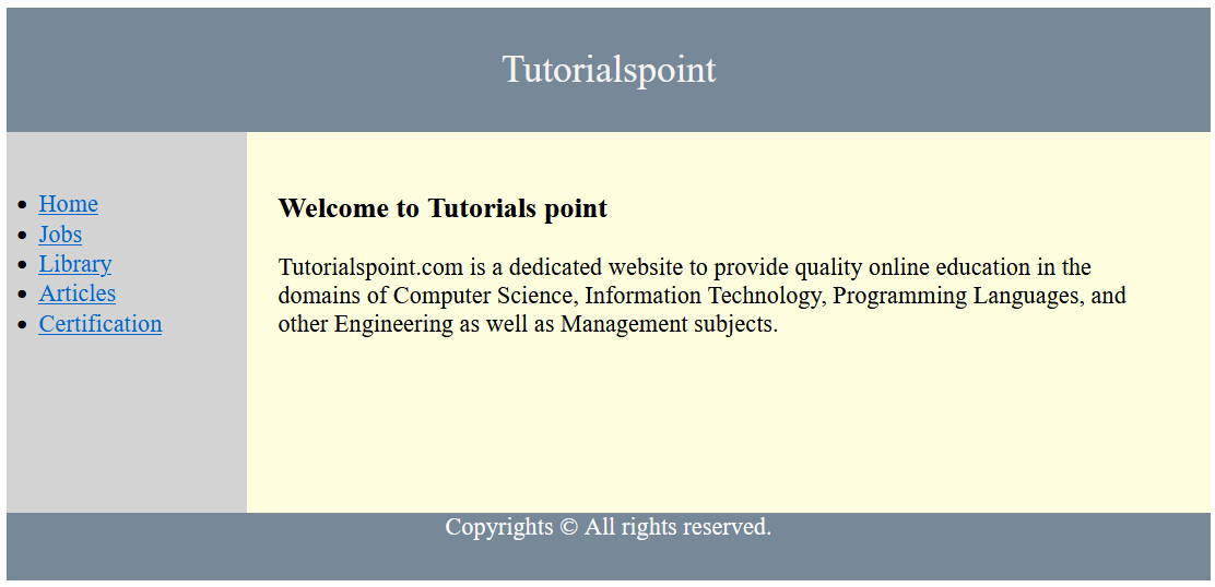
In the following example, the <nav> and <article> tags have been floated to the left using the float: left property of CSS.
<!DOCTYPE html>
<html>
<head>
   <title>The float Property</title>
   <style>
   * {
      box-sizing: border-box;
   }
   header {
      font-size: 25px;
      color: whitesmoke;
      padding: 1px;
      text-align: center;
      background-color: lightslategray;
   }
   nav {
      float: left;
      width: 20%;
      height: 250px;
      background: lightgray;
      padding: 20px;
   }
   nav ul {
      padding: 1px;
   }
   article {
      float: left;
      padding: 20px;
      width: 80%;
      background-color: lightyellow;
      height: 250px;
   }
   footer {
      background-color: lightslategray;
      padding: 10px;
      text-align: center;
      color: white;
      padding-top: 20px;
      padding-bottom: 10px;
   }
   footer a {
      margin: 10px;
   }
   footer p {
      margin-top: 30px;
   }
</style>
</head>
<body>
   <!--header segment-->
   <header>
      <div>
        <p>Tutorialspoint</p>
      </div>
   </header>
   <section>
   <!--Menu Navigation segment-->
   <nav>
         <ul>
            <li>
               <a href="#">Home</a>
            </li>
            <li>
               <a href="#">Jobs</a>
            </li>
            <li>
               <a href="#">Library</a>
            </li>
            <li>
               <a href="#">Articles</a>
            </li>
            <li>
               <a href="#">Certification</a>
            </li>
         </ul>
      </nav>
      <!--Content segment-->
      <article>
         <h1>Welcome to Tutorials point</h1>
         <p> Tutorialspoint.com is a dedicated website to provide quality online education in the domains of Computer Science, Information Technology, Programming Languages, and other Engineering as well as Management subjects. </p>
      </article>
   </section>
   <!--Footer segment-->
   <footer>
      <div>
         <p>Copyrights © All rights reserved.</p>
      </div>
   </footer>
</body>
</html>

On running the above code, we will get a layout structure consisting of a header, a navigation bar, a content section, and a footer.
The CSS flex
The CSS flexbox (also known as Flexible Box Layout) is a more efficient way of designing a layout. It allows developers to arrange and distribute spaces among multiple components of a web page. To use the features of Flexbox, we need to set the display property to flex or inline-flex.
Note − We have a dedicated Flexbox tutorial on our website. Kindly refer to that tutorial for better understanding.
Example
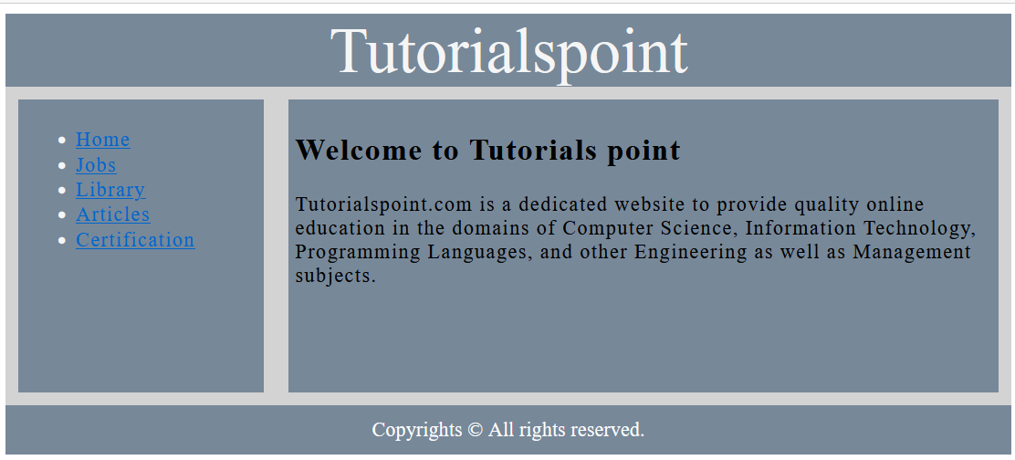
The following example illustrates how to use the display: flex property of CSS to design a layout of a web page.
<!DOCTYPE html>
<html>
<head>
   <style>
      header {
         text-align: center;
         background-color: lightslategray;
         font-size: 50px;
         color: whitesmoke;
      }
      .contain {
         display: flex;
         background: lightgray;
         height: 250px;
         width: 100%;
      }
      .flex-item1 {
         flex-basis: 25%;
         background-color: lightslategray;
         color: whitesmoke;
         margin: 10px;
         padding: 5px;
         letter-spacing: 1px;
      }
      .flex-item2 {
         flex-basis: 75%;
         background-color: lightslategray;
         margin: 10px;
         padding: 5px;
         letter-spacing: 1px;
      }
      footer {
         background-color: lightslategray;
         text-align: center;
         color: white;
         padding: 10px;
      }
   </style>
</head>
<body>
   <header>
      <div>Tutorialspoint</div>
   </header>
   <div class = "contain">
      <div class = "flex-item1">
         <ul>
            <li>
               <a href="#">Home</a>
            </li>
            <li>
               <a href="#">Jobs</a>
            </li>
            <li>
               <a href="#">Library</a>
            </li>
            <li>
               <a href="#">Articles</a>
            </li>
            <li>
               <a href="#">Certification</a>
            </li>
         </ul>
      </div>
      <div class = "flex-item2">
         <h2>Welcome to Tutorials point</h2>
         <p>Tutorialspoint.com is a dedicated website to provide quality online education in the domains of Computer Science, Information Technology, Programming Languages, and other Engineering as well as Management subjects. </p>
      </div>
   </div>
   <footer>
      <div>
         Copyrights ©  All rights reserved.
      </div>
   </footer>
</body>
</html>

On executing the above HTML code, we will get a layout structure.
The CSS grid
The CSS grid layout is another addition to the HTML layout designing techniques that define a grid of rows and columns. It also provides abilities to control the sizing as well as positioning of web page contents.
Example
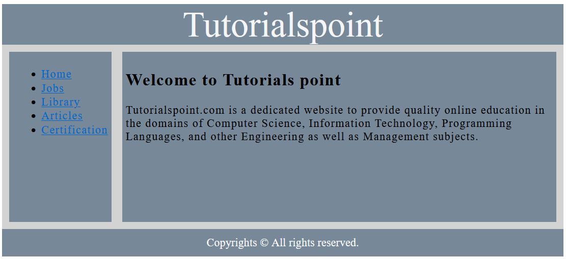
In this example, we are going to design the same web page layout by using the display: grid property of CSS.
<!DOCTYPE html>
<html>
<head>
   <style>
      header {
         text-align: center;
         background-color: lightslategray;
         font-size: 50px;
         color: whitesmoke;
      }
      .contain {
         display: grid;
         background-color: lightgray;
         grid-template-columns: auto auto;
         padding: 5px;
         grid-gap: 5px;
         height: 250px;
      }
      .item1 {
         background-color: lightslategray;
         margin: 5px;
         padding: 5px;
         letter-spacing: 1px;
      }
      .item2 {
         background-color: lightslategray;
         margin: 5px;
         padding: 5px;
         letter-spacing: 1px;
      }
      footer {
         background-color: lightslategray;
         text-align: center;
         color: white;
         padding: 10px;
      }
   </style>
</head>
<body>
   <header>
      <div>Tutorialspoint</div>
   </header>
   <div class="contain">
      <div class="item1">
         <ul>
            <li>
               <a href="#">Home</a>
            </li>
            <li>
               <a href="#">Jobs</a>
            </li>
            <li>
               <a href="#">Library</a>
            </li>
            <li>
               <a href="#">Articles</a>
            </li>
            <li>
               <a href="#">Certification</a>
            </li>
         </ul>
      </div>
      <div class="item2">
         <h2>Welcome to Tutorials point</h2>
         <p>Tutorialspoint.com is a dedicated website to provide quality online education in the domains of Computer Science, Information Technology, Programming Languages, and other Engineering as well as Management subjects. </p>
      </div>
   </div>
   <footer>
      <div>Copyrights ©   All rights reserved.</div>
   </footer>
</body>
</html>

On running the above code, it will generate a layout structure.


 浙公网安备 33010602011771号