h25 HTML Input Attributes
HTML Input Attributes
The HTML input attributes are used to define the characteristics and behavior of the <input> element. These attributes are used with the different types of input fields such as text, email, password, date, number and so forth. Note that the Input element is used to create interactive controls for the web-based forms so that it can accept data from the user.
The <input> element requires only an opening tag and it will work only if we add it in between the <form> tags. In this tutorial, we are going to explore the attributes that are used with <input> element.
The attributes of the <input> element are as follows −
-
name 名称
-
value 值
-
type 类型
-
size 宽度,大小,尺寸
-
maxlength 最大长度
-
readonly 只读(不能修改)
-
disabled 禁用(失效)
-
min
-
max
-
accept
-
multiple
-
placeholder 占位(给出提示信息,类似于tooltip)
-
required 需要的,必需的(必需输入)
-
autofocus
-
list
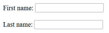
The "type" and "name" Attribute
The type attribute indicates the type of input control like text, password, email and so on. The name attribute of an input element assigns an identifier to the form control that enables the server to recognize and retrieve the value.
Example
The following HTML code illustrates the use of type and name Attributes.
<!DOCTYPE html>
<html>
<head>
   <title>The type and name Attributes</title>
</head>
<body>
   <form >
      First name: <input type = "text" name = "first_name" />
      <br><br>
      Last name: <input type = "text" name = "last_name" />
   </form>
</body>
</html>
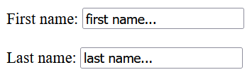
The "value" Attribute
The value attribute is used to provide an initial value inside the input control.
Example
In the following example, we are creating two input fields with initial value as " first name..." and " last name...".
<!DOCTYPE html>
<html>
<head>
   <title>The value Attribute</title>
</head>
<body>
   <form >
      First name: <input type = "text" name = "first_name" value = "first name..." />
      <br><br>
      Last name: <input type = "text" name = "last_name" value = "last name..."/>
   </form>
</body>
</html>
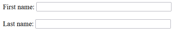
The "size" Attribute
The size attribute allows to specify the width of the text-input control in terms of characters. The default size is 20 characters.
Example
In this example, the size of text-input control is set to 40.
<!DOCTYPE html>
<html>
<head>
   <title>The size Attribute</title>
</head>
<body>
   <form >
      First name: <input type = "text" name = "first_name" size = "40" />
      <br><br>
      Last name: <input type = "text" name = "last_name" size = "40"/>
   </form>
</body>
</html>
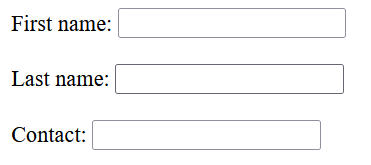
The "maxlength" Attribute
The maxlength attribute allows to specify the maximum number of characters a user can enter into the text box.
Example
The following example demonstrates how to set the maxlength of an input field.
<!DOCTYPE html>
<html>
<head>
   <title>The maxlength Attribute</title>
</head>
<body>
   <form >
      First name: <input type = "text" name = "first_name" />
      <br><br>
      Last name: <input type = "text" name = "last_name" />
      <br><br>
      Contact: <input type = "text" name = "phone" maxlength = "10"/>
   </form>
</body>
</html>
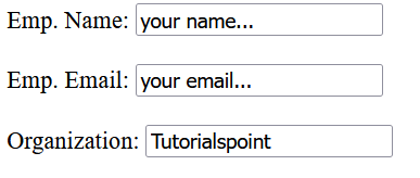
The "readonly" Attribute
The "readonly" attribute of an input field indicates the field as read-only. Although the content of a read-only field cannot be altered, users can still select it and copy the text. Also, the value of a read-only field is included when the form is submitted.
Example
Following example shows the use of "readonly" attribute of <input> element −
<!DOCTYPE html>
<html>
<head>
   <title>The readonly Attribute</title>
</head>
<body>
   <form >
      Emp. Name: <input type = "text" name = " your_name" value = "your name..."/>
      <br><br>
      Emp. Email: <input type = "text" name = "mail" value = "your email..."/>
      <br><br>
      Organization: <input type = "text" name = "organization" value = "Tutorialspoint" readonly/>
   </form>
</body>
</html>
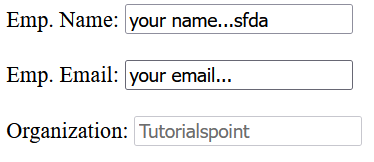
The "disabled" Attribute
The disabled attribute of an input field indicates the field as disabled. Unlike readonly, the value of a disabled field will not be included when the form is submitted.
Example
In this example, the field containing Organization name is marked as disabled.
<!DOCTYPE html>
<html>
<head>
   <title>The disabled Attribute</title>
</head>
<body>
   <form >
      Emp. Name: <input type = "text" name = "your_name" value = "your name..."/>
      <br><br>
      Emp. Email: <input type = "email" name = "mail" value = "your email..."/>
      <br><br>
      Organization: <input type = "text" name = "organization" value = "Tutorialspoint" disabled/>
   </form>
</body>
</html>
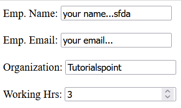
The "min" and "max" Attributes
The min and max attributes determine the minimum and maximum values respectively of an input field like number, date, week and so on. If we use them together, they will allow users to enter an input within a predefined range.
Example
In the following example, we are mentioning the minimum working hours as 3 and maximum as 8 by using the min and max attributes.
<!DOCTYPE html>
<html>
<head>
   <title>The min and max Attribute</title>
</head>
<body>
   <form >
      Emp. Name: <input type = "text" name = "your_name" value = "your name..."/>
      <br><br>
      Emp. Email: <input type = "email" name = "mail" value = "your email..."/>
      <br><br>
      Organization: <input type = "text" name = "organization" value = "Tutorialspoint" readonly/>
      <br><br>
      Working Hrs: <input type = "number" name = "working_hours" min="3" max="8"/>
   </form>
</body>
</html>
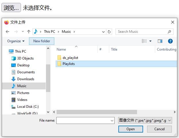
The "accept" and "multiple" Attribute
The accept attribute specifies the types of files that the server will take in. If we use the multiple attribute, it will allow the users to upload more than one file.
Example
The following HTML code can accept multiple image files.
<!DOCTYPE html>
<html>
<head>
   <title>The accept and multiple Attributes</title>
</head>
<body>
   <form>
      <input type = "file" name = "fileupload" accept = "image/*" multiple />
   </form>
</body>
</html>
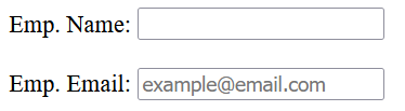
The "placeholder" Attribute
The placeholder attribute of an input field like text, search and email briefly outlines the desired value of the field. Its predefined value is displayed in the input field until the user begins to enter their own value.
Example
In the following example, we are using the placeholder attribute for the email input field.
<!DOCTYPE html>
<html>
<head>
   <title>The placeholder Attribute</title>
</head>
<body>
   <form>
      Emp. Name: <input type = "text" name = "your_name"/>
      <br><br>
      Emp. Email: <input type = "email" name = "mail" placeholder = "example@email.com"/>
   </form>
</body>
</html>
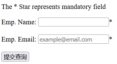
The "required" Attribute
The required attribute in an input field like text, search, password and email signifies that the field must contain some values for the form to be successfully submitted. In other words, it indicates the mandatory field.
Example
The following example illustrates the use of required attribute. Without filling the mandatory fields, users will not be able to submit the form.
<!DOCTYPE html>
<html>
<head>
   <title>The required Attribute</title>
</head>
<body>
   <form >
      <p>The * Star represents mandatory field</p>
      Emp. Name: <input type = "text" name = "your_name" required/>*
      <br><br>
      Emp. Email: <input type = "email" name = "mail" placeholder = "example@email.com" required/>*
      <br><br>
      <input type = "submit">
   </form>
</body>
</html>
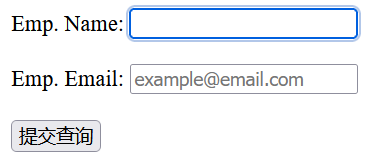
The "autofocus" Attribute
The autofocus attribute in an input field ensures that the field must be selected automatically once the webpage loads completely. It implies that the cursor will be positioned to the specified input field. In cases where multiple elements use the autofocus attribute, only the first element will acquire the focus.
Example
Following is the example of autofocus attribute.
<!DOCTYPE html>
<html>
<head>
   <title>The autofocus Attribute</title>
</head>
<body>
   <form >
      Emp. Name: <input type = "text" name = "your_name" autofocus/>
      <br><br>
      Emp. Email: <input type = "email" name = "mail" placeholder = "example@email.com" />
      <br><br>
      <input type = "submit">
   </form>
</body>
</html>
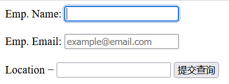
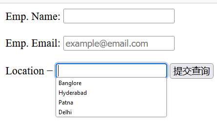
The "list" Attribute
The list attribute defines a set of predefined options for an <input> element, which are defined within a <datalist> element. The <input> element uses a specific string as an ID to create a link to the corresponding <datalist> element.
Example
In this example, we are creating a list of cities with the help of list attribute.
<!DOCTYPE html>
<html>
<head>
   <title>The list Attribute</title>
</head>
<body>
   <form >
      Emp. Name: <input type = "text" name = "your_name" autofocus/>
      <br><br>
      Emp. Email: <input type = "email" name = "mail" placeholder = "example@email.com" />
      <br><br>
      Location −
      <input list="location" name="cities">
         <datalist id = "location">
            <option value="Banglore">
            <option value="Hyderabad">
            <option value="Patna">
            <option value="Delhi">
         </datalist>
      <input type = "submit">
   </form>
</body>
</html>

 浙公网安备 33010602011771号