CSS 动画
当一个网站的静态页面做出来过后, 可以使用一些动画来丰富网页。
- 当鼠标移动到某个按钮上时,会改变颜色
- 当网页大小被修改后,修改标签大小
- 当移动后,让某些元素显示出来,让某些元素消失
CSS 可以根据状态的变化,来控制一些行为。主要表现在如下四个方面
- 哪一个属性需要动画
- 动画维持多久
- 在动画开始之前需要多久
- 如何加速一个动画过程
例如如下:
a {
  display: block;
  width: 300px;
  padding: 31px 5px;
  border-radius: 5px;
  margin: 20% auto;
  background-color: orange;
  text-align: center;
  font-family: Helvetica;
  font-size: 32px;
  color: MintCream;
  transition-property: background-color;  /* 背景属性 */
  transition-duration: 2s;   /* 周期为2秒 */
}

a:hover {
  background-color: LimeGreen;
}
1. Duration
我们必须用 transition-property 来指定是要对哪个属性进行动画, 再利用 transition-duration 来指定维持多久。
a {
  transition-property: color;
  transition-duration: 1s;
}
duration 的单位可以是秒,也可以是毫秒。
2. Delay
表示动效开始前的延迟, 单位与duration 一样。
transition-property: width;
transition-duration: 750ms;
transition-delay: 250ms;
3. Timing
'transition-timing-function' 是表示动效展示过程,默认值是 ease 开始慢,中间快,最后减慢。
其它值如下所示
ease-in— starts slow, accelerates quickly, stops abruptlyease-out— begins abruptly, slows down, and ends slowlyease-in-out— starts slow, gets fast in the middle, and ends slowlylinear— constant speed throughout
CSS 提供了一条命令修改 transition: color 1.5s linear 0.5s; 等价于
transition-property: color;
transition-duration: 1.5s;
transition-timing-function: linear;
transition-delay: 0.5s;
多个属性联合的写法
transition: color 1s linear,
            font-size 750ms ease-in 100ms;
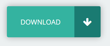
案例
@import url(https://fonts.googleapis.com/css?family=Open+Sans);
@import url(https://maxcdn.bootstrapcdn.com/font-awesome/4.3.0/css/font-awesome.min.css);

/* Main Styles */
body {
  min-width: 300px;
  background-color: #ecf0f1;
  font-family: 'Open Sans', sans-serif;
  font-size: 16px;
}

.button {
  position: absolute;
  top: 0;
  bottom: 0;
  left: 0;
  right: 0;
  display: block;
  overflow: hidden;
  margin: auto;
  border-radius: 5px;
  box-shadow: 0 0 20px 0 rgba(0, 0, 0, 0.3);
  width: 300px;
  height: 100px;
  line-height: 100px;
  background-color: #34B3A0;
  color: #fff;
}

.button span,
.button div,
.button i {
 transition: width 750ms ease-in 200ms,
             left 500ms ease-out 450ms,
             font-size 950ms linear;

}

.button span,
.button .icon {
  position: absolute;
  display: block;
  height: 100%;
  text-align: center;
}

.button span {
  width: 72%;
  left: 0px;
  line-height: inherit;
  font-size: 22px;
}

.button .icon {
  right: 0;
  width: 28%;
}

.button .icon .fa {
  font-size: 30px;
  vertical-align: middle;
}

.icon {
  width: 200px;
  background-color: #1A7B72;
}

.button:hover span {
  left: -72%;
}

.button:hover .icon {
  width: 100%;
}

.button:hover .icon .fa {
  font-size: 45px;
}
<!DOCTYPE html>
<html lang="en">
<head>
  <meta charset="UTF-8">
  <title>Animation All</title>
  <link rel="stylesheet" href="style.css">
</head>
<body>
  <a class="fancy button" href="#" role="button">
    <span>DOWNLOAD</span>
    <div class="icon">
      <i class="fa fa-arrow-down"></i>
    </div>
  </a>
</body>
</html>

 浙公网安备 33010602011771号