Bootstrap 使用笔记
1. 简介
Bootstrap是twitter发布的一个前端响应式布局框架,会根据你的屏幕的大小来调整HTML元素的大小,拥有Grid布局,导航,显示等模块组件。
使用bootstrap 可以减少前端代码,减少不必要的浏览器兼容问题。
参考链接: https://getbootstrap.com/
1. 1 Grid 布局
Bootstrap栅格系统基于CSS Flexbox, 使用行和列来创建container,由 container, row, col 组成,关系如下图:
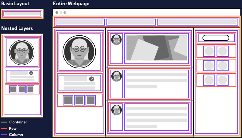
一个网页由一个大的 container 组成 ,里面有许多行,每行下面有一到多个列组成,这就是网页的布局。
<div class="container">
  <div class="row">
    <div class="col">
      <!-- 列是一个网页的最小单元! -->
    </div>
  </div>
</div>
默认情况下,Bootstrap使用一行12列一行的方式,默认都是等距。

在这里,md 表示 medium (中等的),* 代表一个数字,它指定了这个元素所占的列宽。
xs 表示 extra small 使用屏幕
col-{breakpoints}-{width}
参考连接: https://getbootstrap.com/docs/5.0/layout/grid/
1.2 组件与工具
2. Tabs
Tabs are common navigation technique that give links to different parts of a site.
3. Pills
Pills are a set of buttons that give links to different parts of a site.
Bootstrap provides the .pull-left class to left-align an element, and the.pull-right class to right-align an element. Let's use these classes to finish styling the navigation bar.
4. Jumbotron
Many sites have a large showcase area featuring important content. Bootstrap calls this large showcase a jumbotron.
5. 图片 img-reponsive
6. 文本
text-center 居中
text-primary 蓝色 主要操作
, 使用span元素 text-danger 变成红色
7. 按钮
class="btn"
class = "btn-block"

btn-primary 深蓝色主要操作
浅蓝色 btn-info 被用在那些用户可能会采取的操作上。
红色btn-danger被用来提醒用户该操作具有“破坏性”,例如删除一张猫的图片。
8. 导航
表格: 给你表单的文本输入框增加 classform-control 。
9. well,它的作用是为设定的列创造出一种视觉上的深度感。
10. target 用于选中

 浙公网安备 33010602011771号