Flex布局【实战】
实战:使用 Flex 布局构建如下界面
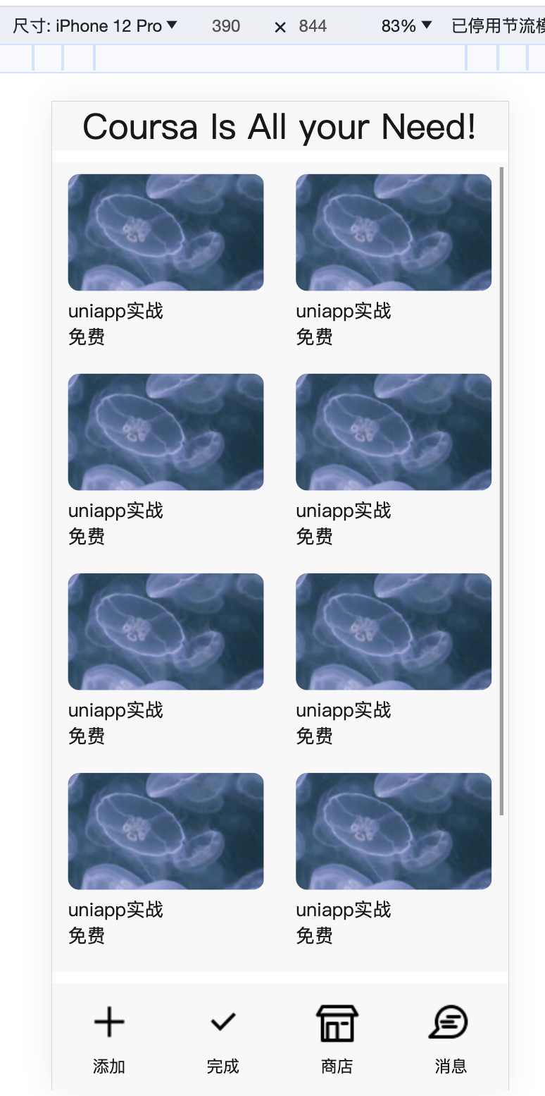
分析:
- 竖向:使用 flex 布局将页面分为三部分,即头部、主体和底部。其中头部和底部需要固定高度,其余的高度分配给主体部分(使用
flex-direction=column;和flex-grow: 1;) - 主体部分:使用 flex 布局排列多个卡片,这里可以使用 uniapp 提供的 scroll-view 滚动视图
- 底部:使用 flex 布局多个视图
一种实现:
<template>
	<view class="main-page">
		<view class="head-part">
			Coursa Is All your Need!
		</view>
		<view class="body-part">
			<scroll-view scroll-y="true" class="scroll-view-clz">
				<view class="list-scroll-views">
					<view class="view-item">
						<image src="../../static/course.png" mode="widthFix"></image>
						<view>uniapp实战</view>
						<view>免费</view>
					</view>
					<view class="view-item">
						<image src="../../static/course.png" mode="widthFix"></image>
						<view>uniapp实战</view>
						<view>免费</view>
					</view>
					<view class="view-item">
						<image src="../../static/course.png" mode="widthFix"></image>
						<view>uniapp实战</view>
						<view>免费</view>
					</view>
					<view class="view-item">
						<image src="../../static/course.png" mode="widthFix"></image>
						<view>uniapp实战</view>
						<view>免费</view>
					</view>
					<view class="view-item">
						<image src="../../static/course.png" mode="widthFix"></image>
						<view>uniapp实战</view>
						<view>免费</view>
					</view>
					<view class="view-item">
						<image src="../../static/course.png" mode="widthFix"></image>
						<view>uniapp实战</view>
						<view>免费</view>
					</view>
					<view class="view-item">
						<image src="../../static/course.png" mode="widthFix"></image>
						<view>uniapp实战</view>
						<view>免费</view>
					</view>
					<view class="view-item">
						<image src="../../static/course.png" mode="widthFix"></image>
						<view>uniapp实战</view>
						<view>免费</view>
					</view>
					<view class="view-item">
						<image src="../../static/course.png" mode="widthFix"></image>
						<view>uniapp实战</view>
						<view>免费</view>
					</view>
					<view class="view-item">
						<image src="../../static/course.png" mode="widthFix"></image>
						<view>uniapp实战</view>
						<view>免费</view>
					</view>
				</view>
			</scroll-view>
		</view>
		<view class="bottom-part">
			<view class="bottom-item">
				<image src="@/static/tools/add.png" mode="widthFix"></image>
				<view class="des">添加</view>
			</view>
			<view class="bottom-item">
				<image src="@/static/tools/done.png" mode="widthFix"></image>
				<view class="des">完成</view>
			</view>
			<view class="bottom-item">
				<image src="@/static/tools/store.png" mode="widthFix"></image>
				<view class="des">商店</view>
			</view>
			<view class="bottom-item">
				<image src="@/static/tools/message.png" mode="widthFix"></image>
				<view class="des">消息</view>
			</view>
		</view>
	</view>
</template>

<script>
</script>

<style>
	.main-page {
		width: 100%;
		height: 100vh;
		display: flex;
		flex-direction: column;
	}

	.head-part {
		height: 5vh;
		line-height: 5vh;
		font-size: 30px;
		text-align: center;
		background-color: #f8f8f8;
	}

	.body-part {
		height: 100%;
		margin: 10px 0;
		background-color: #f8f8f8;
		flex-grow: 1;
		position: relative;
	}

	.scroll-view-clz {
		position: absolute;
		top: 0;
		left: 0;
		bottom: 0;
		right: 0;
	}

	.list-scroll-views {
		width: 100%;
		display: flex;
		flex-wrap: wrap;
		justify-content: space-around;
	}

	.view-item {
		width: 43vw;
		margin-top: 10px;
		margin-bottom: 10px;
	}

	.view-item image {
		width: 100%;
		border-radius: 10px;
	}

	.bottom-part {
		width: 100%;
		background-color: #f8f8f8;
		display: flex;
		flex-wrap: wrap;
		justify-content: space-around;
	}

	.bottom-item {
		width: 45px;
		font-size: 14px;
		text-align: center;
		padding: 10px 0;
	}

	.bottom-item image {
		width: 100%;
	}
</style>
其中的主体定位中的元素采用了绝对定位。
- 绝对定位:An element with position: absolute; is positioned relative to the nearest positioned ancestor (instead of positioned relative to the viewport, like fixed)
- 绝对定位示例:https://www.w3schools.com/css/tryit.asp?filename=trycss_position_absolute
沉舟侧畔千帆过,病树前头万木春。


【推荐】国内首个AI IDE,深度理解中文开发场景,立即下载体验Trae
【推荐】编程新体验,更懂你的AI,立即体验豆包MarsCode编程助手
【推荐】抖音旗下AI助手豆包,你的智能百科全书,全免费不限次数
【推荐】轻量又高性能的 SSH 工具 IShell:AI 加持,快人一步
· 25岁的心里话
· 闲置电脑爆改个人服务器(超详细) #公网映射 #Vmware虚拟网络编辑器
· 基于 Docker 搭建 FRP 内网穿透开源项目(很简单哒)
· 零经验选手,Compose 一天开发一款小游戏!
· 一起来玩mcp_server_sqlite,让AI帮你做增删改查!!