Flex 弹性布局
flex 弹性布局
传统布局基于 盒装模型,依赖 display属性 + position属性 + float属性
摘要
容器级别
-
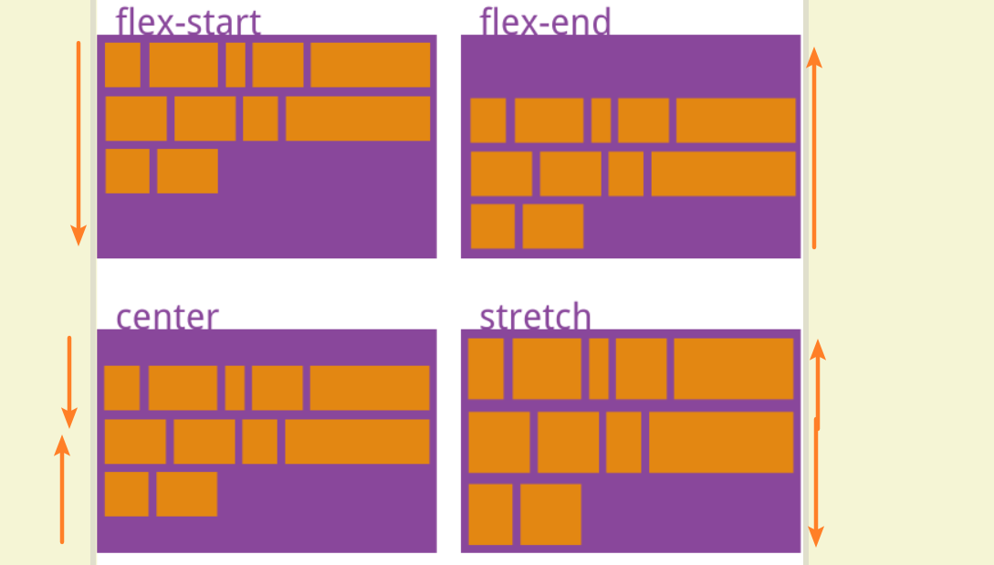
justify-content主轴上的对齐方式,flex-start(默认)、center、space-between等 -
align-items交叉轴上的对齐方式,stretch(默认)、flex-start、center等 -
align-content多个主轴之间的对齐方式,stretch(默认)、center、space-between等
项目级别
align-self单个项目对齐方式,默认继承父元素的align-items,可以对其进行覆盖
容器属性
-
flex-direction
轴方向
属性值:
row/row-reverse/column/column-reverse -
flex-wrap
nowrap:默认不换行,会进行压缩wrap:向下换行,不会压缩wrap-reverse:向上换行,不压缩,很少用 -
flex-flow
flex-direction || flex-wrap两者的结合,尽量不用 -
justify-content
主轴上的对齐方式
flex-start默认左对齐flex-end右对齐center居中space-between两端对齐,自动调整,高频使用space-aroundspace=evenly间距均分 -
align-items
单轴上的多个交叉轴对齐方式
flex-startflex-endcenter高频baseline文字基线,很少使用stretch默认值,拉伸子元素高度为父元素高度 -
align-content
多根主轴之间的对齐方式
flex-start、flex-end、center、stretch 默认、space-between、space-around
项目属性
-
order排列顺序,越小越靠前,几乎不用
-
flex-grow剩余空间的占比,经常使用
-
flex-shrink默认为1,空间不足时会等比缩小。0表示不缩小,尽量不用
-
flex-basis -
flex简写 -
align-self
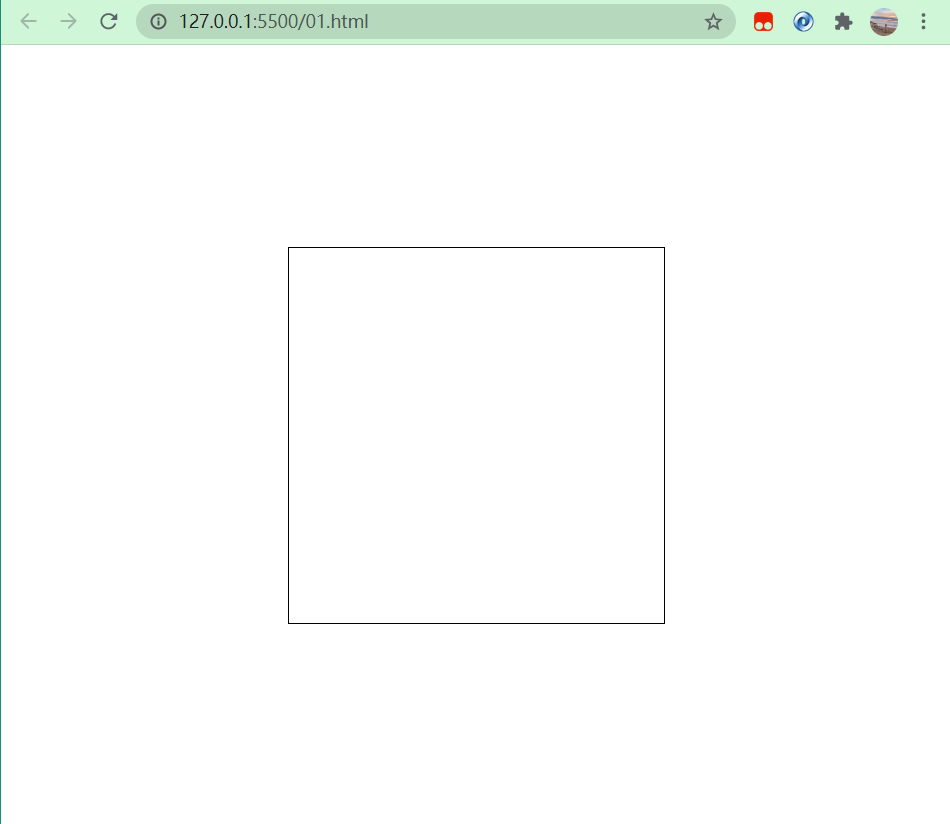
案例一:屏幕居中对齐
<!DOCTYPE html>
<html lang="en">
<head>
    <meta charset="UTF-8">
    <meta http-equiv="X-UA-Compatible" content="IE=edge">
    <meta name="viewport" content="width=device-width, initial-scale=1.0">
    <title>Document</title>
</head>
<style>
    * {
        padding: 0;
        margin: 0;
    }
    body {
        /* 虚拟高度,表示整个屏幕高度 */
        height: 100vh;
        display: flex;
        justify-content: center;
        align-items: center;
    }

    .box {
        width: 300px;
        height: 300px;
        min-height: 300px;
        min-width: 300px;
        outline: 1px solid #000;
    }

</style>
<body>
    <div class="box"></div>
</body>
</html>
案例二:九宫格


【推荐】还在用 ECharts 开发大屏?试试这款永久免费的开源 BI 工具!
【推荐】国内首个AI IDE,深度理解中文开发场景,立即下载体验Trae
【推荐】编程新体验,更懂你的AI,立即体验豆包MarsCode编程助手
【推荐】轻量又高性能的 SSH 工具 IShell:AI 加持,快人一步
· .NET制作智能桌面机器人:结合BotSharp智能体框架开发语音交互
· 软件产品开发中常见的10个问题及处理方法
· .NET 原生驾驭 AI 新基建实战系列:向量数据库的应用与畅想
· 从问题排查到源码分析:ActiveMQ消费端频繁日志刷屏的秘密
· 一次Java后端服务间歇性响应慢的问题排查记录
· 互联网不景气了那就玩玩嵌入式吧,用纯.NET开发并制作一个智能桌面机器人(四):结合BotSharp
· 《HelloGitHub》第 108 期
· Windows桌面应用自动更新解决方案SharpUpdater5发布
· 我的家庭实验室服务器集群硬件清单
· Supergateway:MCP服务器的远程调试与集成工具