20230129学
1) 学css
background-position
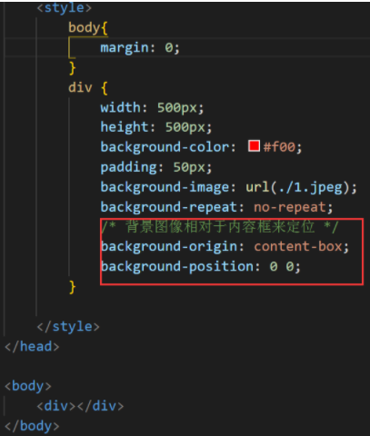
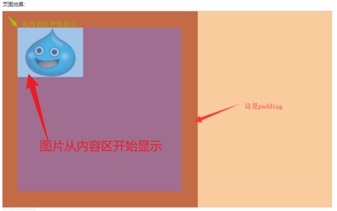
background-origin是起源,是指的是这个布局是从哪里开始的。
例子:
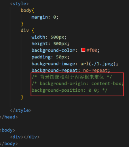
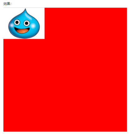
效果:
代码:
效果:
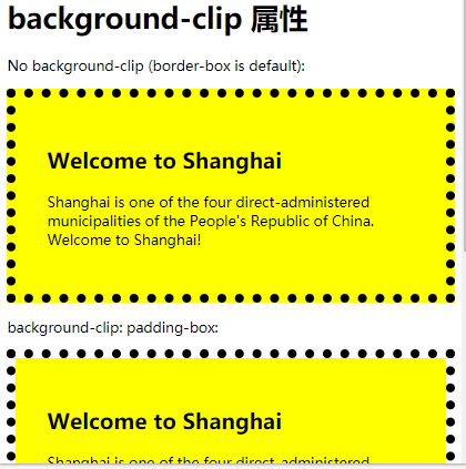
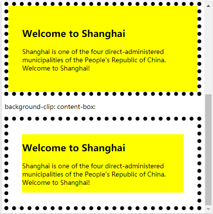
2)border-clip属性:规定背景的绘制区域。
<!DOCTYPE html>
<html>
<head>
<style>
#example1 {
  border: 10px dotted black;
  padding: 35px;
  background: yellow;
}

#example2 {
  border: 10px dotted black;
  padding: 35px;
  background: yellow;
  background-clip: padding-box;
}

#example3 {
  border: 10px dotted black;
  padding: 35px;
  background: yellow;
  background-clip: content-box;
}
</style>
</head>
<body>

<h1>background-clip 属性</h1>

<p>No background-clip (border-box is default):</p>
<div id="example1">
  <h2>Welcome to Shanghai</h2>
  <p>Shanghai is one of the four direct-administered municipalities of the People's Republic of China. Welcome to Shanghai!</p>
</div>

<p>background-clip: padding-box:</p>
<div id="example2">
  <h2>Welcome to Shanghai</h2>
  <p>Shanghai is one of the four direct-administered municipalities of the People's Republic of China. Welcome to Shanghai!</p>
</div>

<p>background-clip: content-box:</p>
<div id="example3">
  <h2>Welcome to Shanghai</h2>
  <p>Shanghai is one of the four direct-administered municipalities of the People's Republic of China. Welcome to Shanghai!</p>
</div>

</body>
</html>
忘记一切,好好学,就行了。
3)自适应@media
<!DOCTYPE html>
<html lang="en">

<head>
    <meta charset="UTF-8">
    <meta http-equiv="X-UA-Compatible" content="IE=edge">
    <meta name="viewport" content="width=device-width, initial-scale=1.0">
    <title>Document</title>
    <style>
        * {
            box-sizing: border-box;
        }

        body {
            font-family: Arial, Helvetica, sans-serif;
            padding: 5px;
            background: #f1f1f1;
        }
        /* 页眉/Blog标题 */

        .header {
            padding: 30px;
            text-align: center;
            background-color: white;
        }

        .header h1 {
            font-size: 50px;
        }
        /* 设置上导航栏的样式 */

        .topnav {
            overflow: hidden;
            background-color: #333;
        }
        /* 设置topnav链接的样式 */

        .topnav a {
            /* float浮动 */
            float: left;
            display: block;
            color: #f2f2f2;
            text-align: center;
            padding: 4px 6px;
            text-decoration: none;
        }
        /* 改变鼠标悬停时的颜色 */

        .topnav a:hover {
            background-color: #ddd;
            color: black;
        }
        /* 创建两个不相等的彼此并排的浮动列 */
        /* 左列 */

        .leftcolumn {
            /* 设置左浮动。设置百分比 */
            float: left;
            width: 75%;
        }

        .rightcolumn {
            float: right;
            width: 25%;
            background-color: #f1f1f1;
            padding-left: 20px;
        }
        /* 伪图像 */

        .fakeimg {
            background-color: #aaa;
            width: 100%;
            padding: 200px;
        }
        /* 清除列之后的浮动。 */

        .row:after {
            content: "";
            display: table;
            clear: both;
        }
        /* 页脚 */

        .footer {
            padding: 20px;
            text-align: center;
            background-color: #ddd;
            margin-top: 20px;
        }
        /* 响应式布局-当屏幕的宽度小于800像素时,使两列堆叠而不是并排 */

        @media screen and (max-width:800px) {
            .leftcolumn,
            .rightcolumn {
                width: 100%;
                padding: 0;
            }
        }
        /* 响应式布局-当屏幕的宽度小于400像素的时候,使导航链接堆叠而不是并排。 */

        @media screen and (max-width:400px) {
            .topnav a {
                float: none;
                width: 100px;
            }
        }
    </style>
</head>

<body>
    <!-- css网站布局  知识过一遍 -->
    <!-- 这是头部区域 -->
    <div class="header">
        <h1>我的网站</h1>
        <p>欢迎浏览网站</p>
    </div>
    <!-- 上面的导航 -->
    <div class="topnav">
        <a href="#">Link</a>
        <a href="#">Link</a>
        <a href="#">Link</a>
        <a href="#" style="float:right">Link</a>
    </div>
    <!-- div是中间内容 -->
    <div class="row">
        <div class="leftcolumn">
            <div class="card">
                <h2>TiTLE HEADING</h2>
                <h5>Title description,Dec 7,2017</h5>
                <div class="fakeimg" style="height: 100px; background-color: grey;">Image</div>
                <p>文字</p>
                <p>文字。。。。。。</p>
            </div>
            <div class="card">
                <h2>标题</h2>
                <h5>日期</h5>
                <div class="fakeimg" style="height: 100px;background-color:grey ;">图片</div>
                <p>文字</p>
                <p>文字。。。。。</p>
            </div>
        </div>
        <div class="rightcolumn" style="border-color: lightslategray;">
            <div class="card">
                <h2>关于我</h2>
                <div class="fakeing" style="height: 100px;background-color: grey;">Image</div>
                <p>文字。。。。。。</p>
            </div>
            <div class="card">
                <h3>popular Post</h3>
                <div class="fakeimg">
                    <p>Image</p>
                </div>
                <div class="fakeimg">
                    <p>Image</p>
                </div>
                <div class="fakeimg">
                    <p>Image</p>
                </div>
            </div>
            <div class="card">
                <h3>Follow Me</h3>
                <p>Some text...</p>
            </div>
        </div>
    </div>
    <div class="footer">
        <h2>Footer</h2>
    </div>

</body>

</html>
简单的不记载了。记重点学会的。常用的。

 浙公网安备 33010602011771号