css居中对齐
转 css居中对齐
需求:练习要求:
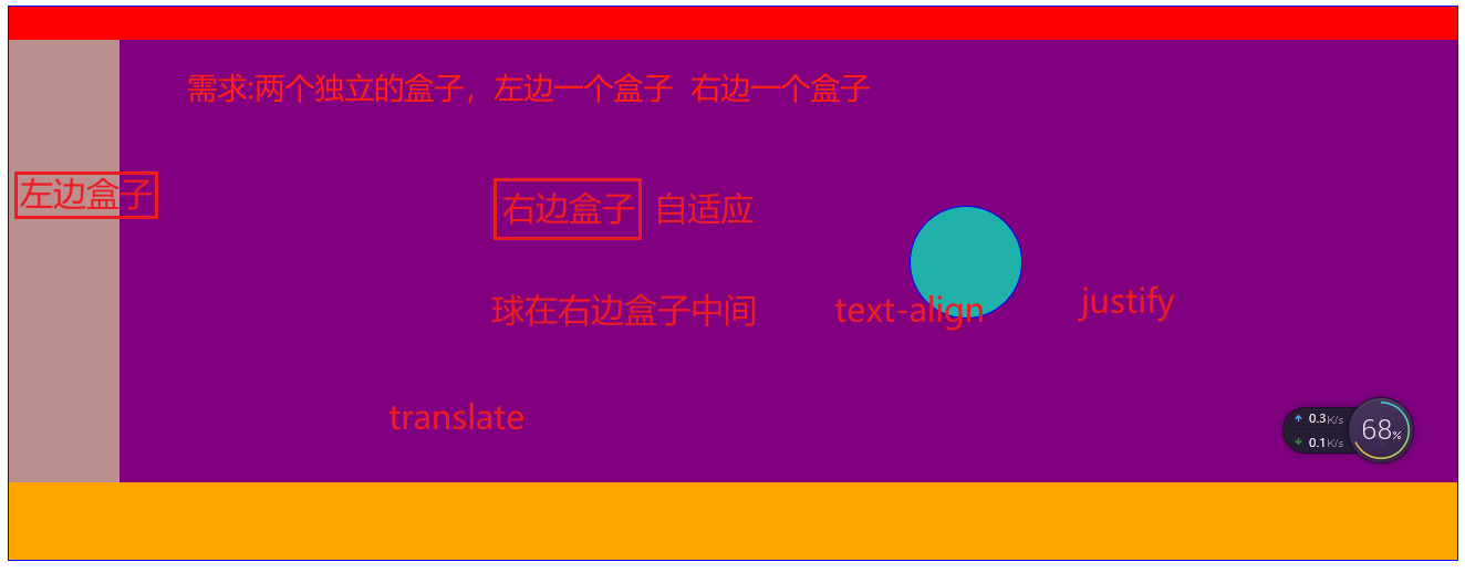
方法1:
<!DOCTYPE html>
<html lang="en">

<head>
    <meta charset="UTF-8">
    <meta http-equiv="X-UA-Compatible" content="IE=edge">
    <meta name="viewport" content="width=device-width, initial-scale=1.0">
    <title>Document</title>
    <style>
        #allcontent {
            width: 100%;
            height: 500px;
            border: 1px solid blue;
        }

        #first {
            height: 30px;
            background-color: red;
        }

        #second {
            /* position: relative; */
            height: 400px;
            display: flex;
        }

        #left {
            width: 100px;
            height: 400px;
            background-color: rosybrown;
        }

        #right {
            /* 子绝父相 */
            position: relative;
            /* width: 400px; */
            width: 100%;
            height: 400px;
            background-color: purple;
        }

        #right,
        #left,
        #circle {
            float: left;
        }

        #circle {
            position: absolute;
            /* 方法1:因为绝对定位后盒子是脱标状态,所以在position:absolute之后,设置的top bottom left right等为50%,然后再使用margin-():(xxx)px减去盒子一半的数字即可 */
            top: 50%;
            bottom: 50%;
            left: 50%;
            right: 50%;
            margin-top: -50px;
            margin-left: -50px;
            /* transform: translate(50%, 50%); */
            /* translate定位,定位位置之后
            transform:translate(X,Y);
            transform:translateX();
            transform:translateY(); */
            /* 方法2:transform这边把圆形的圆心位置移动到原点。然后再布局。 */
            /* transform: translate(-50px, -50px);
            top: 50%;
            left: 50%; */
            /* top: 52px; */
            /* top: 150px; */
            /* left: 150px; */
            /* text-align: center;
            transform: translateX(50%); */
            width: 100px;
            height: 100px;
            border: 1px solid blue;
            border-radius: 50%;
            background-color: lightseagreen;
        }

        #third {
            height: 70px;
            background-color: orange;
        }
    </style>
</head>

<body>
    <div id="allcontent">
        <div id="first"></div>
        <div id="second">
            <div id="left"></div>
            <div id="right">
                <div id="circle"></div>
            </div>
            <!-- <div id="circle"></div> -->
        </div>
        <div id="third"></div>
    </div>
</body>

</html>
方法2:
<!DOCTYPE html>
<html lang="en">

<head>
    <meta charset="UTF-8">
    <meta http-equiv="X-UA-Compatible" content="IE=edge">
    <meta name="viewport" content="width=device-width, initial-scale=1.0">
    <title>Document</title>
    <style>
        #allcontent {
            width: 100%;
            height: 500px;
            border: 1px solid blue;
        }

        #first {
            height: 30px;
            background-color: red;
        }

        #second {
            /* position: relative; */
            height: 400px;
            display: flex;
        }

        #left {
            width: 100px;
            height: 400px;
            background-color: rosybrown;
        }

        #right {
            /* 子绝父相 */
            position: relative;
            /* width: 400px; */
            width: 100%;
            height: 400px;
            background-color: purple;
        }

        #right,
        #left,
        #circle {
            float: left;
        }

        #circle {
            position: absolute;
            /* 方法1:因为绝对定位后盒子是脱标状态,所以在position:absolute之后,设置的top bottom left right等为50%,然后再使用margin-():(xxx)px减去盒子一半的数字即可 */
            /* top: 50%;
            bottom: 50%;
            left: 50%;
            right: 50%;
            margin-top: -50px;
            margin-left: -50px; */
            /* transform: translate(50%, 50%); */
            /* translate定位,定位位置之后
            transform:translate(X,Y);
            transform:translateX();
            transform:translateY(); */
            /* 方法2:transform这边把圆形的圆心位置移动到原点。然后再布局。 */
            transform: translate(-50px, -50px);
            top: 50%;
            left: 50%;
            /* top: 52px; */
            /* top: 150px; */
            /* left: 150px; */
            /* text-align: center;
            transform: translateX(50%); */
            width: 100px;
            height: 100px;
            border: 1px solid blue;
            border-radius: 50%;
            background-color: lightseagreen;
        }

        #third {
            height: 70px;
            background-color: orange;
        }
    </style>
</head>

<body>
    <div id="allcontent">
        <div id="first"></div>
        <div id="second">
            <div id="left"></div>
            <div id="right">
                <div id="circle"></div>
            </div>
            <!-- <div id="circle"></div> -->
        </div>
        <div id="third"></div>
    </div>
</body>

</html>
 1 <!DOCTYPE html>
 2 <html lang="en">
 3
 4 <head>
 5     <meta charset="UTF-8">
 6     <meta http-equiv="X-UA-Compatible" content="IE=edge">
 7     <meta name="viewport" content="width=device-width, initial-scale=1.0">
 8     <title>Document</title>
 9     <style>
10         #allcontent {
11             width: 100%;
12             height: 500px;
13             border: 1px solid blue;
14         }
15
16         #first {
17             height: 30px;
18             background-color: red;
19         }
20
21         #second {
22             /* position: relative; */
23             height: 400px;
24             display: flex;
25         }
26
27         #left {
28             width: 100px;
29             height: 400px;
30             background-color: rosybrown;
31         }
32
33         #right {
34             /* 子绝父相 */
35             position: relative;
36             /* width: 400px; */
37             width: 100%;
38             height: 400px;
39             background-color: purple;
40         }
41
42         #right,
43         #left,
44         #circle {
45             float: left;
46         }
47
48         #circle {
49             position: absolute;
50             /* 方法1:因为绝对定位后盒子是脱标状态,所以在position:absolute之后,设置的top bottom left right等为50%,然后再使用margin-():(xxx)px减去盒子一半的数字即可 */
51             /* top: 50%;
52             bottom: 50%;
53             left: 50%;
54             right: 50%;
55             margin-top: -50px;
56             margin-left: -50px; */
57             /* transform: translate(50%, 50%); */
58             /* translate定位,定位位置之后
59             transform:translate(X,Y);
60             transform:translateX();
61             transform:translateY(); */
62             /* 方法2:transform这边把圆形的圆心位置移动到原点。然后再布局。 */
63             transform: translate(-50px, -50px);
64             top: 50%;
65             left: 50%;
66             /* top: 52px; */
67             /* top: 150px; */
68             /* left: 150px; */
69             /* text-align: center;
70             transform: translateX(50%); */
71             width: 100px;
72             height: 100px;
73             border: 1px solid blue;
74             border-radius: 50%;
75             background-color: lightseagreen;
76         }
77
78         #third {
79             height: 70px;
80             background-color: orange;
81         }
82     </style>
83 </head>
84
85 <body>
86     <div id="allcontent">
87         <div id="first"></div>
88         <div id="second">
89             <div id="left"></div>
90             <div id="right">
91                 <div id="circle"></div>
92             </div>
93             <!-- <div id="circle"></div> -->
94         </div>
95         <div id="third"></div>
96     </div>
97 </body>
98
99 </html>

居中:
因为绝对定位后盒子是脱标状态,所以在position:absolute之后,设置的top bottom left right等为50%,然后再使用margin-():(xxx)px减去盒子一半的数字即可
位移居中:
transform:translate(-50%,-50%),就不用像上面还要手动计算减去margin-()盒子的一半,这个命令会自己计算减去的值达到居中的效果
css中位移translate()如何使用?translate用法总结
 云罗郡主2018-10-29 13:44:30原创
一:translate()用法
在css样式中,很多人都喜欢使用translate()来表示位移,可以使用translate()中的x和y来表示元素在水平方向或者垂直方向上移动。
例如:1.translateY(y):表示该元素在垂直方向上移动,也就是我们所说的y轴
2.translateX(x):表示该元素在水平方向上移动,也就是我们所说的x轴
二:translate()语法
|
1 |
|
在css3中,transform属性的变形方法都是属于transform,并且要加上transform,从而表示变形处理,元素在水平方向中移动的距离的单位用px和百分比表示,当x出现正值的时候,表示元素在水平方向右有移动,当x为负值的时候,表示该元素向左移动,
例如:
|
1 2 3 4 5 6 7 8 9 10 11 12 13 14 15 16 17 18 19 20 21 22 23 24 25 26 27 28 29 30 31 32 33 |
|
效果如下:

大前端零基础入门到就业:进入学习
总结:transform:translateX(50px)说明在水平方向上移动50px,这时候我们如果我们把50px改成-50px,该元素就在水平方向相反的方向移动50px。
translate(y)的用法:
translate(y)的用法和translate(x)的用法很相似,x是在水平方向上移动,y是在垂直方向上移动,当
y出现正值的时候,说明该元素在向下移动,如果出现负值,说明是向上移动,和我们的正常思维相反。
translate(x,y)的混合使用:
表示元素在x中水平方向上移动,这里需要注意的是,y值是一个参数,没有设置y的值话,可能表示元素在x轴移动,其实单纯的使用translate()是没有太多的意义,我们可以结合css使用。
以上就是对css中位移translate()如何使用?translate用法总结的全部介绍,如果你想了解更多有关CSS视频教程,请关注php中文网。
以上就是css中位移translate()如何使用?translate用法总结的详细内容,更多请关注php中文网其它相关文章!

 浙公网安备 33010602011771号