[搬运][纯英文] 15个登录页面设计建议 15 Tips for Better Signup / Login UX
- 源地址:https://learnui.design/blog/tips-signup-login-ux.html
- 1. Autofocus on the first field
- 2. Use specialized mobile keyboards
- 3. Validate fields immediately
- 4. Make labels clickable
- 5. Show password requirements when users are choosing a password
- 6. Let users see their password
- 7. Use button text to expose the value waiting for users on the other side
- 8. Allow for single sign-on
- 9. Save a click by notifying users they agree to the terms of service (not requiring their explicit permission)
- 10. Use different terms for “sign in” and “sign up”
- 11. Allow easy switching between “sign in” and “sign up”
- 12. Log in with email, not username
- 13. If the user guesses an invalid password, say why it’s invalid
- 14. Remember typed values between password attempts
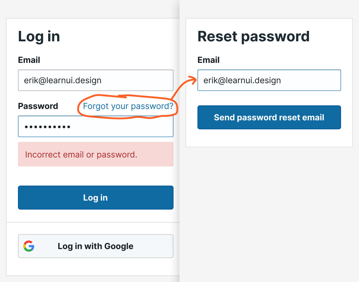
- 15. The “reset password” screen should remember which email you already entered
- Other signup UX questions?
源地址:https://learnui.design/blog/tips-signup-login-ux.html
OK, I hate long intros, so: this is a checklist of some of the most important UX tips for creating usable signup and login forms. It’s based on my experience looking at hundreds of beginning designer login flows, thanks to my courses Learn UI Design and Learn UX Design.
Let’s get started.
1. Autofocus on the first field
Ironically, the fundamental rule of interaction design is: remove interaction. Remove clicks, remove reading, remove waiting, remove thinking.
An easy example: if you know that literally 95% of people opening a signup form will immediately click into the first field, save them the trouble and auto-focus on it.
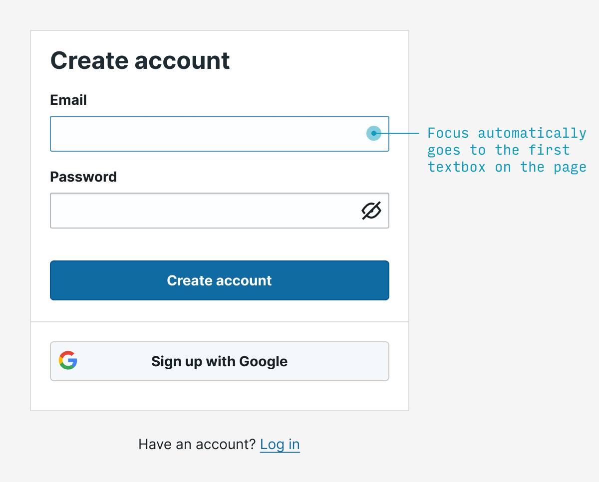
(Note that autofocusing can be a jarring to users using screenreaders, so it’s worth testing this experience 👍)
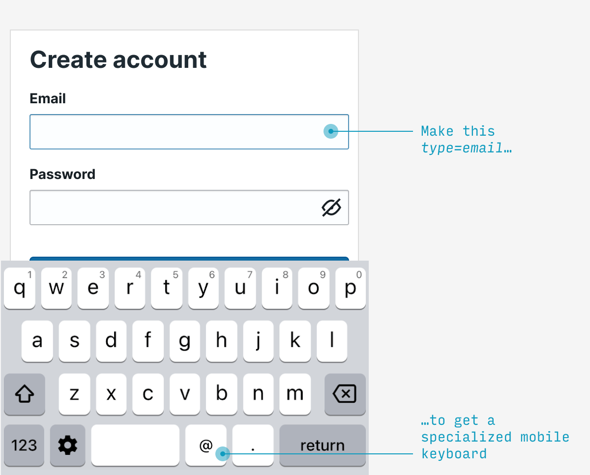
2. Use specialized mobile keyboards
The only things certain in life are (a) death and (b) email addresses have an “@” and a “.” in them. Fortunately, mobile phones have specialized email entry keyboards showing those characters – but you must label your textbox type=email in HTML. This is such a simple change to make mobile users’ lives easier.
Note: also applies to telephone numbers (type=tel), URLs (type=url), and numbers (type=num) in your signup flow.
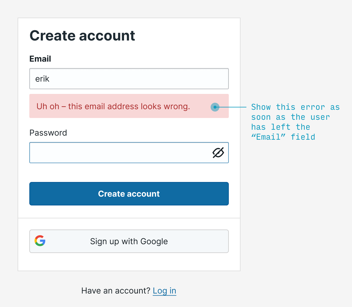
3. Validate fields immediately
Rather than waiting for the user to fill out the entire form before you point out any errors, let them know as soon as your system can tell there’s an error. For something like email, it makes sense to validate on blur (that is, when they focus on another field).
Typically I’d try to catch both blank as well as invalid email addresses.
4. Make labels clickable
Every single labelled text input you ever create should have clickable labels. It’s a wonder this isn’t done by HTML by default, but simply add the input element inside its respective label element and you’re good to go. Not only does this (a) allow me to absentmindedly click the label to start typing, but (b) it also helps me if my clumsy finger accidentally misses the textbox by a bit.
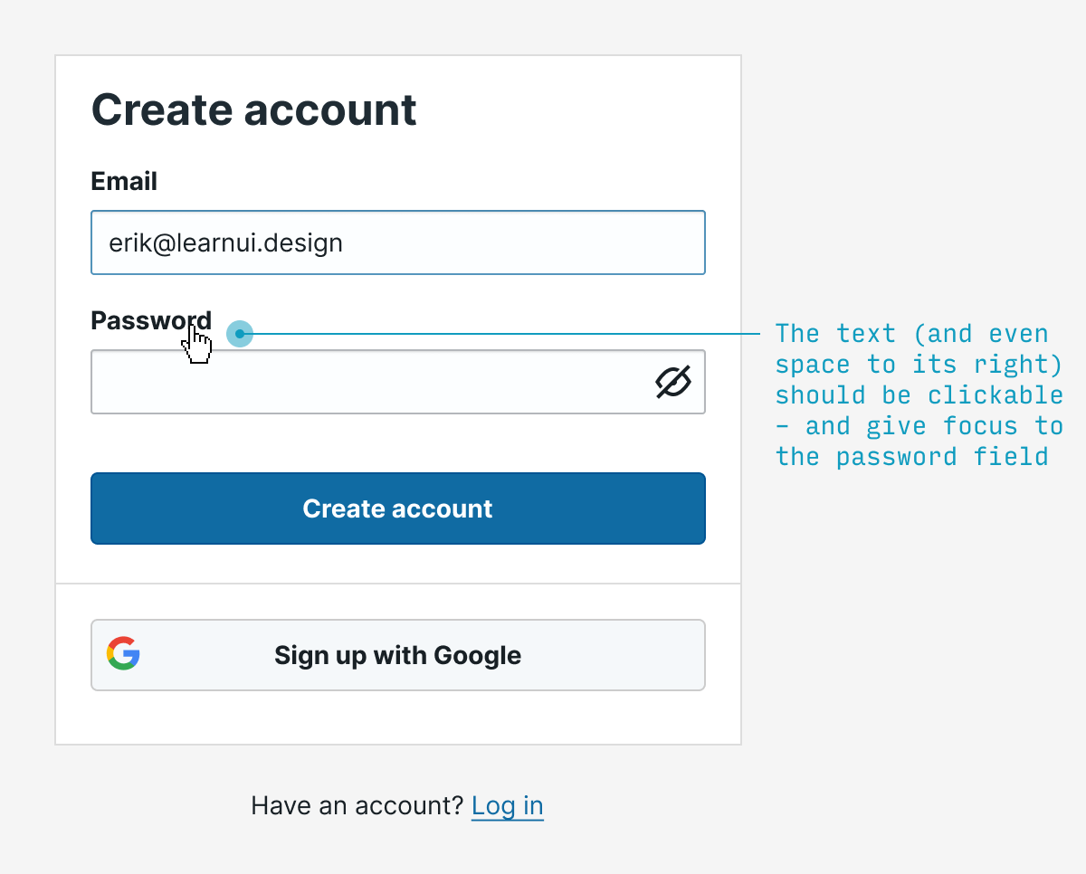
(Accessibility tip ☝️ – screen readers don’t play nicely with input inside label – so also wrap the text describing the input in a separate span with a unique id, then add aria-labelledby="my-unique-id" to the input 👍)
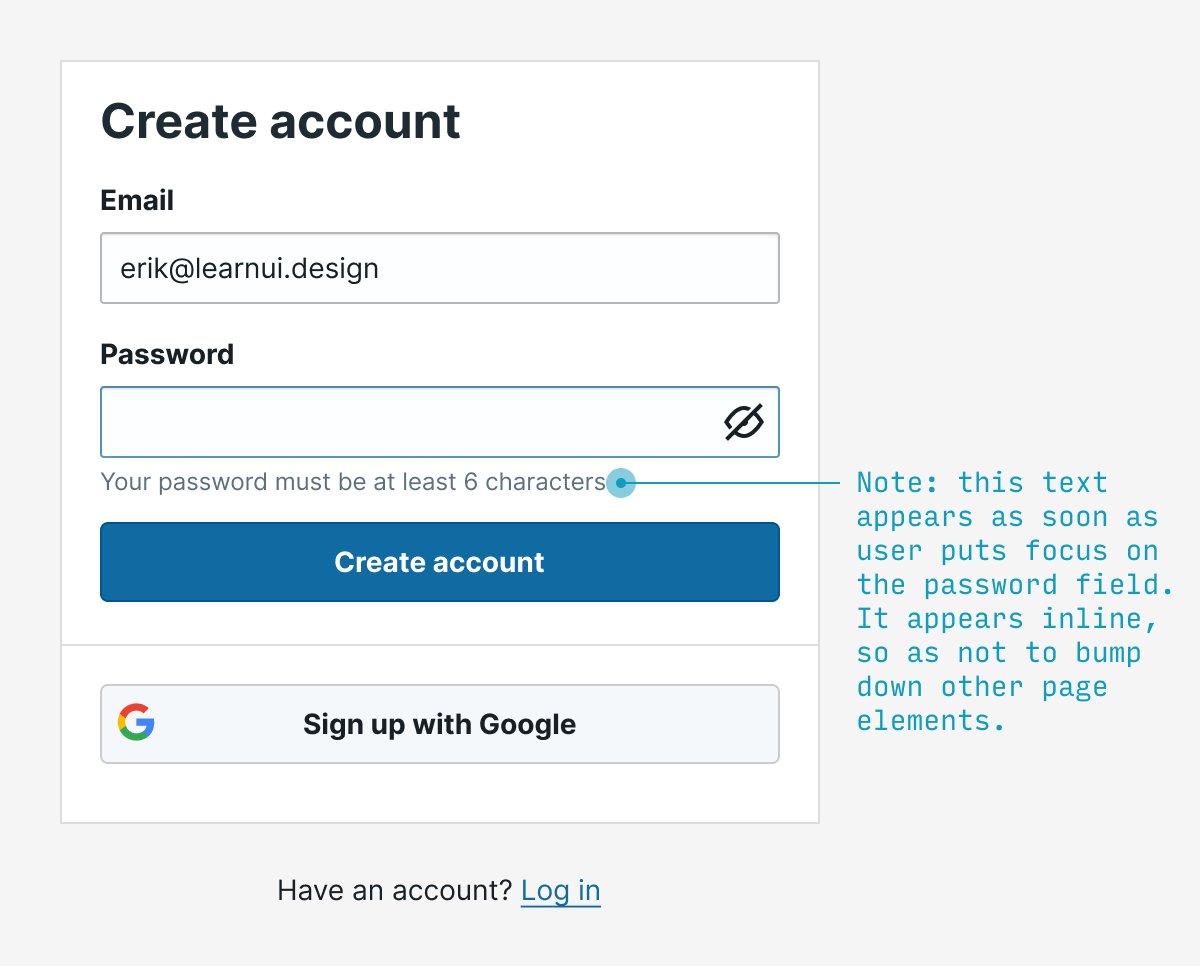
5. Show password requirements when users are choosing a password
No user should have to guess at what the password requirements are. Show them when they’re relevant (P.S. And remove them when they’re not).
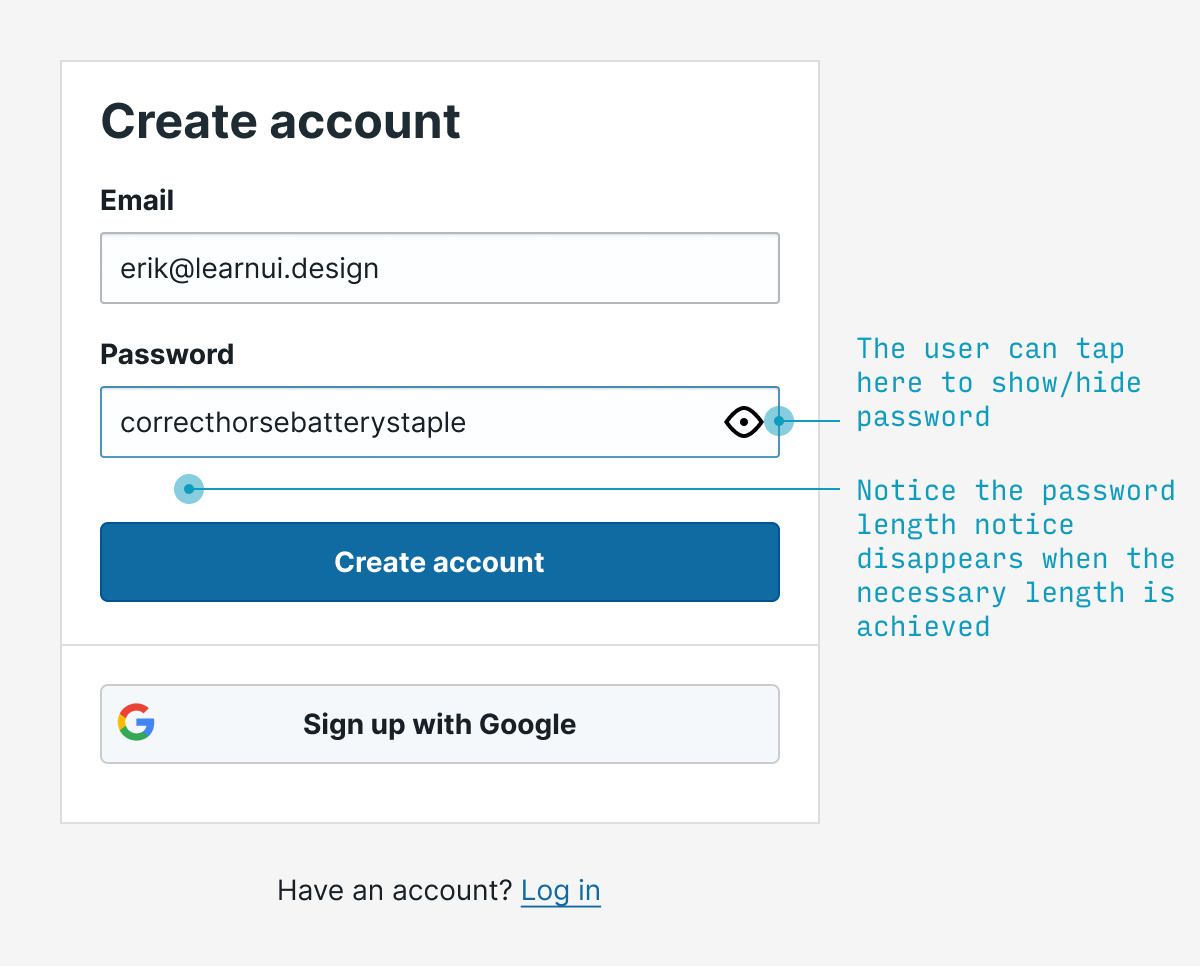
6. Let users see their password
Allowing users to view the password they’ve entered will prevent thorny UX issues with choosing a password they didn’t mean to – while also being less onerous than requiring them to type it twice.
(That being said, the latter method is still far better than nothing)
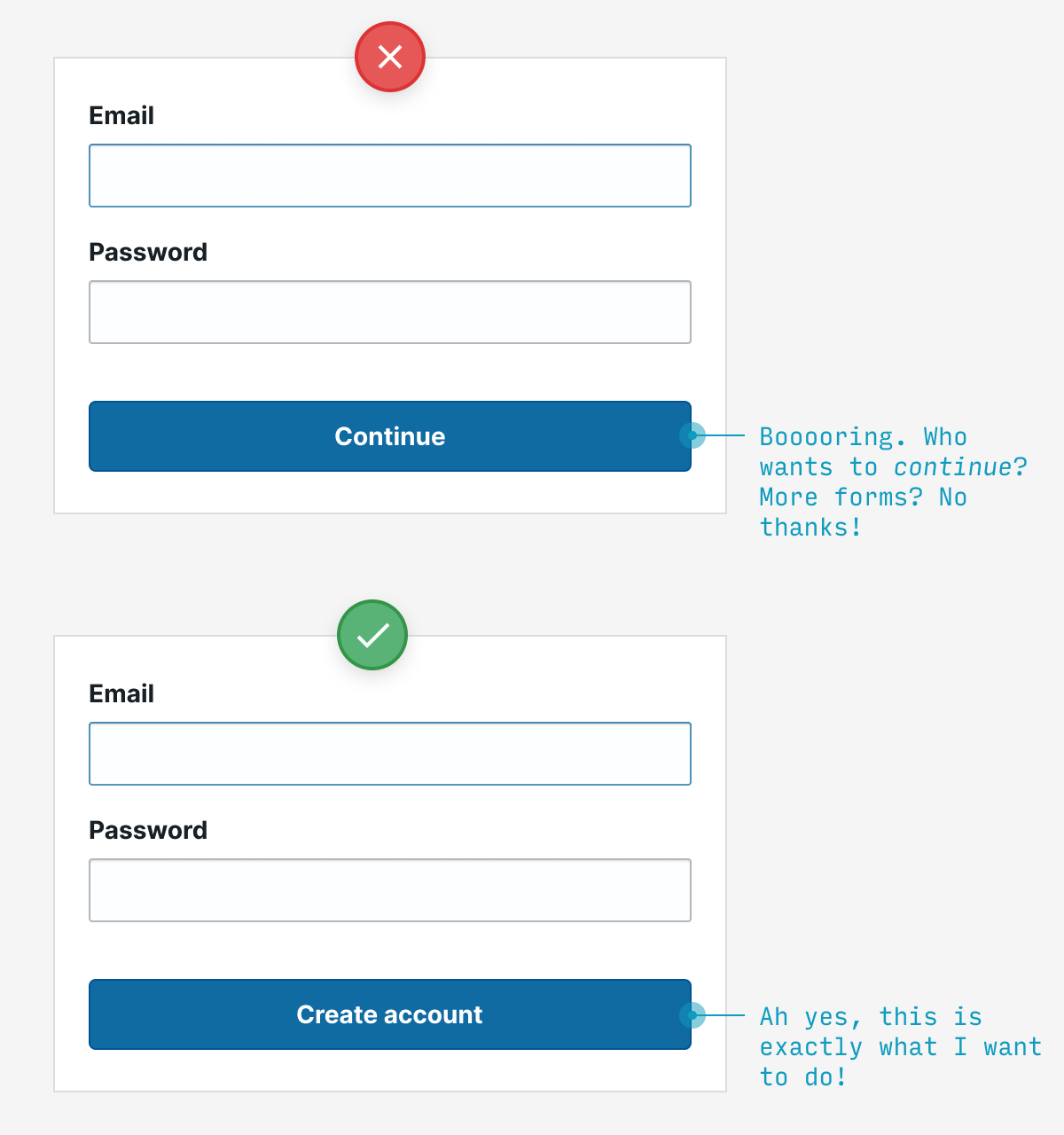
7. Use button text to expose the value waiting for users on the other side
The labels on your buttons are an opportunity – to tempt your users to click through, of course. If you label them with boring, non-descript stuff (e.g. “Continue”, “Submit”), well, yaaaawn.
But ask yourself: what value awaits a user on the other side? Is it getting my free account set up? Am I 30 seconds away from experiencing the future of work! Tell me, dang it!
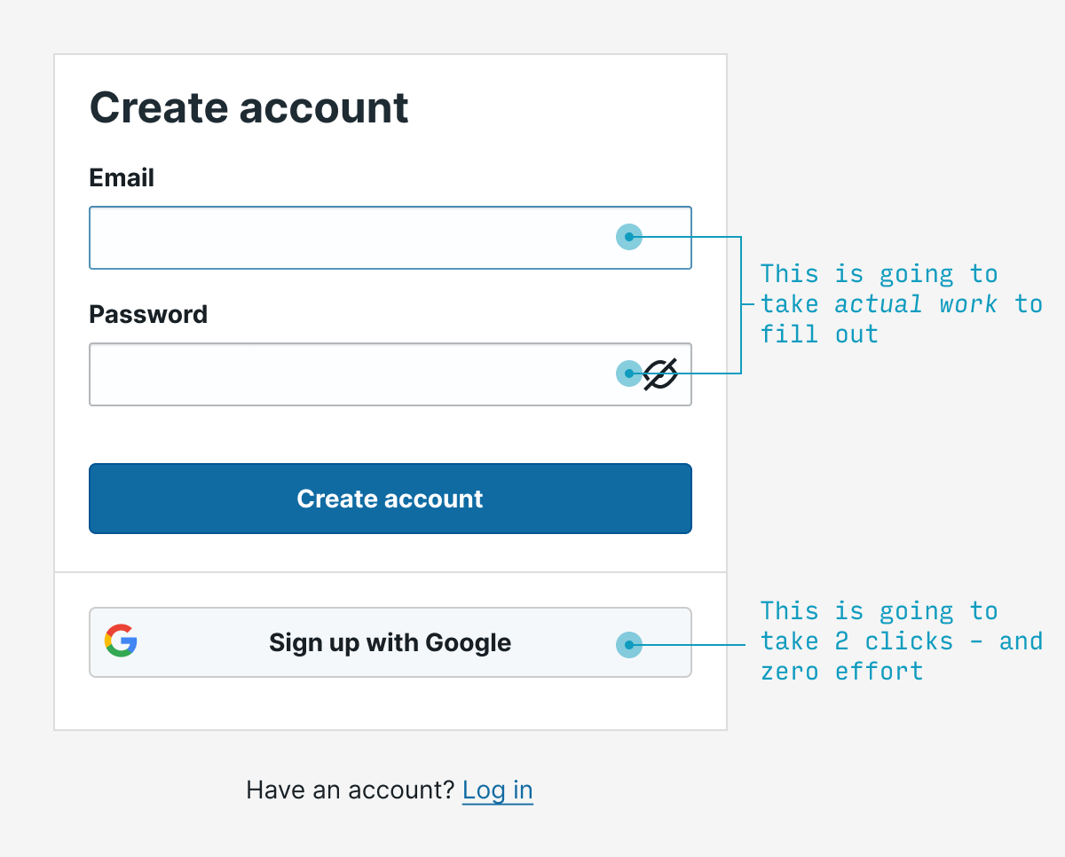
8. Allow for single sign-on
Why force users to pick yet another username and password to deal with for our hum-drum little service? What if – and hear me out on this – we allowed them to use an existing name and password? Like their Gmail account or twitter handle!
Crazy, right?
But that’s exactly what we can all be doing. And unless you have very specific reasons not to, it’s highly recommended.
(Now sites just need to remind users when they’ve already clicked this option)
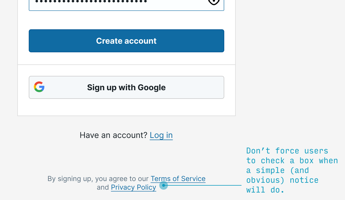
9. Save a click by notifying users they agree to the terms of service (not requiring their explicit permission)
OK, so first thing’s first: this isn’t legal everywhere. The EU, for instance, requires that sites require their users to explicitly check a box saying they agree to the site’s terms. My opinion? Privacy theater, and bad UX to boot. Save users a click – when you’re allowed.
10. Use different terms for “sign in” and “sign up”
You want your sign-in to be so simple, the village idiot could still complete it half asleep without thinking.
To those ends, don’t use, say, “Sign in” and “Sign up” – which requires me to think for half a second whether I want “in” or “up”.
Instead, go with options like “Register” vs. “Sign in”, or other pairs of options that are more than 2 letters apart. It may only save your users a half a second, but if you wouldn’t save them half a second now, it’s not looking good for the rest of your app 😬.

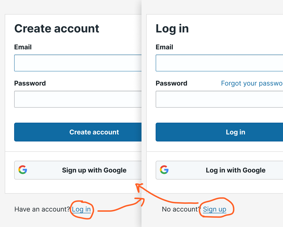
11. Allow easy switching between “sign in” and “sign up”
In the case that someone does click the wrong option, you want it to be dead simple for them to switch from registration and logging in – and vice versa.
Most commonly, this is displayed as a link (not a button – a mistake beginning designers make weirdly often) located at the bottom of the form.
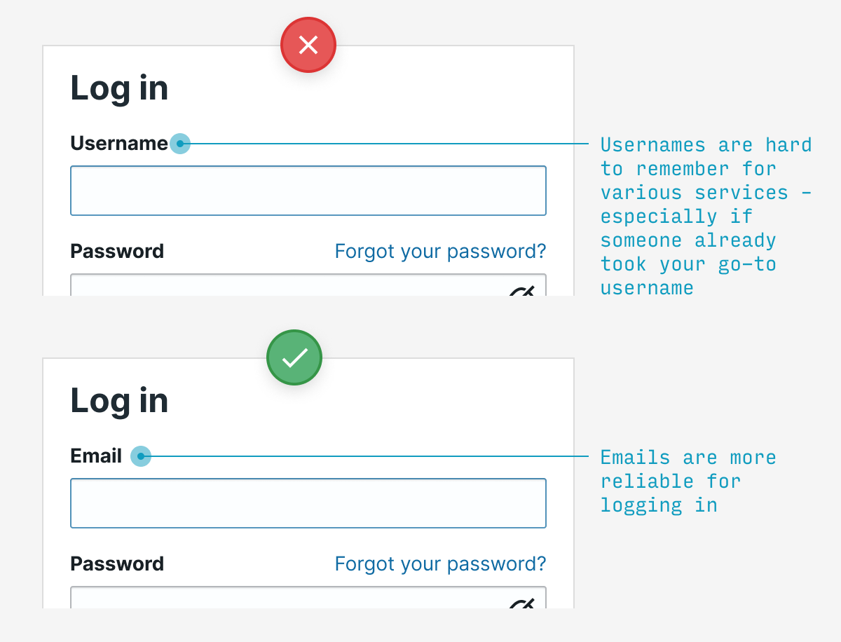
12. Log in with email, not username
Usernames are tough to remember for every individual service, and you may have been forced to pick something besides your usual. Emails are a much easier way to log in.
13. If the user guesses an invalid password, say why it’s invalid
If the user guesses a password that’s both (a) wrong and (b) doesn’t meet the password requirements, say which requirement the password failed to meet. Much more useful than saying “incorrect password”, but not giving the user a clue as to how they might fix it.

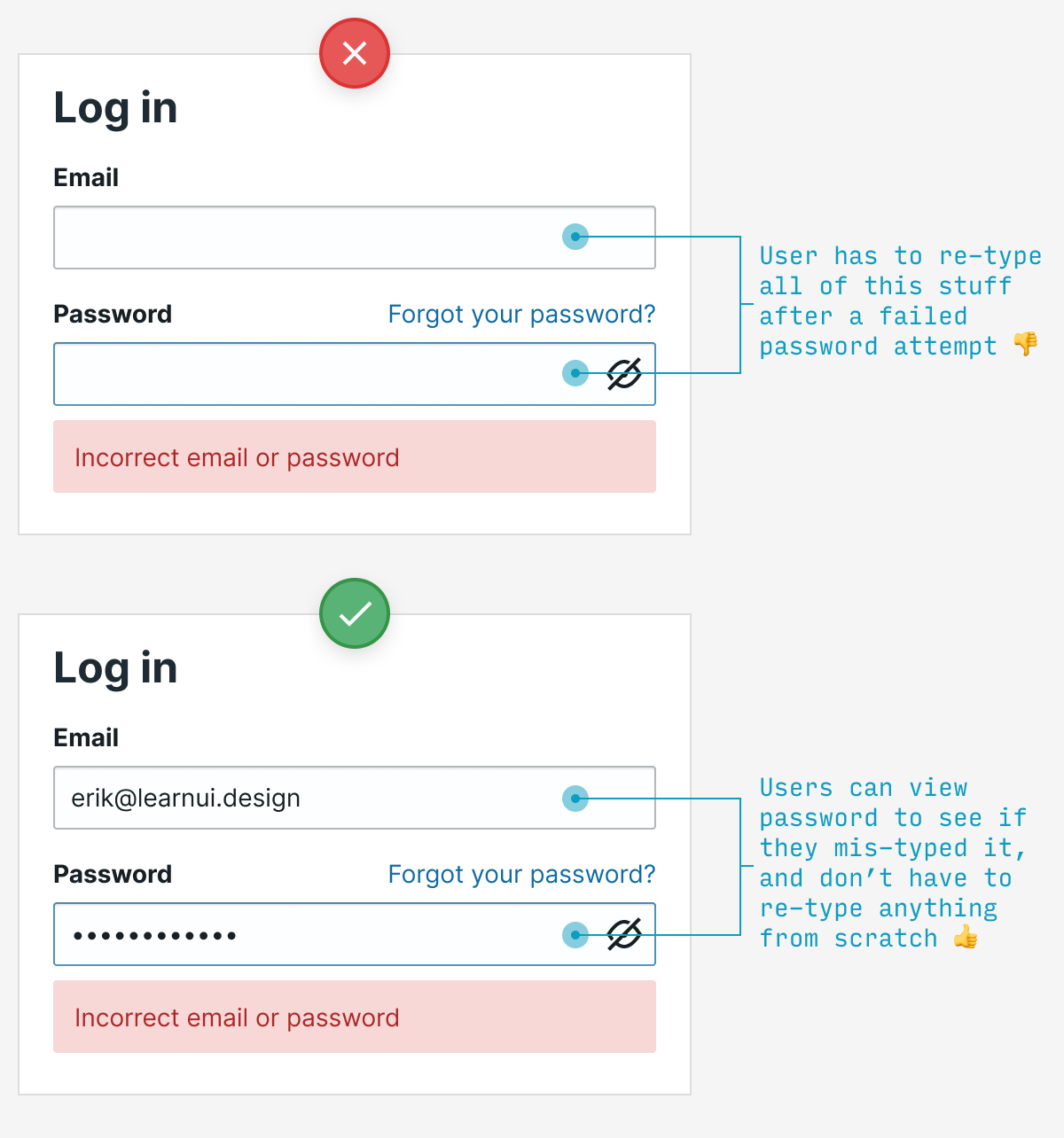
14. Remember typed values between password attempts
If the user enters their password unsuccessfully, they should not have to type their email again. In fact, if you allow them to see their password, don’t erase that either – they may want to check to see if they made a typo.
15. The “reset password” screen should remember which email you already entered
Far too often, if you click “Forgot password”, you’ll be forced to re-enter an email you typed just 30 seconds before. By the time the user has exhausted their guesses at their password and wants to reset, don’t pester them for information you already know.
Other signup UX questions?
Having looked at hundreds of signup flows from beginning designers, these tips address some of the most frequent problems I see. Implement all of them, and you’ll have a login UX that feels, well, as noticeable as air.
Remember: no one came to your app to log in. Heck, they probably didn’t even come to use your app for its own sake. In all likelihood, unless your app is for entertainment, most users probably want to use it to achieve a specific goal as quickly as possible, then get on with their life.
As good UX designers, let’s honor our users’ impatience and make this stuff as simple as possible.
Any other questions about registration/login UX? Drop them in the comments below.


 浙公网安备 33010602011771号