HTML--CSS
字体图标
-
字体图标展示的是图标,本质是字体。
-
处理简单的、颜色单一的图
字体图标的优点:
-
灵活性:灵活地修改样式,例如:尺寸、颜色等
-
轻量级:体积小、渲染快、降低服务器请求次数
-
兼容性:几乎兼容所有主流浏览器
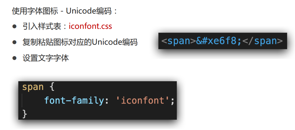
使用方便:
1. 下载字体包
2. 使用字体图标
下载地址:Iconfont:iconfont-阿里巴巴矢量图标库
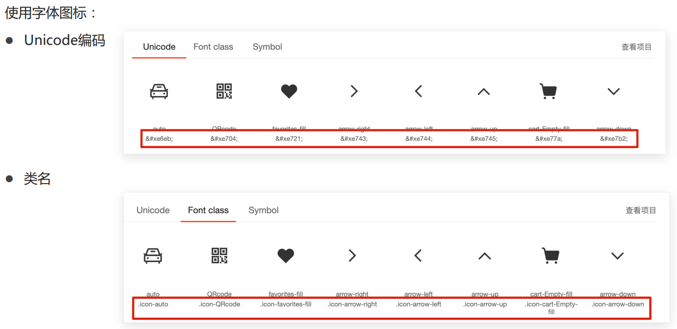
使用字体图标 – 类名:
引入字体图标样式表
调用图标对应的类名,必须调用2个类名
iconfont类:基本样式,包含字体的使用等
icon-xxx:图标对应的类名
<!DOCTYPE html>
<html lang="en">
<head>
<meta charset="UTF-8">
<meta http-equiv="X-UA-Compatible" content="IE=edge">
<meta name="viewport" content="width=device-width, initial-scale=1.0">
<title>Document</title>
<style>
.box {
width: 220px;
height: 100px;
line-height: 100px;
border-radius: 25px;
transition: all .5s;
position: relative;
background-color: orange;
color: aliceblue;
}
.box .shopfont {
font-size: 32px;
text-decoration: none;
color: aliceblue;
transition: all .5s;
}
.box .iconfont {
font-size: 36px;
margin-left: 25PX;
}
.box:hover {
opacity: .6;
}
.box .shopfont:hover {
margin-left: 10px;
}
.box >.icon-arrow-down{ /* 子代选择器 */
position: absolute;
bottom: -5px;
left: 150px;
float: right;
font-size: 36px;
color: rgb(255, 255, 255);
}
div > .icon-favorites-fill{
font-size: 24px;
transition: all .5s;
color: RED;
}
div > .icon-favorites-fill:hover{
font-size: 34px;
}
</style>
</head>
<body>
<link rel="stylesheet" href="./iconfont/iconfont.css">
<div class="box">
<span class="iconfont icon-cart-Empty-fill"></span>
<a href="#" class="shopfont">购物车</a>
<span class="iconfont icon-arrow-down"></span>
</div>
<div>
<span class="iconfont icon-favorites-fill
"></span>
</div>
</body>
</html>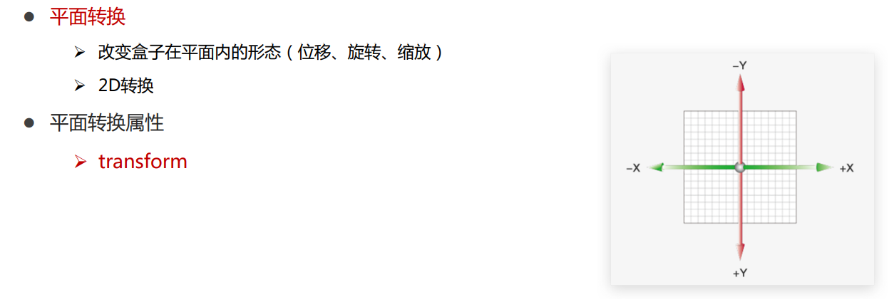 语法
语法
transform: translate(水平移动距离, 垂直移动距离);
取值(正负均可)
像素单位数值
百分比(参照物为盒子自身尺寸)
注意:X轴正向为右,Y轴正向为下
技巧
translate()如果只给出一个值, 表示x轴方向移动距离
单独设置某个方向的移动距离:translateX() & translateY()
语法
transform: rotate(角度);
注意:角度单位是deg
技巧:取值正负均可
取值为正, 则顺时针旋转
取值为负, 则逆时针旋转
语法
默认圆点是盒子中心点
transform-origin: 原点水平位置 原点垂直位置;
取值
方位名词(left、top、right、bottom、center)
像素单位数值
百分比(参照盒子自身尺寸计算)
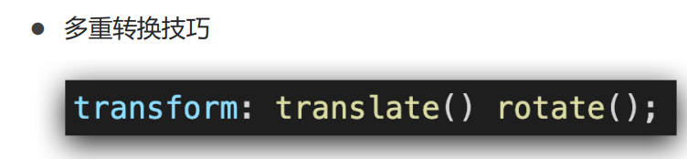
多重转换原理
旋转会改变网页元素的坐标轴向
先写旋转,则后面的转换效果的轴向以旋转后的轴向为准,会影响转换结果
语法
transform: scale(x轴缩放倍数, y轴缩放倍数);
技巧
一般情况下, 只为scale设置一个值, 表示x轴和y轴等比例缩放
transform: scale(缩放倍数);
scale值大于1表示放大, scale值小于1表示缩小
::after——> CSS伪元素::after用来创建一个伪元素,作为已选中元素的最后一个子元素。通常会配合content属性来为该元素添加装饰内容。这个虚拟元素默认是行内元素。
::after 表示法是在CSS 3 中引入的,::符号是用来区分[伪类](/zh-CN/CSS/Pseudo-classes)和伪元素的。支持 CSS3 的浏览器同时也都支持 CSS2 中引入的表示法:after
CSS 中,::before 创建一个伪元素,其将成为匹配选中的元素的第一个子元素。常通过 content 属性来为一个元素添加修饰性的内容。此元素默认为行内元素。
::before 和::after 生成的伪元素 包含在元素格式框内,因此不能应用在*替换元素上,* 比如<img>或<br> 元素。
<!DOCTYPE html>
<html lang="en">

<head>
    <meta charset="UTF-8">
    <meta http-equiv="X-UA-Compatible" content="IE=edge">
    <meta name="viewport" content="width=device-width, initial-scale=1.0">
    <title>缩放效果</title>
    <style>
        .box {
            width: 300px;
            height: 210px;
            margin: 100px auto;
            background-color: pink;

        }

        .box img {
            width: 100%;
            transition: all 0.5s; /* 过渡 */
        }

        .box:hover img {
            /* width: 150%; */

            transform: scale(1.2);/* 缩放:大于一为放大,小于一为缩小  */
            transform: scale(0.8);
        }
    </style>
</head>

<body>
    <div class="box">
        <img src="./images/product.jpeg" alt="">
    </div>
</body>

</html>
<!DOCTYPE html>
<html lang="en">
<head>
    <meta charset="UTF-8">
    <meta http-equiv="X-UA-Compatible" content="IE=edge">
    <meta name="viewport" content="width=device-width, initial-scale=1.0">
    <title>绝对定位元素居中效果</title>
    <style>
        .father {
            position: relative;
            width: 500px;
            height: 300px;
            margin: 100px auto;
            border: 1px solid #000;
        }

        .son {
            position: absolute;
            left: 50%;
            top: 50%;
            /* margin-left: -100px;
            margin-top: -50px; */

            transform: translate(-50%, -50%);

            width: 203px;
            height: 100px;
            background-color: pink;
        }
    </style>
</head>
<body>
    <div class="father">
        <div class="son"></div>
    </div>
</body>
</html>
<!DOCTYPE html>
<html lang="en">
<head>
<meta charset="UTF-8">
<meta http-equiv="X-UA-Compatible" content="IE=edge">
<meta name="viewport" content="width=device-width, initial-scale=1.0">
<title>旋转效果</title>
<style>
img {
width: 250px;
transition: all 2s;
}
img:hover {
/* 顺 */
transform: rotate(360deg);
/* 逆 */
/* transform: rotate(-360deg); */
}
</style>
</head>
<body>
<img src="./images/rotate.png" alt="">
</body>
</html><!DOCTYPE html>
<html lang="en">
<head>
<meta charset="UTF-8">
<meta http-equiv="X-UA-Compatible" content="IE=edge">
<meta name="viewport" content="width=device-width, initial-scale=1.0">
<title>转换原点</title>
<style>
img {
width: 250px;
border: 1px solid #000;
transition: all 2s;
transform-origin: right bottom;
transform-origin: left bottom;
}
img:hover {
transform: rotate(360deg);
}
</style>
</head>
<body>
<img src="./images/rotate.png" alt="">
</body>
</html><!DOCTYPE html>
<html lang="en">
<head>
<meta charset="UTF-8">
<meta http-equiv="X-UA-Compatible" content="IE=edge">
<meta name="viewport" content="width=device-width, initial-scale=1.0">
<title>多重转换</title>
<style>
.box {
width: 800px;
height: 200px;
border: 1px solid #000;
}
img {
width: 200px;
transition: all 8s;
}
.box:hover img {
/* 边走边转 */
transform: translate(600px) rotate(360deg);
/* 旋转可以改变坐标轴向 */
/* transform: rotate(360deg) translate(600px); */
/* 层叠性 */
/* transform: translate(600px);
transform: rotate(360deg); */
}
</style>
</head>
<body>
<div class="box">
<img src="./images/tyre1.png" alt="">
</div>
</body>
</html><!DOCTYPE html>
<html lang="en">
<head>
<meta charset="UTF-8">
<meta http-equiv="X-UA-Compatible" content="IE=edge">
<meta name="viewport" content="width=device-width, initial-scale=1.0">
<title>渐变背景</title>
<style>
.box {
width: 300px;
height: 200px;
/* background-image: linear-gradient(
pink,
green,
hotpink
); */
background-image: linear-gradient(
transparent,/* 透明 */
rgba(0,0,0, .6)
);
}
</style>
</head>
<body>
<div class="box"></div>
</body>
</html>综合案列
<!DOCTYPE html>
<html lang="en">

<head>
    <meta charset="UTF-8">
    <meta http-equiv="X-UA-Compatible" content="IE=edge">
    <meta name="viewport" content="width=device-width, initial-scale=1.0">
    <title>华为新闻</title>
    <link rel="stylesheet" href="./css/demo.css">
</head>

<body>
    <div class="box">
        <ul>
            <li>
                <a href="#">
                    <div class="pic">
                        <img src="./images/product.jpeg" alt="">
                    </div>
                    <div class="txt">
                        <h4>产品</h4>
                        <h5>OceanStor Pacific 海量存储斩获2021 Interop金奖</h5>
                        <p>
                            <span>了解更多</span>
                            <i></i>
                        </p>
                    </div>

                    <!-- 添加渐变背景 -->
                    <div class="mask"></div>
                </a>
            </li>
            <li>
                <a href="#">
                    <div class="pic">
                        <img src="./images/huawei1.jpeg" alt="">
                    </div>
                    <div class="txt">
                        <h4>行业洞察</h4>
                        <h5>迈向智能世界2030</h5>
                        <p>
                            <span>了解更多</span>
                            <i></i>
                        </p>
                    </div>
                    <!-- 添加渐变背景 -->
                    <div class="mask"></div>
                </a>
            </li>
            <li>
                <a href="#">
                    <div class="pic">
                        <img src="./images/huawei2.jpeg" alt="">
                    </div>
                    <div class="txt">
                        <h4>《ICT新视界》刊首语</h4>
                        <h5>笃行致远,共建具有获得感、幸福感、安全感的智慧城市</h5>
                        <p>
                            <span>了解更多</span>
                            <i></i>
                        </p>
                    </div>
                    <!-- 添加渐变背景 -->
                    <div class="mask"></div>
                </a>
            </li>
        </ul>
    </div>
</body>

</html>
本文来自博客园,作者:link-零,转载请注明原文链接:https://www.cnblogs.com/e-link/p/16980730.html❤❤❤

 浙公网安备 33010602011771号