css 网站布局,响应式网格视图
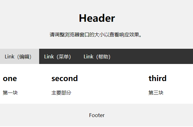
简洁网站布局
<!DOCTYPE html>
<html lang="en">
<head>
<title>CSS 网站布局</title>
<meta charset="utf-8">
<meta name="viewport" content="width=device-width, initial-scale=1">
<style>
* {
  box-sizing: border-box;
}

body {
  margin: 0;
}

/* 设置页眉样式 */
.header {
  background-color: #f1f1f1;
  padding: 20px;
  text-align: center;
}

/* 设置顶部导航栏的样式 */
.topnav {
  overflow: hidden;
  background-color: #333;
}

/* 设置 topnav 链接的样式 */
.topnav a {
  float: left;
  display: block;
  color: #f2f2f2;
  text-align: center;
  padding: 14px 16px;
  text-decoration: none;
}

/* 改变鼠标悬停时的颜色 */
.topnav a:hover {
  background-color: #ddd;
  color: black;
}

/* 创建并排的三个非等列 */
.column {
  float: left;
  padding: 10px;
}

/* 左和右列 */
.column.side {
  width: 25%;
}

/* 中间列 */
.column.middle {
  width: 50%;
}

/* 清除列之后的浮动 */
.row:after {
  content: "";
  display: table;
  clear: both;
}

/* 响应式布局 - 创建堆叠而非并排的三列 */
@media screen and (max-width: 600px) {
  .column.side, .column.middle {
    width: 100%;
  }
}

/* 设置页脚的样式 */
.footer {
  background-color: #f1f1f1;
  padding: 10px;
  text-align: center;
}
</style>
</head>
<body>

<div class="header">
  <h1>Header</h1>
  <p>请调整浏览器窗口的大小以查看响应效果。</p>
</div>

<div class="topnav">
  <a href="#">Link(编辑)</a>
  <a href="#">Link(菜单)</a>
  <a href="#">Link(帮助)</a>
</div>

<div class="row">
  <div class="column side">
    <h2>one</h2>
    <p>第一块</p>
  </div>

  <div class="column middle">
    <h2>second</h2>
    <p>主要部分</p>
  </div>

  <div class="column side">
    <h2>third</h2>
    <p>第三块</p>
  </div>
</div>

<div class="footer">
  <p>Footer</p>
</div>

</body>
</html>
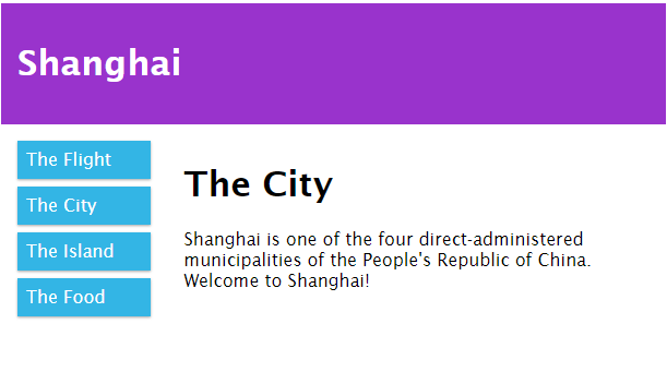
响应式网格视图
<!DOCTYPE html>
<html>
<head>
<meta name="viewport" content="width=device-width, initial-scale=1.0">
<style>
* {
  box-sizing: border-box;
}

.row::after {
  content: "";
  clear: both;
  display: table;
}

[class*="col-"] {
  float: left;
  padding: 15px;
}

.col-1 {width: 8.33%;}
.col-2 {width: 16.66%;}
.col-3 {width: 25%;}
.col-4 {width: 33.33%;}
.col-5 {width: 41.66%;}
.col-6 {width: 50%;}
.col-7 {width: 58.33%;}
.col-8 {width: 66.66%;}
.col-9 {width: 75%;}
.col-10 {width: 83.33%;}
.col-11 {width: 91.66%;}
.col-12 {width: 100%;}

html {
  font-family: "Lucida Sans", sans-serif;
}

.header {
  background-color: #9933cc;
  color: #ffffff;
  padding: 15px;
}

.menu ul {
  list-style-type: none;
  margin: 0;
  padding: 0;
}

.menu li {
  padding: 8px;
  margin-bottom: 7px;
  background-color: #33b5e5;
  color: #ffffff;
  box-shadow: 0 1px 3px rgba(0,0,0,0.12), 0 1px 2px rgba(0,0,0,0.24);
}

.menu li:hover {
  background-color: #0099cc;
}
</style>
</head>
<body>

<div class="header">
  <h1>Shanghai</h1>
</div>

<div class="row">
  <div class="col-3 menu">
    <ul>
      <li>The Flight</li>
      <li>The City</li>
      <li>The Island</li>
      <li>The Food</li>
    </ul>
  </div>

  <div class="col-9">
    <h1>The City</h1>
    <p>Shanghai is one of the four direct-administered municipalities of the People's Republic of China. Welcome to Shanghai!
</p>
  </div>
</div>

</body>
</html>

 浙公网安备 33010602011771号