圆环的多种实现
圆环的实现??
我在微信小程序里要用到才想要写 记得web课上学过边角弧度radius 可课上划水忘得差不多
回过头去看css教程 又试了几遍
最后找到五种实现方法作为记录
阴影实现的效果
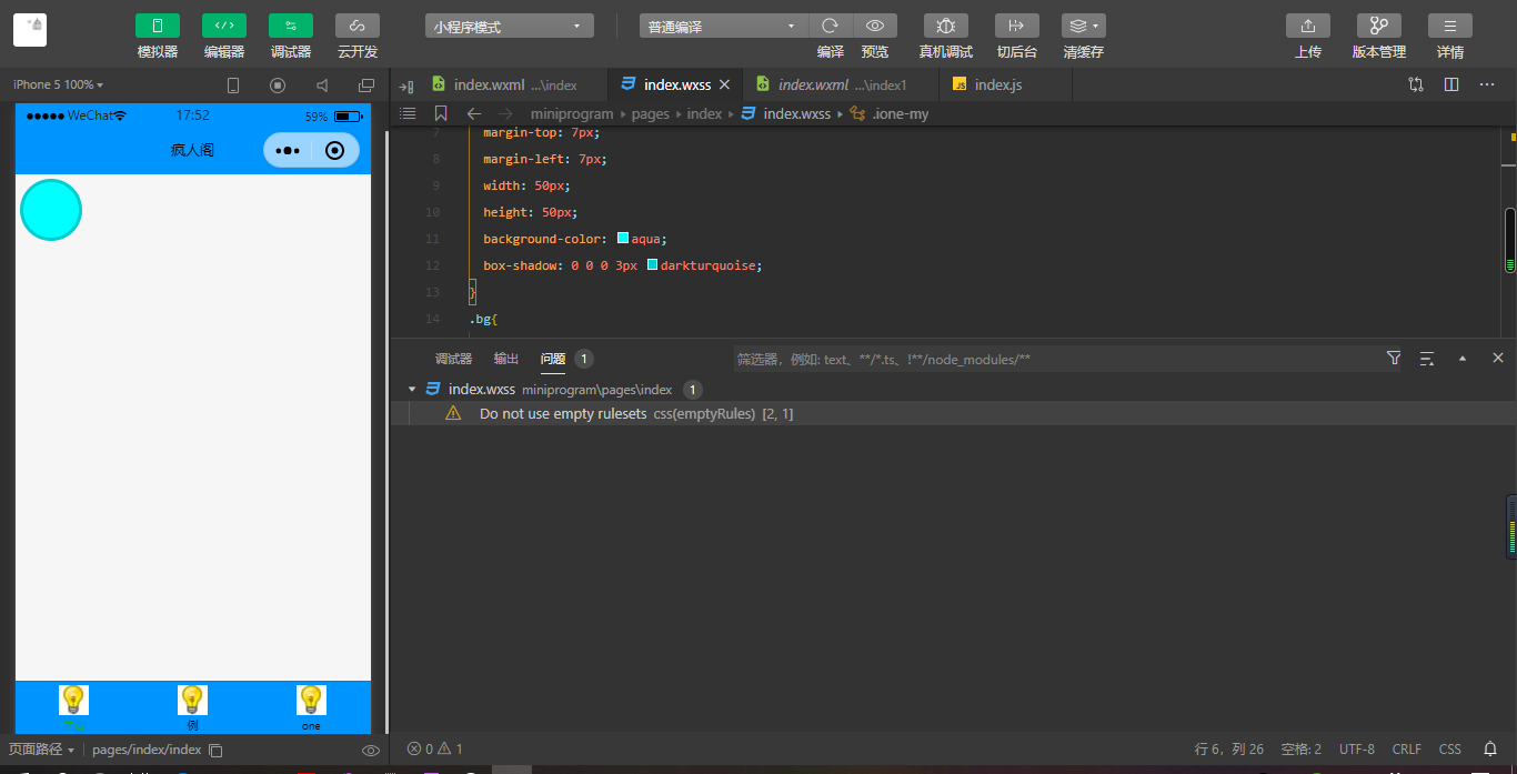
1.阴影做边框
<div class="element1"></div>
element1{
  border-radius: 50%;
  border: 0;
  margin-top: 7px;
  margin-left: 7px;
  width: 50px;
  height: 50px;
  background-color: aqua;
  box-shadow: 0 0 0 3px darkturquoise;
}
2.两个标签嵌套
<div class="element2">
    <div class="child1"></div>
</div>
.element2{
            width: 53px;
            height: 53px;
            background-color: lightpink;
            border-radius: 50%;
        }
        .child1{
            width: 50px;
            height: 50px;
            border-radius: 50%;
            background-color: #009966;
            position: relative;
            top: 7px;
            left: 7px;
        }
3.使用伪元素 before/after
<div class="element3"></div>
.element3{
            width: 53px;
            height: 53px;
            background-color: lightpink;
            border-radius: 50%;
        }
        .element3:after{
            content: "";
            display: block;
            width: 50px;
            height: 50px;
            border-radius: 50%;
            background-color: #009966;
            position: relative;
            top: 7px;
            left: 7px;
        }
4.使用border
<div class="element4"></div>
 .element4{
            width: 50px;
            height: 50px;
            background-color: #009966;
            border-radius: 50%;
            border: 3px solid lightpink ;
        }
5.用radial-gradient实现
<div class="element5"></div>
.element5{
            width: 53px;
            height: 53px;
            border-radius: 50%;
            background: -webkit-radial-gradient( circle closest-side,#009966 50%,lightpink 50%);
        }

 浙公网安备 33010602011771号