
WPF - 简单的UI框架
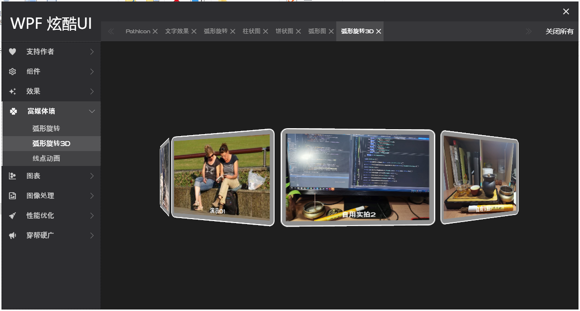
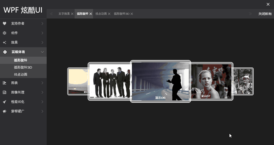
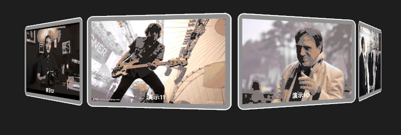
实现了一个简单的WPF应用程序UI框架 ,分享出来。界面效果图如下:
运行效果如下:
喜欢的可以下载源码参考:https://github.com/DuelWithSelf/WPFEffects
左侧分类导览按钮为自定义的CustomControl, 参照ListBox的模式。 为了偷懒,暂时未深度封装,先用StackPanel承载,先用上再说,效果还不错
 <StackPanel x:Name="SpNavItems">
     <CustomFrms:ListMenuBox Text="支持作者" IconData="{StaticResource PathData.Heart}"
                             Key="AboutMe"/>
     <CustomFrms:ListMenuBox Text="组件" IconData="{StaticResource PathData.SettingsOutline}">
         <CustomFrms:ListMenuItem Text="PathIcon" Key="PathData"/>
     </CustomFrms:ListMenuBox>
     <CustomFrms:ListMenuBox Text="效果" IconData="{StaticResource PathData.Creation}">
         <CustomFrms:ListMenuItem Text="文字效果" Key="TextblockEffect"/>
     </CustomFrms:ListMenuBox>
     <CustomFrms:ListMenuBox Text="富媒体墙" IconData="{StaticResource PathData.Clover}">
         <CustomFrms:ListMenuItem Text="弧形旋转" Key="Carousel"/>
         <CustomFrms:ListMenuItem Text="弧形旋转3D" Key="Carousel3D"/>
         <CustomFrms:ListMenuItem Text="线点动画" Key="AnimLine"/>
     </CustomFrms:ListMenuBox>
     <CustomFrms:ListMenuBox Text="图表" IconData="{StaticResource PathData.ChartScatterplotHexbin}">
         <CustomFrms:ListMenuItem Text="柱状图" Key="HistogramChart"/>
         <CustomFrms:ListMenuItem Text="饼状图" Key="PieChart"/>
         <CustomFrms:ListMenuItem Text="弧形图" Key="RadianChart"/>
     </CustomFrms:ListMenuBox>
     <CustomFrms:ListMenuBox Text="图像处理" IconData="{StaticResource PathData.FileImageRegular}">
         <CustomFrms:ListMenuItem Text="图片分隔" Key="ImgCoordinate"/>
     </CustomFrms:ListMenuBox>
     <CustomFrms:ListMenuBox Text="性能优化" IconData="{StaticResource PathData.BroomSolid}">
         <CustomFrms:ListMenuItem Text="图片加载建议" Key="ImagePerformance"/>
         <CustomFrms:ListMenuItem Text="图片加载反例" Key="ImagePerformance2"/>
     </CustomFrms:ListMenuBox>
     <CustomFrms:ListMenuBox Text="穿帮硬广" IconData="{StaticResource PathData.Bullhorn}"
                             Key="Advertise"/>
 </StackPanel>
自定义的样式:
<Style TargetType="{x:Type CustomFrms:ListMenuBox}">
    <Setter Property="IconWidth" Value="14"/>
    <Setter Property="IconHeight" Value="14"/>
    <Setter Property="FontSize" Value="14"/>
    <Setter Property="NormalBrush" Value="{StaticResource ColorBrush.MiddleWhite}"/>
    <Setter Property="FocusBrush" Value="White"/>
    <Setter Property="BorderBrush" Value="White"/>
    <Setter Property="FocusBackground" Value="{StaticResource ColorBrush.LightWhite}"/>
    <Setter Property="Template">
        <Setter.Value>
            <ControlTemplate TargetType="{x:Type CustomFrms:ListMenuBox}">
                <Border x:Name="Part_BdrContainer" Background="{TemplateBinding Background}"
                        BorderBrush="{TemplateBinding BorderBrush}"
                        BorderThickness="{TemplateBinding BorderThickness}">
                    <Grid>
                        <Grid x:Name="Part_Header" Height="40" Background="Transparent" VerticalAlignment="Top">
                            <Path x:Name="Part_Icon" Margin="15,0,0,0"
                                      Width="{Binding Path=IconWidth, RelativeSource={RelativeSource TemplatedParent}}"
                                      Height="{Binding Path=IconHeight, RelativeSource={RelativeSource TemplatedParent}}"
                                      Data="{Binding Path=IconData, RelativeSource={RelativeSource TemplatedParent}}"
                                      Fill="{Binding Path=NormalBrush, RelativeSource={RelativeSource TemplatedParent}}"
                                      Stretch="Fill" HorizontalAlignment="Left" VerticalAlignment="Center"/>
                            <TextBlock x:Name="Part_Title" Padding="{Binding Path=TextPadding, RelativeSource={RelativeSource TemplatedParent}}"
                                           FontSize="{Binding Path=FontSize, RelativeSource={RelativeSource TemplatedParent}}"
                                           HorizontalAlignment="Left" VerticalAlignment="Center" Margin="50,0,0,0"
                                           Foreground="{Binding Path=NormalBrush, RelativeSource={RelativeSource TemplatedParent}}"
                                           Text="{Binding Path=Text, RelativeSource={RelativeSource TemplatedParent}}"/>
                            <Path x:Name="Part_Arrow" Data="M0,20 L10,10 L0,0 L0,1 L9,10 L0,19 L0,20 V20 H10 Z"
                                      Width="6" Height="12" Stretch="Fill"
                                      Fill="{Binding Path=NormalBrush, RelativeSource={RelativeSource TemplatedParent}}"
                                      HorizontalAlignment="Right" Margin="0,0,15,0" VerticalAlignment="Center">
                                    <Path.RenderTransform>
                                        <TransformGroup>
                                            <RotateTransform Angle="0"/>
                                        </TransformGroup>
                                    </Path.RenderTransform>
                                </Path>
                        </Grid>
                        <StackPanel x:Name="Part_ItemsContainer" Margin="0,40,0,0" Height="0">
                            <ItemsPresenter SnapsToDevicePixels="{TemplateBinding SnapsToDevicePixels}"/>
                        </StackPanel>
                    </Grid>
                </Border>
                <ControlTemplate.Triggers>
                        <Trigger Property="IsExpanded" Value="True">
                            <Setter TargetName="Part_Icon" Property="Fill"
                                    Value="{Binding Path=FocusBrush, RelativeSource={RelativeSource TemplatedParent}}"/>
                            <Setter TargetName="Part_Title" Property="Foreground"
                                    Value="{Binding Path=FocusBrush, RelativeSource={RelativeSource TemplatedParent}}"/>
                            <Setter TargetName="Part_Arrow" Property="Fill"
                                    Value="{Binding Path=FocusBrush, RelativeSource={RelativeSource TemplatedParent}}"/>
                            <Setter TargetName="Part_BdrContainer" Property="Background"
                                    Value="{Binding Path=FocusBackground, RelativeSource={RelativeSource TemplatedParent}}"/>
                            <Setter TargetName="Part_BdrContainer" Property="BorderThickness"
                                    Value="2,0,0,0"/>
                        </Trigger>
                        <Trigger Property="IsMouseOver" Value="True">
                            <Setter TargetName="Part_Icon" Property="Fill"
                                    Value="{Binding Path=FocusBrush, RelativeSource={RelativeSource TemplatedParent}}"/>
                            <Setter TargetName="Part_Title" Property="Foreground"
                                    Value="{Binding Path=FocusBrush, RelativeSource={RelativeSource TemplatedParent}}"/>
                            <Setter TargetName="Part_Arrow" Property="Fill"
                                    Value="{Binding Path=FocusBrush, RelativeSource={RelativeSource TemplatedParent}}"/>
                            <Setter TargetName="Part_BdrContainer" Property="Background"
                                    Value="{Binding Path=FocusBackground, RelativeSource={RelativeSource TemplatedParent}}"/>
                            <Setter TargetName="Part_BdrContainer" Property="BorderThickness"
                                    Value="2,0,0,0"/>
                        </Trigger>
                    </ControlTemplate.Triggers>
            </ControlTemplate>
        </Setter.Value>
    </Setter>
</Style>
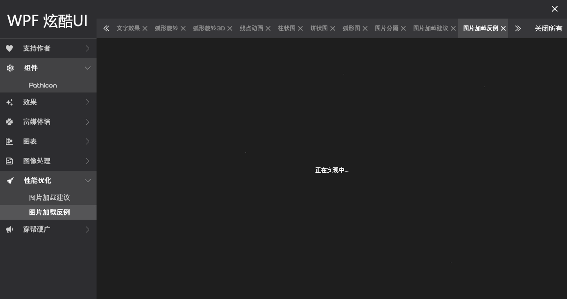
打算持续更新,将左侧面板所有功能模块全给实现了。比如已实现的:


 浙公网安备 33010602011771号