
vue中使用css实现气泡图
html部分:
<div  id="scatter">
   <div class="bubble_min bubble10"></div>
   <div class="bubble_min bubble12"></div>
   <div class="bubble_min bubble8"></div>
   <div class="bubble_min bubble12"></div>
   <div class="bubble_min bubble8"></div>
   <ul>
     <li class="li" v-for="item,index in bubbleData" :key="index"
      :style="{top:item.top,left:item.left,background:item.background,width:item.width+'px',height:item.width+'px',animationDuration:item.time+'s'}">
        <span :style="{width:item.width+'px'}">{{item.width>40?item.name:''}}</span>
        <span :style="{width:item.width+'px'}">{{item.width>40?item.value+'%':''}}</span>
        <div class="tip">{{item.name+':'+item.value+'%'}}</div>
     </li>
   </ul>
 </div>
js部分:
/**
     *获取n等分圆周坐标点
     *半径:r
     *圆心坐标:(ox,oy)
     */
    getPoint(r, ox, oy, n) {
      let point = [];
      var radians = (Math.PI / 180) * Math.round(360 / n);
      for (let i = 0; i < n; i++) {
        var x = ox + r * Math.sin(radians * i),
          y = oy + r * Math.cos(radians * i);
        point.unshift([Math.floor(x), Math.floor(y)]);
      }
      return point;
    },
    // 初始化气泡图
    initScatter() {
      this.bubbleData = [
        {value:56,name:'类目一'},
        {value:13,name:'类目二'},
        {value:45,name:'类目三'},
        {value:1,name:'类目四'},
        {value:69,name:'类目四'}
      ]
      let offsets;
      let colors = ["#f1a137", "#8585f8", "#68ccf7", "#95da2f", "#f8a1ac"];
	  //气泡位置,只有一个时显示在中间,较多时围成一个圆
      if (this.bubbleData.length === 1) {
        offsets = [[100, 100]];
      } else {
        offsets = this.getPoint(100, 100, 110, this.bubbleData.length);
      }
      this.bubbleData.forEach((v, i) => {
        v.top = offsets[i][0] + "px";
        v.left = offsets[i][1] + "px";
		//循环使用colors颜色列表
        v.background = colors[i % 5];
		//将类目的value作为气泡的宽度,由于value为1-20时,气泡太小不美观,因此给每个气泡增加20的宽度
        v.width = v.value + Math.ceil(v.value / (v.value + 1)) * 20;
		//气泡的动画时长
        v.time = v.value>50?(v.value%6)+10:(v.value%6)+6
      });
    },
css部分:
/* 气泡图 */
#scatter {
  width: 350px;
  height: 300px;
  position: relative;
  li {
    opacity: 0.7;
    border-radius: 50%;
    position: absolute;
    z-index: 1;
    display: flex;
    flex-direction: column;
    justify-content: center;
    align-items: center;
    animation-name: itemfloat;
    animation-timing-function: linear;
    animation-fill-mode: both;
    animation-iteration-count: infinite;
    .tip {
      width: 150px;
      height: 40px;
      line-height: 40px;
      text-align: center;
      color: #000;
      border: 1px solid #ccc;
      border-radius: 8px;
      background: #fff;
      display: none;
      position: absolute;
      top: -45px;
      z-index: 101;
      transition: display 2s;
    }
    span {
      color: #fff;
      font-size: 12px;
      text-align: center;
      padding: 0 5px;
      display: inline-block;
      overflow: hidden;
      text-overflow: ellipsis;
      white-space: nowrap;
    }
  }
  li:hover .tip {
    display: block;
  }
  li:nth-child(2n) {
    animation-duration: 8s;
  }
  li:nth-child(2n-1) {
    animation-duration: 12s;
  }
  li:hover {
    z-index: 100;
    opacity: 1;
    transition: opacity 2 s;
  }

  .bubble_min:nth-child(1) {
    width: 20px;
    height: 20px;
    top: 100px;
    left: 40px;
  }
  .bubble_min:nth-child(2) {
    width: 60px;
    height: 60px;
    top: 130px;
    left: 100px;
  }
  .bubble_min:nth-child(3) {
    width: 50px;
    height: 50px;
    top: 90px;
    left: 180px;
  }
  .bubble_min:nth-child(4) {
    width: 30px;
    height: 30px;
    top: 250px;
    left: 300px;
  }
  .bubble_min:nth-child(5) {
    width: 30px;
    height: 30px;
    top: 110px;
    left: 240px;
  }
  .bubble_min {
    background-image: url(../../../../assets/bubble.png);
    background-size:100% 100% ;
    border-radius: 50%;
    position: absolute;
    z-index: 1;
    opacity: 0.5;
    animation-name: minibubble;
    animation-timing-function: linear;
    animation-fill-mode: both;
    animation-iteration-count: infinite;
  }
  .bubble8 {
    animation-duration: 8s;
  }
  .bubble10 {
    animation-duration: 10s;
  }
  .bubble12 {
    animation-duration: 12s;
  }
  @keyframes itemfloat {
    0% {
      transform: translateY(0);
    }
    25% {
      transform: translateY(-15px);
    }
    50% {
      transform: translateY(0);
    }
    75% {
      transform: translateY(15px);
    }
    100% {
      transform: translateY(0);
    }
  }
  @keyframes minibubble {
    0% {
      transform: translateY(200px)  rotate(0deg);
    }
    100% {
      transform: translateY(-240px)  rotate(1500deg);
    }
  }
}
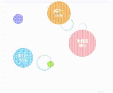
效果图如下: