css形状
自适应的椭圆
椭圆
border-radius: 50%;
二分之一椭圆
border-radius: 100% 0 0 100%/50%;
四分之一椭圆
border-radius: 100% 0 0 0;
关于border-radius的解释,语法:水平切角/垂直切角,水平切角和垂直切角里都有四个方位。
以二分之一椭圆为例:左上角的水平切角和垂直切角分别为100%和50%,右上角都为0,右下角都为0,左下角为100%和50%,所以是100% 0 0 100%/50%

平行四边形
直接通过矩形变形得到:
transform: skewX(-45deg);
存在的问题,内部的文字也倾斜了。
解决方案主要有:1. 将内部文字反向侵袭skewX(45deg); 2. 使用伪元素;
伪元素方案:
div {
  width: 100px;
  height: 20px;
  position: relative;
  text-align: center;
}
div::before {
  content: '';
  width: 100%;
  height: 100%;
  background: yellowgreen;
  position: absolute;
  left: 0;
  top: 0;
  transform: skewX(-45deg);
  z-index: -1;
}
菱形
通过简单的矩形旋转可以得到如下的示例图片:
可以发现和之前的平行四边形一样内部的背景图片也变形了。
解决方案:
- 使用单独的元素img替换background-image,再负方向旋转校正

transform: rotate(-45deg) scale(1.42);
这里的scale是因为如果不放大,图片四个角会有空隙,需要乘以 (\(\sqrt{2}\))
- 使用clip-path
clip-path: polygon(50% 0, 100% 50%, 50% 100%, 0 50%)
切角效果
三角切角
background: #58a;
background-image:
  linear-gradient(45deg, white 15px, transparent 0),
  linear-gradient(-45deg, white 15px, transparent 0),
  linear-gradient(135deg, white 15px, transparent 0),
  linear-gradient(-135deg, white 15px, transparent 0);
弧形切角
background-image:
  radial-gradient(circle at top left, transparent 15px, #58a 0),
  radial-gradient(circle at bottom left, transparent 15px, #58a 0),
  radial-gradient(circle at top right, transparent 15px, #58a 0),
  radial-gradient(circle at bottom right, transparent 15px, #58a 0);
background-size: 50% 50%;
background-repeat: no-repeat;
background-position: top left, bottom left, top right,bottom right;
svg+border-image
background: #58a;
background-clip: padding-box;
border: 15px solid #58a;
border-image: 1 url('data:image/svg+xml,\
<svg xmlns="http://www.w3.org/2000/svg"\
 width="3" height="3" fill="%2358a">\
 <polygon points="0,1 1,0 2,0 3,1 3,2 2,3 1,3 0,2"/>\
 </svg>')
clip-path
background: #58a;
clip-path:
  polygon(20px 0, calc(100% - 20px) 0, 100% 20px,
  100% calc(100% - 20px), calc(100% - 20px) 100%,
  20px 100%, 0 calc(100% - 20px), 0 20px)
梯形
简易梯形
transform: perspective(.5em) rotateX(5deg);
书签效果
只需改变transform-origin, trasnform-origin设置为right bottom即可实现上面的书签效果:
transform-origin: right bottom;
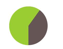
简单的饼图
伪元素解决方案
.pie {
  width: 100px;
  height: 100px;
  border-radius: 50%;
  background: yellowgreen;
  position: relative;
  background-image: linear-gradient(90deg, transparent 50%, #655 0);
}
.pie::before {
  content: '';
  width: 50%;
  height: 100%;
  position: absolute;
  left: 50%;
  transform-origin: left;
  background: yellowgreen;
  border-radius: 0 100% 100% 0/50%;
  transform: rotate(.3turn);
}
但是这样写当饼图比率超过50%的时候无法按照预想的正确显示,60%:
这个问题可以用动画的一个小技巧解决,用负的动画延时来直接跳至动画的任意时间点,并定格在那里。因为动画是暂停的,所以动画的第一帧(由负的animation-delay值定义)将是唯一显示出的那一帧,在饼图上显示出的比率就是我们的animation-delay值在总的动画时间里所占的比率:
@keyframes spin {
  to {transform: rotate(.5turn);}
}
@keyframes bg {
  50% {background: #655;}
}
.pie-60::before {
 /* 相同的样式略 */
  animation: spin 50s linear infinite,
              bg 100s step-end infinite;
  animation-delay: -60s;
  animation-play-state: paused;
}
svg解决方案
关于strokw-width和stoke-dasharray
先了解一下stroke-width和stroke-dasharray:
stroke-width表示线段宽度;
stroke-dasharray第一个参数表示线段长度,第二个参数表示间隙宽度。
使用示例如下:
如上图左边的图形:

<div class="pie1">
  <svg width="100" height="100">
    <circle r="25" cx="50" cy="50"/>
  </svg>
</div>
.pie1 circle{
  fill: yellowgreen;
  stroke: #655;
  stroke-width: 40;
  stroke-dasharray: 20 10;
}
改变stoke-width 还能实现各种有趣的图形:
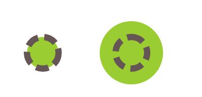
设置stroke-width等于2 x r, stroke-dasharray的第二个参数大于2 x pi x r就可以得到连续的图案。
实现不同比率的圆
要设置60%比率的圆,stroke-dasharray的线段长度为(60% * 2 * pi * r) , 这里的r是circlr的半径。
所以可设置圆周长为100,这样设置不同比率的圆形时stroke-dasharray的第一个参数就可以直接按照比率进行设置。
因为2 x pi x16约等于100,所以设置r为16。
这样设置以后60%比率的圆, storke-dasharray的第一个参数只需填写45即可。
.pie3 svg {
  transform: rotate(-90deg) scale(3);
  background: yellowgreen;
  border-radius: 50%;
}
.pie3 circle {
  fill: transparent;
  stroke: #655;
  stroke-width: 32;
  stroke-dasharray: 60 100;
}
多色块的圆
使用svg解决方案能很方便地增加第三种颜色,增加圆形,并设置stroke-dashoffset即可。
stroke-dashoffset 属性指定了dash模式到路径开始的距离。
如果使用了一个 <百分比> 值, 那么这个值就代表了当前视口的一个百分比。
值可以取为负值。
.pie4 circle:nth-child(1) {
  fill: transparent;
  stroke: #58a;
  stroke-width: 32;
  stroke-dasharray: 30 100;
}
.pie4 circle:nth-child(2) {
  fill: transparent;
  stroke: deeppink;
  stroke-width: 32;
  stroke-dasharray: 30 100;
  stroke-dashoffset: 100;
}
本文来自博客园,作者:每天不emo,转载请注明原文链接:https://www.cnblogs.com/duanlvxin/p/17155444.html

 浙公网安备 33010602011771号