
《数据分析实战-托马兹.卓巴斯》读书笔记第2章-变量分布与相关性、图表
 托马兹·卓巴斯的《数据分析实战》,2018年6月出版,本系列为读书笔记。主要是为了系统整理,加深记忆。第2章描述了用于理解数据的多种技巧。我们会了解如何计算变量的分布与相关性,并生成多种图表。
第2章 探索数据
本章会介绍一些技术,帮你更好地理解数据,以及探索特征之间的关系。你将学习以下主题:
·生成描述性的统计数据
·探索特征之间的相关性
·可视化特征之间的相互作用
·生成直方图
·创建多变量的图表
·数据取样
·将数据集拆分成训练集、交叉验证集和测试集
2.1导论
接下来的技巧会使用Python与D3.js来建立对数据的理解。我们会分析变量的分布,捋清特征之间的关系,并将其相互作用可视化。你会学到生成直方图及在二维图表中表示三维数据的方法。最后,你会学习给样本分层,并将数据集拆分成测试集与训练集。
2.2生成描述性的统计数据
要完全理解任何随机变量的分布,我们需要知道其平均数与标准差、最小值与最大值、中位数、四分位数、偏度和峰度。
独立安装 pandas
pip install pandas
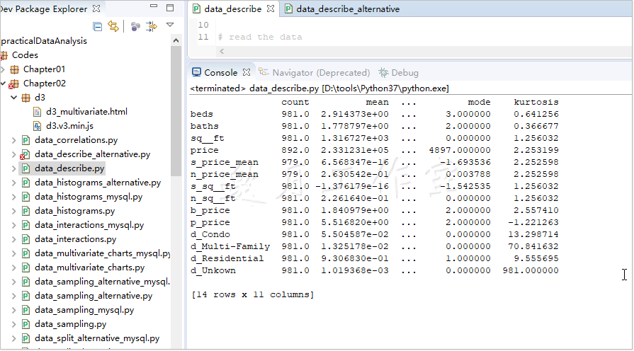
生成描述性数据,简单示例1-使用padas
pandas有个很管用的.describe()方法,它替我们做了大部分的工作。这个方法能生成我们想要的大部分描述变量;输出看起来是这样的(为清晰做了相应简化):
 1 import pandas as pd
 2
 3 # name of the file to read from
 4 r_filenameCSV = '../../Data/Chapter02/' + \
 5     'realEstate_trans_full.csv'
 6
 7 # name of the output file
 8 w_filenameCSV = '../../Data/Chapter02/' + \
 9     'realEstate_descriptives.csv'
10
11 # read the data
12 csv_read = pd.read_csv(r_filenameCSV)
13
14 # calculate the descriptives: count, mean, std,
15 # min, 25%, 50%, 75%, max
16 # for a subset of columns
17 # 对某些列计算描述变量:总数,平均数、标准差、最小值
18 #25%数、50%数、75%数、最大值
19 csv_desc = csv_read[
20     [
21         'beds','baths','sq__ft','price','s_price_mean',
22         'n_price_mean','s_sq__ft','n_sq__ft','b_price',
23         'p_price','d_Condo','d_Multi-Family',
24         'd_Residential','d_Unkown'
25     ]
26 ].describe().transpose()
27
28 # and add skewness(偏度),mode(众数) and kurtosis(峰度)
29 csv_desc['skew'] = csv_read.skew(numeric_only=True)
30 csv_desc['mode'] = \
31     csv_read.mode(numeric_only=True).transpose()
32 csv_desc['kurtosis'] = csv_read.kurt(numeric_only=True)
33
34 print(csv_desc)
DataFrame对象的索引标明了描述性统计数据的名字,每一列代表我们数据集中一个特定的变量。不过,我们还缺偏度、峰度和众数。为了更方便地加入csv_desc变量,我们使用.transpose()移项了.describe()方法的输出结果,使得变量放在索引里,每一列代表描述性的变量。
简单示例2-使用SciPy和NumPy
独立安装 SciPy
pip install SciPy
.genfromtxt(...)方法以文件名作为第一个(也是唯一必需的)参数。本例中分隔符是',',也可以是\t。names参数指定为True,意味着变量名存于第一行。最后,usecols参数指定文件中哪些列要存进csv_read对象。
最终可以计算出要求的数据:
import scipy.stats as st
import numpy as np

# name of the file to read from
r_filenameCSV = '../../Data/Chapter02/' + \
    'realEstate_trans_full.csv'

# read the data
csv_read = np.genfromtxt(
    r_filenameCSV,
    delimiter=',',
    names=True,
    # only numeric columns
    usecols=[4,5,6,8,11,12,13,14,15,16,17,18,19,20]
)

# calculate the descriptives
desc = st.describe([list(item) for item in csv_read])

# and print out to the screen
print(desc)

.genfromtxt(...)方法创建的数据是一系列元组。.describe(...)方法只接受列表形式的数据,所以得先(使用列表表达式)将每个元组转换成列表。
http://docs.scipy.org/doc/scipy/reference/stats.html#statistical-functions
2.3探索特征之间的相关性
两个变量之间的相关系数用来衡量它们之间的关系。
系数为1,我们可以说这两个变量完全相关;系数为-1,我们可以说第二个变量与第一个变量完全负相关;系数0意味着两者之间不存在可度量的关系。
这里要强调一个基础事实:不能因为两个变量是相关的,就说两者之间存在因果关系。要了解更多,可访问https://web.cn.edu/kwheeler/logic_causation.html。
我们将测算公寓的卧室数目、浴室数目、楼板面积与价格之间的相关性。
原理:pandas可用于计算三种相关度:皮尔逊积矩相关系数、肯达尔等级相关系数和斯皮尔曼等级相关系数。后两者对于非正态分布的随机变量并不是很敏感。
我们计算这三种相关系数,并且将结果存在csv_corr变量中。
import pandas as pd

# name of the file to read from
r_filenameCSV = '../../Data/Chapter02/' + \
    'realEstate_trans_full.csv'

# name of the output file
w_filenameCSV = '../../Data/Chapter02/' + \
    'realEstate_corellations.csv'

# read the data and select only 4 variables
csv_read = pd.read_csv(r_filenameCSV)
csv_read = csv_read[['beds','baths','sq__ft','price']]

# calculate the correlations
#皮尔逊积矩相关系数、肯达尔等级相关系数、斯皮尔曼级相关系数
coefficients = ['pearson', 'kendall', 'spearman']

csv_corr = {}

for coefficient in coefficients:
    csv_corr[coefficient] = csv_read \
        .corr(method=coefficient) \
        .transpose()

# output to a file
with open(w_filenameCSV,'w') as write_csv:
    for corr in csv_corr:
        write_csv.write(corr + '\n')
        write_csv.write(csv_corr[corr].to_csv(sep=','))
        write_csv.write('\n') */

参考,也可以使用NumPy计算皮尔逊相关系数:http://docs.scipy.org/doc/numpy/reference/generated/numpy.corrcoef.html。
2.4可视化特征之间的相互作用
D3.js是Mike Bostock用以可视化数据的一个强大框架。它能帮你使用HTML、SVG和CSS来操作数据。本技巧将探索房屋的面积与价格之间是否存在联系。
代码分两部分:准备数据(pandas和SQLAlchemy)和呈现数据(HTML与D3.js)。
上一章1.7已经将csv数据写入mysql,代码如下:
 1 import pandas as pd
 2 import sqlalchemy as sa
 3 # from sqlalchemy.ext.declarative import declarative_base
 4 # from sqlalchemy import create_engine
 5
 6 # name of the CSV file to read from and SQLite database
 7 r_filenameCSV = '../../Data/Chapter01/realEstate_trans.csv'
 8 rw_filenameSQLite = '../../Data/Chapter01/realEstate_trans__Result.db'
 9
10
11
12 # create the connection to the database
13 engine = sa.create_engine("mysql+pymysql://root:downmoon@localhost:3306/test?charset=utf8")
14
15
16 #===============================================================================
17 # Base = declarative_base()
18 # engine = sa.create_engine("mysql+pymysql://root:downmoon@localhost:3306/test?charset=utf8")
19 #
20 # Base.metadata.reflect(engine)
21 # tables = Base.metadata.tables
22 #
23 # print(tables)
24 # # 获取本地test数据库中的 real_estates 表
25 # real_estates = tables["real_estate"]
26 #
27 # # 查看engine包含的表名
28 # print(engine.table_names())
29 #===============================================================================
30
31
32
33 # read the data
34 csv_read = pd.read_csv(r_filenameCSV)
35
36 # transform sale_date to a datetime object
37 csv_read['sale_date'] = pd.to_datetime(csv_read['sale_date'])
38
39 # store the data in the database
40 csv_read.to_sql('real_estate', engine, if_exists='replace')
41
42 # print the top 10 rows from the database
43 query = 'SELECT * FROM real_estate LIMIT 5'
44 top5 = pd.read_sql_query(query, engine)
45 print(top5)
使用SQL Alchemy从mySQL数据库中提取数据。下面给出查询的例子(data_interaction.py文件),取出的数据保存在/Data/Chapter02/realEstate_d3.csv文件中。
 1 import pandas as pd
 2 import sqlalchemy as sa
 3
 4 # names of the files to output the samples
 5 w_filenameD3js = '../../Data/Chapter02/realEstate_d3.csv'
 6
 7 # database credentials
 8 usr  = 'root'
 9 pswd = 'downmoon'
10 dbname='test'
11
12 # create the connection to the database
13 engine = sa.create_engine(
14     'mysql+pymysql://{0}:{1}@localhost:3306/{2}?charset=utf8' \
15     .format(usr, pswd,dbname)
16 )
17
18 # read prices from the database
19 query = '''SELECT sq__ft,
20             price / 1000 AS price
21         FROM real_estate
22         WHERE sq__ft > 0
23         AND beds BETWEEN 2 AND 4'''
24 data = pd.read_sql_query(query, engine)
25
26 # output the samples to files
27 with open(w_filenameD3js,'w',newline='') as write_csv:
28     write_csv.write(data.to_csv(sep=',', index=False))
使用这个框架前得先导入。这里提供用D3.js创建散布图的伪代码。下一节我们会一步步解释代码:
原理:
首先,往HTML的DOM(Document Object Model)结构追加一个SVG(Scalable Vector Graphics)对象:
        var width   = 800;
        var height  = 600;
        var spacing = 60;

        // Append an SVG object to the HTML body
        var chart = d3.select('body')
            .append('svg')
            .attr('width',  width  + spacing)
            .attr('height', height + spacing)
        ;
使用D3.js从DOM中取出body对象,加上一个SVG对象,指定属性、宽和高。SVG对象加到了DOM上,现在该读取数据了。可由下面的代码完成:
   // Read in the dataset (from CSV on the server)
  d3.csv('http://localhost:8080/examples/realEstate_d3.csv', function(d) {
            draw(d) });
使用D3.js提供的方法读入CSV文件。.csv(...)方法的第一个参数指定了数据集;本例读取的是tomcat上的CSV文件(realEstate_d3.csv)。
第二个参数是一个回调函数,这个函数将调用draw(...)方法处理数据。
D3.js不能直接读取本地文件(存储在你的电脑上的文件)。你需要配置一个Web服务器(Apache或Node.js都可以)。如果是Apache,你得把文件放在服务器上,如果是Node.js,你可以读取数据然后传给D3.js。
draw(...)函数首先找出价格和楼板面积的最大值;该数据会用于定义图表坐标轴的范围:
function draw(dataset){
            // Find the maximum price and area
            var limit_max = {
                'price': d3.max(dataset, function(d) {
                    return parseInt(d['price']); }),
                'sq__ft': d3.max(dataset, function(d) {
                    return parseInt(d['sq__ft']); })
            };
我们使用D3.js的.max(...)方法。这个方法返回传入数组的最大元素。作为可选项,你可以指定一个accessor函数,访问数据集中的数据,根据需要进行处理。我们的匿名函数对数据集中的每一个元素都返回作为整数解析的结果(数据是作为字符串读入的)。
下面定义范围:
 // Define the scales
            var scale_x = d3.scale.linear()
                .domain([0, limit_max['price']])
                .range([spacing, width - spacing * 2]);

            var scale_y = d3.scale.linear()
                .domain([0, limit_max['sq__ft']])
                .range([height - spacing, spacing]);
D3.js的scale.linear()方法用传入的参数建立了线性间隔的标度。domain指定了数据集的范围。我们的价格从0到$884000(limit_max['price']),楼板面积从0到5822(limit_max['sq__ft'])。range(...)的参数指定了domain如何转换为SVG窗口的大小。对于scale_x,有这么个关系:如果price=0,图表中的点要置于左起60像素处;如果价格是$884000,点要置于左起600(width)-60(spacing)*2=480像素处。
下面定义坐标轴:
//Define the axes
            var axis_x = d3.svg.axis()
                .scale(scale_x)
                .orient('bottom')
                .ticks(5);

            var axis_y = d3.svg.axis()
                .scale(scale_y)
                .orient('left')
                .ticks(5);
坐标轴要有标度,这也是我们首先传的。对于axis_x,我们希望它处于底部,所以是.orient('bottom'),axis_y要处于图表的左边(.orient('left'))。.ticks(5)指定了坐标轴上要显示多少个刻度标识;D3.js自动选择最佳间隔。
你可以使用.tickValues(...)取代.ticks(...),自行指定刻度值。
现在准备好在图表上绘出点了:
// Draw dots on the chart
            chart.selectAll('circle')
                .data(dataset)
                .enter()
                .append('circle')
                .attr('cx', function(d) {
                    return scale_x(parseInt(d['price']));
                })
                .attr('cy', function(d) {
                    return scale_y(parseInt(d['sq__ft']));
                })
                .attr('r', 3)
                ;
首先选出图表上所有的圆圈;因为还没有圆圈,所以这个命令返回一个空数组。.data(dataset).enter()链形成了一个for循环,对于数据集中的每个元素,往我们的图表上加一个点,即.append('circle')。每个圆圈需要三个参数:cx(水平位置)、cy(垂直位置)和r(半径)。.attr(...)指定了这些参数。看代码就知道,我们的匿名函数返回了转换后的价格和面积。
绘出点之后,我们可以画坐标轴了:
// Append X axis to chart
            chart.append('g')
                .attr('class', 'axis')
                .attr('transform', 'translate(0,' + (height - spacing) + ')')
                .call(axis_x);

            // Append Y axis to chart
            chart.append('g')
                .attr('class', 'axis')
                .attr('transform', 'translate(' + spacing + ',0)')
                .call(axis_y);
D3.js的文档中指出,要加上坐标轴,必须先附加一个g元素。然后指定g元素的class,使其黑且细(否则,坐标轴和刻度线都会很粗——参见HTML文件中的CSS部分)。translation属性将坐标轴从图表的顶部挪到底部,第一个参数指定了沿着横轴的动作,第二个参数指定了纵向的转换。最后调用axis_x。尽管看上去很奇怪——为啥要调用一个变量?——原因很简单:axis_x不是数组,而是能生成很多SVG元素的函数。调用这个函数,可以将这些元素加到g元素上。
最后,加上标签,以便人们了解坐标轴代表的意义:
// Append axis labels
            chart.append('text')
                .attr("transform", "translate(" + (width / 2) + " ," + (height - spacing / 3) + ")")
                .style('text-anchor', 'middle')
                .text('Price $ (,000)');

             chart.append("text")
                .attr("transform", "rotate(-90)")
                .attr("y", 14)
                .attr("x",0 - (height / 2))
                .style("text-anchor", "middle")
                .text("Floor area sq. ft.");
我们附加了一个文本框,指定其位置,并将文本锚定在中点。rotate转换将标签逆时针旋转90度。.text(...)指定了具体的标签内容。
然后就有了我们的图:
可视化数据时,D3.js很给力。这里有一套很好的D3.js教程:http://alignedleft.com/tutorials/d3/。也推荐学习Mike Bostock的例子:https://github.com/mbostock/d3/wiki/Gallery。
邀月注:其他开源的图表组件多的是,这里只是原书作者的一家之言。
2.5生成直方图
独立安装 Matplotlib
pip install Matplotlib
独立安装 Seaborn
pip install Seaborn
直方图能帮你迅速了解数据的分布。它将观测数据分组,并以长条表示各分组中观测数据的个数。这是个简单而有力的工具,可检测数据是否有问题,也可看出数据是否遵从某种已知的分布。
本技巧将生成数据集中所有价格的直方图。你需要用pandas和SQLAlchemy来检索数据。Matplotlib和Seaborn处理展示层的工作。Matplotlib是用于科学数据展示的一个2D库。Seaborn构建在Matplotlib的基础上,并为生成统计图表提供了一个更简便的方法(比如直方图等)。
我们假设数据可从mySQL数据库取出。参考下面的代码将生成价格的直方图,并保存到PDF文件中(data_histograms.py文件)
 1 import matplotlib.pyplot as plt
 2 import pandas as pd
 3 import seaborn as sns
 4 import sqlalchemy as sa
 5
 6 # database credentials
 7 usr  = 'root'
 8 pswd = 'downmoon'
 9 dbname='test'
10
11 # create the connection to the database
12 engine = sa.create_engine(
13     'mysql+pymysql://{0}:{1}@localhost:3306/{2}?charset=utf8' \
14     .format(usr, pswd,dbname)
15 )
16
17 # read prices from the database
18 query = 'SELECT price FROM real_estate'
19 price = pd.read_sql_query(query, engine)
20
21 # generate the histograms
22 ax = sns.distplot(
23     price,
24     bins=10,
25     kde=True    # show estimated kernel function
26 )
27
28 # set the title for the plot
29 ax.set_title('Price histogram with estimated kernel function')
30
31 # and save to a file
32 plt.savefig('../../Data/Chapter02/Figures/price_histogram.pdf')
33
34 # finally, show the plot
35 plt.show()
原理:首先从数据库中读取数据。我们省略了连接数据库的部分——参考以前的章节或者源代码。price变量就是数据集中所有价格形成的一个列表。
用Seaborn生成直方图很轻松,一行代码就可以搞定。.distplot(...)方法将一个数字列表(price变量)作为第一个(也是唯一必需的)参数。其余参数都是可选项。bins参数指定了要创建多少个块。kde参数指定是否要展示评估的核密度。
核密度评估是一个得力的非参数检验技巧,用来评估一个未知分布的概率密度函数(PDF,probability density function)。核函数的积分为1(也就是说,在整个函数域上,密度函数累积起来的最大值为1),中位数为0。
.distplot(...)方法返回一个坐标轴对象(参见http://matplotlib.org/api/axes_api.html)作为我们图表的画布。.set_title(...)方法创建了图表的标题。
我们使用Matplotlib的.savefig(...)方法保存图表。唯一必需的参数是文件保存的路径和名字。.savefig(...)方法足够智能,能从文件名的扩展中推断出合适的格式。可接受的文件名扩展包括:原始RGBA的raw和rgba,bitmap,pdf,可缩放矢量图形的svg和svgz,封装式Postscript的eps,jpeg或jpg,bmp.jpg,gif,pgf(LaTex的PGF代码),tif或tiff,以及ps(Postscript)。
最后一个方法将图表输出到屏幕:

2.6创建多变量的图表
独立安装 Bokeh----邀月注:这是一个不小的包
pip install Bokeh
/*
Installing collected packages: PyYAML, MarkupSafe, Jinja2, pillow, packaging, tornado, bokeh
Successfully installed Jinja2-2.10.3 MarkupSafe-1.1.1 PyYAML-5.2 bokeh-1.4.0 packaging-19.2 pillow-6.2.1 tornado-6.0.3
FINISHED
*/
前一个技巧显示,在Sacramento地区,不足两个卧室的房屋成交量很少。在2.4节中,我们用D3.js展现价格和楼板面积之间的关系。本技巧会在这个二维图表中加入另一个维度,卧室的数目。
Bokeh是一个结合了Seaborn和D3.js的模块:它生成很有吸引力的数据可视化图像(就像Seaborn),也允许你通过D3.js在HTML文件中操作图表。用D3.js生成类似的图表需要更多的代码。源代码在data_multivariate_charts.py中:
 1 # prepare the query to extract the data from the database
 2 query = 'SELECT beds, sq__ft, price / 1000 AS price \
 3     FROM real_estate \
 4     WHERE sq__ft > 0 \
 5     AND beds BETWEEN 2 AND 4'
 6
 7 # extract the data
 8 data = pd.read_sql_query(query, engine)
 9
10 # attach the color based on the bed count
11 data['color'] = data['beds'].map(lambda x: colormap[x])
12
13 # create the figure and specify label for axes
14 fig = b.figure(title='Price vs floor area and bed count')
15 fig.xaxis.axis_label = 'Price ($ \'000)'
16 fig.yaxis.axis_label = 'Feet sq'
17
18 # and plot the data
19 for i in range(2,5):
20     d = data[data.beds == i]
21
22     fig.circle(d['price'], d['sq__ft'], color=d['color'],
23         fill_alpha=.1, size=8, legend='{0} beds'.format(i))
24
25 # specify the output HTML file
26 b.output_file(
27     '../../Data/Chapter02/Figures/price_bed_area.html',
28     title='Price vs floor area for different bed count'
29 )
原理:首先,和通常情况一样,我们需要数据;从mySQL数据库取出数据,这个做法你应该已经很熟悉了。然后给每一条记录上色,这会帮助我们看出在不同卧室个数条件下价格和楼板面积的关系。colormap变量如下:
# colors for different bed count
colormap = {
    2: 'firebrick',
    3: '#228b22',
    4: 'navy'
}
颜色可以指定为可读的字符串或者十六进制值(如前面的代码所示)。
要将卧室个数映射到特定的颜色,我们使用了lambda。lambda是Python内置的功能,允许你用一个未命名短函数,而不是普通的函数,原地完成单个任务。它也让代码更可读。
参考下面的教程,理解为什么lambda很有用,以及方便使用的场景:https://pythonco nquerstheuniverse.wordpress.com/2011/08/29/lambda_tutorial/。
现在我们可以创建图像。我们使用Bokeh的.figure(...)方法。你可以指定图表的标题(正如我们所做的),以及图形的宽和高。我们也定义坐标轴的标签,以便读者知道他们在看什么。
然后我们绘制数据。我们遍历卧室可能个数的列表range(2,5)。(实际上生成的列表是[2,3,4]——参考range(...)方法的文档https://docs.python.org/3/library/stdtypes.html#typesseq-range)。对每个数字,我们提取数据的一个子集,并存在DataFrame对象d中。
对于对象d的每条记录,我们往图表中加一个圆圈。.circle(...)方法以x坐标和y坐标作为第一个和第二个参数。由于我们想看在不同卧室数目条件下,价格和面积的关系,所以我们指定圆圈的颜色。fill_alpha参数定义了圆圈的透明度;取值范围为[0,1],0表示完全透明,1表示完全不透明。size参数确定了圆圈有多大,legend是附加在图表上的图例。
Bokeh将图表保存为交互型HTML文件。title参数确定了文件名。这是一份完备的HTML代码。其中包括了JavaScript和CSS。我们的代码生成下面的图表:

图表可以移动、缩放、调整长宽。
参考:Bokeh是非常有用的可视化库。要了解它的功能,可以看看这里的示例:http://bokeh.pydata.org/en/latest/docs/gallery.html。
2.7数据取样
有时候数据集过大,不方便建立模型。出于实用的考虑(不要让模型的估计没有个尽头),最好从完整的数据集中取出一些分层样本。
本技巧从MongoDB读取数据,用Python取样。
要实践本技巧,你需要PyMongo(邀月注:可修改为mysql)、pandas和NumPy。
有两种做法:确定一个抽样的比例(比如说,20%),或者确定要取出的记录条数。下面的代码展示了如何提取一定比例的数据(data_sampling.py文件):
原理:首先确定取样的比例,即strata_frac变量。从mySQL(邀月注:原书代码为MongoDB,修改为mySQL)取出数据。MongoDB返回的是一个字典。pandas的.from_dict(...)方法生成一个DataFrame对象,这样处理起来更方便。
要获取数据集中的一个子集,pandas的.sample(...)方法是一个很方便的途径。不过这里还是有一个陷阱:所有的观测值被选出的概率相同,可能我们得到的样本中,变量的分布并不能代表整个数据集。
在这个简单的例子中,为了避免前面的陷阱,我们遍历卧室数目的取值,用.sample(...)方法从这个子集中取出一个样本。我们可以指定frac参数,以返回数据集子集(卧室数目)的一部分。
我们还使用了DataFrame的.append(...)方法:有一个DataFrame对象(例子中的sample),将另一个DataFrame附加到这一个已有的记录后面。ignore_index参数设为True时,会忽略附加DataFrame的索引值,并沿用原有DataFrame的索引值。
更多:有时,你会希望指定抽样的数目,而不是占原数据集的比例。之前说过,pandas的.sample(...)方法也能很好地处理这种场景(data_sampling_alternative.py文件)。
 1 #import pymongo
 2 import pandas as pd
 3 import numpy as np
 4 import sqlalchemy as sa
 5
 6 # define a specific count of observations to get back
 7 strata_cnt = 200
 8
 9 # name of the file to output the sample
10 w_filenameSample = \
11     '../../Data/Chapter02/realEstate_sample2.csv'
12
13 # limiting sales transactions to those of 2, 3, and 4 bedroom
14 # properties
15 beds = [2,3,4]
16
17 # database credentials
18 usr  = 'root'
19 pswd = 'downmoon'
20 dbname='test'
21
22 # create the connection to the database
23 engine = sa.create_engine(
24     'mysql+pymysql://{0}:{1}@localhost:3306/{2}?charset=utf8' \
25     .format(usr, pswd,dbname)
26 )
27
28
29 query = 'SELECT zip,city,price,beds,sq__ft FROM real_estate where \
30             beds in ("2","3","4")\
31             '
32 sales = pd.read_sql_query(query, engine)
33
34 # calculate the expected counts
35 ttl_cnt = sales['beds'].count()
36 strata_expected_counts = sales['beds'].value_counts() / \
37                          ttl_cnt * strata_cnt
38
39 # and select the sample
40 sample = pd.DataFrame()
41
42 for bed in beds:
43     sample = sample.append(
44         sales[sales.beds == bed] \
45         .sample(n=np.round(strata_expected_counts[bed])),
46         ignore_index=True
47     )
48
49 # check if the counts selected match those expected
50 strata_sampled_counts = sample['beds'].value_counts()
51 print('Expected: ', strata_expected_counts)
52 print('Sampled: ', strata_sampled_counts)
53 print(
54     'Total: expected -- {0}, sampled -- {1}' \
55     .format(strata_cnt, strata_sampled_counts.sum())
56 )
57
58 # output to the file
59 with open(w_filenameSample,'w') as write_csv:
60     write_csv.write(sample.to_csv(sep=',', index=False))
以上代码运行会报错,解决方案如下:
/* Traceback (most recent call last):
  File "D:\Java2018\practicalDataAnalysis\Codes\Chapter02\data_sampling_alternative_mysql.py", line 45, in <module>
    .sample(n=np.round(strata_expected_counts[bed])),
  File "D:\tools\Python37\lib\site-packages\pandas\core\generic.py", line 4970, in sample
    locs = rs.choice(axis_length, size=n, replace=replace, p=weights)
  File "mtrand.pyx", line 847, in numpy.random.mtrand.RandomState.choice
TypeError: 'numpy.float64' object cannot be interpreted as an integer

.sample(n=np.round(strata_expected_counts[bed])),改为.sample(n=int(np.round(strata_expected_counts[bed]))),
*/
2.8将数据集拆分成训练集、交叉验证集和测试集
独立安装 Bokeh----邀月注:这是一个不小的包
pip install Bokeh
/*
Installing collected packages: joblib, scikit-learn, sklearn
Successfully installed joblib-0.14.1 scikit-learn-0.22 sklearn-0.0
FINISHED
*/
要建立一个可信的统计模型,我们需要确信它精确地抽象出了我们要处理的现象。要获得这个保证,我们需要测试模型。要保证精确度,我们训练和测试不能用同样的数据集。
本技法中,你会学到如何将你的数据集快速分成两个子集:一个用来训练模型,另一个用来测试。
要实践本技巧,你需要pandas、SQLAlchemy和NumPy。
我们从Mysql数据库读出数据,存到DataFrame里。通常我们划出20%~40%的数据用于测试。本例中,我们选出1/3的数据(data_split_mysql.py文件):
 1 import numpy as np
 2 import pandas as pd
 3 import sqlalchemy as sa
 4
 5 # specify what proportion of data to hold out for testing
 6 test_size = 0.33
 7
 8 # names of the files to output the samples
 9 w_filenameTrain = '../../Data/Chapter02/realEstate_train.csv'
10 w_filenameTest  = '../../Data/Chapter02/realEstate_test.csv'
11
12 # database credentials
13 usr  = 'root'
14 pswd = 'downmoon'
15 dbname='test'
16
17 # create the connection to the database
18 engine = sa.create_engine(
19     'mysql+mysqlconnector://{0}:{1}@localhost:3306/{2}?charset=utf8' \
20     .format(usr, pswd,dbname)
21 )
22
23 # read prices from the database
24 query = 'SELECT * FROM real_estate'
25 data = pd.read_sql_query(query, engine)
26
27 # create a variable to flag the training sample
28 data['train']  = np.random.rand(len(data)) < (1 - test_size)
29
30 # split the data into training and testing
31 train = data[data.train]
32 test  = data[~data.train]
33
34 # output the samples to files
35 with open(w_filenameTrain,'w') as write_csv:
36     write_csv.write(train.to_csv(sep=',', index=False))
37
38 with open(w_filenameTest,'w') as write_csv:
39     write_csv.write(test.to_csv(sep=',', index=False))
原理:
我们从指定划分数据的比例与存储数据的位置开始:两个存放训练集和测试集的文件。
我们希望随机选择测试数据。这里,我们使用NumPy的伪随机数生成器。.rand(...)方法生成指定长度(len(data))的随机数的列表。生成的随机数在0和1之间。
接着我们将这些数字与要归到训练集的比例(1-test_size)进行比较:如果数字小于比例,我们就将记录放在训练集(train属性的值为True)中;否则就放到测试集中(train属性的值为False)。
最后两行将数据集拆成训练集和测试集。~是逻辑运算“否”的运算符;这样,如果train属性为False,那么“否”一下就成了True。
SciKit-learn提供了另一种拆分数据集的方法。我们先将原始的数据集分成两块,一块是因变量y,一块是自变量x:
# select the independent and dependent variables
x = data[['zip', 'beds', 'sq__ft']]
y = data['price']
然后就可以拆了:
# and perform the split
x_train, x_test, y_train, y_test = sk.train_test_split(
    x, y, test_size=0.33, random_state=42)
.train_test_split(...)方法帮我们将数据集拆成互补的子集:一个是训练集,另一个是测试集。在每个种类中,我们有两个数据集:一个包含因变量,另一个包含自变量。
Tips1、

ModuleNotFoundError: No module named 'sklearn.cross_validation'
/*
在sklearn 0.18及以上的版本中,出现了sklearn.cross_validation无法导入的情况,原因是新版本中此包被废弃

只需将 cross_validation 改为 model_selection 即可
 */
Tips2、
/*  File "D:\Java2018\practicalDataAnalysis\Codes\Chapter02\data_split_alternative_mysql.py", line 40, in <module>
    y_train.reshape((x_train.shape[0], 1)), \
。。。。。。。
AttributeError: 'Series' object has no attribute 'reshape'

只需 y_train.reshape((x_train.shape[0], 1)改为 y_train.values.reshape((x_train.shape[0], 1)即可
*/
第2 章完。
随书源码官方下载:
http://www.hzcourse.com/web/refbook/detail/7821/92

 浙公网安备 33010602011771号