文字纹理效果
参考:http://www.cnblogs.com/xiaohuochai/p/7498757.html
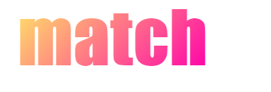
1、渐变色纹理
<style>
.box-with-text { background-image: linear-gradient(135deg,hsl(50, 100%, 70%), hsl(320, 100%, 50%)); -webkit-text-fill-color: transparent; -webkit-background-clip: text; background-size: cover;font:bolder 100px/100px Impact;position:absolute;}
</style>
<div class="box-with-text">match</div>
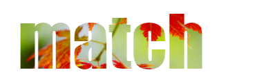
2、背景图片纹理
<style>
.box-with-text { background-image: url(http://7xpdkf.com1.z0.glb.clouddn.com/runjs/img/leaf.jpg); -webkit-text-fill-color: transparent; -webkit-background-clip: text; background-size: cover;font:bolder 100px/100px Impact;position:absolute;}
</style>
<div class="box-with-text">match</div>
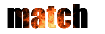
3、gif背景图片纹理
<style>
.box-with-text { background: url(http://7xpdkf.com1.z0.glb.clouddn.com/runjs/img/fire.gif) 0 -130px /cover; -webkit-text-fill-color: transparent; -webkit-background-clip: text; font:bolder 100px/100px Impact;position:absolute;}
</style>
<div class="box-with-text">match</div>
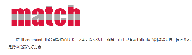
4、通过animation移动背景的位置和尺寸来添加动画
<style>
@keyframes stripes {100% {background-position: 0 -50px;}}
.box-with-text {animation: stripes 2s linear infinite;background:linear-gradient(crimson 50%, #aaa 50%) 0 0/ 100% 50px ; -webkit-text-fill-color: transparent; -webkit-background-clip: text; font:bolder 100px/100px Impact;position:absolute;}
</style>
<div class="box-with-text">match</div>

 浙公网安备 33010602011771号