
关于怎么用border实现三角形。圆形。以及给边框家阴影效果。
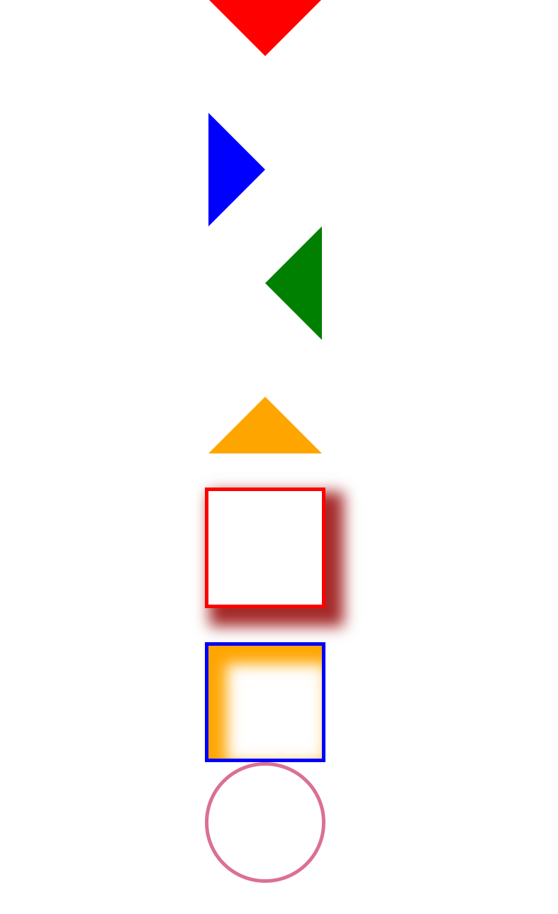
使用border画原和三角形。以及加边框阴影效果。
html源代码:
<!DOCTYPE html>
<html lang="en">
<head>
<meta charset="UTF-8">
<meta name="viewport" content="width=device-width, initial-scale=1.0">
<meta http-equiv="X-UA-Compatible" content="ie=edge">
<title>Document</title>
<link rel="stylesheet" href="../css/border.css">
</head>
<body>
<header></header>
<article></article>
<section></section>
<div></div>
<footer></footer>
<div></div>
<div></div>
</body>
</html>
CSS源代码:
*{
margin: 0 auto;
}
header{
width: 0px;
height: 0px;
border-top: 50px solid red;
border-left: 50px solid transparent;
border-right: 50px solid transparent;
border-bottom: 50px solid transparent;
}
article{
width: 0px;
height: 0px;
border-top: 50px solid transparent;
border-left: 50px solid blue;
border-right: 50px solid transparent;
border-bottom: 50px solid transparent;
}
section{
width: 0px;
height: 0px;
border-top: 50px solid transparent;
border-left: 50px solid transparent;
border-right: 50px solid green;
border-bottom: 50px solid transparent;
}
div{
width: 0px;
height: 0px;
border-top: 50px solid transparent;
border-left: 50px solid transparent;
border-right: 50px solid transparent;
border-bottom: 50px solid orange;
}
footer{
width: 100px;
height: 100px;
border: 3px solid red;
box-shadow: brown 10px 10px 20px 6px;
margin-top: 30px;
}
footer+div{
width: 100px;
height: 100px;
border: 3px solid blue;
box-shadow: orange 10px 10px 20px 6px inset;
margin-top: 30px;
}
div+div{
width: 100px;
height: 100px;
border:3px solid palevioletred;
border-radius: 50%;
}

 浙公网安备 33010602011771号