

Echarts - 去掉图表横纵坐标轴刻度线
效果图
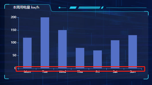
去掉前:
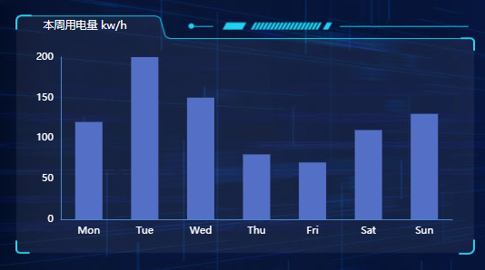
去掉后:
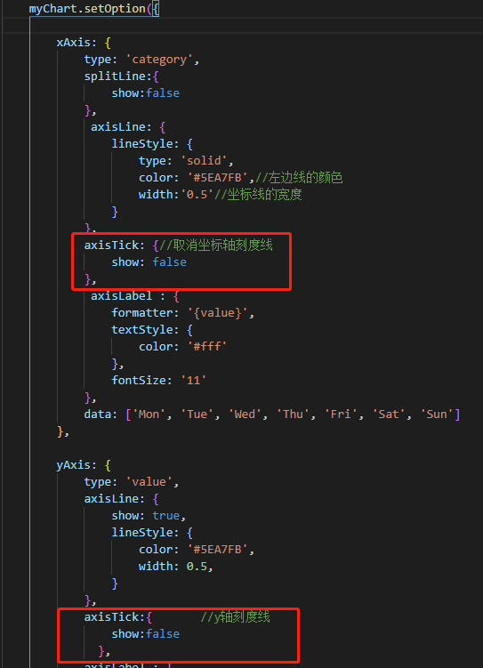
axisTick: {
   show: false
}
X轴Y轴文字颜色和大小的设置
axisLabel:{
    textStyle:{
        color:"#f9f9f9",
            fontSize:12
    }
}
X轴Y轴刻度线的颜色和宽度的设置:
axisLine:{
    show:true,//是否显示
    lineStyle:{
        color:"#1a80b0",//轴线的颜色
        width:1,//轴线的宽度
        type:"solid"//轴线的类型
    }
}
轴线的设置:
设置轴线时,需先设置刻度线文字的颜色
 splitLine: { //y轴的颜色
                lineStyle: {
                  type: "dashed", //虚线
                  color: '#004e86' //颜色
            },
x轴文字无法显示全,需设置角度
 axisLabel:{
                color: 'white',
                fontSize:10,
                interval:0,
                rotate:-40,
                textStyle:{
                  color: "#f9fafc",//x轴文字的颜色
                  fontSize:10
                }
              },
y轴单位颜色
              type:'value',
              name:'单位:万元',
              nameTextStyle:{
                color:"#fff",
              },
echarts formatter鼠标悬停显示信息
 tooltip: {
            trigger: 'axis',
            axisPointer: {
              type: 'shadow'
            }
          },


【推荐】国内首个AI IDE,深度理解中文开发场景,立即下载体验Trae
【推荐】编程新体验,更懂你的AI,立即体验豆包MarsCode编程助手
【推荐】抖音旗下AI助手豆包,你的智能百科全书,全免费不限次数
【推荐】轻量又高性能的 SSH 工具 IShell:AI 加持,快人一步
· TypeScript + Deepseek 打造卜卦网站:技术与玄学的结合
· 阿里巴巴 QwQ-32B真的超越了 DeepSeek R-1吗?
· 【译】Visual Studio 中新的强大生产力特性
· 【设计模式】告别冗长if-else语句:使用策略模式优化代码结构
· 10年+ .NET Coder 心语 ── 封装的思维:从隐藏、稳定开始理解其本质意义