使用css3属性border-image实现锯齿边框
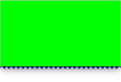
<!DOCTYPE html>
<html lang="en">

<head>
  <meta charset="UTF-8">
  <meta name="viewport" content="width=device-width, initial-scale=1.0">
  <title>Document</title>
  <style>
    .big_box{
      width: 400px;
      height: 260px;
      overflow: hidden;
    }
    .box{
      width: 400px;
      height: 200px;
      background: #0f0;
      border-bottom: 20px solid transparent;
      border-image: url(img/三角形.png);
      border-image-width: 20px;
      border-image-slice: 72;
      border-image-repeat: repeat;
      border-image-outset: 20px;
      box-shadow: 0 0 30px #000;
    }
  </style>
</head>

<body>
  <div class="big_box">
    <div class="box"></div>
  </div>
</body>

</html>
三角形png:

最终效果:
青云直上三千码

 浙公网安备 33010602011771号