
CSS: animation
thermodynamic char:

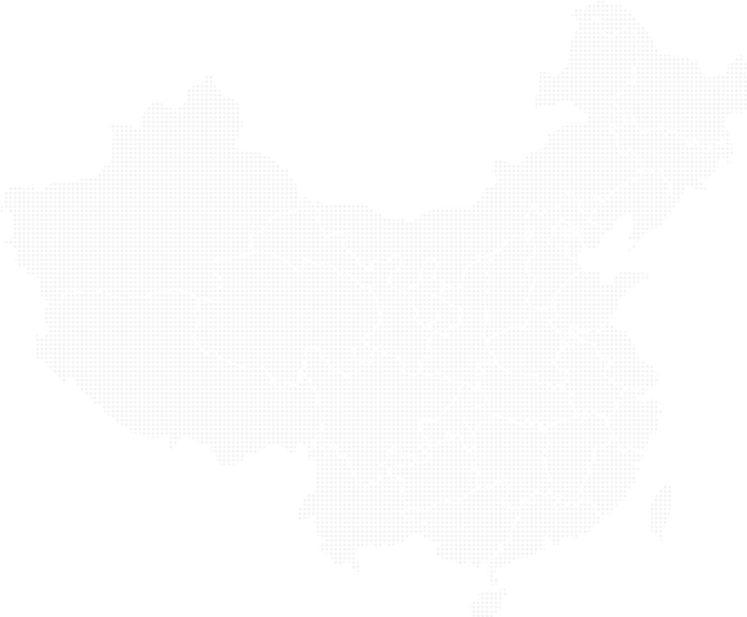
<!DOCTYPE html>
<html lang="en">

<head>
  <meta charset="UTF-8">
  <meta http-equiv="X-UA-Compatible" content="IE=edge">
  <meta name="viewport" content="width=device-width, initial-scale=1.0">
  <title>Document</title>
  <style>
    body {
      background: #333;
    }

    .map {
      position: relative;
      width: 747px;
      height: 616px;
      background: url(/images/map.png) no-repeat;
      margin: 0 auto;
    }

    .city {
      position: absolute;
      top: 228px;
      left: 543px;
      color: aliceblue;
    }

    .dot {
      width: 8px;
      height: 8px;
      background: blueviolet;
      border-radius: 50%;
    }

    .city div[class^=pulse] {
      position: absolute;
      top: 50%;
      left: 50%;
      transform: translate(-50%, -50%);
      width: 8px;
      height: 8px;
      box-shadow: 0 0 12px blueviolet;
      border-radius: 50%;
      animation-name: animate;
      animation-duration: 1s;
      animation-timing-function: linear;
      animation-iteration-count: infinite;
    }
    .city div.pulse1{
      animation-delay: 0;
    }
    .city div.pulse2{
      animation-delay: 0.4s;
    }
    .city div.pulse3{
      animation-delay: 0.8s;
    }
    @keyframes animate{
      0%{}
      70%{
        width: 40px;
        height: 40px;
        opacity: 1;
      }
      100%{
        width: 70px;
        height: 70px;
        opacity: 0;
      }
    }
  </style>
</head>

<body>
  <div class="map">
    <div class="city">
      <div class="dot"></div>
      <div class="pulse1"></div>
      <div class="pulse2"></div>
      <div class="pulse3"></div>
    </div>
  </div>
</body>

</html>
打字机
<!DOCTYPE html>
<html lang="en">

<head>
  <meta charset="UTF-8">
  <meta http-equiv="X-UA-Compatible" content="IE=edge">
  <meta name="viewport" content="width=device-width, initial-scale=1.0">
  <title>Document</title>
  <style>
    div {
      overflow: hidden;
      width: 0;
      height: 40px;
      /* background: tan; */
      font-size: 20px;
      line-height: 40px;
      white-space: nowrap;
      animation: animation 4s steps(7) forwards;
    }

    @keyframes animation {
      0% {
        width: 0;
      }

      100% {
        width: 140px;
      }
    }
  </style>
</head>

<body>
  <div>英语间距大小写</div>
</body>

</html>
<!DOCTYPE html>
<html lang="en">

<head>
  <meta charset="UTF-8">
  <meta http-equiv="X-UA-Compatible" content="IE=edge">
  <meta name="viewport" content="width=device-width, initial-scale=1.0">
  <title>Document</title>
  <style>
    body {
      background: grey;
    }

    .outer {
      position: relative;
      width: 100%;
      height: 100px;
      background: url(/images/bg1.png) no-repeat;
      background-size: contain;
      /* background-repeat: repeat  */
      animation: background 1s linear 0s infinite;
      /* animation: name duration timing-function delay iteration-count direction fill-mode; */
    }

    .inner {
      position: absolute;
      width: 200px;
      height: 100px;
      background: url(/images/bear.png) no-repeat;
      animation: animation 1s steps(8) infinite, move 3s linear forwards;
    }

    @keyframes background {
      0% {
        background-position: 0 0;
      }

      100% {
        background-position: 100% 0;
        /* background-color: 0 0; */
      }
    }

    @keyframes animation {
      0% {
        background-position: 0 0;
      }

      100% {
        background-position: -1600px 0;
      }
    }

    @keyframes move {
      0% {
        left: 0;
      }

      100% {
        /* left: calc(50% - 100px); */
        left: 50%;
        transform: translateX(-50%);
      }
    }
  </style>
</head>

<body>
  <div class="outer">
    <div class="inner"></div>
  </div>
</body>

</html>


【推荐】国内首个AI IDE,深度理解中文开发场景,立即下载体验Trae
【推荐】编程新体验,更懂你的AI,立即体验豆包MarsCode编程助手
【推荐】抖音旗下AI助手豆包,你的智能百科全书,全免费不限次数
【推荐】轻量又高性能的 SSH 工具 IShell:AI 加持,快人一步
· 震惊!C++程序真的从main开始吗?99%的程序员都答错了
· 【硬核科普】Trae如何「偷看」你的代码?零基础破解AI编程运行原理
· 单元测试从入门到精通
· 上周热点回顾(3.3-3.9)
· winform 绘制太阳,地球,月球 运作规律