html 之 Bootstrap
一、Bootstrap介绍
1、Bootstrap的由来
Bootstrap 是一个流行的开源前端框架,用于快速构建响应式和现代化的网站和 Web 应用程序。它由 Twitter 的前端工程师 Mark Otto 和 Jacob Thornton 在2011年开发,最初命名为 Twitter Blueprint。后来,他们将其开源并更名为 Bootstrap。
Bootstrap 提供了一套用于构建网站和应用程序的HTML、CSS 和 JavaScript 工具和组件。它的设计目标是让开发人员能够快速创建出现代化、美观且功能丰富的界面,同时确保在各种设备上都能提供一致的用户体验,即所谓的响应式设计。
bootstrap的版本:v3、v4、v5我们推荐使用v3就行
4、导入Bootstrap
1 2 3 4 5 6 | 1、使用link <link href="https://cdn.bootcdn.net/ajax/libs/twitter-bootstrap/3.3.6/css/bootstrap.min.css" rel="stylesheet"> <script src="https://cdn.bootcdn.net/ajax/libs/jquery/3.6.4/jquery.js"></script> <script src="https://cdn.bootcdn.net/ajax/libs/twitter-bootstrap/3.3.6/js/bootstrap.min.js"></script>2、下载到本地 |
注:
你在引入js文件的时候,一定要先引入jQuery文件,bootstrap的js文件是依赖于jQuery的js
在v3版本,在v4、v5版本就不需要了
5、Normalize.css
为了增强跨浏览器渲染的一致性,我们使用了 Normalize.css,这是由 Nicolas Gallagher 和 Jonathan Neal 维护的一个CSS 重置样式库。
二、容器布局
Bootstrap 需要为页面内容和栅格系统包裹一个 .container 容器。我们提供了两个作此用处的类。
注意,由于 padding 等属性的原因,下面两种容器类不能互相嵌套。
1、.container 类用于固定宽度并支持响应式布局的容器。
1 2 3 | <div class="container"> ...</div> |
2、.container-fluid 类用于 100% 宽度,占据全部视口(viewport)的容器。
1 2 3 | <div class="container-fluid"> ...</div> |
三、栅格系统
1、什么是栅格系统
Bootstrap 提供了一套响应式、移动设备优先的流式栅格系统,随着屏幕或视口(viewport)尺寸的增加,系统会自动分为最多12列。
栅格系统用于通过一系列的行(row)与列(column)的组合来创建页面布局,你的内容就可以放入这些创建好的布局中。下面就介绍一下 Bootstrap 栅格系统的工作原理:
- “行(row)”必须包含在
.container(固定宽度)或.container-fluid(100% 宽度)中,以便为其赋予合适的排列(aligment)和内补(padding)。 - 通过“行(row)”在水平方向创建一组“列(column)”。
- 你的内容应当放置于“列(column)”内,并且,只有“列(column)”可以作为行(row)”的直接子元素。
- 类似
.row和.col-xs-4这种预定义的类,可以用来快速创建栅格布局。Bootstrap 源码中定义的 mixin 也可以用来创建语义化的布局。 - 通过为“列(column)”设置
padding属性,从而创建列与列之间的间隔(gutter)。通过为.row元素设置负值margin从而抵消掉为.container元素设置的padding,也就间接为“行(row)”所包含的“列(column)”抵消掉了padding。 - 负值的 margin就是下面的示例为什么是向外突出的原因。在栅格列中的内容排成一行。
- 栅格系统中的列是通过指定1到12的值来表示其跨越的范围。例如,三个等宽的列可以使用三个
.col-xs-4来创建。 - 如果一“行(row)”中包含了的“列(column)”大于 12,多余的“列(column)”所在的元素将被作为一个整体另起一行排列。
- 栅格类适用于与屏幕宽度大于或等于分界点大小的设备 , 并且针对小屏幕设备覆盖栅格类。 因此,在元素上应用任何
.col-md-*栅格类适用于与屏幕宽度大于或等于分界点大小的设备 , 并且针对小屏幕设备覆盖栅格类。 因此,在元素上应用任何.col-lg-*不存在, 也影响大屏幕设备。
2、栅格参数
通过下表可以详细查看 Bootstrap 的栅格系统是如何在多种屏幕设备上工作的
| 超小屏幕 手机 (<768px) | 小屏幕 平板 (≥768px) | 中等屏幕 桌面显示器 (≥992px) | 大屏幕 大桌面显示器 (≥1200px) | |
|---|---|---|---|---|
| 栅格系统行为 | 总是水平排列 | 开始是堆叠在一起的,当大于这些阈值时将变为水平排列C | ||
.container 最大宽度 |
None (自动) | 750px | 970px | 1170px |
| 类前缀 | .col-xs- |
.col-sm- |
.col-md- |
.col-lg- |
| 列数 | 12 | |||
| 最大列宽 | 自动 | ~62px | ~81px | ~97px |
| 槽(gutter)宽 | 30px (每列左右均有 15px) | |||
| 可嵌套 | 是 | |||
| 偏移(Offsets) | 是 | |||
| 列排序 | 是 | |||
3、row 将container均分12份
1 2 3 4 5 6 7 8 9 10 11 12 13 14 15 16 17 18 19 20 21 22 23 24 25 26 27 28 29 30 31 32 33 34 35 36 37 38 39 40 41 42 43 44 45 46 47 48 49 50 | <head> <meta charset="UTF-8"> <title>标题</title> <link href="https://cdn.bootcdn.net/ajax/libs/twitter-bootstrap/3.3.6/css/bootstrap.min.css" rel="stylesheet"> <script src="https://cdn.bootcdn.net/ajax/libs/jquery/3.6.4/jquery.js"></script> <script src="https://cdn.bootcdn.net/ajax/libs/twitter-bootstrap/3.3.6/js/bootstrap.min.js"></script> <style> .c1 { background-color: #df61ab; border: 1px solid black; height: 100px; } </style></head><body><div class="container c1"> <div class="row"> <div class="col-md-6 c1"></div> <div class="col-md-6 c1"></div> </div> <div class="row"> <div class="col-md-1 c1"></div> <div class="col-md-1 c1"></div> <div class="col-md-1 c1"></div> <div class="col-md-1 c1"></div> <div class="col-md-1 c1"></div> <div class="col-md-1 c1"></div> <div class="col-md-1 c1"></div> <div class="col-md-1 c1"></div> <div class="col-md-1 c1"></div> <div class="col-md-1 c1"></div> <div class="col-md-1 c1"></div> <div class="col-md-1 c1"></div> </div> <div class="row"> <div class="col-md-3 c1"></div> <div class="col-md-9 c1"></div> </div> <div class="row"> <div class="col-md-2 c1 offset="></div> <div class="col-md-8 c1 offset="></div> <div class="col-md-2 c1 offset="></div> </div></div></body> |
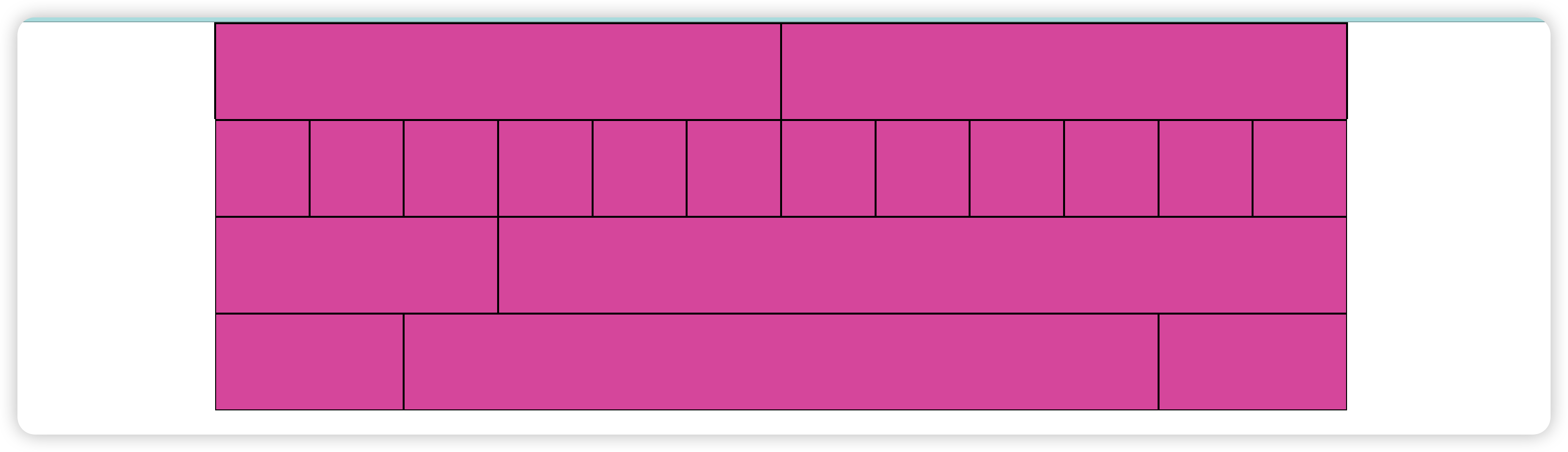
4、 居中 col-md-offset-*
1 | <div class="col-md-8 c1 col-md-offset-2"></div> |
四、排版
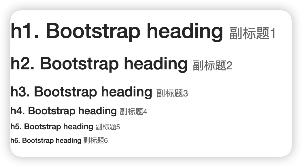
1、标题标签,<h1> 到 <h6> 均可使用。
另外,还提供了 .h1 到 .h6 类,为的是给内联(inline)属性的文本赋予标题的样式。
在标题内还可以包含 <small> 标签或赋予 .small 类的元素,可以用来标记副标题。
1 2 3 4 5 6 7 8 | <body><h1>h1. Bootstrap heading <small>副标题1</small></h1><h2>h2. Bootstrap heading <small>副标题2</small></h2><h3>h3. Bootstrap heading <small>副标题3</small></h3><h4>h4. Bootstrap heading <small>副标题4</small></h4><h5>h5. Bootstrap heading <small>副标题5</small></h5><h6>h6. Bootstrap heading <small>副标题6</small></h6></body> |
2、页面主体
Bootstrap 将全局 font-size 设置为 14px,line-height 设置为 1.428。这些属性直接赋予 <body> 元素和所有段落元素。另外,<p> (段落)元素还被设置了等于 1/2 行高(即 10px)的底部外边距(margin)。
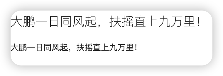
3、中心内容
通过添加 .lead 类可以让段落突出显示。
1 2 | <p class="lead">大鹏一日同风起,扶摇直上九万里!</p><p>大鹏一日同风起,扶摇直上九万里!</p> |
4、对齐
通过文本对齐类,可以简单方便的将文字重新对齐。
1 2 3 4 5 | <p class="text-left">Left aligned text.</p><p class="text-center">Center aligned text.</p><p class="text-right">Right aligned text.</p><p class="text-justify">Justified text.</p><p class="text-nowrap">No wrap text.</p> |
5、更多请查看官网文档
全局 CSS 样式 · Bootstrap v3 中文文档 | Bootstrap 中文网 (bootcss.com)
五、表格
1、条纹状表格
通过 .table-striped 类可以给 <tbody> 之内的每一行增加斑马条纹样式。
1 2 3 4 | 跨浏览器兼容性条纹状表格是依赖 :nth-child CSS 选择器实现的,而这一功能不被 Internet Explorer 8 支持。<table class="table table-striped"> ...</table> |
2、带边框的表格
添加 .table-bordered 类为表格和其中的每个单元格增加边框。
1 2 3 | <table class="table table-bordered"> ...</table> |
3、鼠标悬停
通过添加 .table-hover 类可以让 <tbody> 中的每一行对鼠标悬停状态作出响应。
1 2 3 | <table class="table table-hover"> ...</table> |
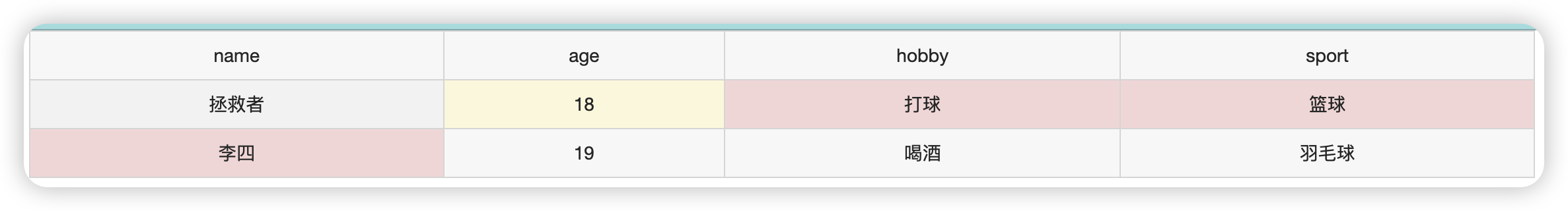
4、状态类
通过这些状态类可以为行或单元格设置颜色。
| Class | 描述 |
|---|---|
.active |
鼠标悬停在行或单元格上时所设置的颜色 |
.success |
标识成功或积极的动作 |
.info |
标识普通的提示信息或动作 |
.warning |
标识警告或需要用户注意 |
.danger |
标识危险或潜在的带来负面影响的动作 |
5、响应式表格
将任何 .table 元素包裹在 .table-responsive 元素内,即可创建响应式表格,其会在小屏幕设备上(小于768px)水平滚动。当屏幕大于 768px 宽度时,水平滚动条消失。
1 2 3 | @-moz-document url-prefix() { fieldset { display: table-cell; }} |
六、表单
1、单独的表单控件会被自动赋予一些全局样式。
所有设置了 .form-control 类的 <input>、<textarea> 和 <select> 元素都将被默认设置宽度属性为 width: 100%;。 将 label 元素和前面提到的控件包裹在 .form-group 中可以获得最好的排列。
1 2 3 4 5 6 7 8 9 10 11 12 13 14 15 16 17 18 19 20 21 | <form> <div class="form-group"> <label for="exampleInputEmail1">Email address</label> <input type="email" class="form-control" id="exampleInputEmail1" placeholder="Email"> </div> <div class="form-group"> <label for="exampleInputPassword1">Password</label> <input type="password" class="form-control" id="exampleInputPassword1" placeholder="Password"> </div> <div class="form-group"> <label for="exampleInputFile">File input</label> <input type="file" id="exampleInputFile"> <p class="help-block">Example block-level help text here.</p> </div> <div class="checkbox"> <label> <input type="checkbox"> Check me out </label> </div> <button type="submit" class="btn btn-default">Submit</button></form> |

补充:btn 类
在Bootstrap中,btn 类是用于创建按钮样式的一个重要类。它用于为HTML按钮元素(<button>标签)和某些其他元素(例如<a>标签)应用预定义的样式,使其看起来更加美观和一致。btn 类常用于创建交互式的操作按钮,例如“提交”、“取消”、“保存”等。
具体来说,btn 类的用法和作用如下:
-
样式设置:
btn类为按钮提供了默认的样式。默认按钮具有边框、背景颜色和悬停(hover)效果,以及点击(active)效果。 -
不同类型的按钮:Bootstrap提供了多种不同样式的按钮,通过在
btn类上添加不同的类,可以实现不同类型的按钮。在你提供的代码中,使用了btn-default类,这表示创建一个默认样式的按钮。除了
btn-default类,Bootstrap还提供了其他类,如:btn-primary: 主要按钮,通常用于标记主要操作。btn-secondary: 次要按钮,用于标记次要操作。btn-success: 成功按钮,用于表示成功操作。btn-danger: 危险按钮,用于表示删除或危险操作。btn-warning: 警告按钮,用于表示警告信息。btn-info: 信息按钮,用于表示一般信息。btn-link: 链接按钮,创建类似链接的按钮样式。
-
大小调整:
btn类还可以与btn-lg、btn-sm和btn-xs类一起使用,来调整按钮的尺寸。例如:btn btn-primary btn-lg将创建一个大尺寸的主要按钮。
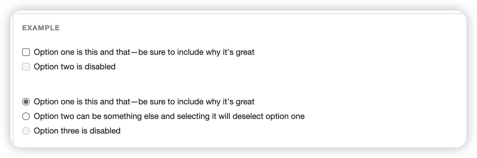
2、多选和单选框
多选框(checkbox)用于选择列表中的一个或多个选项,而单选框(radio)用于从多个选项中只选择一个。
Disabled checkboxes and radios are supported, but to provide a "not-allowed" cursor on hover of the parent <label>, you'll need to add the .disabled class to the parent .radio, .radio-inline, .checkbox, or .checkbox-inline.
1 2 3 4 5 6 7 8 9 10 11 12 13 14 15 16 17 18 19 20 21 22 23 24 25 26 27 28 29 30 31 | <div class="checkbox"> <label> <input type="checkbox" value=""> Option one is this and that—be sure to include why it's great </label></div><div class="checkbox disabled"> <label> <input type="checkbox" value="" disabled> Option two is disabled </label></div><div class="radio"> <label> <input type="radio" name="optionsRadios" id="optionsRadios1" value="option1" checked> Option one is this and that—be sure to include why it's great </label></div><div class="radio"> <label> <input type="radio" name="optionsRadios" id="optionsRadios2" value="option2"> Option two can be something else and selecting it will deselect option one </label></div><div class="radio disabled"> <label> <input type="radio" name="optionsRadios" id="optionsRadios3" value="option3" disabled> Option three is disabled </label></div> |
3、更多样式查官网
全局 CSS 样式 · Bootstrap v3 中文文档 | Bootstrap 中文网 (bootcss.com)