前端三剑客之CSS( position位置固定)
一、CSS介绍
1、CSS(层叠样式表,Cascading Style Sheets)
是一种用于描述网页内容(HTML或XML等)外观样式的标记语言。它是一种样式表语言,用于控制网页的布局、字体、颜色、大小、间距以及其他与显示有关的属性。
2、css学习步骤
- 先学习选择器,作用就是如何找到标签
- 找到标签之后,给标签增加样式
3、css选择器
选择器的语法结构
选择器 {
属性名1:属性值1
属性名2:属性值2
属性名3:属性值3
属性名4:属性值4
}
4、CSS的三种引入方式
内部样式表(Internal CSS)
在html中直接写在style标签
1 2 3 4 5 6 7 8 9 10 11 12 13 14 15 16 17 18 19 20 | <!DOCTYPE html><html><head> <style> /* CSS样式代码 */ h1 { color: blue; font-size: 28px; } p { color: #333; font-size: 16px; } </style></head><body> <h1>这是标题</h1> <p>这是段落文本。</p></body></html> |
外部样式表(External CSS)
单独写一个CSS文件,然后通过link标签引入外部的css文件
1 2 3 | <head> <link rel="stylesheet" type="text/css" href="styles.css"></head>= |
-
rel属性:定义当前链接与文档之间的关系。rel属性的值通常设置为 "stylesheet",表示该链接是一个样式表文件。 -
type属性:在引入CSS样式表时,type属性的值通常设置为 "text/css",表示链接资源是文本类型的CSS样式表。 -
href属性:指定链接资源的URL(统一资源定位符)
内联样式(Inline CSS)
直接写在标签上,行内式
1 2 3 | <body> <p style="color: #666; font-size: 18px;">这是段落文本。</p></body> |
二、选择器
1、基本选择器
1 2 3 4 5 6 7 8 9 10 11 12 13 14 15 16 17 | #p1 { # id选择器 color: red; font-size: 30px;}.c1 { # 类选择器 color: #5e5e15; font-size: 25px;}p { # p标签选择器 color: green;}* { # 通用选择器 color: orange;} |
2、组合选择器
1 2 3 4 5 6 7 | ul li .c1 { # 层级选择标签 color: red;}div > p { 选择div下的直接子标签 color: red;} |
3、属性选择器
1 2 3 4 5 6 7 8 9 10 11 | [username] { color: red; }[username=kevin] { color: red; }input[username=kevin] { color: red; } |
4、分组和嵌套
1 2 3 | div, p, span { color: red; } |
5、
1 2 3 4 5 6 7 8 9 10 11 12 13 14 15 16 17 18 19 20 21 22 23 24 25 26 27 28 29 30 31 32 33 34 35 36 37 38 39 40 41 42 43 44 45 46 47 48 49 50 | <!DOCTYPE html><html lang="en"><head> <meta charset="UTF-8"> <title>Title</title> <style> /*未访问时候显示的*/ a:link { color: #FF0000; } /* 鼠标移动到链接上 */ a:hover { color: #FF00FF } /* 选定的链接 */ a:active { color: #0000FF } /* 已访问的链接 */ a:visited { color: #00FF00 } input:focus { outline: none; background-color: #eee; } </style></head><body><a href="https://th.bing.com/th/id/R.710b1f9f2fa1799788bbb5abf080ba34?rik=%2behXZ27GYBUYkA&riu=http%3a%2f%2fimage.hnol.net%2fc%2f2018-12%2f09%2f13%2f201812091309509561-239867.jpg&ehk=VnxPBitnefIIO85WygHQiwD8AKSP29Y6ne3kfNN%2fozg%3d&risl=&pid=ImgRaw&r=0">点我看西藏</a><a href="https://cbgccdn.thecover.cn/FhqtFG-kwKJOUOhhceVFGVo-hR0O"></a><a href="https://www.bing.com/ck/a?!&&p=be6377121d25ec1bJmltdHM9MTY4OTcyNDgwMCZpZ3VpZD0zMDBjN2MwMS1iOTE0LTY0OWItMzUyNC02ZWYwYjhjNjY1MTImaW5zaWQ9NTQ4NA&ptn=3&hsh=3&fclid=300c7c01-b914-649b-3524-6ef0b8c66512&u=a1L2ltYWdlcy9zZWFyY2g_cT3nvo7lpbPlm74mRk9STT1JUUZSQkEmaWQ9MzZFQTNDQzcwNzA4NzRFNzZCMTZFNDdGRTFEMTYxNkYzRDJFOUYyNA&ntb=1">点我看美女</a><a href="https://www.bing.com/images/search?view=detailV2&ccid=xvyXerHv&id=4D8ABF6E14C4E679789B7C67804D0710D800E9C4&thid=OIP.xvyXerHv_C9XwbYeoLShCwHaNK&mediaurl=https%3a%2f%2fth.bing.com%2fth%2fid%2fR.c6fc977ab1effc2f57c1b61ea0b4a10b%3frik%3dxOkA2BAHTYBnfA%26riu%3dhttp%253a%252f%252fpic.3gbizhi.com%252f2016%252f0619%252f20160619103137648.jpg%26ehk%3dNulKD8j21Eu6wB9zuAYpgZ8H3J7vxPq8IiYqI%252bx%252fRy8%253d%26risl%3d%26pid%3dImgRaw%26r%3d0&exph=2208&expw=1242&q=%e7%be%8e%e5%a5%b3%e5%9b%be&simid=608018643482119098&FORM=IRPRST&ck=C9DB6D1F1BF97615074838D318ED4617&selectedIndex=25">点我看美女2</a><p> <!-- 文本输入框 --> <label for="username">用户名:</label> <input type="text" id="username" name="username" required> <!-- "name" 属性用于标识输入框的名称,用于在提交表单时识别输入的数据 --> </p></body></html> |
6、选择器的优先级
1 2 3 4 5 6 7 8 9 | 比较id、类、标签选择器的优先级# style样式、外部引入的CSS、行内式1. 选择器相同的情况下,谁的优先级更高行内式的优先级是最高的!!!,选择器相同,除了行内式谁离标签越近就听谁的2. 选择器不同的情况下,谁的优先级更高 # 比较id、类、标签选择器的优先级行内式 > id选择器 > 类选择器 > 标签选择器 |
三、CSS属性相关
1、宽和高(width、height)
宽和高默认情况下只能跟块级元素设置才有效
1 2 3 4 5 6 7 8 9 10 11 | /* 通过类选择器设置元素的宽度和高度 */.myClass { width: 300px; height: 150px;}/* 通过元素选择器设置元素的宽度和高度 */div { width: 400px; height: 200px;} |
设置<a>标签内容(超链接文本)的行高
使用line-height属性。line-height用于控制行间距,也就是行高,决定了文本在行内的垂直间距。
1 2 3 | selector { line-height: value px;} |
2、字体属性
1 2 3 4 5 6 7 8 | font-weight用来设置字体的字重(粗细)。 值 描述 normal 默认值,标准粗细 bold 粗体 bolder 更粗 lighter 更细 100~900 设置具体粗细,400等同于normal,而700等同于bold inherit 继承父元素字体的粗细值 |
3、 文本颜色
纯颜色单词如red、十六进制、rgb
1 2 3 4 5 6 7 8 9 10 11 12 13 14 | <style> div { font-size: 20px; /*font-family: "Bitstream Vera Sans Mono", Monaco, "Courier New", Courier, monospace;*/ /*font-weight: bold;*/ /*font-weight: bolder;*/ /*font-weight: lighter;*/ font-weight: lighter; /*color: #cbab95;*/ /*color: rgb(198, 88, 95);*/ color: rgba(100,200,100, 0.9); /*opacity: 0.1; 透明度 */ } </style> |
4、文字属性
align:对齐
text-align: center; 文字居中
text-decoration: none; 去除下划线,比如超链接中去掉下划线
hover: 鼠标移动到上面变色
1 2 3 4 5 6 7 8 9 10 11 12 13 14 15 16 17 18 19 20 21 22 | <style> p { /*text-align: left;*/ /*text-align: right;*/ /*text-align: center; 掌握这个就行了,只能跟文本内容居中*/ text-align: justify; 两端对齐 text-indent: 28px; } a { /*text-decoration: underline;*/ /*text-decoration: line-through;*/ /*text-decoration: overline;*/ /*text-decoration: none; 掌握的*/ } /* 鼠标移动到上面变色 */ a:hover { color: red; /* 或者您想要的颜色 */ } </style> |
5、背景属性
1 2 3 4 5 6 7 8 9 10 11 12 13 14 15 16 17 18 19 20 21 22 | <style> div { width: 800px; height: 800px; border: 1px solid black; text-align: center; color: #df61ab; font-weight: lighter; /*background-color: red;*/ background-image: url("th.jpeg"); /*background-repeat: repeat-x;*/ /*background-repeat: repeat-y;*/ /*background-repeat: no-repeat;*/ /*background-position: 200px 350px;*/ /*background-position: center center;*/ /*background: url("1234.png") repeat-x red center center ;*/ /*background: repeat-x red;*/ } </style>## center center 水平和垂直方向都居中 |
注意:
background-image 设置背景图片
border: 1px solid red; 中 solid 表示边框的样式。solid 指定边框为实线样式
6、边框属性
border-width 用于设置边框的宽度
可以使用像素(px)、百分比(%)或其他单位来指定宽度。可以单独为每个边框(上、右、下、左)设置不同的宽度,也可以使用缩写形式同时设置四个边框的宽度。
border-style 用于设置边框的样式
决定了边框的外观,可以选择 none、hidden、dotted、dashed、solid、double、groove、ridge、inset、outset 等样式。与 border-width 一样,您也可以为每个边框单独设置样式或使用缩写形式同时设置四个边框的样式。
border-color 用于设置边框的颜色
1 2 3 4 5 6 7 8 9 10 11 12 13 14 15 16 17 18 19 20 21 22 | /* 分别设置每个边框的宽度、样式和颜色 */div { border-top-width: 2px; border-right-width: 1px; border-bottom-width: 3px; border-left-width: 1px; border-top-style: solid; border-right-style: dotted; border-bottom-style: dashed; border-left-style: double; border-top-color: red; border-right-color: blue; border-bottom-color: green; border-left-color: yellow;}/* 缩写形式同时设置宽度、样式和颜色 */p { border: 1px solid black;} |
border-radius 属性
用于设置元素的圆角效果。通过调整 border-radius 属性,你可以将一个矩形元素的角变成圆形或椭圆形,从而实现更加美观的界面设计。
border-radius 属性不仅可以用于普通的块级元素,还可以用于圆形图片、按钮等。它可以让元素的外观更加柔和和美观,并且可以轻松地创建各种不同样式的元素。
单个值:指定一个值时,所有四个角都具有相同的圆角大小。
1 2 3 4 | /* 圆形 */border-radius: 50%;/* 圆角矩形 */border-radius: 10px; |
两个值:第一个值应用于左上角和右下角,第二个值应用于右上角和左下角
1 2 | /* 水平方向圆角不同,垂直方向圆角相同 */border-radius: 20px 10px; |
三个值:第一个值应用于左上角,第二个值应用于右上角和左下角,第三个值应用于右下角。
1 2 | /* 左上角圆角、右上角和左下角圆角相同,右下角圆角不同 */border-radius: 20px 10px 15px; |
四个值:按顺序应用于左上角、右上角、右下角和左下角。
1 2 | /* 左上角圆角不同,右上角、右下角和左下角圆角相同 */border-radius: 10px 20px 10px 20px; |
补充:利用border-radius实现圆脸头像
1 2 3 4 5 6 7 8 9 10 11 12 13 14 15 16 17 18 19 20 21 22 23 24 25 26 27 28 29 30 31 32 33 34 35 36 | <head> <meta charset="UTF-8"> <title>圆脸</title> <style> * { margin: 0; padding: 0; background: #eeeeee; } div { width: 100px; height: 100px; border: 1px solid black; margin: 0 auto; border-radius: 50%; overflow: hidden; position:fixed; right: 50%; bottom: 50%; text-align: center; } img { width: 100%; } </style></head><body><div> <img src="111.png" alt="可爱的小圆头"></div></body> |
注⚠️:
1. * 选择器先去掉默认的margin、padding值
2. div作为父标签定义头像框的大小、颜色、设置边框圆角效果(border-radius: 50%)
3. 解决溢出overflow、定位到屏幕的位置
4.头像像素大小要合适
效果:

7、display属性
原文:
1. 要求浏览器不显示第一行内容
display: none; 掩藏展示且连行一起去掉
visibility: hidden; 掩藏展示,但是保留行
1 2 3 4 5 6 7 | #d1 { width: 300px; height: 100px; background: red; display: none; /*visibility: hidden;*/ } |
2. 将块元素在一行内展示
display: inline-block;
这允许该元素在行内占据一定的空间,并且具有块级元素的特性。
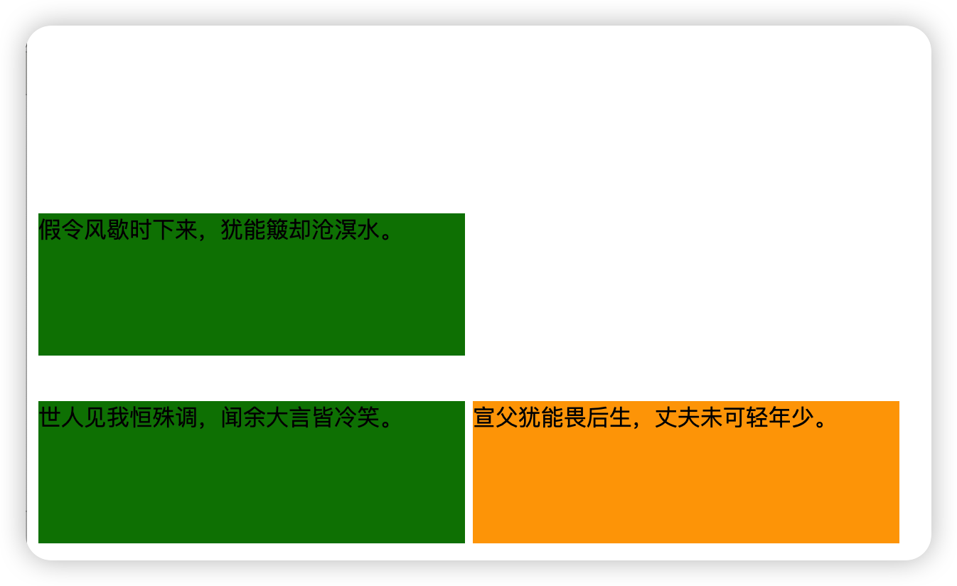
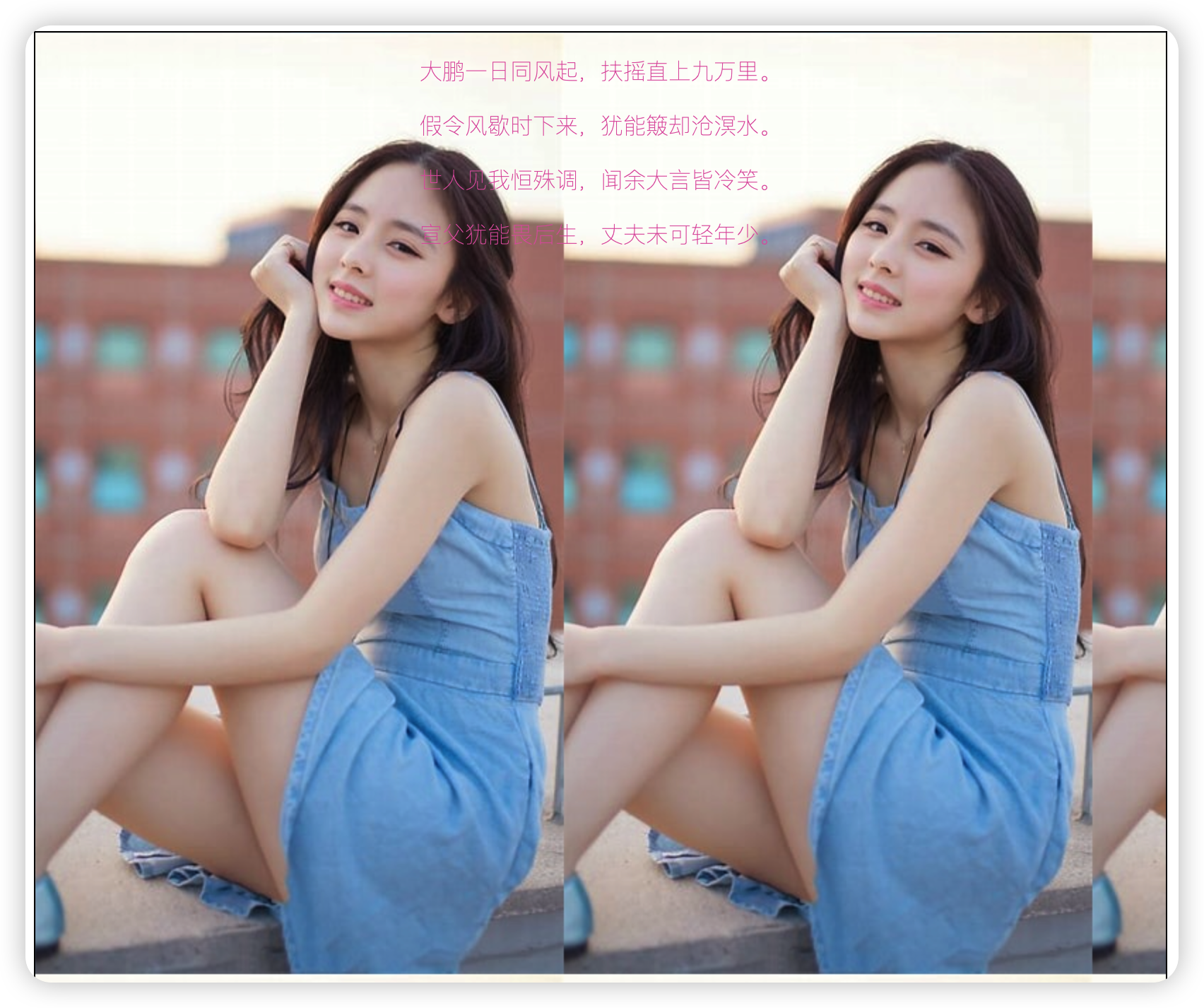
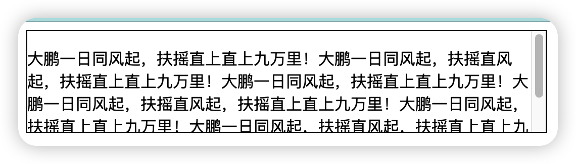
1 2 3 4 5 6 7 8 9 10 11 12 13 14 15 16 17 18 19 20 21 22 23 24 25 26 27 28 29 30 31 32 33 34 35 36 37 38 39 40 41 42 43 44 45 46 47 48 49 50 51 52 53 | <!DOCTYPE html><html lang="en"><head> <meta charset="UTF-8"> <title>Title</title> <style> #d1 { width: 300px; height: 100px; background: red; /*display: none;*/ visibility: hidden; } #d2 { width: 300px; height: 100px; background: green; } .c3 { width: 300px; height: 100px; background: green; display: inline-block; } .c4 { width: 300px; height: 100px; background: orange; display: inline-block; </style></head><body><p id="d1" class="c1">大鹏一日同风起,扶摇直上九万里。</p><p id="d2" class="c2">假令风歇时下来,犹能簸却沧溟水。</p><p id="d3" class="c3">世人见我恒殊调,闻余大言皆冷笑。</p><p id="d4" class="c4"> 宣父犹能畏后生,丈夫未可轻年少。</p></body></html> |
是 CSS 中的一个布局属性,用于创建弹性(flex)布局容器。
它是 CSS3中引入的弹性布局模型,使用 display: flex; 时,元素内部的子元素(称为 flex 项目)会成为一个弹性容器,
它们可以根据容器的方向和尺寸来自动调整位置和大小。这种布局方式提供了更多控制,使得调整和排列元素变得更加容易和直观。
-
flex-direction: 控制弹性容器内子元素的排列方向。可以设置为row(默认值,从左到右排列)、row-reverse(从右到左排列)、column(从上到下排列)、column-reverse(从下到上排列)。 -
justify-content: 定义了弹性项目在主轴上的对齐方式(水平方向)。可以设置为flex-start(靠左对齐)、flex-end(靠右对齐)、center(居中对齐)、space-between(两端对齐,项目之间的间距相等)、space-around(每个项目两侧的间距相等,项目之间的间距是它们的一半)等。 -
align-items: 定义了弹性项目在交叉轴上的对齐方式(垂直方向)。可以设置为flex-start(靠上对齐)、flex-end(靠下对齐)、center(居中对齐)、baseline(以基线对齐,适用于文本)等。 -
flex-wrap: 控制弹性项目是否换行。可以设置为nowrap(默认值,不换行)、wrap(换行,第一行在上方)、wrap-reverse(换行,第一行在下方)。 -
align-content: 当弹性项目换行时,定义了多根轴线(行)之间的对齐方式(垂直方向)。可以设置为flex-start(靠上对齐)、flex-end(靠下对齐)、center(居中对齐)、space-between(两端对齐,项目之间的间距相等)、space-around(每个项目两侧的间距相等,项目之间的间距是它们的一半)等。
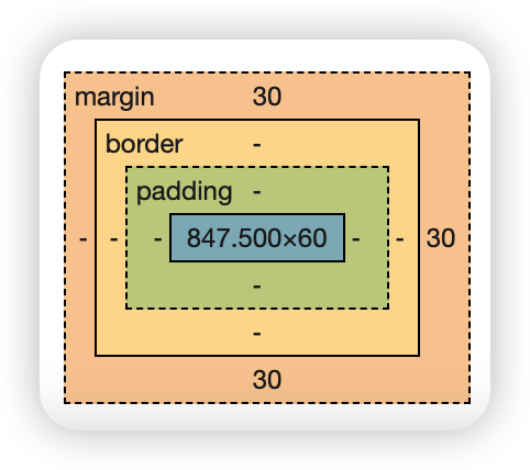
1、盒子与盒子之间的关系
1 2 3 4 5 6 | 快递盒与快递盒之间的距离称为是外边距----------->margin值快递盒与内部的物品之间的距离称为是内边距---------->padding值快递盒子的厚度称之为是边框--------------->border表示物品的实际大小称之为是内容-------------->content来表示# 调整标签与标签之间的距离使用的是margin值 |
在CSS中,可以通过设置以下属性来调整盒子模型的不同部分:
-
width和height:用于设置元素的宽度和高度。 -
padding:用于设置元素的内边距,可以单独设置四个方向的内边距,或者使用缩写形式同时设置四个方向的内边距。 -
border:用于设置元素的边框样式,可以设置边框的样式、宽度和颜色。 -
margin:用于设置元素的外边距,可以单独设置四个方向的外边距,或者使用缩写形式同时设置四个方向的外边距。
CSS盒子模型是网页布局和设计的重要概念,通过合理设置内边距、边框和外边距,可以实现丰富多样的页面布局效果
浏览器可看到盒子模型
2、float 浮动
float: right; 或者 float: left;
浮动可以让两个块元素放在一行
原始效果:
要求使下面两行文本一行显示
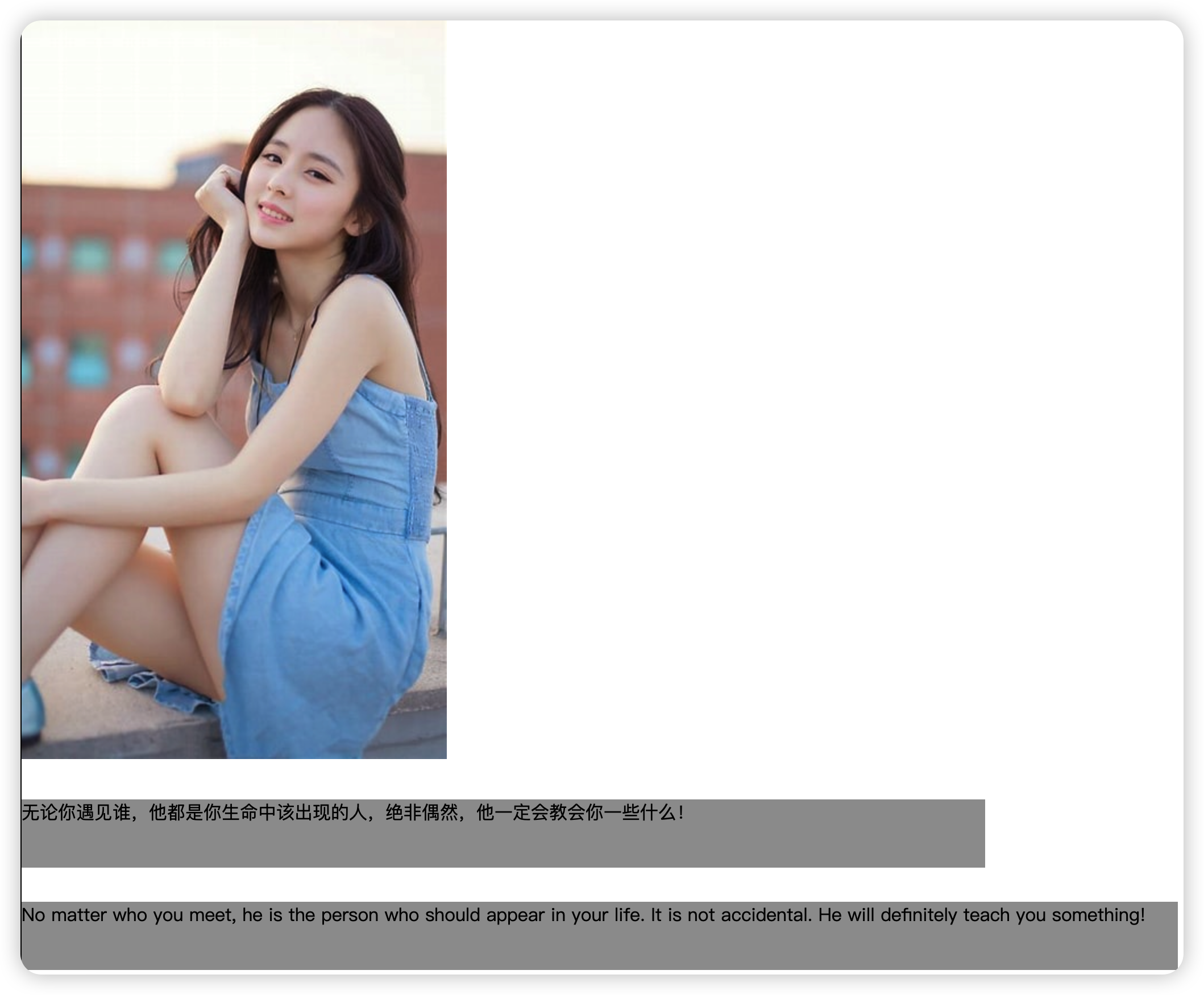
1 2 3 4 5 6 7 8 9 10 11 12 13 14 15 16 17 18 19 20 21 22 23 24 25 26 27 28 29 30 31 32 33 34 35 36 37 38 39 40 41 42 43 44 | <style> .float-left { border: black solid 1px; } .c1 { margin: 30px; margin-left: 0; /*width: 50%;*/ height: 60px; background-color: #9c9c9c; float: left; } .c2 { margin: 30px; margin-left: 0; /*width: 60%;*/ height: 60px; background-color: #9c9c9c; float: right; } </style></head><body><div class="float-left"> <p> <img src="th.jpeg" alt="Image"> </p> <p class="c1"> 无论你遇见谁,他都是你生命中该出现的人,绝非偶然,他一定会教会你一些什么! </p> <p class="c2"> No matter who you meet, he is the person who should appear in your life. It is not accidental. He will definitely teach you something! </p></div></body> |
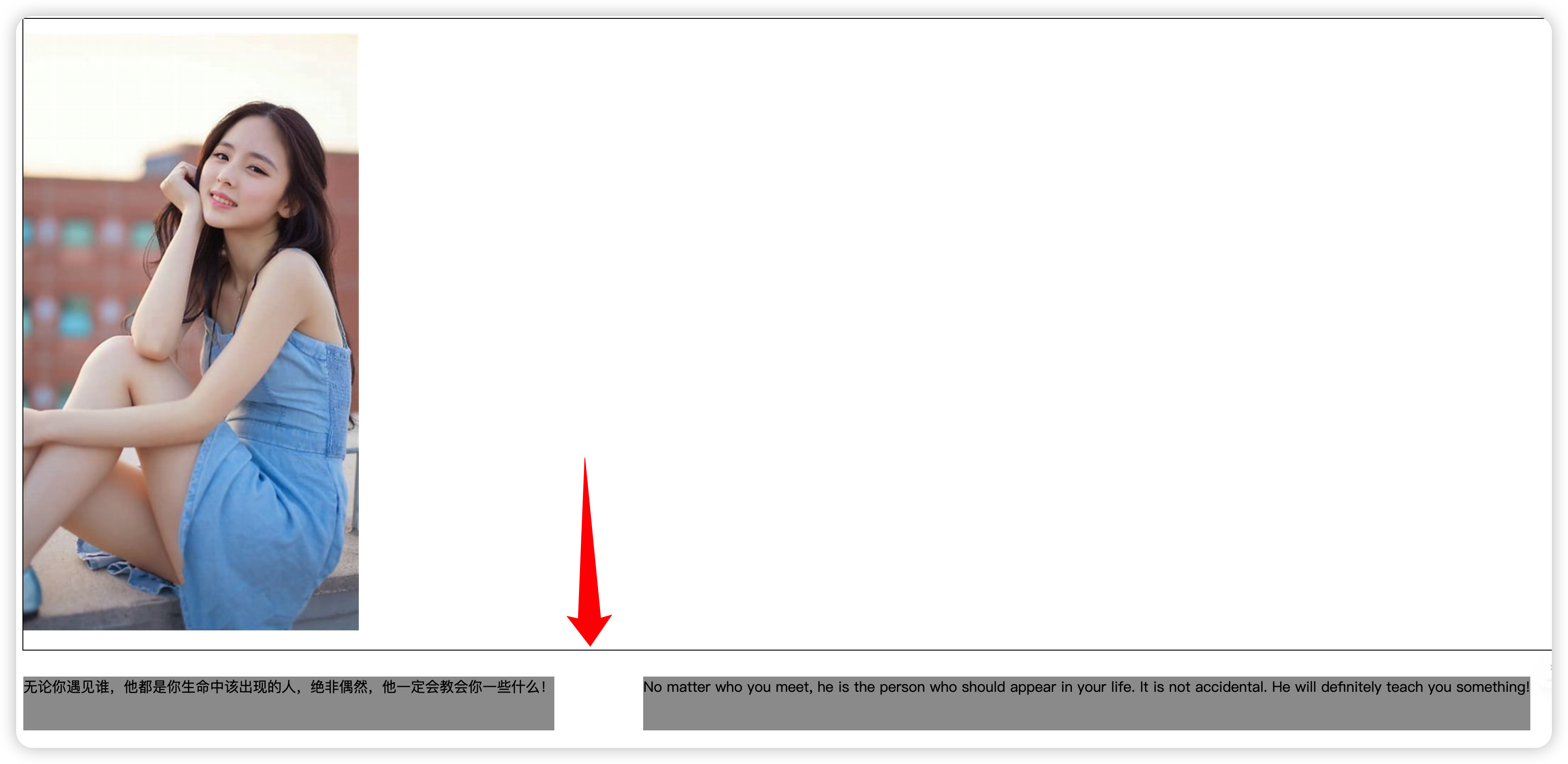
此时:文本框出现塌陷,这不是需要的效果
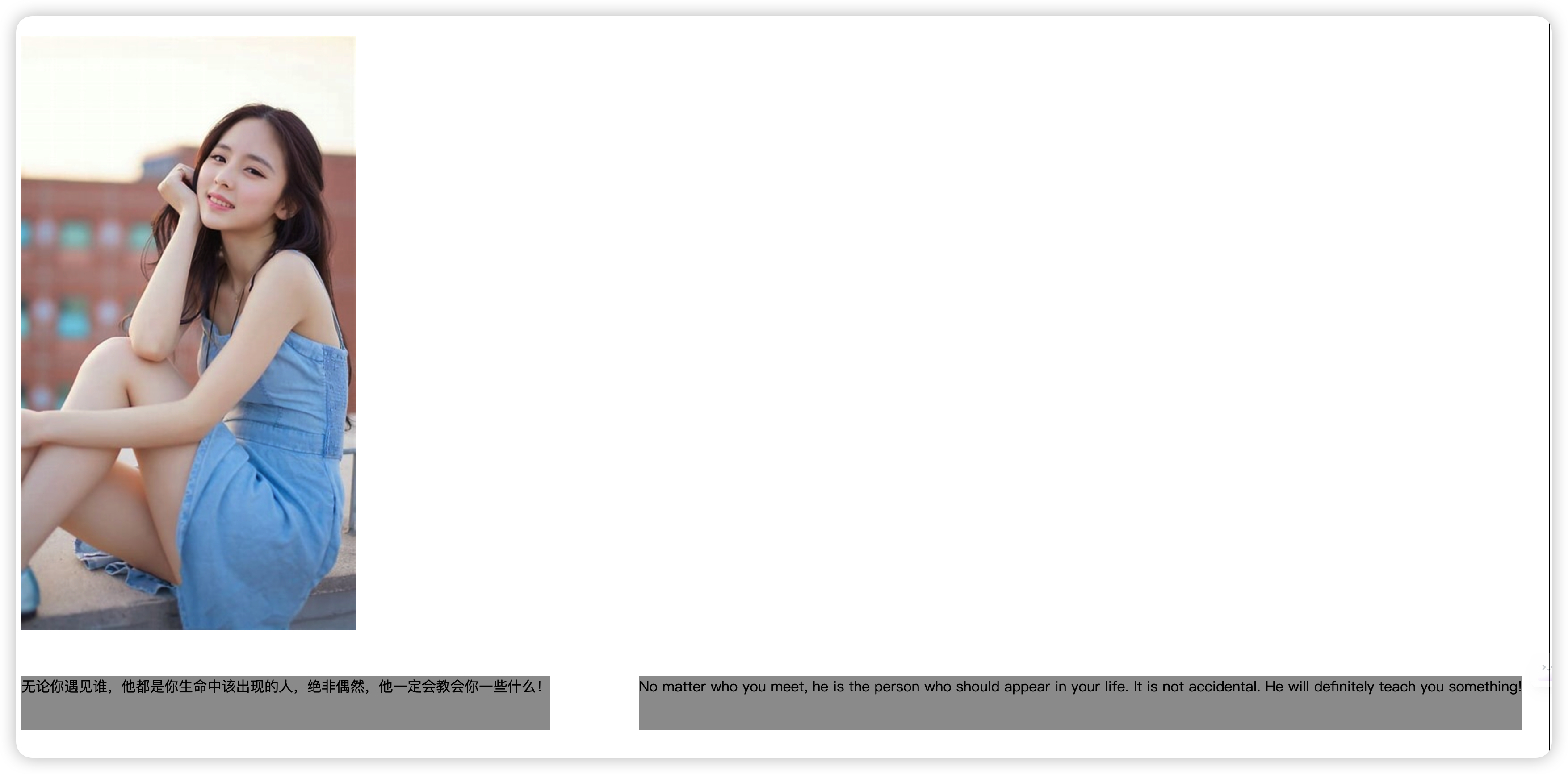
1 2 3 4 5 6 7 8 9 10 11 12 13 14 15 16 17 18 19 20 21 22 23 24 25 26 27 28 29 30 31 32 33 34 35 36 37 38 39 40 41 42 43 44 45 46 47 48 | <style> .float-left { border: black solid 1px; } .c1 { margin: 30px; margin-left: 0; /*width: 50%;*/ height: 60px; background-color: #9c9c9c; float: left; } .c2 { margin: 30px; margin-left: 0; /*width: 60%;*/ height: 60px; background-color: #9c9c9c; float: right; } .clearfix:after { content: ""; display: block; clear: both; } </style></head><body><div class="float-left clearfix"> <p> <img src="th.jpeg" alt="Image"> </p> <p class="c1"> 无论你遇见谁,他都是你生命中该出现的人,绝非偶然,他一定会教会你一些什么! </p> <p class="c2"> No matter who you meet, he is the person who should appear in your life. It is not accidental. He will definitely teach you something! </p></div></body> |
注:
使用 clearfix 修复float带来的影响
clearfix 要指明修复的对象,如 div标签<div class="float-left clearfix">
3、clearfix 技术
在CSS中,clearfix 用于解决由于使用浮动(float)布局而导致的父元素高度塌陷(高度坍塌)问题。当子元素浮动时,它们会脱离正常的文档流,这可能会导致父元素的高度无法正确包含浮动的子元素,从而导致父元素的高度塌陷。
为了解决这个问题,我们可以使用clearfix技巧来清除浮动。clearfix本质上是一个伪元素(pseudo-element),通过在父元素上添加一个伪元素,并将其清除属性设置为clear: both;,来实现父元素正确包含浮动子元素的效果。
通常,在父元素上应用clearfix的类或选择器具有以下样式规则:
1 2 3 4 5 | .clearfix::after { content: ""; display: table; clear: both;} |
解释每个样式规则:
-
content: "";:在伪元素中插入一个空的内容。这是伪元素所必需的,因为它需要一些内容来呈现。 -
display: table;:将伪元素的显示类型设置为table。这是为了确保伪元素占据父元素的宽度,并清除浮动元素。 -
clear: both;:清除浮动。这会使伪元素位于浮动元素的下方,从而将父元素的高度正确扩展以包含浮动的子元素。
使用clearfix技巧可以有效地解决浮动元素造成的高度塌陷问题,保持布局的完整性和稳定性。在现代CSS布局中,更多地使用Flexbox或Grid布局来实现复杂和灵活的布局,而clearfix主要用于旧有的浮动布局兼容性或特定场景下的清除浮动需求。
4、
现象:文本内容超出边框的范围
解决:
1 2 3 4 5 6 7 8 9 | <style> div { width: 30%; height:100px; border: 1px solid black; overflow: auto; # 解决溢出 /*overflow: visible*/ } </style> |
效果:出现滚动条
overflow属性的参数:
1 2 3 4 5 6 7 8 9 10 | 值 描述visible 默认值。内容不会被修剪,会呈现在元素框之外。hidden 内容会被修剪,并且其余内容是不可见的。scroll 内容会被修剪,但是浏览器会显示滚动条以便查看其余的内容。auto 如果内容被修剪,则浏览器会显示滚动条以便查看其余的内容。inherit 规定应该从父元素继承 overflow 属性的值。● overflow (水平和垂直均设置)● overflow-x(设置水平方向)● overflow-y(设置垂直方向) |
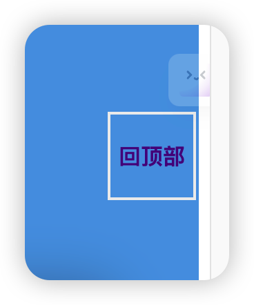
5、定位 position
效果:回顶部的效果
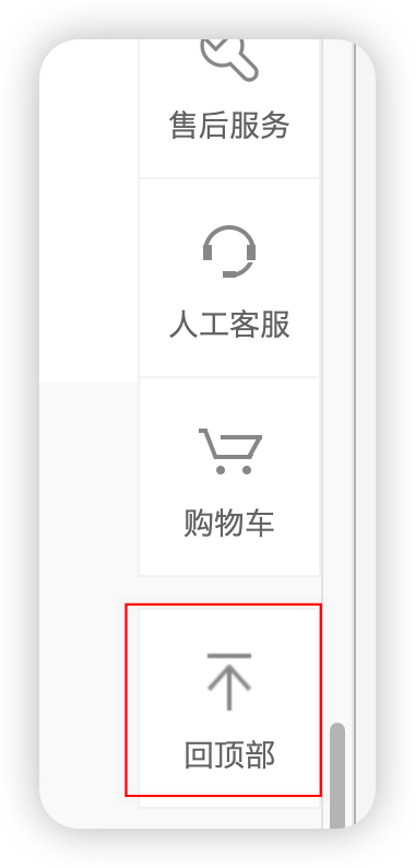
实现:
1 2 3 4 5 6 7 8 9 10 11 12 13 14 15 16 17 18 19 20 21 22 23 24 25 | <style> .c1 { width: 60px; height: 60px; border:2px solid #EEEEEE; position:fixed; right: 10px; bottom: 60px; text-align: center; display: flex; /* 使用弹性布局 */ justify-content: center; /* 水平居中 */ align-items: center; /* 垂直居中(可选,如果需要垂直居中也可以加上) */ } a { font-weight: bolder; text-decoration: none; } </style></head><body> <div style="height: 500px;background-color: #df61ab"></div> <div style="height: 500px;background-color: #52a0e5"></div> <div style="height: 500px;background-color: #9c9c9c"></div> <div class="c1"><a href="">回顶部</a></div></body> |
1 2 3 4 5 6 7 | 1. static-------->静止的----->默认情况下,所有的标签都是不能够移动的2. 相对定位:就是相对标签自己原来的位置定位----->relative相对的3. 绝对定位:就是相对于它的父标签进行定位,如果没有父标签,就相对于body标签---->absolute绝对定位 # 如果相对于父标签移动,前提是父标签必须是可移动的,言外之意就是父标签先设置: position: relative;4. 固定定位:就是相对于浏览器窗口定位 |
五、 思路分享
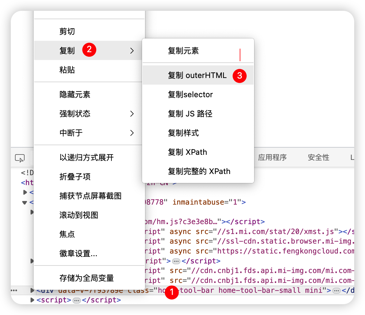
1、仿写页面
用到的图片直接复制小米官网的链接(图片基本都是存在云服务器的对象存储里),图片链接在F12源码处。
比如:
1 2 3 4 5 6 7 | <a href=""><img src="https://cdn.cnbj1.fds.api.mi-img.com/mi.com-assets/shop/img/logo-mi2.png"></a># 图片的像素大小使用img标签调节img {width: 40px;height: 40px} |
2、要看哪一块的源码,直接右键检查就定位到了
3、复制别人的代码,进行修改
4、如何快速同步一篇博客园文章?
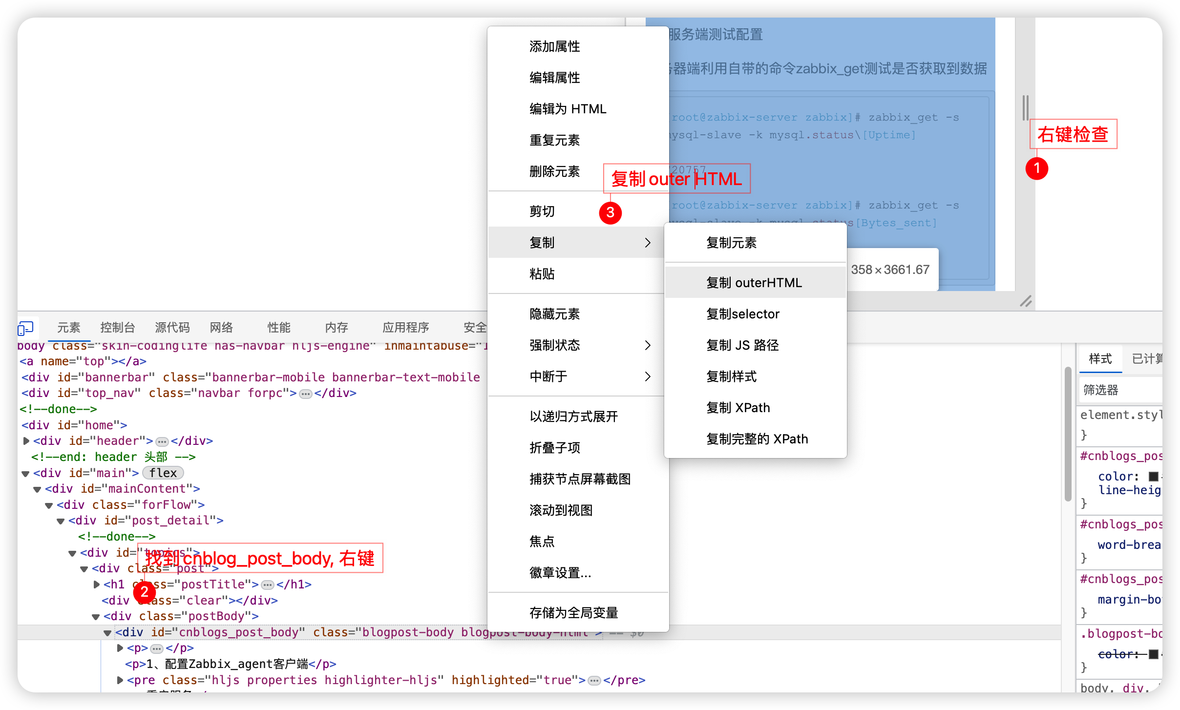
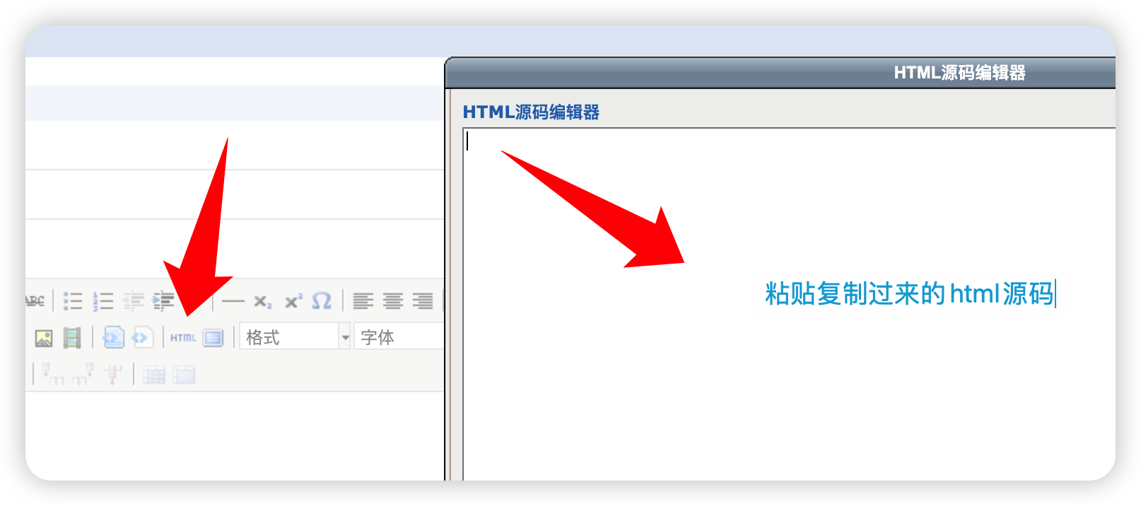
效果完全和原文章一样