WPF Layout Philosophy
(*) Elements (like controls) should not be explicitly sized. Instead, they grow to fit their
content. For example, a button expands as you add more text. You can limit controls to
acceptable sizes by setting a maximum and minimum size.
(*) Elements do not indicate their position with screen coordinates. Instead, they are
arranged by their container based on their size, order, and (optionally) other information
that’s specific to the layout container. If you need to add whitespace between
elements, you use theMargin property.
(*) Layout containers “share” the available space among their children. They attempt to
give each element its preferred size (based on its content) if the space is available. They
can also distribute extra space to one or more children.
(*) Layout containers can be nested. A typical user interface begins with the Grid, WPF’s
most capable container, and contains other layout containers that arrange smaller
groups of elements, such as captioned text boxes, items in a list, icons on a toolbar, a
column of buttons, and so on.
控件大小和位置是被决定的
An element can’t always get its preferred size—sometimes the container isn’t large enough to accommodate it.
In this case, the container must truncate the offending element to fit the visible area.
As you’ll see, you can often avoid this situation by setting a minimum window size.
各种Panel
The key point to understand with panels is that, as containers, they are responsible for the positioning (and in some cases, the sizing) of all the controls placed within. This means that the individual child controls themselves don’t need to be aware of the specific layout system they are participating in—which greatly simplifies the code and architecture.
|
StackPanel |
Places elements in a horizontal or vertical stack. This layout container is typically used for small sections of a larger, more complex window. |
|
WrapPanel |
Places elements in a series of wrapped lines. In horizontal orientation, the WrapPanel lays items out in a row from left to right and then onto subsequent lines. In vertical orientation, the WrapPanel lays out items in a top-to-bottom column and then uses additional columns to fit the remaining items. |
|
DockPanel |
Aligns elements against an entire edge of the container. |
|
Grid |
Arranges elements in rows and columns according to an invisible table. This is one of the most flexible and commonly used layout containers. In fact, the Grid is so useful that when you add a new XAML document for a window in Visual Studio, it automatically adds the Grid tags as the first-level container. |
|
UniformGrid |
Places elements in an invisible table but forces all cells to have the same size. This layout container is used infrequently. |
|
Canvas |
Allows elements to be positioned absolutely using fixed coordinates. This layout container is the most similar to traditional Windows Forms, but it doesn’t provide anchoring or docking features. |
Panel会给放置在里面的children附加attached property
Different layout containers can provide attached properties to their children. For example, all the children of
a Grid object gain Row and Column properties that allow them to choose the cell where they’re placed.
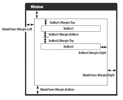
图解Margin
Margin四元组对应着leftMargin,TopMargin, RightMargin, BottomMargin,而不是坐标。
Grid的大小设置
先赞一个,Grid真是太好用了。有三种方法来设置单元格大小,也就是column的宽度和row的长度,
按比例
在Grid里按比例缩放,用*来说明,*表示单位一,*前面的数字表示有多少个单位一。
<RowDefinition Height="45*" />
<RowDefinition Height="147*" />
无论怎么缩放,第一行的高度都是第二行的45/147。
如果只有一个*,那么1可以省略:
<RowDefinition Height="*" />等价于<RowDefinition Height="1*" />
固定
如果只有数字不加*,就和fixxed size没有两样了。
按需
<ColumnDefinition Width="Auto"/>
按内容分配,需要多少就给多少少,不少给,也不多给。
控件跨多单元格
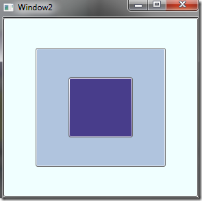
用一个例子说明:先定义一个6*6的Grid,每个单元格大小相同。然后往里放三个按钮:
注意它们的初始位置和Span大小。
<Button Grid.Row="0" Grid.Column="0" Grid.RowSpan="6" Grid.ColumnSpan="6" Background="Azure"/>
<Button Grid.Row="1" Grid.Column="1" Grid.RowSpan="4" Grid.ColumnSpan="4" Background="LightSteelBlue"/>
<Button Grid.Row="2" Grid.Column="2" Grid.RowSpan="2" Grid.ColumnSpan="2" Background="DarkSlateBlue"/>
 可见,控件的层叠上下关系和他们在XAML中声明的先后顺序有关。
GridSpliter动态调整划分后的单元格大小
GridSpliter必须放在Grid里面,并让它独占Grid中的一行或一列。
对水平和竖直的GridSpliter,都应设置至少5个属性:
| Horizontal splitter (横线) |
set VerticalAlignment to Center; set HorizontalAlignment to Strech; set Height, Grid.Row, Grid.ColumnSpan |
| Vertical splitter (竖线) |
set HorizontalAlignment to Center; set VerticalAlignment to Strech; set Width, Grid.Column, Grid.RowSpan |
有一点需要注意:应该把GridSpliter理解成一条直线而非线段。无论Grid.ColumnSpan或Grid.RowSpan设置成多少,拖动spliter bar时都会改变整个Grid的比例,即便那部分Grid没有包含在spliter的span里。所以为了图省事,尽量把Span设得大一点好了,比如99。
另外,在一个Grid里只能有水平或竖直中的一种,不能既有水平又有竖直。如果要做出类似效果,可以用Grid嵌套与Shared Size Group相结合的方式。
Shared Size Groups
A Grid contains a collection of rows and columns, which are sized explicitly, proportionately, or based on
the size of their children. There’s one other way to size a row or a column—to match the size of another row or column. The goal of shared size groups is to keep separate portions of your user interface consistent.
用法:
只要设置一个SharedSizeGroup属性就可以了,多个设置了同一个SharedSizeGroup值的控件会自动同步大小。
SharedSizeGroup的可见范围是一个Window,而不是整个Application,只有在同一个窗体之内才能共享大小。
例子:
下面是这个可拖动窗体的代码:
看这段代码的时候请留意:
(*) 在Grid标签里:Grid.IsSharedSizeScope="True"必须设置,否则共享大小不起作用。
(*) <ColumnDefinition Width="auto" SharedSizeGroup="Column1"/>就是使用方法,
Column1是随便起的名字,width要设置成auto。
设置成auto也即意味着里面要有内容,否则宽度为0。
<Grid.RowDefinitions>
<RowDefinition Height="*" />
<RowDefinition Height="Auto" />
<RowDefinition Height="*" />
</Grid.RowDefinitions>
<Grid Name="grid1">
<Grid.ColumnDefinitions>
<ColumnDefinition Width="auto" SharedSizeGroup="Column1"/>
<ColumnDefinition Width="auto" /><!--放置spliter-->
<ColumnDefinition Width="*" />
</Grid.ColumnDefinitions>
<Label Grid.Column="0">aaaa</Label>
<GridSplitter Grid.Column="1" VerticalAlignment="Stretch" HorizontalAlignment="Center" Width="5"></GridSplitter>
</Grid>
<Grid Name="grid2" Grid.Row="2">
<Grid.ColumnDefinitions>
<ColumnDefinition Width="auto" SharedSizeGroup="Column1"/>
<ColumnDefinition Width="auto" /><!--放置spliter-->
<ColumnDefinition Width="*" />
</Grid.ColumnDefinitions>
<GridSplitter Grid.Column="1" VerticalAlignment="Stretch" HorizontalAlignment="Center" Width="5"></GridSplitter>
</Grid>
<GridSplitter Grid.Row="1" VerticalAlignment="Center" HorizontalAlignment="Stretch" Height="5"/>
</Grid>
Canvas ——Coordinate-Based Layout
To position an element on the Canvas, you set the attached Canvas.Left and Canvas.Top properties.
Alternatively, you can use Canvas.Right instead of Canvas.Left to space an element from the right
edge of the Canvas, and Canvas.Bottom instead of Canvas.Top.
Z-Order
Ordinarily, all the elements you add have the same ZIndex—0. When elements have the
same ZIndex, they’re displayed in the same order that they exist in Canvas.Children collection.
Higher ZIndex elements always appear over lower ZIndex elements.You can set the ZIndex using
any positive or negative integer.


【推荐】国内首个AI IDE,深度理解中文开发场景,立即下载体验Trae
【推荐】编程新体验,更懂你的AI,立即体验豆包MarsCode编程助手
【推荐】抖音旗下AI助手豆包,你的智能百科全书,全免费不限次数
【推荐】轻量又高性能的 SSH 工具 IShell:AI 加持,快人一步
· 如何编写易于单元测试的代码
· 10年+ .NET Coder 心语,封装的思维:从隐藏、稳定开始理解其本质意义
· .NET Core 中如何实现缓存的预热?
· 从 HTTP 原因短语缺失研究 HTTP/2 和 HTTP/3 的设计差异
· AI与.NET技术实操系列:向量存储与相似性搜索在 .NET 中的实现
· 10年+ .NET Coder 心语 ── 封装的思维:从隐藏、稳定开始理解其本质意义
· 地球OL攻略 —— 某应届生求职总结
· 提示词工程——AI应用必不可少的技术
· Open-Sora 2.0 重磅开源!
· 周边上新:园子的第一款马克杯温暖上架