Python数据挖掘学习进度02(matplotlib之helloword、折线图)
matplotlib介绍:
Matplotlib 是专门用于开发2D图表(包括3D图表)的python库
对应的JS库有 D3 (opens new window)echarts
官网:Matplotlib
为神魔要学习matplotlib:
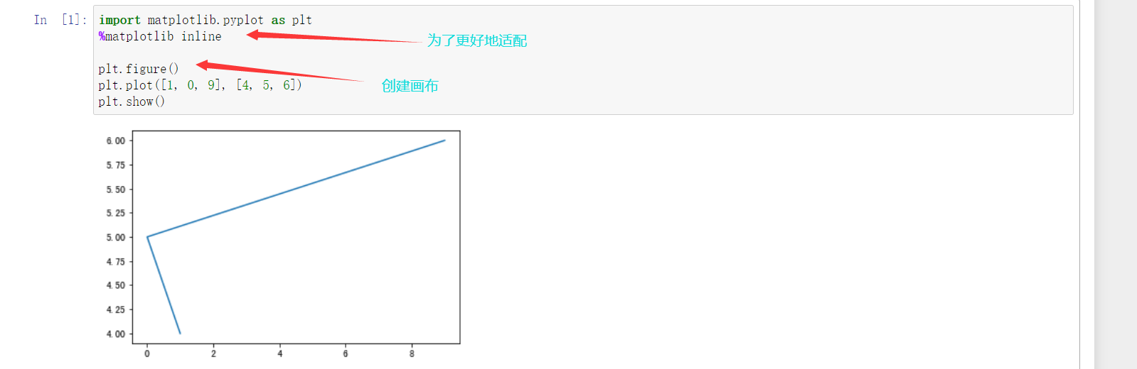
实现一个简单的matplotlib画图:
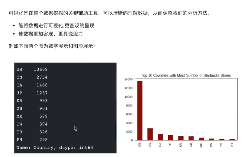
我们可以将图丰富起来。如下所示

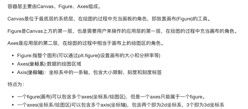
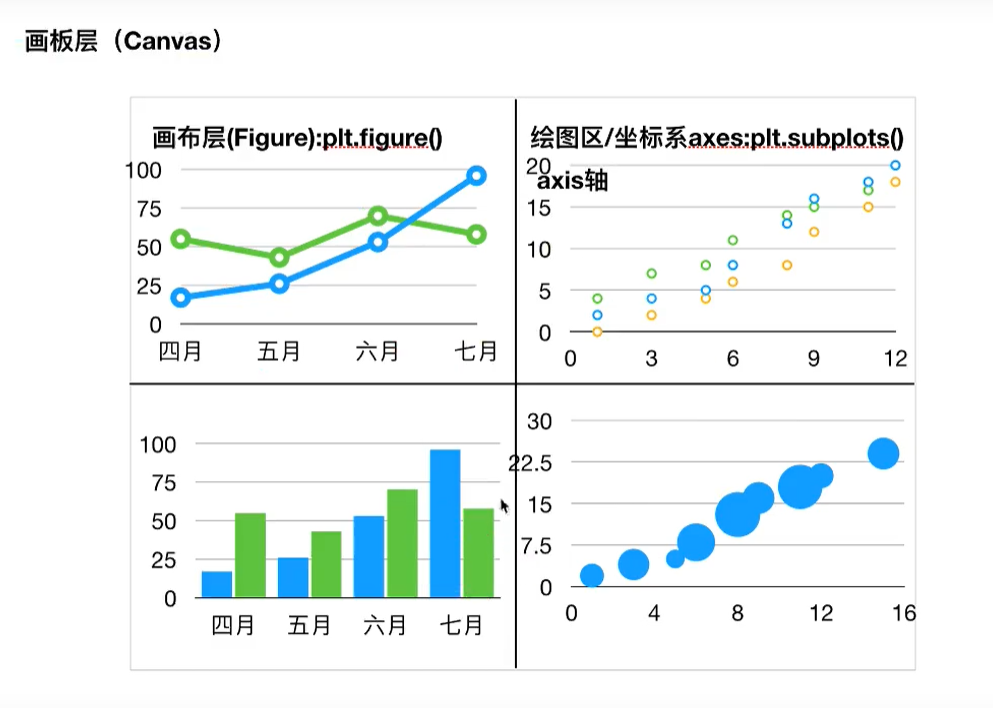
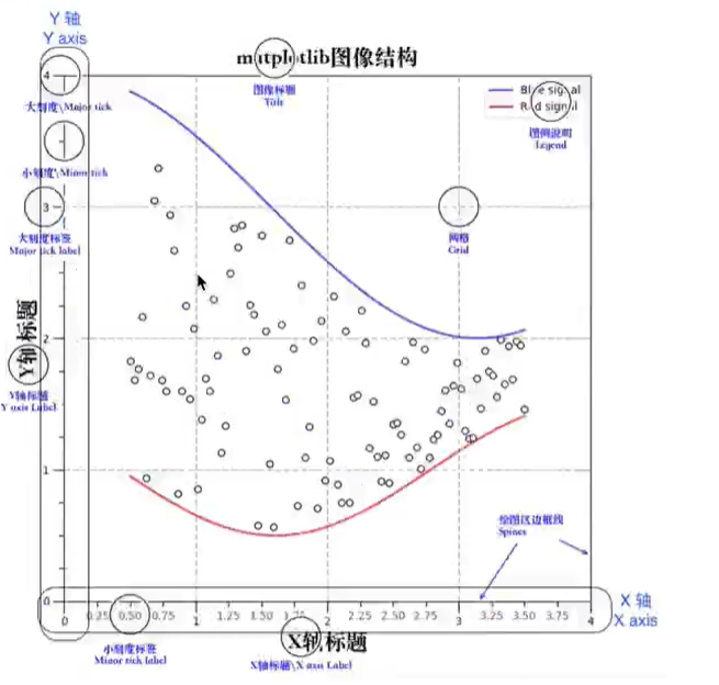
matplotlib的三层结构:
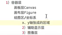
容器:
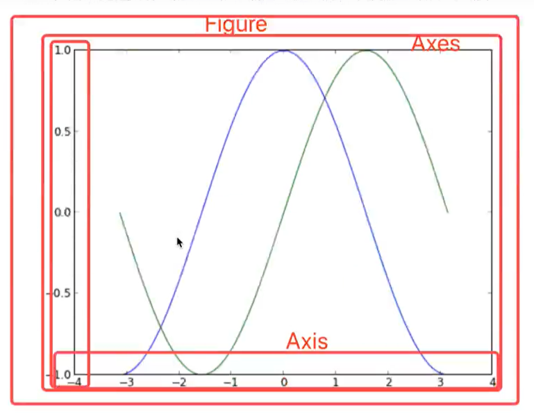
辅助显示层:

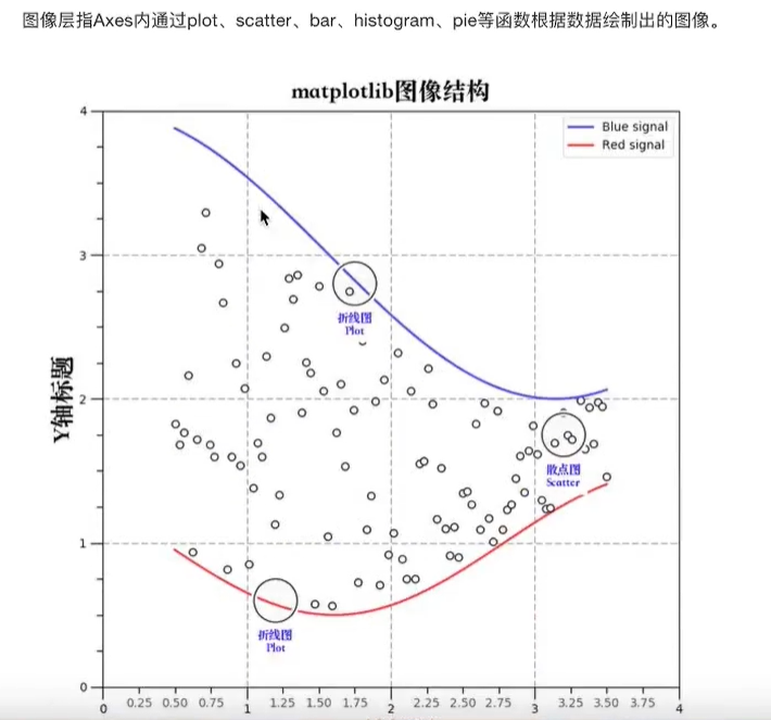
图像层:
总结:

折线图:
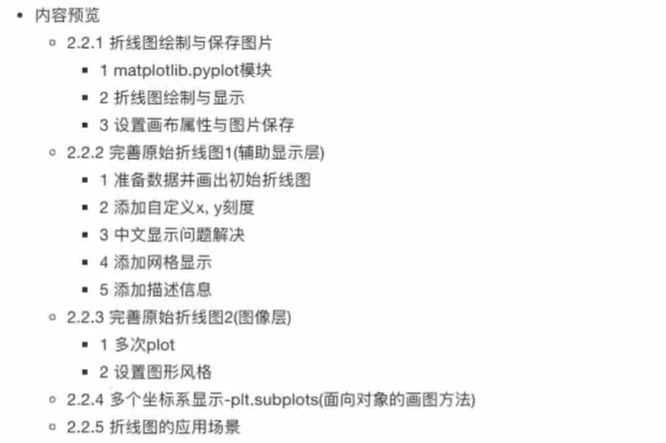
折线图绘制与保存图片:
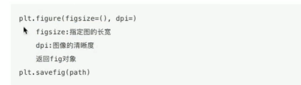
设置画布属性和图片保存:

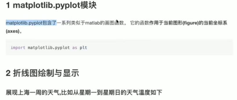
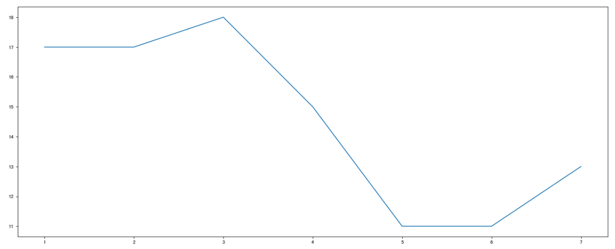
 展现上海一周的天气,比如从星期一到星期日的天气温度如下
# 1、创建画布
plt.figure(figsize=(20, 8), dpi=80)

# 2、绘制图像
plt.plot([1, 2, 3, 4, 5, 6, 7], [17, 17, 18, 15, 11, 11, 13])

# 保存图像
plt.savefig("test78.png")

# 3、显示图像
plt.show()
完善原始折线图1(辅助显示器):
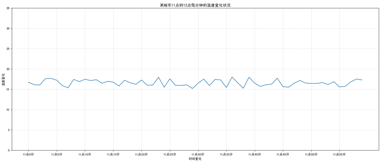
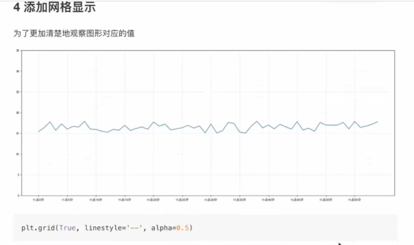
显示温度变化状况:
# 需求:画出某城市11点到12点1小时内每分钟的温度变化折线图,温度范围在15度~18度
import random

# 1、准备数据 x y
x = range(60)
y_shanghai = [random.uniform(15, 18) for i in x]

# 2、创建画布
plt.figure(figsize=(20, 8), dpi=80)

# 3、绘制图像
plt.plot(x, y_shanghai)

# 修改x、y刻度
# 准备x的刻度说明
x_label = ["11点{}分".format(i) for i in x]
plt.xticks(x[::5], x_label[::5])
plt.yticks(range(0, 40, 5))

# 添加网格显示
plt.grid(linestyle="--", alpha=0.5)

# 添加描述信息
plt.xlabel("时间变化")
plt.ylabel("温度变化")
plt.title("某城市11点到12点每分钟的温度变化状况")

# 4、显示图
plt.show()
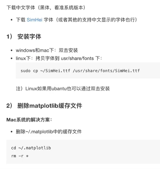
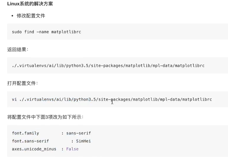
中文显示问题:

添加网格:
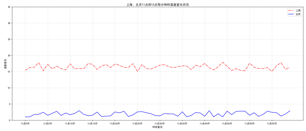
完善原始折线图2(图像层):
# 需求:再添加一个城市的温度变化
# 收集到北京当天温度变化情况,温度在1度到3度。

# 1、准备数据 x y
x = range(60)
y_shanghai = [random.uniform(15, 18) for i in x]
y_beijing = [random.uniform(1, 3) for i in x]

# 2、创建画布
plt.figure(figsize=(20, 8), dpi=80)

# 3、绘制图像
plt.plot(x, y_shanghai, color="r", linestyle="-.", label="上海")
plt.plot(x, y_beijing, color="b", label="北京")

# 显示图例
plt.legend()

# 修改x、y刻度
# 准备x的刻度说明
x_label = ["11点{}分".format(i) for i in x]
plt.xticks(x[::5], x_label[::5])
plt.yticks(range(0, 40, 5))

# 添加网格显示
plt.grid(linestyle="--", alpha=0.5)

# 添加描述信息
plt.xlabel("时间变化")
plt.ylabel("温度变化")
plt.title("上海、北京11点到12点每分钟的温度变化状况")

# 4、显示图
plt.show()

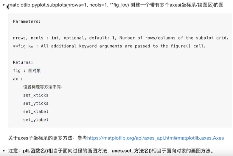
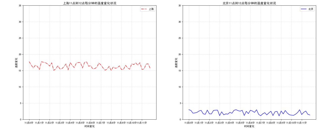
多个坐标系显示-plt.subplots(面向对象的画图方法):
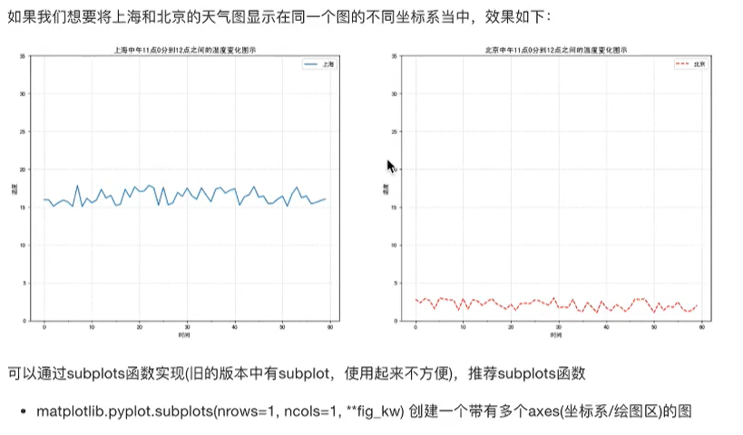
# 需求:再添加一个城市的温度变化
# 收集到北京当天温度变化情况,温度在1度到3度。

# 1、准备数据 x y
x = range(60)
y_shanghai = [random.uniform(15, 18) for i in x]
y_beijing = [random.uniform(1, 3) for i in x]

# 2、创建画布
# plt.figure(figsize=(20, 8), dpi=80)
figure, axes = plt.subplots(nrows=1, ncols=2, figsize=(20, 8), dpi=80)

# 3、绘制图像
axes[0].plot(x, y_shanghai, color="r", linestyle="-.", label="上海")
axes[1].plot(x, y_beijing, color="b", label="北京")

# 显示图例
axes[0].legend()
axes[1].legend()

# 修改x、y刻度
# 准备x的刻度说明
x_label = ["11点{}分".format(i) for i in x]
axes[0].set_xticks(x[::5])
axes[0].set_xticklabels(x_label)
axes[0].set_yticks(range(0, 40, 5))
axes[1].set_xticks(x[::5])
axes[1].set_xticklabels(x_label)
axes[1].set_yticks(range(0, 40, 5))

# 添加网格显示
axes[0].grid(linestyle="--", alpha=0.5)
axes[1].grid(linestyle="--", alpha=0.5)

# 添加描述信息
axes[0].set_xlabel("时间变化")
axes[0].set_ylabel("温度变化")
axes[0].set_title("上海11点到12点每分钟的温度变化状况")
axes[1].set_xlabel("时间变化")
axes[1].set_ylabel("温度变化")
axes[1].set_title("北京11点到12点每分钟的温度变化状况")

# 4、显示图
plt.show()
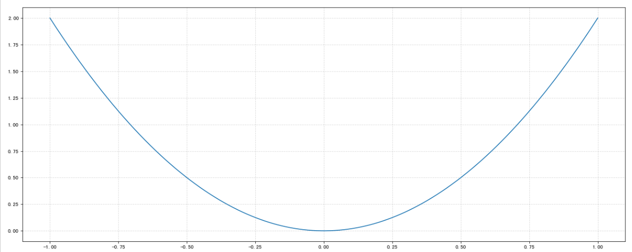
折线图的应用场景:
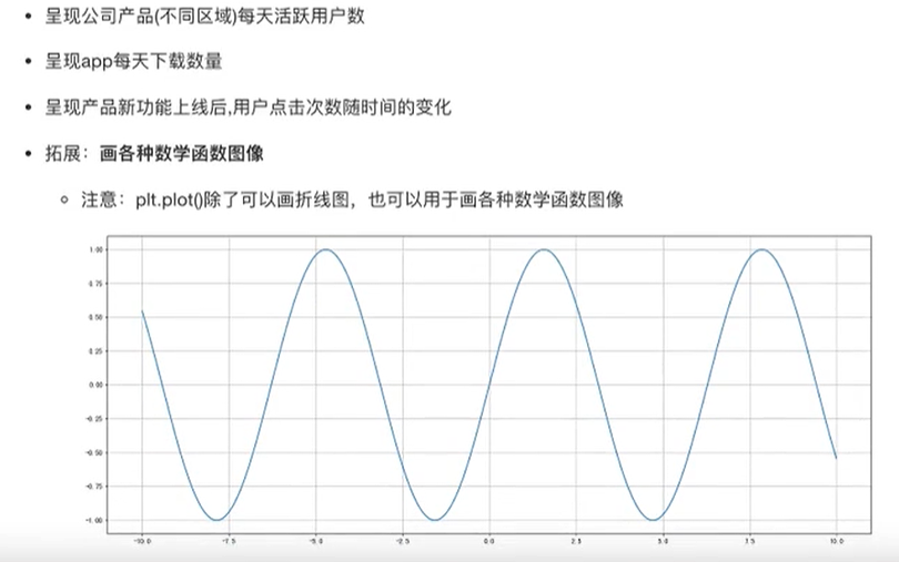
import numpy as np
# 1、准备x,y数据
x = np.linspace(-1, 1, 1000)
y = 2 * x * x

# 2、创建画布
plt.figure(figsize=(20, 8), dpi=80)

# 3、绘制图像
plt.plot(x, y)

# 添加网格显示
plt.grid(linestyle="--", alpha=0.5)

# 4、显示图像
plt.show()

 浙公网安备 33010602011771号