

python中用Matplotlib做多个纵轴 (多y轴)
Matlab里做多给轴的函数很直接,双轴是plotyy, 三轴是plotyyy, 四轴是plot4y,更多应该是multiplotyyy。
而matplotlib似乎可以用figure.add_axes()来实现,探索中……
多轴绘制的图层原理
关于Matplotlib的图层
图层可分为四种
- Canvas层 画布层 位于最底层,用户一般接触不到。 matplotlib.pyplot就是一个canvas层
- Figure层 图像层 建立在Canvas之上。 plt.figure()就是一个figure层
- Axes层 坐标层 建立在Figure之上。fig.add_axes(ax)就加一个Axes层ax在figure上,这时就可以画出一个空白的坐标了。
- plot层 绘制层 坐标轴、图例等辅助信息层以及图像层都是建立在Axes之上
【2018-5-14】
多轴的绘制要用到有两种方法可以实现,一是用主轴和寄生轴的方法,即mpl_toolkits.axisartist.parasite_axes里的HostAxes,和ParasiteAxes。 另一种是用twinx(),结合mpl_toolkits.axes_grid1里的host_subplot。 这里用寄生轴的方法实现。
首先是要创建主轴用HostAxes(figure,[ 左,下,宽,高 ]) 然后寄生出独立的y轴来,并共享x轴。独立的y轴对应独立的曲线 将寄生轴加入主轴的列表
第一根寄生轴可以直接借用原坐标的右轴,所以不需要新增轴 如果需要两个以上的y轴,第三个y轴就要新建固定轴了,要用到get_grid_helper().new_fixed_axis 设置第三及更多Y轴的偏移量 将主轴装载到figure上 设置轴的外面特性,比如颜色,刻度范围等
from mpl_toolkits.axisartist.parasite_axes import HostAxes, ParasiteAxes
import matplotlib.pyplot as plt
import numpy as np

fig = plt.figure(1) #定义figure,(1)中的1是什么
ax_cof = HostAxes(fig, [0, 0, 0.9, 0.9])  #用[left, bottom, weight, height]的方式定义axes,0 <= l,b,w,h <= 1

#parasite addtional axes, share x
ax_temp = ParasiteAxes(ax_cof, sharex=ax_cof)
ax_load = ParasiteAxes(ax_cof, sharex=ax_cof)
ax_cp = ParasiteAxes(ax_cof, sharex=ax_cof)
ax_wear = ParasiteAxes(ax_cof, sharex=ax_cof)

#append axes
ax_cof.parasites.append(ax_temp)
ax_cof.parasites.append(ax_load)
ax_cof.parasites.append(ax_cp)
ax_cof.parasites.append(ax_wear)


#invisible right axis of ax_cof
ax_cof.axis['right'].set_visible(False)
ax_cof.axis['top'].set_visible(False)
ax_temp.axis['right'].set_visible(True)
ax_temp.axis['right'].major_ticklabels.set_visible(True)
ax_temp.axis['right'].label.set_visible(True)

#set label for axis
ax_cof.set_ylabel('cof')
ax_cof.set_xlabel('Distance (m)')
ax_temp.set_ylabel('Temperature')
ax_load.set_ylabel('load')
ax_cp.set_ylabel('CP')
ax_wear.set_ylabel('Wear')

load_axisline = ax_load.get_grid_helper().new_fixed_axis
cp_axisline = ax_cp.get_grid_helper().new_fixed_axis
wear_axisline = ax_wear.get_grid_helper().new_fixed_axis

ax_load.axis['right2'] = load_axisline(loc='right', axes=ax_load, offset=(40,0))
ax_cp.axis['right3'] = cp_axisline(loc='right', axes=ax_cp, offset=(80,0))
ax_wear.axis['right4'] = wear_axisline(loc='right', axes=ax_wear, offset=(120,0))

fig.add_axes(ax_cof)

''' #set limit of x, y
ax_cof.set_xlim(0,2)
ax_cof.set_ylim(0,3)
'''

curve_cof, = ax_cof.plot([0, 1, 2], [0, 1, 2], label="CoF", color='black')
curve_temp, = ax_temp.plot([0, 1, 2], [0, 3, 2], label="Temp", color='red')
curve_load, = ax_load.plot([0, 1, 2], [1, 2, 3], label="Load", color='green')
curve_cp, = ax_cp.plot([0, 1, 2], [0, 40, 25], label="CP", color='pink')
curve_wear, = ax_wear.plot([0, 1, 2], [25, 18, 9], label="Wear", color='blue')


ax_temp.set_ylim(0,4)
ax_load.set_ylim(0,4)
ax_cp.set_ylim(0,50)
ax_wear.set_ylim(0,30)

ax_cof.legend()

#轴名称,刻度值的颜色
#ax_cof.axis['left'].label.set_color(ax_cof.get_color())
ax_temp.axis['right'].label.set_color('red')
ax_load.axis['right2'].label.set_color('green')
ax_cp.axis['right3'].label.set_color('pink')
ax_wear.axis['right4'].label.set_color('blue')

ax_temp.axis['right'].major_ticks.set_color('red')
ax_load.axis['right2'].major_ticks.set_color('green')
ax_cp.axis['right3'].major_ticks.set_color('pink')
ax_wear.axis['right4'].major_ticks.set_color('blue')

ax_temp.axis['right'].major_ticklabels.set_color('red')
ax_load.axis['right2'].major_ticklabels.set_color('green')
ax_cp.axis['right3'].major_ticklabels.set_color('pink')
ax_wear.axis['right4'].major_ticklabels.set_color('blue')

ax_temp.axis['right'].line.set_color('red')
ax_load.axis['right2'].line.set_color('green')
ax_cp.axis['right3'].line.set_color('pink')
ax_wear.axis['right4'].line.set_color('blue')

plt.show()
结果是这样的:

以下是摸索过程中的练习,给自己纪录一下。
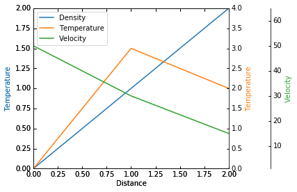
用一个修改了的官方例子来说明一下, jupyter notebook 代码如下:
%matplotlib inline
from mpl_toolkits.axisartist.parasite_axes import HostAxes, ParasiteAxes
import matplotlib.pyplot as plt
fig = plt.figure(1)
host = HostAxes(fig, [0.15, 0.1, 0.65, 0.8])
par1 = ParasiteAxes(host, sharex=host)
par2 = ParasiteAxes(host, sharex=host)
host.parasites.append(par1)
host.parasites.append(par2)
host.set_ylabel('Denstity')
host.set_xlabel('Distance')
host.axis['right'].set_visible(False)
par1.axis['right'].set_visible(True)
par1.set_ylabel('Temperature')
par1.axis['right'].major_ticklabels.set_visible(True)
par1.axis['right'].label.set_visible(True)
par2.set_ylabel('Velocity')
offset = (60, 0)
new_axisline = par2._grid_helper.new_fixed_axis # "_grid_helper"与"get_grid_helper()"等价,可以代替
#new_axisline = par2.get_grid_helper().new_fixed_axis # 用"get_grid_helper()"代替,结果一样,区别目前不清楚
par2.axis['right2'] = new_axisline(loc='right', axes=par2, offset=offset)
fig.add_axes(host)
host.set_xlim(0,2)
host.set_ylim(0,2)
host.set_xlabel('Distance')
host.set_ylabel('Density')
host.set_ylabel('Temperature')
p1, = host.plot([0, 1, 2], [0, 1, 2], label="Density")
p2, = par1.plot([0, 1, 2], [0, 3, 2], label="Temperature")
p3, = par2.plot([0, 1, 2], [50, 30, 15], label="Velocity")
par1.set_ylim(0,4)
par2.set_ylim(1,60)
host.legend()
#轴名称,刻度值的颜色
host.axis['left'].label.set_color(p1.get_color())
par1.axis['right'].label.set_color(p2.get_color())
par2.axis['right2'].label.set_color(p3.get_color())
par2.axis['right2'].major_ticklabels.set_color(p3.get_color()) #刻度值颜色
par2.axis['right2'].set_axisline_style('-|>',size=1.5) #轴的形状色
par2.axis['right2'].line.set_color(p3.get_color()) #轴的颜色
结果图是这样:
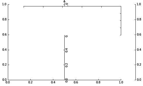
尝试引入浮动坐标轴来实现多轴,但貌似浮动的纵轴如果在坐标边界右边就不能显示出来了,
update: 浮动轴应该是只能在原坐标内显示,要增加纵轴,像matplab中plotyyy函数那样的纵轴要用固定轴,与浮动轴对应函数是ax.new_fixed_axis(location, offset)
代码如下:
import mpl_toolkits.axisartist as AA
import matplotlib.pyplot as plt
%matplotlib inline
fig = plt.figure(1) #定义figure,(1)中的1是什么
ax = AA.Axes(fig, [0, 0, 0.9, 0.9])  #用[left, bottom, weight, height]的方式定义axes,0 <= l,b,w,h <= 1
fig.add_axes(ax)

#用Subplot的方式定义
ax1 = AA.Subplot(fig,211)
fig.add_axes(ax1)

#控制,t,b,r,l轴的显示与否
ax.axis["right"].set_visible(False)
ax.axis["top"].set_visible(False)
ax1.axis['bottom'].set_visible(False)
ax1.axis['left'].set_visible(False)

#浮动轴,nth_coord=0是横轴,=1是纵轴,value是交叉点
ax.axis['x=0.5'] = ax.new_floating_axis(nth_coord=1, value=0.5)
ax.axis['x=0.5'].set_axisline_style('->', size=1.5)  #坐标带箭头

#增加y轴,用new_fixed_axis(location, offset(右多少,上多少))
ax.axis['right2'] = ax.new_fixed_axis(loc='right',
                                      offset=(50,0))
结果如下
试验过程中发现一隐藏功能
jupyter notebook 码如下:
%matplotlib inline

import numpy as np
import matplotlib.pyplot as plt

fig = plt.figure()

t = np.arange(0.0, 1.0, 0.01)
s = np.sin(2 * np.pi * t)
c = np.cos(2 * np.pi * t)

ax1 = fig.add_axes([0, 0, 0.8, 0.5])
line1, = ax1.plot(t, s, color='blue', lw=2)
ax2 = fig.add_axes([0, 0, 0.8, 0.5])
line2, = ax2.plot(t, c, color='blue', lw=2)

plt.show()
执行后跳出一提醒:
X:\anaconda3\lib\site-packages\matplotlib\cbook\deprecation.py:106: MatplotlibDeprecationWarning: Adding an axes using the same arguments as a
previous axes currently reuses the earlier instance.  In a future version, a new instance will always be created and returned.  Meanwhile, this
 warning can be suppressed, and the future behavior ensured, by passing a unique label to each axes instance.
  warnings.warn(message, mplDeprecation, stacklevel=1)
图的效果是
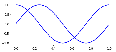
因为参数一样,把两图给合并显示了,如果 ax2 = fig.add_axes([0, 0, 0.8, 0.5])中的l,b,w,h有一个不一样,后定义的直接遮盖前面定义,或加上去的axes

 浙公网安备 33010602011771号