css display:一键掌握flex 的六个属性
display:flex 是一种布局方式。它即可以应用于容器中,也可以应用于行内元素。是W3C提出的一种新的方案,可以简便、完整、响应式地实现各种页面布局。目前,它已经得到了所有浏览器的支持。
Flex是Flexible Box的缩写,意为"弹性布局",用来为盒状模型提供最大的灵活性。设为Flex布局以后,子元素的float、clear和vertical-align属性将失效
flex的六个属性
一、fex- direction容器内元素的排列方向(默认是横向排列)
HTML代码:
<div id='main'>
<div class="box">div1</div>
<div class="box">div2</div>
<div class="box">div3</div>
</div>
css 代码:
#main{
width: 200px;
height: 200;
display: flex;
flex-direction: row;
background-color: grey ;
}
.box{
width: 50px;
height: 50px;
text-align: center;
Line-height: 50px;
border: Ipx solid black;
background-color: rgba(237, 125, 49, 1);
color: white;
}
效果展示:
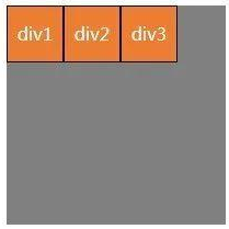
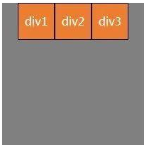
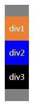
(1) f1ex- direction:roW;沿水平主轴让元素从左向右排列
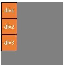
(2)f1ex- di rection: column;让元素沿垂直主轴从上到下垂直排列
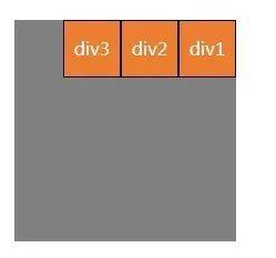
(3)f1ex- direction:row- reverse;沿水平主轴让元素从右向左排列
二、flex-wrap容器内元素的换行(默认不换行)
(1)f1ex-wrap: nowrap;(默认)元素不换行,比如:个div宽度100%,设置此属性,2个div宽度就自动变成各50%
(2)f1ex-wrap:wrap;元素换行,比如:一个div宽度100%,设置此属性,第二个div就在第二行了
三、 justify- content元素在主轴(页面)上的排列
HTML代码:
<div id='main'>
<div class="box">div1</div>
<div class="box">div2</div>
<div class="box">div3</div>
</div>
css 代码:
#main{
width: 200px;
height: 200;
display: flex
justify-content: centers
background-color: grey
}
.box{
width: 50px;
height: 50px;
text-align: center;
line-height: 50px;
border: 1px solid black;
background-color: rgba(237, 125, 49,1)
colon: white;
}
效果展示:
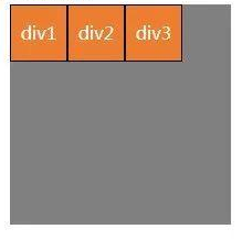
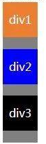
(1) justify- content: center;元素在主轴(页面)上居中排列
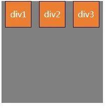
(2) justify- content:flex- start;元素在主轴(页面)上由左或者上开始排列
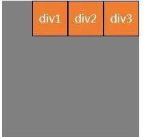
(3) justify- content:flex-end;元素在主轴(页面)上由右或者下开始排列
(4) justify- content: Space- between;元素在主轴(页面)上左右两端或者上下两端开始排列

(5) justify- content: Space- ar ound;每个元素两侧的间隔相等。所以,元素之间的间隔比元素与边框的间隔大一倍
四、 align- items元素在主轴/页面当前行的横轴/纵轴方向上的对齐方式
HTML代码:
<div id='main'>
<div class="box">div1</div>
<div class="box" style="height:00px">div2</div>
<div class="box">style="height:150px"div3</div>
</div>
css 代码:
#main{
width: 200px;
height: 200;
display: flex;
alian-items: flex-start
background-color: grey
}
.box{
width: 50px;
height: 50px;
text-align: center;
line-height: 50px;
border: 1px solid black;
background-color: rgba(237, 125, 49,1)
colon: white;
}
效果展示:
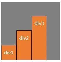
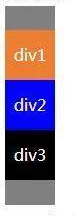
(1) align- n tems:f1ex- start;弹性盒子元素的侧轴(纵轴)起始位置的边界紧靠住该行的侧轴起始边界(靠上对齐)。
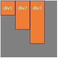
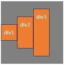
(2) align- items:f1ex-end;弹性盒子元素的侧轴(纵轴)起始位置的边界紧靠住该行的侧轴结束边界。(靠下对齐)
(3) align-items: center;弹性盒子元素在该行的侧轴(纵轴)上居中放置。(居中对齐)
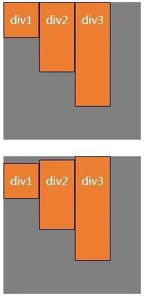
(4) align-items: baseline;如弹性盒子元素的行内轴与侧轴为同一条,则该值与'f1ex- st art'等效,如下图。
其它情况下,该值将参与基线对齐,如右下图中所示,div1的行高为50px,div2的行高为60px,div3的行高为70px,三个div的文本基线是对其的。(靠上对齐)
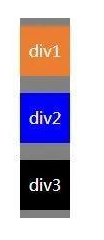
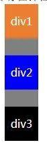
四、 align- content在弹性容器内的元素没有占用交又轴上所有可用的空间时对齐容器内的各项(垂直)
HTML代码:
<div id='main'>
<div class="box" style="background-color: red">div1</div>
<div class="box" style="background-color: blue">div2</div>
<div class="box" style="background-color:black">div3</div>
</div>
css 代码:
#main{
width: 200px;
height: 200;
display: flex;
flex-wrap: wrap
webkit-flex-wrap: wrap;
atign-content: flex-start
background-color: grey;
}
.box{
width: 50px;
height: 50px;
text-align: center;
line-height: 50px;
colon: white;
}
效果展示:
(1) align- content:flex- start;元素位于容器的开头。各行向弹性盒容器的起始位置堆叠。
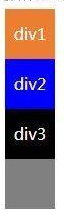
(2)a1ign- content:f1ex-end;元素位于容器的结尾。各行向弹性盒容器的结尾位置堆叠。
(3) align- content: stretch;元素位于容器的中心。各行向弹性盒容器的中间位置堆叠。
(4) align- content: center;默认值。元素被拉伸以适应容器。各行将会伸展以占用剩余的空间。如果剩余的空间是负数,该值等效于f1ex-start
(5) align- content: space- between;元素位于各行之间留有空白的容器内。各行在弹性盒容器中平均分布。
(6) align- content: space- around;元素位于各行之前、之间、之后都留有空白的容器内。各行在弹性盒容器中平均分布,两端保留子元素与子元素之间间距大小的一半。
如果剩余的空间是负数或弹性盒容器中只有一行,该值等于center