echarts_部分图表配置_堆叠折线图

echarts基本图表使用:

1.获取包裹元素(var myChart = echarts.init(document.getElementById(‘thisId’));)2.设置option(option={...})3.使用设置好的option显示图表(myChart.setOption(option);)

废话不多讲上图:

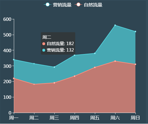
function ZX_bottom (thisId,titleName){
    var myChart = echarts.init(document.getElementById(thisId));
    
    option = {
            tooltip : {
                trigger: 'axis',
                /*show:false,//添加鼠标浮动窗口就消失了*/
                axisPointer: {
                    
                    type: 'line',//指示器类型。  cross' 十字准星指示器 其他选项 line  shadow
                    label: {
                        backgroundColor: 'rgba(255, 255, 255, .5)'//XY轴显示的小方块
                    },
                    crossStyle: {//线的颜色 axisPointer.type 为 'cross' 时有效。
                        color: '#fff'
                    }
                }
            },
            backgroundColor : 'rgba(43, 62, 75, .5)',//背景颜色
            toolbox: {//工具栏
                show: false//是否显示工具栏组件
            },
            legend: {
                data:['营销流量','自然流量'],
                textStyle : {
                    color : '#FFF',
                    fontSize: 15
                }
            },
            grid : {
                left : '2%',
                right : '7%',
                bottom : '3%',
                containLabel : true,
                
            },
            xAxis : [
                {
                    type : 'category',
                    boundaryGap : false,//x轴两侧留白策略
                    axisLabel : {
                        show : true,
                        textStyle : {
                            color : '#FFF',
                            fontSize: 15
                        }
                    },
                    splitLine : {//去掉网格线
                        show : false
                    },
                    axisLine : {
                        lineStyle : {
                            color : '#FFF',
                            fontSize: 15
                        }
                    },
                    axisTick : {
                        lineStyle : {
                            color : '#FFF',
                            fontSize: 15
                        }
                    },
                    data : ['周一','周二','周三','周四','周五','周六','周日'],
                }
            ],
            yAxis : [
                {
                    type : 'value',
                    axisLabel : {
                        show : true,
                        textStyle : {
                            color : '#FFF',
                            fontSize: 15
                        }
                    },
                    splitLine : {//去掉网格线
                        show : false
                    },
                    axisLine : {
                        lineStyle : {
                            color : '#FFF',
                            fontSize: 15
                        }
                    },
                    axisTick : {
                        lineStyle : {
                            color : '#FFF',
                            fontSize: 15
                        }
                    }
                }
            ],
            series : [
                        
                        {
                            name:'自然流量',
                            type:'line',
                            stack: '总量',
                            areaStyle: {normal: {}},
                            color:['#ff907f'],//对应上面data的背景色
                            data:[220, 182, 191, 234, 290, 330, 310]
                        },{
                            name:'营销流量',
                            type:'line',
                            stack: '总量',
                            areaStyle: {normal: {}},
                            color:['#52d2dd'],//对应上面data的背景色
                            data:[120, 132, 101, 134, 90, 230, 210]
                        }
                    ]
        };
    myChart.setOption(option);
}


posted @ 2017-08-03 16:17  孙大阳  阅读(4199)  评论(0编辑  收藏  举报