flex布局基础的属性有哪些?
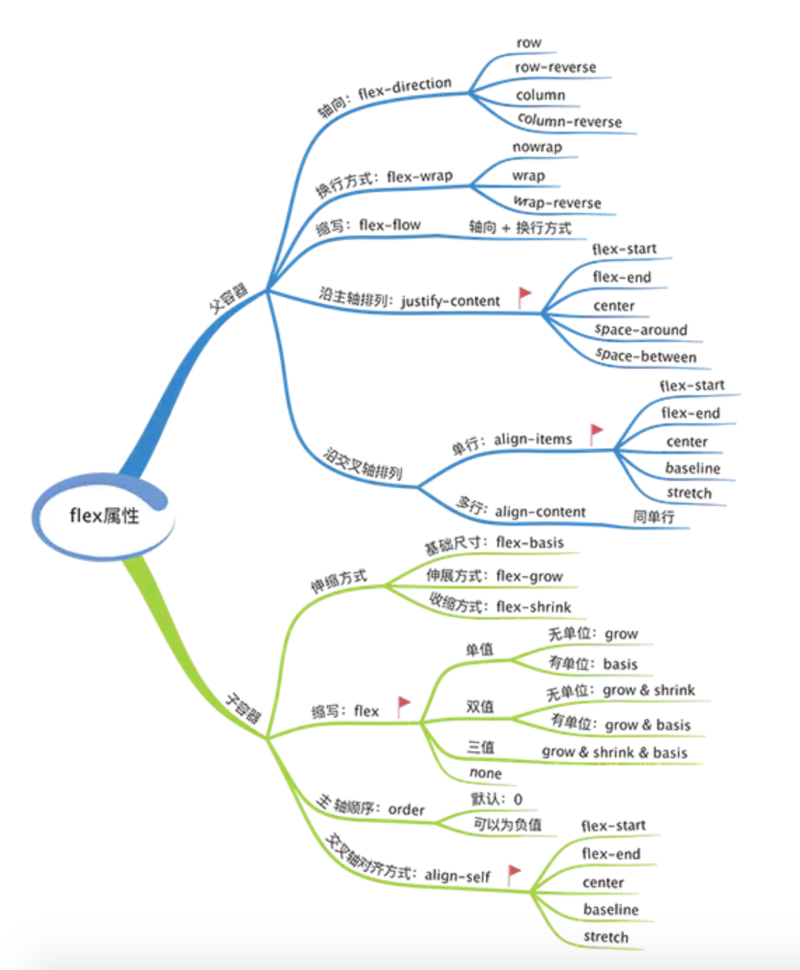
一、flex-容器属性
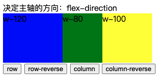
1、首先决定是flex主轴方向:flex-direction
- row 水平向右(默认)
- row-reverse 水平向左
- column 垂直向下
- column-rrverse 水平向右


<!DOCTYPE html>
<html lang="en">

<head>
   <meta charset="UTF-8">
   <meta name="viewport" content="width=device-width, initial-scale=1.0">
   <meta http-equiv="X-UA-Compatible" content="ie=edge">
   <title>Document</title>
</head>
<style>
   #dad {
      position: relative;
      display: flex;
      height: 100px;
   }

   #son-1 {
      width: 120px;
      background: blue;
   }

   #son-2 {
      width: 80px;
      background: green;
   }

   #son-3 {
      width: 100px;
      background: yellow;
   }
</style>
<script>
   function handleClick(flexDirection) {
      document.getElementById('dad').style.flexDirection = flexDirection;
   }
</script>

<body>
   <div>决定主轴的方向:flex-direction</div>
   <div id="dad">
      <div id="son-1">w-120</div>
      <div id="son-2">w-80</div>
      <div id="son-3">w-100</div>
   </div>
   <button onclick="handleClick('row')">row</button>
   <button onclick="handleClick('row-reverse')">row-reverse</button>
   <button onclick="handleClick('column')">column</button>
   <button onclick="handleClick('column-reverse')">column-reverse</button>
</body>

</html>
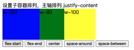
2、设置父容器属性,决定子容器主轴排列方式(水平方向):justify-content
- flex-start 左对齐(默认)
- flex-end 右对齐
- center 居中对齐
- space-around 均匀分布,
- space-between 均匀分布,收尾子容器紧邻父容器
<!DOCTYPE html>
<html lang="en">

<head>
   <meta charset="UTF-8">
   <meta name="viewport" content="width=device-width, initial-scale=1.0">
   <meta http-equiv="X-UA-Compatible" content="ie=edge">
   <title>Document</title>
</head>
<style>
   #dad {
      position: relative;
      display: flex;
      height: 100px;
      display: flex;
   }

   #son-1 {
      width: 120px;
      background: blue;
   }

   #son-2 {
      width: 80px;
      background: green;
   }

   #son-3 {
      width: 100px;
      background: yellow;
   }
</style>
<script>
   function handleClick(justifyContent) {
      document.getElementById('dad').style.justifyContent = justifyContent;
   }
</script>

<body>
   <div>
      设置子容器排列,主轴排列 justify-content
   </div>
   <div id="dad">
      <div id="son-1">w-120</div>
      <div id="son-2">w-80</div>
      <div id="son-3">w-100</div>
   </div>
   <button onclick="handleClick('flex-start')">flex-start</button>
   <button onclick="handleClick('flex-end')">flex-end</button>
   <button onclick="handleClick('center')">center</button>
   <button onclick="handleClick('space-around')">space-around</button>
   <button onclick="handleClick('space-between')">space-between</button>
</body>

</html>
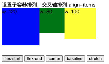
3、设置父容器属性,决定子容器的交叉轴排列方式(垂直方向):align-items
- flex-start 顶部对齐(默认)
- flex-end 底部对齐
- center 居中对齐
- baseline 基准线对齐
- stretch 拉伸对齐
<!DOCTYPE html>
<html lang="en">

<head>
   <meta charset="UTF-8">
   <meta name="viewport" content="width=device-width, initial-scale=1.0">
   <meta http-equiv="X-UA-Compatible" content="ie=edge">
   <title>Document</title>
</head>
<style>
   #dad {
      position: relative;
      display: flex;
      height: 150px;
   }

   #son-1 {
      width: 120px;
      height: 120px;
      background: blue;
   }

   #son-2 {
      width: 80px;
      height: 80px;
      background: green;
   }

   #son-3 {
      width: 100px;
      height: 100px;
      background: yellow;
   }
</style>
<script>
   function handleClick(alignItems) {
      document.getElementById('dad').style.alignItems = alignItems;
   }
</script>

<body>
   <div>设置子容器排列,交叉轴排列 align-items</div>
   <div id="dad">
      <div id="son-1">w-120</div>
      <div id="son-2">w-80</div>
      <div id="son-3">w-100</div>
   </div>
   <button onclick="handleClick('flex-start')">flex-start</button>
   <button onclick="handleClick('flex-end')">flex-end</button>
   <button onclick="handleClick('center')">center</button>
   <button onclick="handleClick('baseline')">baseline</button>
   <button onclick="handleClick('stretch')">stretch</button>
</body>

</html>
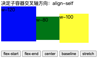
4、设置子容器交叉轴排列,和父容器align-items完全一致:align-self
- flex-start 顶部对齐(默认)
- flex-end 底部对齐
- center 居中对齐
- baseline 基准线对齐
- stretch 拉伸对齐
<!DOCTYPE html>
<html lang="en">

<head>
   <meta charset="UTF-8">
   <meta name="viewport" content="width=device-width, initial-scale=1.0">
   <meta http-equiv="X-UA-Compatible" content="ie=edge">
   <title>Document</title>
</head>
<style>
   #dad {
      position: relative;
      display: flex;
      height: 150px;
      align-items: center;
   }

   #son-1 {
      width: 120px;
      height: 120px;
      background: blue;
   }

   #son-2 {
      width: 80px;
      height: 80px;
      background: green;
   }

   #son-3 {
      width: 100px;
      height: 100px;
      background: yellow;
   }
</style>
<script>
   function handleClick(alignSelf) {
      document.getElementById('son-1').style.alignSelf = alignSelf;
   }
</script>

<body>
   <div>决定子容器交叉轴方向:align-self</div>
   <div id="dad">
      <div id="son-1">w-120</div>
      <div id="son-2">w-80</div>
      <div id="son-3">w-100</div>
   </div>
   <button onclick="handleClick('flex-start')">flex-start</button>
   <button onclick="handleClick('flex-end')">flex-end</button>
   <button onclick="handleClick('center')">center</button>
   <button onclick="handleClick('baseline')">baseline</button>
   <button onclick="handleClick('stretch')">stretch</button>
</body>

</html>
二、flex-参数属性
1、order:默认0,用于决定项目排列顺序,数值越小,项目排列越靠前。
<!DOCTYPE html>
<html lang="en">
<head>
  <meta charset="UTF-8">
  <meta name="viewport" content="width=device-width, initial-scale=1.0">
  <title>Document</title>
  <style>
    #dad {
      position: relative;
      display: flex;
      height: 150px;
   }

   #son-1 {
      width: 120px;
      height: 120px;
      background: blue;
      order: 0;
   }

   #son-2 {
      width: 80px;
      height: 80px;
      background: green;
      order: 0;
   }

   #son-3 {
      width: 100px;
      height: 100px;
      background: yellow;
      order:0;
   }
  </style>
  <script>
   function handleClick(cls) {
      const order = document.getElementById(cls).style.order;
      document.getElementById(cls).style.order = Number(order) + 1;
   }
</script>
</head>
<body>
   <div>决定项目排列顺序:order</div>
   <div id="dad">
      <div id="son-1">w-120</div>
      <div id="son-2">w-80</div>
      <div id="son-3">w-100</div>
   </div>
   <button onclick="handleClick('son-1')">w-120 ++</button>
   <button onclick="handleClick('son-2')">w-80 ++</button>
   <button onclick="handleClick('son-3')">w-100 ++</button>
</body>
</html>

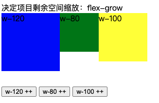
2、flex-grow:默认0,用于决定项目在有剩余空间的情况下是否放大,默认不放大;注意,即便设置了固定宽度,也会放大。
<!DOCTYPE html>
<html lang="en">
<head>
  <meta charset="UTF-8">
  <meta name="viewport" content="width=device-width, initial-scale=1.0">
  <title>Document</title>
  <style>
    #dad {
      position: relative;
      display: flex;
      height: 150px;
   }

   #son-1 {
      width: 120px;
      height: 120px;
      background: blue;
      flex-grow: 0;
   }

   #son-2 {
      width: 80px;
      height: 80px;
      background: green;
      flex-grow: 0;
   }

   #son-3 {
      width: 100px;
      height: 100px;
      background: yellow;
      flex-grow: 0;
   }
  </style>
  <script>
   function handleClick(cls) {
      const flexGrow = document.getElementById(cls).style.flexGrow;
      document.getElementById(cls).style.flexGrow = Number(flexGrow) + 1;
   }
</script>
</head>
<body>
   <div>决定项目剩余空间缩放:flex-grow</div>
   <div id="dad">
      <div id="son-1">w-120</div>
      <div id="son-2">w-80</div>
      <div id="son-3">w-100</div>
   </div>
   <button onclick="handleClick('son-1')">w-120 ++</button>
   <button onclick="handleClick('son-2')">w-80 ++</button>
   <button onclick="handleClick('son-3')">w-100 ++</button>
</body>
</html>
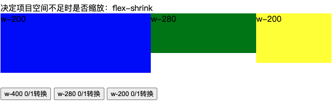
3、flex-shrink:默认1,用于决定项目在空间不足时是否缩小,默认项目都是1,即空间不足时大家一起等比缩小;注意,即便设置了固定宽度,也会缩小。
<!DOCTYPE html>
<html lang="en">
<head>
  <meta charset="UTF-8">
  <meta name="viewport" content="width=device-width, initial-scale=1.0">
  <title>Document</title>
  <style>
    #dad {
      position: relative;
      display: flex;
      height: 150px;
   }

   #son-1 {
      width: 400px;
      height: 120px;
      background: blue;
      flex-shrink: 1;
   }

   #son-2 {
      width: 280px;
      height: 80px;
      background: green;
      flex-shrink: 1;
   }

   #son-3 {
      width: 200px;
      height: 100px;
      background: yellow;
      flex-shrink: 1;
   }
  </style>
  <script>
   function handleClick(cls) {
      const flexShrink = document.getElementById(cls).style.flexShrink;
      document.getElementById(cls).style.flexShrink = flexShrink==0?1:0;
   }
</script>
</head>
<body>
   <div>决定项目空间不足时是否缩放:flex-shrink</div>
   <div id="dad">
      <div id="son-1">w-200</div>
      <div id="son-2">w-280</div>
      <div id="son-3">w-200</div>
   </div>
   <button onclick="handleClick('son-1')">w-400 0/1转换</button>
   <button onclick="handleClick('son-2')">w-280 0/1转换</button>
   <button onclick="handleClick('son-3')">w-200 0/1转换</button>
</body>
</html>
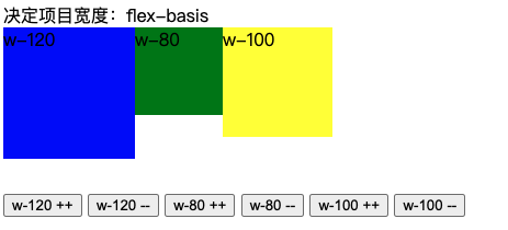
4、flex-basis:默认auto,用于设置项目宽度,默认auto时,项目会保持默认宽度,或者以width为自身的宽度,但如果设置了flex-basis,权重会width属性高,因此会覆盖widtn属性。
<!DOCTYPE html>
<html lang="en">
<head>
  <meta charset="UTF-8">
  <meta name="viewport" content="width=device-width, initial-scale=1.0">
  <title>Document</title>
  <style>
    #dad {
      position: relative;
      display: flex;
      height: 150px;
   }

   #son-1 {
      width: 120px;
      height: 120px;
      background: blue;
      flex-basis: 120px;
   }

   #son-2 {
      width: 80px;
      height: 80px;
      background: green;
      flex-basis: 80px;
   }

   #son-3 {
      width: 100px;
      height: 100px;
      background: yellow;
      flex-basis: 100px;
   }
  </style>
  <script>
   function handleClick(cls,minx) {
      if(minx == 1){
         document.getElementById(cls).style.flexBasis = '400px';
      }else{
         document.getElementById(cls).style.flexBasis = '50px';
      }
   }
</script>
</head>
<body>
   <div>决定项目宽度:flex-basis</div>
   <div id="dad">
      <div id="son-1">w-120</div>
      <div id="son-2">w-80</div>
      <div id="son-3">w-100</div>
   </div>
   <button onclick="handleClick('son-1','1')">w-120 ++</button>
   <button onclick="handleClick('son-1','0')">w-120 --</button>
   <button onclick="handleClick('son-2','1')">w-80 ++</button>
    <button onclick="handleClick('son-2','0')">w-80 --</button>
   <button onclick="handleClick('son-3','1')">w-100 ++</button>
    <button onclick="handleClick('son-3','0')">w-100 --</button>
</body>
</html>
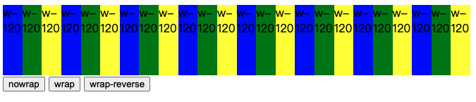
5、flex-wrap:默认值nowrap,设置项目是否换行;
<!DOCTYPE html>
<html lang="en">

<head>
   <meta charset="UTF-8">
   <meta name="viewport" content="width=device-width, initial-scale=1.0">
   <meta http-equiv="X-UA-Compatible" content="ie=edge">
   <title>Document</title>
</head>
<style>
   #dad {
      position: relative;
      display: flex;
      /* height: 100px; */
   }

   #son-1 {
      width: 100px;
      height: 100px;
      background: blue;
   }

   #son-2 {
      width: 100px;
      height: 100px;
      background: green;
   }

   #son-3 {
      width: 100px;
      height: 100px;
      background: yellow;
   }
</style>
<script>
   function handleClick(flexWrap) {
      document.getElementById('dad').style.flexWrap = flexWrap;
   }
</script>

<body>
   <div id="dad">
      <div id="son-1">w-120</div>
      <div id="son-2">w-120</div>
      <div id="son-3">w-120</div>
      <div id="son-1">w-120</div>
      <div id="son-2">w-120</div>
      <div id="son-3">w-120</div>
      <div id="son-1">w-120</div>
      <div id="son-2">w-120</div>
      <div id="son-3">w-120</div>
      <div id="son-1">w-120</div>
      <div id="son-2">w-120</div>
      <div id="son-3">w-120</div>
      <div id="son-1">w-120</div>
      <div id="son-2">w-120</div>
      <div id="son-3">w-120</div>
      <div id="son-1">w-120</div>
      <div id="son-2">w-120</div>
      <div id="son-3">w-120</div>
      <div id="son-1">w-120</div>
      <div id="son-2">w-120</div>
      <div id="son-3">w-120</div>
      <div id="son-1">w-120</div>
      <div id="son-2">w-120</div>
      <div id="son-3">w-120</div>
   </div>
   <div style="position: relative;">
      <button onclick="handleClick('nowrap')">nowrap</button>
      <button onclick="handleClick('wrap')">wrap</button>
      <button onclick="handleClick('wrap-reverse')">wrap-reverse</button>
   </div>
</body>

</html>
6、简写flex = flex-grow,flex-shrink,flex-basis
| 单值语法 | 等同于 | 备注 |
|---|---|---|
| flex: initial | flex: 0 1 auto | 初始值,常用 |
| flex: 0 | flex: 0 1 0% | 适用场景少 |
| flex: none | flex: 0 0 auto | 推荐 |
| flex: 1 | flex: 1 1 0% | 推荐 |
| flex: auto | flex: 1 1 auto | 适用场景少 |