css-布局
一,BFC自适应布局
1,BFC含义
BFC(Block formatting context)直译为"块级格式化上下文"。它是一个独立的渲染区域,只有Block-level box参与, 它规定了内部的Block-level Box如何布局,并且与这个区域外部毫不相干。
2,BFC 作用:
1. 利用 BFC 避免外边距折叠
2. 清除内部浮动 (撑开高度)
原理: 触发父 div 的 BFC 属性,使下面的子 div 都处在父 div 的同一个 BFC 区域之内
3. 避免文字环绕
4. 分属于不同的 BFC 时,可以阻止 margin 重叠
5. 多列布局中使用 BFC
3,如何生成 BFC:(脱离文档流,满足下列的任意一个或多个条件即可)
1. 根元素,即 HTML 元素(最大的一个 BFC)
2. float 的值不为 none
3. position 的值为 absolute 或 fixed
4. overflow 的值不为 visible(默认值。内容不会被修剪,会呈现在元素框之外)
5. display 的值为 inline-block、table-cell、table-caption
4,BFC 布局规则:
1. 内部的 Box 会在垂直方向,一个接一个地放置。
2. 属于同一个 BFC 的两个相邻的 Box 的 margin 会发生重叠
3. BFC 就是页面上的一个隔离的独立容器,容器里面的子元素不会影响到外面的元素。反之也如此, 文字环绕效果,设置 float
4. BFC 的区域不会与 float box 重叠。
5. 计算 BFC 的高度,浮动元素也参与计算
例子1(利用BFC避免margin重叠)
<!DOCTYPE html>
<html lang="en">
<head>
    <title>防止margin重叠</title>
</head>
<style>
    *{
        margin: 0;
        padding: 0;
    }
    div {
        color: #f55;
        background: #eaf886;
        width: 200px;
        line-height: 100px;
        text-align:center;
        margin: 30px;
    }
</style>
<body>
    <div>box1</div>
    <div>box2</div>
</body>
</html>
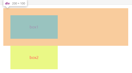
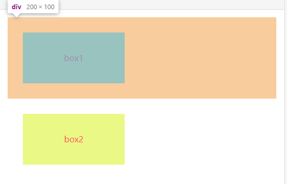
可以看到,属于同一个BFC的两个相邻的Box会发生margin重叠,所以我们可以设置,两个不同的BFC,也就是我们可以把第二个div激活成为一个BFC, 分属于不同的 BFC 时,可以阻止 margin 重叠
<!DOCTYPE html>
<html lang="en">
<head>
    <title>防止margin重叠</title>
</head>
<style>
    *{
        margin: 0;
        padding: 0;
    }
    div{
        color: #f55;
        background: #eaf886;
        width: 200px;
        line-height: 100px;
        text-align:center;
        margin: 30px;
    }
	div:nth-child(2){
		position:absolute /*激活成BFC*/
	}
</style>
<body>
    <div>box1</div>
    <div>box2</div>
</body>
</html>
BFC两栏布局
<!DOCTYPE html>
<html lang="en">
<head>
    <title>BFC两栏布局</title>
</head>
<style>
    *{
        margin: 0;
        padding: 0;
    }
    body {
        width: 100%;
        position: relative;
    }

    .left {
        width: 100px;
        height: 250px;
        float: left;
        background: rgb(139, 214, 78);
        text-align: center;
        line-height: 300px;
        font-size: 20px;
    }

    .right {
        overflow: hidden;
        height: 300px;
        background: rgb(170, 54, 236);
        text-align: center;
        line-height: 300px;
        font-size: 40px;
    }
</style>
<body>
    <div class="left">left</div>
    <div class="right">right</div>
</body>
</html>
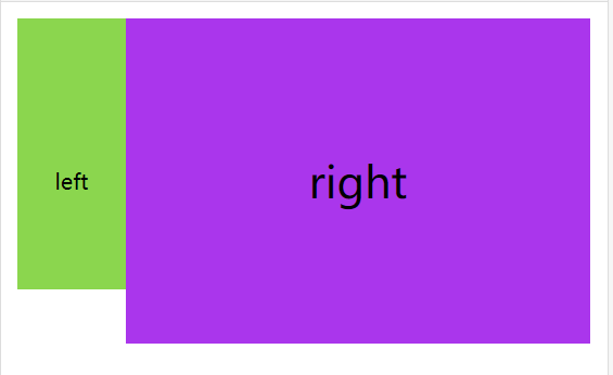
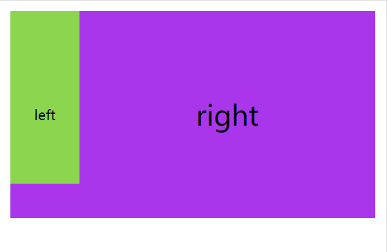
关键:让右侧块变为BFC,因为BFC元素不与Float元素相重叠,如果去掉右侧 overflow:hidden,则如图下:
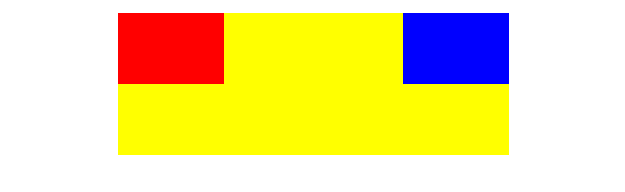
二,浮动布局
<!DOCTYPE html>
<html lang="en">
  <head>
    <title>Document</title>
    <style>
      * {
        padding: 0;
        margin: 0;
      }
      .left,
      .right,
      .center {
        min-height: 100px;
      }
      .left {
        background-color: red;
        width: 200px;
        float: left;
      }
      .right {
        background-color: blue;
        width: 200px;
        float: right;
      }
      .center {
        background-color: orange;
        width: 100%;
      }
    </style>
  </head>
  <body>
    <aside class="left"></aside>
    <aside class="right"></aside>
    <main class="center">
      <h1>浮动解决方案</h1>
      <p>方法:left和right写在center前面,并且分别左右浮动,中间的这个div因为是块级元素,所以在水平方向上按照他的包容块自动撑开</p>
    </main>
  </body>
</html>
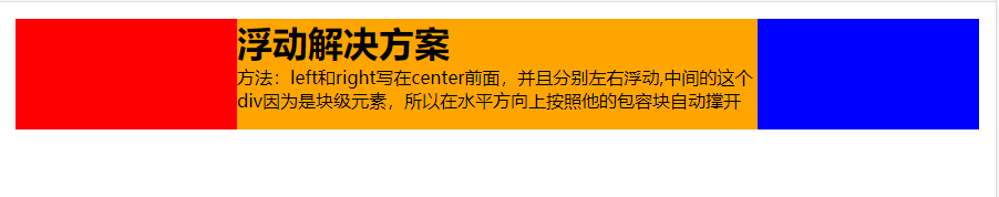
这种布局方式,dom 结构必须是先写浮动部分,然后再中间块,否则右浮动块会掉到下一行。 浮动布局的优点就是比较简单,兼容性也比较好。但浮动布局是有局限性的,浮动元素脱离文档流,要做清除浮动,这个处理不好的话,会带来很多问题,比如父容器高度塌陷等。
三,绝对定位布局
<!DOCTYPE html>
<html lang="en">
<head>
<title>绝对定位三栏布局</title>
<style>
* {
margin: 0;
padding: 0;
}
aside {
position: absolute;
width: 300px;
min-height: 100px;
}
aside.left {
left: 0;
background-color: red;
}
aside.right {
right: 0;
background-color: blue;
}
main.center {
position: absolute;
left: 300px;
right: 300px;
background-color: orange;
}
</style>
</head>
<body>
<aside class="left"></aside>
<aside class="right"></aside>
<main class="center">
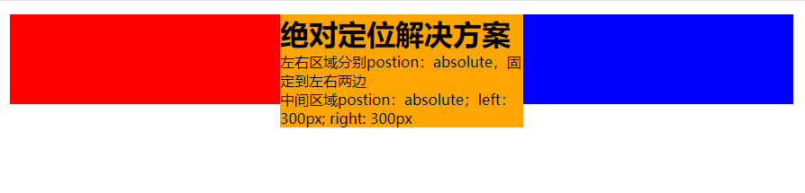
<h1>绝对定位解决方案</h1>
<p>左右区域分别postion:absolute,固定到左右两边</p>
<p>中间区域postion:absolute;left:300px; right: 300px</p>
</main>
</body>
</html>
绝对定位布局优点就是快捷,设置很方便,而且也不容易出问题。缺点就是,容器脱离了文档流,后代元素也脱离了文档流,高度未知的时候,会有问题,这就导致了这种方法的有效性和可使用性是比较差的。
四,flexbox布局
<!DOCTYPE html>
<html lang="en">
  <head>
    <meta charset="UTF-8" />
    <meta name="viewport" content="width=device-width, initial-scale=1.0" />
    <meta http-equiv="X-UA-Compatible" content="ie=edge" />
    <title>Document</title>
    <style>
      * {
        margin: 0;
        padding: 0;
      }
      .left,
      .right,
      .center {
        min-height: 100px;
      }
      .wrapper {
        display: flex;
      }
      .left {
        background-color: red;
        width: 300px;
      }
      .center {
        background-color: orange;
        flex: 1;
      }
      .right {
        background-color: blue;
        width: 300px;
      }
    </style>
  </head>
  <body>
    <div class="wrapper">
      <aside class="left"></aside>
      <main class="center">
        <h1>flex布局解决方案</h1>
        <p>包裹这个3个块的父元素display: flex; 中间的元素flex: 1;</p>
      </main>
      <aside class="right"></aside>
    </div>
  </body>
</html>

flexbox 布局是 css3 里新出的一个,它就是为了解决上述两种方式的不足出现的,是比较完美的一个。目前移动端的布局也都是用 flexbox。 flexbox 的缺点就是 IE10 开始支持,但是 IE10 的是-ms 形式的。
五,表格布局
<!DOCTYPE html>
<html lang="en">
  <head>
    <meta charset="UTF-8" />
    <meta name="viewport" content="width=device-width, initial-scale=1.0" />
    <meta http-equiv="X-UA-Compatible" content="ie=edge" />
    <title>表格布局</title>
    <style>
      * {
        margin: 0;
        padding: 0;
      }
      .wrapper {
        display: table;
        width: 100%;
      }
      .left,
      .right,
      .center {
        min-height: 100px;
        display: table-cell;
      }
      .left {
        width: 300px;
        background-color: red;
      }
      .center {
        background-color: orange;
      }
      .right {
        background-color: blue;
        width: 300px;
      }
    </style>
  </head>
  <body>
    <div class="wrapper">
      <aside class="left"></aside>
      <main class="center">
        <h1>表格布局</h1>
        <p>父元素display: table;并且宽度为100%</p>
        <p>每一个子元素display: table-cell;</p>
        <p>左右两侧添加宽度,中间不加宽度</p>
      </main>
      <aside class="right"></aside>
    </div>
  </body>
</html>

表格布局的兼容性很好,在 flex 布局不兼容的时候,可以尝试表格布局。当内容溢出时会自动撑开父元素。
表格布局也是有缺陷:① 无法设置栏边距;② 对 seo 不友好;③ 当其中一个单元格高度超出的时候,两侧的单元格也是会跟着一起变高的,然而有时候这并不是我们想要的效果。
六,网格布局
<!DOCTYPE html>
<html lang="en">
  <head>
    <meta charset="UTF-8" />
    <meta name="viewport" content="width=device-width, initial-scale=1.0" />
    <meta http-equiv="X-UA-Compatible" content="ie=edge" />
    <title>网格布局</title>
    <style>
      * {
        margin: 0;
        padding: 0;
      }
      /* 网格布局 */
      .wrapper {
        display: grid;
        width: 100%;
        grid-template-columns: 300px 1fr 300px;
      }

      .left {
        background-color: red;
      }
      .center {
        background-color: orange;
      }
      .right {
        background-color: blue;
      }
    </style>
  </head>
  <body>
    <div class="wrapper">
      <aside class="left"></aside>
      <main class="center">
        <h1>网格布局</h1>
        <p>父元素display: grid;并且宽度为100%</p>
        <p>grid-template-columns中指定每列的宽度</p>
      </main>
      <aside class="right"></aside>
    </div>
  </body>
</html>

CSS Grid 是创建网格布局最强大和最简单的工具。就像表格一样,网格布局可以让 Web 设计师根据元素按列或行对齐排列,但他和表格不同,网格布局没有内容结构,从而使各种布局不可能与表格一样。例如,一个网格布局中的子元素都可以定位自己的位置,这样他们可以重叠和类似元素定位。
但网格布局的兼容性不好。IE10+上支持,而且也仅支持部分属性。
七,圣杯布局
<!DOCTYPE html>
<html>
  <head>
    <meta charset="utf-8" />
    <title>实现三栏水平布局之圣杯布局</title>
    <style type="text/css">
     .container {
 padding-left: 150px;
 padding-right: 150px;
}
.left {
 float: left;
 width: 150px;
 height: 100px;
 background: red;
 margin-left: -100%;
 position: relative;
 left: -150px;
}
.center {
 float: left;
 width: 100%;
 height: 200px;
 background: yellow;
 position:relative
}
.right {
 float: left;
 width: 150px;
 height: 100px;
 background: blue;
 margin-left: -150px;
 position: relative;
 right: -150px;
}
    </style>
  </head>
  <body>
    <article class="container">
     <div class="center">
       <h2>圣杯布局</h2>
     </div>
     <div class="left"></div>
     <div class="right"></div>
    </article>
  </body>
</html>
实现步骤:
①三个部分都设定为左浮动,否则左右两边内容上不去,就不可能与中间列同一行。然后设置 center 的宽度为 100%(实现中间列内容自适应),此时,left 和 right 部分会跳到下一行
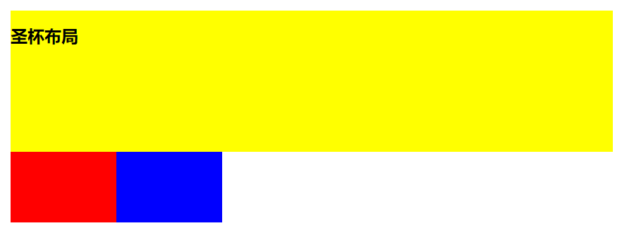
②通过设置 margin-left 为负值让 left 和 right 部分回到与 center 部分同一行
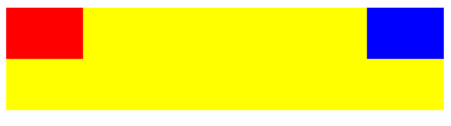
③通过设置父容器的 padding-left 和 padding-right,让左右两边留出间隙。
④通过设置相对定位,让 left 和 right 部分移动到两边
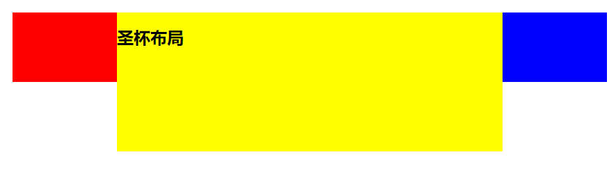
特点:
比较特殊的三栏布局,同样也是两边固定宽度,中间自适应,唯一区别是 dom 结构必须是先写中间列部分,这样实现中间列可以优先加载。
缺点:
center 部分的最小宽度不能小于 left 部分的宽度,否则会 left 部分掉到下一行
如果其中一列内容高度拉长,其他两列的背景并不会自动填充。
八,双飞翼布局
<!DOCTYPE html>
<html>
  <head>
    <meta charset="utf-8" />
    <title>双飞翼布局</title>
    <style type="text/css">
 .container {
 min-width: 600px;
}
.left {
 float: left;
 width: 200px;
 height: 200px;
 background: red;
 margin-left: -100%;
}
.center {
 float: left;
 width: 100%;
 height: 300px;
 background: yellow;
}
.center .inner {
 margin: 0 200px; /*新增部分*/
}
.right {
 float: left;
 width: 200px;
 height: 200px;
 background: blue;
 margin-left: -200px;
}
</style>
  </head>
  <body>
   <article class="container">
    <div class="center">
    <div class="inner">双飞翼布局</div>
    </div>
    <div class="left"></div>
    <div class="right"></div>
   </article>
  </body>
</html>
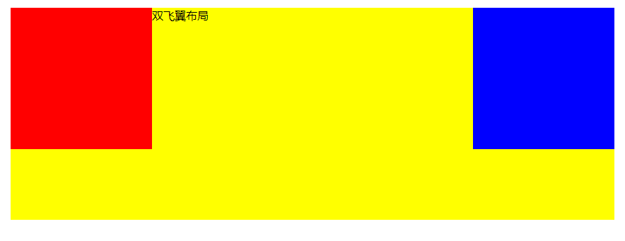
实现步骤(前两步与圣杯布局一样)
1 三个部分都设定为左浮动,然后设置 center 的宽度为 100%,此时,left 和 right 部分会跳到下一行;
2 通过设置 margin-left 为负值让 left 和 right 部分回到与 center 部分同一行;
3 center 部分增加一个内层 div,并设 margin: 0 200px;
特点
同样也是三栏布局,在圣杯布局基础上进一步优化,解决了圣杯布局错乱问题,实现了内容与布局的分离。而且任何一栏都可以是最高栏,不会出问题
缺点
多加一层 dom 树节点,增加渲染树生成的计算量

 浙公网安备 33010602011771号