css3 动画 -- 旋转线条 rotate_line
1.html
<!DOCTYPE html>
<html lang="en">
  <head>
    <meta charset="UTF-8" />
    <meta name="viewport" content="width=device-width, initial-scale=1.0" />
    <title>Border Animation</title>
    <link rel="stylesheet" type="text/css" href="style.css" />
  </head>
  <body>
    <div class="box"></div>
  </body>
</html>
2.css
* {
  margin: 0;
  padding: 0;
}
body {
  background-color: #111;
}
.box {
  width: 200px;
  height: 200px;
  background: url(./avatar.jpg) no-repeat center;
  background-size: cover;
  position: absolute;
  top: 50%;
  left: 50%;
  transform: translate(-50%, -50%);
}
.box::before,
.box::after {
  content: "";
  border: 2px solid #2ecc71;
  position: absolute;
  top: 0;
  left: 0;
  right: 0;
  bottom: 0;
  margin: -15px;
  /* clip: rect(top, right, bottom, left); */
  animation: borderClip 8s linear infinite;
}
.box::after {
  animation-delay: -4s;
}
.box:hover::before,
.box:hover::after {
  animation-play-state: paused;
}
@keyframes borderClip {
  0%,
  100% {
    clip: rect(0px, 230px, 2px, 0px);
  }
  25% {
    clip: rect(0px, 2px, 230px, 0px);
  }
  50% {
    clip: rect(228px, 230px, 230px, 0px);
  }
  75% {
    clip: rect(0px, 230px, 230px, 228px);
  }
}
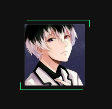
3.效果图

 浙公网安备 33010602011771号