ExtJS - UI组件 - Buttion
更新记录
详细更新记录
2023年3月6日 优化ui内容。
2022年12月3日 加入Button ui内容。
2022年8月15日 发布。
2022年8月13日 从笔记迁移到博客。
ExtJS教程汇总:https://www.cnblogs.com/cqpanda/p/16328016.html
说明
按钮组件,常用于处理程序的单击事件
不同的Toolkit中的具体类不同,Modern包中类为:
Ext.Buttion
Classic包类为:
Ext.button.Button
按钮的界面配置
实例:定义按钮的文本
使用text配置项定义按钮的文本
Ext.create('Ext.button.Button', {
    text: 'PandaButton',
    renderTo: Ext.getBody(),
});
实例:设置按钮的外边距
使用margin配置项即可
Ext.create('Ext.button.Button', {
    margin: '100 0 0 0',  //外边距
    text: 'PandaButton',
    renderTo: Ext.getBody(),
});
实例:设置按钮的内边距
使用padding配置项即可
Ext.create('Ext.button.Button', {
    padding: '100 0 0 0',  //内边距
    text: 'PandaButton',
    renderTo: Ext.getBody(),
});
实例:tooltip提示文本
tooltip:'Click me...!',
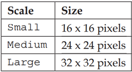
实例:设置按钮的大小(缩放)
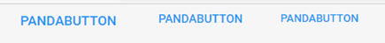
使用scale配置项,支持值:small、medium、large
注意:也可以使用width和height设置按钮的大小
Ext.create('Ext.button.Button', {
    text: 'PandaButton',
    scale: 'large',     //设置缩放
    renderTo: Ext.getBody(),
});

Ext.create('Ext.button.Button', {
    text: 'PandaButton',
    scale: 'medium',    //设置缩放
    renderTo: Ext.getBody(),
});

Ext.create('Ext.button.Button', {
    text: 'PandaButton',
    scale: 'small',     //设置缩放
    renderTo: Ext.getBody(),
});
实例:设置按钮的图标(自定义图标)
使用iconCls配置项
提示:可以配合scale配置项使用
Ext.create('Ext.button.Button', {
    text: 'My Button',
    iconCls:'fa fa-car',
    renderTo: Ext.getBody(),
});
实例:设置按钮的图标位置
使用iconAlign配置项,支持的值:left/ top/ right/bottom
Ext.create('Ext.button.Button',{
    text:'left icon',
    iconCls:'addicon-16',
    iconAlign:'left',   //左侧
    renderTo:Ext.getBody()
});

Ext.create('Ext.button.Button',{
    text:'top icon',
    iconCls:'addicon-16',
    iconAlign:'top',   //顶部
    renderTo:Ext.getBody()
});
Ext.create('Ext.button.Button',{
    text:'right icon',
    iconCls:'addicon-16',
    iconAlign:'right', //右侧
    renderTo:Ext.getBody()
});
Ext.create('Ext.button.Button',{
    text:'bottom icon',
    iconCls:'addicon-16',
    iconAlign:'bottom',    //底部
    renderTo:Ext.getBody()
});
实例:定义Link Button
使用href配置项即可
Ext.create('Ext.button.Button', {
    renderTo: Ext.getBody(),
    text: 'Link Button',
    href: 'https://www.panda666.com/'
});
实例:定义menu button
使用menu配置项即可
每个菜单项还可以监听事件
Ext.create('Ext.Button', {
    text: 'My Button',
    renderTo: Ext.getBody(),
    menu: [
        {
            text: 'Item 1',
            listeners:{ //绑定事件
                click:function(){
                   Ext.Msg.alert("Click event", "You Chick");
                }
            }
        },
        {
            text: 'Item 2'
        },
        {
            text: 'Item 3'
        }
    ]
});
按钮间分割线
between buttons
{ xtype: 'spacer'},
按钮事件处理
实例:按钮绑定点击事件
使用handler配置项即可
注意:也可以去绑定click事件
Ext.create('Ext.button.Button', {
    text: 'My Button',
    renderTo: Ext.getBody(),
    handler: function () {
        console.log('click');
    }
});
实例:按钮绑定多个事件
使用listeners配置项即可
Ext.create('Ext.button.Button', {
    text: 'My Button',
    renderTo: Ext.getBody(),
    listeners: {
        click: {
            fn: function () {
                //Handle click event
                console.log('click');
            }
        },
        mouseout: {
            fn: function () {
                //Handle double click event
                console.log('Mouse out');
            }
        }
    }
});
按钮的UI风格配置(Styling buttons)
注意:仅适用于Modern Toolkit
Buttons can also use the ui configuration setting, for which they offer several different options:
null - a basic gray button (default).
'back' - a back button.
'forward' - a forward button.
'round' - a round button.
'plain'
'action' - shaded using the $active-color
'decline' - shaded using the $alert-color
'confirm' - shaded using the $confirm-color
You can also append -round to each of the last three UI's to give it a round shape:
action round
decline round
confirm round
{
    xtype: 'button',
    text: 'My Button',
    ui: 'round',
    badgeText: '2'
},
{
    xtype: 'button',
    text: 'My Button',
    ui: 'action',
    badgeText: '2'
},
{
    xtype: 'button',
    text: 'My Button',
    ui: 'decline',
    badgeText: '2'
},
{
    xtype: 'button',
    text: 'My Button',
    ui: 'confirm',
    badgeText: '2'
},
本文来自博客园,作者:重庆熊猫,转载请注明原文链接:https://www.cnblogs.com/cqpanda/p/16587153.html

 浙公网安备 33010602011771号