ExtJS-组件(Components)-第二部分
更新记录
2022年7月9日 发布。
2022年6月25日 从笔记迁移到博客。
ExtJS教程汇总:https://www.cnblogs.com/cqpanda/p/16328016.html
组件(Components)-第一部分地址:
https://www.cnblogs.com/cqpanda/p/16411858.html
组件(Components)-第二部分地址:
https://www.cnblogs.com/cqpanda/p/16411884.html
扩展和创建组件
创建自定义的组件
当创建新组件类型时,可以选择 扩展已有的类型 或者 创建新类型
建议将最符合条件的基类进行扩展到所需功能,以减少代码量
这是因为Ext JS提供了自动生命周期管理
比如在需要时自动呈现、在由适当的布局管理器管理时自动调整组件大小定位
以及从容器中移除时自动销毁
扩展已有的组件
Ext.Base是所有ExtJS类型的基类,该类的原型和静态成员由所有其他类继承
可以通过继承Ext.Base类型在尽可能低的级别上添加功能
但在一般情况下,最好在继承链中从更高的级别开始继承
使用extend配置项指定要继承的父类型
实例:继承自Ext.Component
Ext.define('My.custom.Component', {
    extend: 'Ext.Component',
    newMethod : function() {
       //...
    }
});
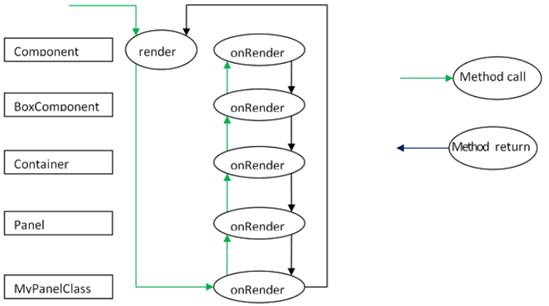
ExtJS使用模板方法模式来委托给子类,而子类的行为只针对该子类
继承链中的每个类都可以为组件生命周期中的某些阶段加入一个额外的逻辑片段
每个类实现自己的特殊行为,同时可以继承链中的其他类
调用render()方法(这是由容器的布局管理器完成的)。此方法不能被重写,而是由Ext基类实现。它调用this.onRender,它是当前子类(如果已实现)中的实现。这将调用其超类版本的超类版本等。最终,每个类都贡献了其功能,控件返回到呈现函数。
实现onRender方法
Ext.define('My.custom.Component', {
    extend: 'Ext.Component',
    onRender: function() {
        this.callParent(arguments); // call the superclass onRender method
        // perform additional rendering tasks here.
    }
});
注意:模板方法也有相应的事件
例如:呈现组件后会触发呈现事件
然而,在进行子类化时,必须使用模板方法在其生命周期阶段执行类逻辑
而不是事件中,因为事件可以被编程方式挂起,也可以被处理程序停止
下面是组件的子类可以实现的模板方法:
initComponent 此方法由构造函数调用
它用于初始化数据、设置配置和附加事件处理程序
beforeShow 在显示组件之前调用此方法
onShow 允许在show操作中添加行为
调用超类的onShow之后,组件将可见
在显示组件之后调用此方法
onShowComplete 在afterShow方法完成后调用此方法
onHide 允许在hide操作中添加行为
调用超类的onHide之后,组件将被隐藏
afterHide 在组件被隐藏后调用此方法
onRender 允许向渲染阶段添加行为
afterRender 允许在渲染完成后添加行为
在此阶段,组件的元素将根据配置进行样式设置
添加任何已配置的CSS类名
并处于已配置的可见性和已配置的启用状态
onEnable 允许向enable操作添加行为
调用超类的onEnable之后,将启用该组件
onDisable 允许在禁用操作中添加行为
调用超类的onDisable之后,该组件将被禁用
onAdded 允许在将组件添加到容器时添加行为
在此阶段,组件位于父容器的子项集合中
调用超类的onAdded之后,ownerCt引用将出现
如果配置了ref,则将设置refOwner
onRemoved 许在组件从其父容器中移除时添加行为
在此阶段,组件已从其父容器的子项集合中移除
但尚未销毁(如果父容器的autoDestroy为true,或者如果remove调用传递了truthy第二个参数,则将销毁该组件)。
调用超类的onRemoved之后,ownerCt和refOwner将不存在
onResize 在resize操作中添加行为
onPosition 在position操作中添加行为
onDestroy 在销毁操作中添加行为。调用超类的onDestroy后,组件将被销毁
beforestroy 销毁之前调用此方法
after set position 组件位置后调用此方法
afterComponentLayout 布局组件后调用此方法
beforeComponentLayout 在布局组件之前调用此方法
选择扩展的基类
Ext.Component
如果所需的UI组件不需要包含任何其他组件
如果它只是为了封装执行需求的某种形式的HTML,那么推荐扩展Ext.Component
beforeLayout 在容器布局(并在必要时呈现)其子组件之前调用此方法
afterLayout 在容器布局(并在必要时呈现)其子组件后调用此方法
实例:
以下类是包装HTML图像元素的组件
允许设置和获取图像的src属性
还将在加载图像时触发加载事件
Ext.define('Ext.ux.Image', {
    extend: 'Ext.Component', 		// subclass Ext.Component
    alias: 'widget.managedimage', //will have xtype of 'managedimage'
    autoEl: {
        tag: 'img',
        src: Ext.BLANK_IMAGE_URL,
        cls: 'my-managed-image'
    },
	 // Add custom processing to the onRender phase.
    // Add a 'load' listener to the element.
    onRender: function() {
        this.autoEl = Ext.apply({}, this.initialConfig, this.autoEl);
        this.callParent(arguments);
        this.el.on('load', this.onLoad, this);
    },

    onLoad: function() {
        this.fireEvent('load', this);
    },

    setSrc: function(src) {
        if (this.rendered) {
            this.el.dom.src = src;
        } else {
            this.src = src;
        }
    },

    getSrc: function(src) {
        return this.el.dom.src || this.src;
    }
});
var image = Ext.create('Ext.ux.Image');
image.on('load', function() {
    console.log('image loaded: ', image.getSrc());
});
image.setSrc('http://www.sencha.com/img/sencha-large.png');
Ext.panel.panel
选择要被扩展的基类主要关注的是:性能、功能
如果所需的UI组件必须具有页眉、页脚、工具栏,则Ext.panel.panel是首选扩展基类
每当需要呈现和管理UI组件时,总是倾向于扩展Ext.panel.panel
Panel类有许多功能:
Border
Header
Header tools
Footer
Footer buttons
Top toolbar
Bottom toolbar
Containing and managing child Components
如果不需要这些功能,使用panel就是浪费资源
扩展panel类通常用于聚合布局中的其他UI组件(通常是容器或表单字段)
并通过tbar和bbar中的控件提供对所包含组件进行操作的方法
重要提示:panel是容器,聚合时使用合适的布局
panel具有以下附加模板方法:
afterCollapse 在面板折叠后调用此方法
afterExpand 在面板展开后调用此方法
onDockedAdd 将停靠项添加到面板后调用此方法
onDockedRemove 在从面板中移除停靠项后调用此方法
Ext.Container
如果所需的UI组件包含其他组件,但不需要面板的任何前面提到的附加功能
那么Ext.container.container是要扩展的适当类
在容器级别,重要的是记住要使用哪个Ext.layout.Container.Container来呈现和管理子组件
Container具有以下附加模板方法
onBeforeAdd 在添加新的子组件之前调用此方法
它被传递给新组件,可用于修改组件或以某种方式准备容器
返回false将中止添加操作
onAdd 添加新组件后调用此方法
它被传递给已添加的组件
此方法可用于更新依赖于子项状态的任何内部结构
onRemove 在删除新组件后调用此方法
它被传递给已被移除的组件
此方法可用于更新依赖于子项状态的任何内部结构
isInstance
实例
实例:自定义组件1
//自定义组件
Ext.define('PandaApp.test.CustomComponent',{
    extend: 'Ext.Component',
    //初始化组件
    initComponent: function(){
        var me = this;
        me.width = 200;
        me.height = 100;
        me.html = {
            tag: 'div',
            html: 'X',
            style: { // this can be replaced by a CSS rule
                'float': 'right',
                'padding': '10px',
                'background-color': '#e00',
                'color': '#fff',
                'font-weight': 'bold',
                'cursor': 'pointer'
            }
        };
        me.myOwnProperty = [1,2,3,4];
        me.callParent();
        console.log('Step 1. initComponent');
    },
    //在渲染之前
    beforeRender: function(){
        console.log('Step 2. beforeRender');
        this.callParent(arguments);
    },
    //渲染时
    onRender: function(){
        console.log('Step 3. onRender');
        this.callParent(arguments);
        this.el.setStyle('background-color','#ccc');
    },
    //渲染之后
    afterRender : function(){
        console.log('4. afterRender');
        this.el.down('div').on('click',this.myCallback,this);
        this.callParent(arguments);
    },
    //销毁之前
    beforeDestroy : function(){
        console.log('5. beforeDestroy');
        this.callParent(arguments);
    },
    //销毁中
    onDestroy : function(){
        console.log('6. onDestroy');
        delete this.myOwnProperty;
        this.el.down('div').un('click',this.myCallback);
        this.callParent(arguments);
    },
    myCallback : function(){
        var me = this;
        Ext.Msg.confirm('Confirmation','Are you sure you want to close this panel?',function(btn){
            if(btn === 'yes'){
                me.destroy();
            }
        });
    }
});

//实例化自定义组件
Ext.create('PandaApp.test.CustomComponent',{
    renderTo : Ext.getBody()
});
实例:自定义组件2
Ext.create("Ext.Component",{
    width: 300,
    height: 150,
    renderTo: Ext.getBody(),
    data: {name:"Veronica", lastName:"Sanchez"},
    //使用模板渲染组件
    tpl: ["<h1>Content</h1><p>Hello {name} {lastName}!</p>"]
});
实例:自定义容器
//自定义容器
Ext.define("MyApp.sample.MyContainer",{
    extend: "Ext.container.Container", //Step 1
    border: true,
    padding: 10,
    initComponent: function(){
        var me = this;
        Ext.each(me.items,function(item){ //Step 2
            item.style = {
                backgroundColor:"#f4f4f4",
                border:"1px solid #333"
            };
            item.padding = 10;
            item.height = 100;
        });
        me.callParent();
    },
    onRender: function(){
        var me = this;
        me.callParent(arguments);
        if( me.border ){ //Step 3
            me.el.setStyle( "border" , "1px solid #333" );
        }
    }
});

//实例化容器
Ext.create("MyApp.sample.MyContainer",{
    renderTo: Ext.getBody(),
    defaults: {
        xtype : "component",
        width : 100
    },
    items :[
        {
            html:"Child Component one" //xtype:"component",
        },
        {
            html:"Child Component two" //xtype:"component",
        }
    ]
});
组件分类
通用组件(General components)
Ext.Panel
Ext.tab.Panel
Ext.Viewport
Ext.Img
Ext.Audio
Ext.Video
Ext.Sheet
Ext.ActionSheet
Ext.MessageBox
表单组件(Form components)
Ext.form.Panel
Ext.form.FieldSet
Ext.field.Checkbox
Ext.field.Hidden
Ext.field.Slider
Ext.field.Text
Ext.picker.Picker
Ext.picker.Date
导航组件(Navigation components)
Ext.Toolbar
Ext.Button
Ext.TitleBar
Ext.SegmentedButton
Ext.Title
Ext.Spacer
存储绑定组件(Store-bound components)
Ext.dataview.DataView
Ext.Carousel
Ext.List
Ext.NestedList
常用组件
Grid(网格)
Grid component can be used to show the data in a tabular format.
Form(表单)
Form widget is to get the data from the user.
ComboBox Ext.form.field.ComboBox
Radio Button Ext.form.field.Radio
Checkbox Ext.form.field.Checkbox
TextField Ext.form.field.Text
Label Ext.form.Label
DateField Ext.form.field.Date
File Upload Ext.form.field.File
Hidden Field Ext.form.field.Hidden
Number Field Ext.form.field.Number
Spinner Ext.form.field.Spinner
Text Area Ext.form.field.TextArea
Time Field Ext.form.field.Time
Trigger Ext.form.field.Trigger
Html Editor Ext.form.field.HtmlEditor
Button Ext.button.Button
Chart Ext.chart.CartesianChart
Message Box(消息框)
Message box is basically used to show data in the form of alert box.
Chart(图表)
Charts are used to represent data in pictorial format.
Tool tip(工具提示)
Tool tip is used to show some basic information when any event occurs.
Window(窗口)
This UI widget is to create a window, which should pop up when any event occurs.
HTML editor(HTML编辑器)
HTML Editor is one of the very useful UI component,
which is used for styling the data that the user enters in terms of fonts, color, size, etc.
Progress bar(进度条)
Shows the progress of the backend work.
Button(按钮)
本文来自博客园,作者:重庆熊猫,转载请注明原文链接:https://www.cnblogs.com/cqpanda/p/16411884.html

 浙公网安备 33010602011771号