Android-自定义控件
原文地址 zhuanlan.zhihu.com

目录收起framelayout 触发覆盖页面的点击事件SurfaceView自定义控件1.构造函数2.测量View大小(onMeasure)注意:3.确定View大小(onSizeChanged)4.确定子View布局位置(onLayout)5.绘制内容(onDraw)Android自定义控件之自定义组合控件前言:使用自定义组合控件的好处?1.)第一种方式:直接在每个xml布局中写相同的标题栏布局代码2.)第二种方式:使用include标签3.)第三种方式:通过自定义组合控件 如何实现一个自定义组合控件1.)先定义一个布局文件3.)自定义一个View根据需求继承不同的ViewGroup子类,比如:RelativeLayout、LinearLayout等,我们这里继承RelativeLayout。4.)在不同的XML布局中引用
framelayout 触发覆盖页面的点击事件
开放中经常用到FrameLayout和RelativLayou。
有时候在只想上面覆盖的VIEW相应点击事件下方的VIEW不相应事件比如在百度地图上面覆盖一个自定义view,
如上代码只需要在覆盖VIEW的根布局加上android:clickable="true"就可以了。
SurfaceView
我们知道View是通过刷新来重绘视图,系统通过发出VSSYNC信号来进行屏幕的重绘,刷新的时间间隔是16ms,如果我们可以在16ms以内将绘制工作完成,则没有任何问题,如果我们绘制过程逻辑很复杂,并且我们的界面更新还非常频繁,这时候就会造成界面的卡顿,影响用户体验,为此Android提供了SurfaceView来解决这一问题。
View和SurfaceView的区别:
- View适用于主动更新的情况,而SurfaceView则适用于被动更新的情况,比如频繁刷新界面。
- View在主线程中对页面进行刷新,而SurfaceView则开启一个子线程来对页面进行刷新。
- View在绘图时没有实现双缓冲机制,SurfaceView在底层机制中就实现了双缓冲机制。
这摘录了一段网上对于双缓冲技术的介绍
双缓冲技术是游戏开发中的一个重要的技术。当一个动画争先显示时,程序又在改变它,前面还没有显示完,程序又请求重新绘制,这样屏幕就会不停地闪烁。而双缓冲技术是把要处理的图片在内存中处理好之后,再将其显示在屏幕上。双缓冲主要是为了解决 反复局部刷屏带来的闪烁。把要画的东西先画到一个内存区域里,然后整体的一次性画出来。
自定义控件
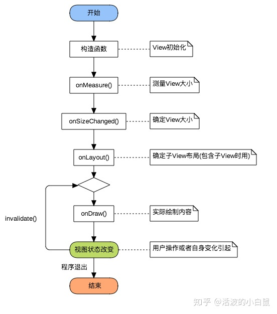
1.构造函数
构造函数是View的入口,可以用于初始化一些的内容,和获取自定义属性。
View的构造函数有四种重载分别如下:
public void SloopView(Context context) {}
public void SloopView(Context context, AttributeSet attrs) {}
public void SloopView(Context context, AttributeSet attrs, int defStyleAttr) {}
public void SloopView(Context context, AttributeSet attrs, int defStyleAttr, int defStyleRes) {}
可以看出,关于View构造函数的参数有多有少,先排除几个不常用的,留下常用的再研究。
有四个参数的构造函数在API21的时候才添加上,暂不考虑。
有三个参数的构造函数中第三个参数是默认的Style,这里的默认的Style是指它在当前Application或Activity所用的Theme中的默认Style,且只有在明确调用的时候才会生效,以系统中的ImageButton为例说明:
public ImageButton(Context context, AttributeSet attrs) {
//调用了三个参数的构造函数,明确指定第三个参数
this(context, attrs, com.android.internal.R.attr.imageButtonStyle);
}
public ImageButton(Context context, AttributeSet attrs, int defStyleAttr) {
//此处调了四个参数的构造函数,无视即可
this(context, attrs, defStyleAttr, 0);
}
注意:即使你在View中使用了Style这个属性也不会调用三个参数的构造函数,所调用的依旧是两个参数的构造函数。
由于三个参数的构造函数第三个参数一般不用,暂不考虑,第三个参数的具体用法会在以后用到的时候详细介绍。
排除了两个之后,只剩下一个参数和两个参数的构造函数,他们的详情如下:
//一般在直接New一个View的时候调用。
public void SloopView(Context context) {}
//一般在layout文件中使用的时候会调用,关于它的所有属性(包括自定义属性)都会包含在attrs中传递进来。
public void SloopView(Context context, AttributeSet attrs) {}
以下方法调用的是一个参数的构造函数:
//在Avtivity中
SloopView view new SloopView(this);
以下方法调用的是两个参数的构造函数:
//在layout文件中 - 格式为: 包名.View名
<com.sloop.study.SloopView
android:layout_width"wrap_content"
android:layout_height"wrap_content"/>
关于构造函数先讲这么多,关于如何自定义属性和使用attrs中的内容,在后面会详细讲解,目前只需要知道这两个构造函数在何时调用即可。
2.测量View大小(onMeasure)
Q: 为什么要测量View大小?
A: View的大小不仅由自身所决定,同时也会受到父控件的影响,为了我们的控件能更好的适应各种情况,一般会自己进行测量。
测量View大小使用的是onMeasure函数,我们可以从onMeasure的两个参数中取出宽高的相关数据:
@Override
protected void onMeasure(int widthMeasureSpec, int heightMeasureSpec) {
    int widthsize  MeasureSpec.getSize(widthMeasureSpec);      //取出宽度的确切数值
    int widthmode  MeasureSpec.getMode(widthMeasureSpec);      //取出宽度的测量模式
    int heightsize  MeasureSpec.getSize(heightMeasureSpec);    //取出高度的确切数值
    int heightmode  MeasureSpec.getMode(heightMeasureSpec);    //取出高度的测量模式
}
从上面可以看出 onMeasure 函数中有 widthMeasureSpec 和 heightMeasureSpec 这两个 int 类型的参数, 毫无疑问他们是和宽高相关的, 但它们其实不是宽和高, 而是由宽、高和各自方向上对应的测量模式来合成的一个值:
测量模式一共有三种, 被定义在 Android 中的 View 类的一个内部类View.MeasureSpec中:
模式二进制数值描述UNSPECIFIED00默认值,父控件没有给子view任何限制,子View可以设置为任意大小。EXACTLY01表示父控件已经确切的指定了子View的大小。AT_MOST10表示子View具体大小没有尺寸限制,但是存在上限,上限一般为父View大小。
在int类型的32位二进制位中,31-30这两位表示测量模式,29~0这三十位表示宽和高的实际值,实际上如下:
以数值1080(二进制为: 1111011000)为例(其中模式和实际数值是连在一起的,为了展示我将他们分开了):
模式名称模式数值实际数值UNSPECIFIED00000000000000000000001111011000EXACTLY01000000000000000000001111011000AT_MOST10000000000000000000001111011000
PS: 实际上关于上面的东西了解即可,在实际运用之中只需要记住有三种模式,用 MeasureSpec 的 getSize是获取数值, getMode是获取模式即可。
注意:
如果对View的宽高进行修改了,不要调用 super.onMeasure( widthMeasureSpec, heightMeasureSpec); 要调用 setMeasuredDimension( widthsize, heightsize); 这个函数。
3.确定View大小(onSizeChanged)
这个函数在视图大小发生改变时调用。
Q: 在测量完View并使用setMeasuredDimension函数之后View的大小基本上已经确定了,那么为什么还要再次确定View的大小呢?
A: 这是因为View的大小不仅由View本身控制,而且受父控件的影响,所以我们在确定View大小的时候最好使用系统提供的onSizeChanged回调函数。
onSizeChanged如下:
@Override
protected void onSizeChanged(int w, int h, int oldw, int oldh) {
    super.onSizeChanged(w, h, oldw, oldh);
}
可以看出,它又四个参数,分别为 宽度,高度,上一次宽度,上一次高度。
这个函数比较简单,我们只需关注 宽度(w), 高度(h) 即可,这两个参数就是View最终的大小。
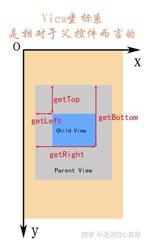
4.确定子View布局位置(onLayout)
确定布局的函数是onLayout,它用于确定子View的位置,在自定义ViewGroup中会用到,他调用的是子View的layout函数。
在自定义ViewGroup中,onLayout一般是循环取出子View,然后经过计算得出各个子View位置的坐标值,然后用以下函数设置子View位置。
child.layout(l, t, r, b);
四个参数分别为:
名称说明对应的函数lView左侧距父View左侧的距离getLeft();tView顶部距父View顶部的距离getTop();rView右侧距父View左侧的距离getRight();bView底部距父View顶部的距离getBottom();
具体可以参考 坐标系 这篇文章。
PS:关于onLayout这个函数在讲解自定义ViewGroup的时候会详细讲解。
5.绘制内容(onDraw)
onDraw是实际绘制的部分,也就是我们真正关心的部分,使用的是Canvas绘图。
@Override
protected void onDraw(Canvas canvas) {
super.onDraw(canvas);
}
Android自定义控件之自定义组合控件
前言:
前两篇介绍了自定义控件的基础原理Android自定义控件之基本原理(一)、自定义属性Android自定义控件之自定义属性(二)。今天重点介绍一下如何通过自定义组合控件来提高布局的复用,降低开发成本,以及维护成本。
自定义控件相关文章地址:
使用自定义组合控件的好处?
我们在项目开发中经常会遇见很多相似或者相同的布局,比如APP的标题栏,我们从三种方式实现标题栏来对比自定义组件带来的好处,毕竟好的东西还是以提高开发效率,降低开发成本为导向的。
1.)第一种方式:直接在每个xml布局中写相同的标题栏布局代码
<?xml version="1.0" encoding="utf-8"?><LinearLayout xmlns:android="http://schemas.android.com/apk/res/android" xmlns:lee="http://schemas.android.com/apk/res-auto" android:layout_width="match_parent" android:layout_height="match_parent" android:orientation="vertical"> <RelativeLayout android:layout_width="match_parent" android:background="@color/green" android:layout_height="45dp"> <Button android:id="@+id/title_bar_left" android:layout_width="wrap_content" android:layout_height="wrap_content" android:layout_alignParentLeft="true" android:layout_centerVertical="true" android:layout_marginLeft="5dp" android:background="@mipmap/titlebar_back_icon" android:minHeight="45dp" android:minWidth="45dp" android:textSize="14sp" /> <TextView android:id="@+id/title_bar_title" android:layout_width="wrap_content" android:layout_height="wrap_content" android:layout_centerInParent="true" android:text="登录" android:singleLine="true" android:textSize="17sp" /> <Button android:id="@+id/title_bar_right" android:layout_width="wrap_content" android:layout_height="wrap_content" android:layout_alignParentRight="true" android:layout_centerVertical="true" android:layout_marginRight="7dp" android:text="提交" android:textColor="@android:color/white" android:background="@null" android:minHeight="45dp" android:minWidth="45dp" android:textSize="14sp" /> </RelativeLayout></LinearLayout>
这种方式没有任何布局复用的概念,同时也让当前的布局变得臃肿难以维护,开发效率低下,而且这个还需要要求每个开发人员必须细心否则有可能会做出参差不齐的标题栏,所以这种方式是最不推荐使用的。
2.)第二种方式:使用include标签
首先定义标题栏布局
<RelativeLayout android:layout_width="match_parent" android:background="@color/green" android:layout_height="45dp"> <Button android:id="@+id/title_bar_left" android:layout_width="wrap_content" android:layout_height="wrap_content" android:layout_alignParentLeft="true" android:layout_centerVertical="true" android:layout_marginLeft="5dp" android:minHeight="45dp" android:minWidth="45dp" android:textSize="14sp" /> <TextView android:id="@+id/title_bar_title" android:layout_width="wrap_content" android:layout_height="wrap_content" android:layout_centerInParent="true" android:singleLine="true" android:textSize="17sp" /> <Button android:id="@+id/title_bar_right" android:layout_width="wrap_content" android:layout_height="wrap_content" android:layout_alignParentRight="true" android:layout_centerVertical="true" android:layout_marginRight="7dp" android:background="@null" android:minHeight="45dp" android:minWidth="45dp" android:textSize="14sp" /> </RelativeLayout>
然后在需要的地方通过include标签实现引用
通过上面的布局代码,我们可以使用上面这种方式确实实现了布局的复用,而且也避免了开发人员开发出参差不齐标题栏的问题,但是同时也引入了新的问题,比如更加降低了开发效率,加大了开发成本,问题就在我们该如何为每个布局文件定义标题栏?只有通过代码的方式来设置标题问题,左右按钮等其他的属性,导致布局属性和Activity代码耦合性比较高,所以这种方式也不是推荐的方式。
3.)第三种方式:通过自定义组合控件
这里先不具体介绍如何实现一个自定义组合控件,这里先介绍一下自定义组合控件带来的好处。
- 提高布局文件开发效率
- 降低布局文件维护成本
- 降低布局文件和Activity代码耦合性
- 容易扩展
- 简单易用
如何实现一个自定义组合控件
1.)先定义一个布局文件
<merge xmlns:android="http://schemas.android.com/apk/res/android"> <Button android:id="@+id/title_bar_left" android:layout_width="wrap_content" android:layout_height="wrap_content" android:layout_alignParentLeft="true" android:layout_centerVertical="true" android:layout_marginLeft="5dp" android:background="@null" android:minHeight="45dp" android:minWidth="45dp" android:textSize="14sp" /> <TextView android:id="@+id/title_bar_title" android:layout_width="wrap_content" android:layout_height="wrap_content" android:layout_centerInParent="true" android:singleLine="true" android:textSize="17sp" /> <Button android:id="@+id/title_bar_right" android:layout_width="wrap_content" android:layout_height="wrap_content" android:layout_alignParentRight="true" android:layout_centerVertical="true" android:layout_marginRight="7dp" android:background="@null" android:minHeight="45dp" android:minWidth="45dp" android:textSize="14sp" /></merge>
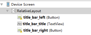
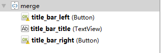
注意:这里为何要使用merge标签,自定义组合控件时会继承RelativeLayout、LinearLayout等控件,这样导致布局的层级无形中增加了一层,如下是对比:
未使用merge标签
使用merge标签
2.)定义自定义属性
比如标题文字、标题栏左边按钮图标等。
<declare-styleable reference|integer" /> <attr reference|integer" /> <attr reference|integer" /> <attr reference|integer" /> </declare-styleable>
3.)自定义一个View根据需求继承不同的ViewGroup子类,比如:RelativeLayout、LinearLayout等,我们这里继承RelativeLayout。
public class CustomTitleBar extends RelativeLayout { private Button titleBarLeftBtn; private Button titleBarRightBtn; private TextView titleBarTitle; public CustomTitleBar(Context context, AttributeSet attrs) { super(context, attrs); LayoutInflater.from(context).inflate(R.layout.custom_title_bar, this, true); titleBarLeftBtn = (Button) findViewById(R.id.title_bar_left); titleBarRightBtn = (Button) findViewById(R.id.title_bar_right); titleBarTitle = (TextView) findViewById(R.id.title_bar_title); TypedArray attributes = context.obtainStyledAttributes(attrs, R.styleable.CustomTitleBar); if (attributes != null) { //处理titleBar背景色 int titleBarBackGround = attributes.getResourceId(R.styleable.CustomTitleBar_tlb_title_background_color, Color.GREEN); setBackgroundResource(titleBarBackGround); //先处理左边按钮 //获取是否要显示左边按钮 boolean leftButtonVisible = attributes.getBoolean(R.styleable.CustomTitleBar_tlb_left_button_visible, true); if (leftButtonVisible) { titleBarLeftBtn.setVisibility(View.VISIBLE); } else { titleBarLeftBtn.setVisibility(View.INVISIBLE); } //设置左边按钮的文字 String leftButtonText = attributes.getString(R.styleable.CustomTitleBar_tlb_left_button_text); if (!TextUtils.isEmpty(leftButtonText)) { titleBarLeftBtn.setText(leftButtonText); //设置左边按钮文字颜色 int leftButtonTextColor = attributes.getColor(R.styleable.CustomTitleBar_tlb_left_button_text_color, Color.WHITE); titleBarLeftBtn.setTextColor(leftButtonTextColor); } //设置左边图片icon 这里是二选一 要么只能是文字 要么只能是图片 int leftButtonDrawable = attributes.getResourceId(R.styleable.CustomTitleBar_tlb_left_button_drawable, R.mipmap.titlebar_back_icon); if (leftButtonDrawable != -1) { titleBarLeftBtn.setCompoundDrawablesWithIntrinsicBounds(leftButtonDrawable, 0, 0, 0); //设置到哪个控件的位置() } //处理标题 //先获取标题是否要显示图片icon int titleTextDrawable = attributes.getResourceId(R.styleable.CustomTitleBar_tlb_title_text_drawable, -1); if (titleTextDrawable != -1) { titleBarTitle.setBackgroundResource(titleTextDrawable); } else { //如果不是图片标题 则获取文字标题 String titleText = attributes.getString(R.styleable.CustomTitleBar_tlb_title_text); if (!TextUtils.isEmpty(titleText)) { titleBarTitle.setText(titleText); } //获取标题显示颜色 int titleTextColor = attributes.getColor(R.styleable.CustomTitleBar_tlb_title_text_color, Color.WHITE); titleBarTitle.setTextColor(titleTextColor); } //先处理右边按钮 //获取是否要显示右边按钮 boolean rightButtonVisible = attributes.getBoolean(R.styleable.CustomTitleBar_tlb_right_button_visible, true); if (rightButtonVisible) { titleBarRightBtn.setVisibility(View.VISIBLE); } else { titleBarRightBtn.setVisibility(View.INVISIBLE); } //设置右边按钮的文字 String rightButtonText = attributes.getString(R.styleable.CustomTitleBar_tlb_right_button_text); if (!TextUtils.isEmpty(rightButtonText)) { titleBarRightBtn.setText(rightButtonText); //设置右边按钮文字颜色 int rightButtonTextColor = attributes.getColor(R.styleable.CustomTitleBar_tlb_right_button_text_color, Color.WHITE); titleBarRightBtn.setTextColor(rightButtonTextColor); } //设置右边图片icon 这里是二选一 要么只能是文字 要么只能是图片 int rightButtonDrawable = attributes.getResourceId(R.styleable.CustomTitleBar_tlb_right_button_drawable, -1); if (rightButtonDrawable != -1) { titleBarRightBtn.setCompoundDrawablesWithIntrinsicBounds(0, 0, rightButtonDrawable, 0); //设置到哪个控件的位置() } attributes.recycle(); } } public void setTitleClickListener(OnClickListener onClickListener) { if (onClickListener != null) { titleBarLeftBtn.setOnClickListener(onClickListener); titleBarRightBtn.setOnClickListener(onClickListener); } } public Button getTitleBarLeftBtn() { return titleBarLeftBtn; } public Button getTitleBarRightBtn() { return titleBarRightBtn; } public TextView getTitleBarTitle() { return titleBarTitle; } }
4.)在不同的XML布局中引用
关于如何使用自定义属性这里就不再说明了,为了更加直观的查看效果,我这里在一个布局文件中实现不同要求的标题栏
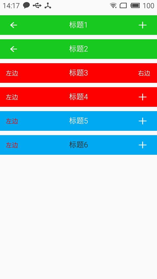
<?xml version="1.0" encoding="utf-8"?><LinearLayout xmlns:android="http://schemas.android.com/apk/res/android" xmlns:lee="http://schemas.android.com/apk/res-auto" android:layout_width="match_parent" android:layout_height="match_parent" android:orientation="vertical"> <com.whoislcj.views.CustomTitleBar android:layout_width="match_parent" android:layout_height="45dp" android:layout_marginTop="10dp" lee:right_button_drawable="@mipmap/titlebar_add_icon" lee:title_background_color="@color/green" lee:title_text="标题1" /> <com.whoislcj.views.CustomTitleBar android:layout_width="match_parent" android:layout_height="45dp" android:layout_marginTop="10dp" lee:right_button_visible="false" lee:title_background_color="@color/green" lee:title_text="标题2" /> <com.whoislcj.views.CustomTitleBar android:layout_width="match_parent" android:layout_height="45dp" android:layout_marginTop="10dp" lee:left_button_text="左边" lee:right_button_text="右边" lee:title_background_color="@color/red" lee:title_text="标题3" /> <com.whoislcj.views.CustomTitleBar android:layout_width="match_parent" android:layout_height="45dp" android:layout_marginTop="10dp" lee:left_button_text="左边" lee:right_button_drawable="@mipmap/titlebar_add_icon" lee:title_background_color="@color/red" lee:title_text="标题4" /> <com.whoislcj.views.CustomTitleBar android:layout_width="match_parent" android:layout_height="45dp" android:layout_marginTop="10dp" lee:left_button_text="左边" lee:left_button_text_color="@color/red" lee:right_button_drawable="@mipmap/titlebar_add_icon" lee:title_background_color="@color/blue" lee:title_text="标题5" /> <com.whoislcj.views.CustomTitleBar android:layout_width="match_parent" android:layout_height="45dp" android:layout_marginTop="10dp" lee:left_button_text="左边" lee:left_button_text_color="@color/red" lee:right_button_drawable="@mipmap/titlebar_add_icon" lee:title_background_color="@color/blue" lee:title_text="标题6" lee:title_text_color="@color/black" /></LinearLayout>
显示效果
总结:
通过本篇文章我们得知,通过自定义组合控件确实能够提高开发效率,降低维护成本,但是也需要UI设计风格保持高度一致,不然的话只能呵呵哒了!所以想要做好一个app需要一个有共识的团队才行。本篇介绍到此为止,下一篇要更新什么我还没有想好!有可能是自定义控件的事件回调,也有可能自定义ViewGroup实现流式布局。
编辑于 2023-04-17 10:29・IP 属地山东开启赞赏赞赏开启后,读者将可以付费支持你的创作。AndroidAndroid 开发Java赞同添加评论分享喜欢收藏设置

 浙公网安备 33010602011771号