matplotlib 在多个绘图区绘图 折线图的应用场景
创建多个画布
# 2、创建画布
# nrows是行数
# ncols是列数
# 1行2列 就是横向排列的两个绘图区
# 2行1列 就是纵向排列的两个绘图区
# 返回图形对象和绘图对象
figure, axes = plt.subplots(nrows=1, ncols=2, figsize=(20, 8), dpi=80)
绘制图像
# 3、绘制图像
axes[0].plot(x, y_shanghai, color='r', linestyle='-.', label='上海')
axes[1].plot(x, y_beijing, color='b', label='北京')
显示图例
axes[0].legend()
axes[1].legend()
修改刻度
# 5、修改刻度 准备刻度说明
x_label = ["11点{}分".format(i) for i in x]
# 5.1 第一种方式
axes[0].set_xticks(x[::10], x_label[::10])
# 5.2 第二种方式
# axes[0].set_xticks(x[::10])
# axes[0].set_xticklabels(x_label[::10])
axes[0].set_yticks(range(0, 40, 5))
# 实测 两种方式都可以

# axes[1].set_xticks(x[::10], x_label[::10])
axes[1].set_xticks(x[::10])
axes[1].set_xticklabels(x_label[::10])
axes[1].set_yticks(range(0, 40, 5))
添加网格显示
axes[0].grid(linestyle='--', alpha=0.5)
axes[1].grid(linestyle='--', alpha=0.5)
添加描述信息
axes[0].set_xlabel("温度变化")
axes[0].set_ylabel("时间变化")
axes[0].set_title("上海十一时温度随时间变化图线")

axes[1].set_xlabel("温度变化")
axes[1].set_ylabel("时间变化")
axes[1].set_title("北京十一时温度随时间变化图线")
完整代码
import matplotlib
import matplotlib.pyplot as plt
import random
if __name__ == "__main__":
# 0、修改支持中文的字体
plt.rcParams["font.sans-serif"] = ["SimHei"] # 设置字体
plt.rcParams["axes.unicode_minus"] = False # 解决图像中 "-" 负号乱码问题
# 1、准备数据
x = range(60)
y_shanghai = [random.uniform(15, 18) for i in x]
y_beijing = [random.uniform(1, 3) for i in x]
# 2、创建画布
# nrows是行数
# ncols是列数
# 1行2列 就是横向排列的两个绘图区
# 2行1列 就是纵向排列的两个绘图区
# 返回图形对象和绘图对象
figure, axes = plt.subplots(nrows=1, ncols=2, figsize=(20, 8), dpi=80)
# 3、绘制图像
axes[0].plot(x, y_shanghai, color='r', linestyle='-.', label='上海')
axes[1].plot(x, y_beijing, color='b', label='北京')
# 4、显示图例
axes[0].legend()
axes[1].legend()
# 5、修改刻度 准备刻度说明
x_label = ["11点{}分".format(i) for i in x]
# 5.1 第一种方式
axes[0].set_xticks(x[::10], x_label[::10])
# 5.2 第二种方式
# axes[0].set_xticks(x[::10])
# axes[0].set_xticklabels(x_label[::10])
axes[0].set_yticks(range(0, 40, 5))
# 实测 两种方式都可以
# axes[1].set_xticks(x[::10], x_label[::10])
axes[1].set_xticks(x[::10])
axes[1].set_xticklabels(x_label[::10])
axes[1].set_yticks(range(0, 40, 5))
# 6、添加网格显示
axes[0].grid(linestyle='--', alpha=0.5)
axes[1].grid(linestyle='--', alpha=0.5)
# 7、添加描述信息
axes[0].set_xlabel("温度变化")
axes[0].set_ylabel("时间变化")
axes[0].set_title("上海十一时温度随时间变化图线")
axes[1].set_xlabel("温度变化")
axes[1].set_ylabel("时间变化")
axes[1].set_title("北京十一时温度随时间变化图线")
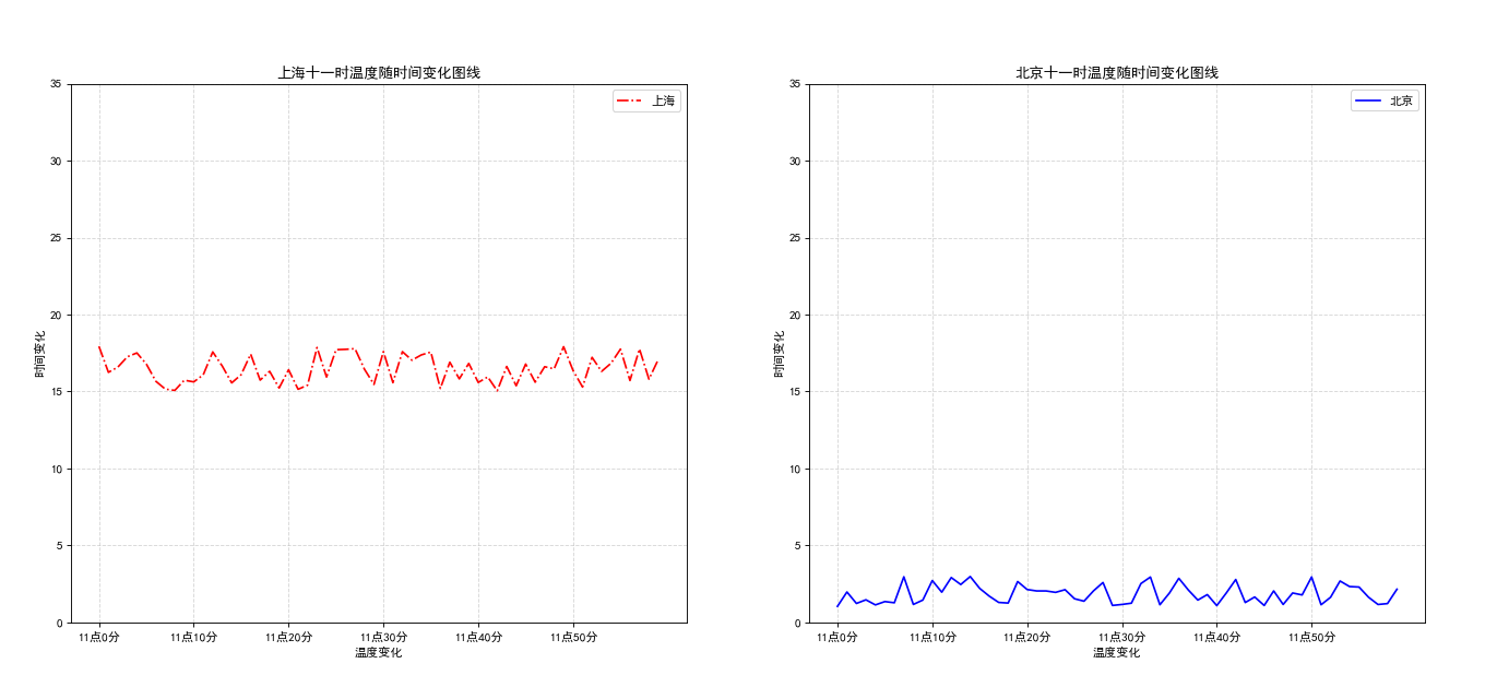
plt.show()运行截图:
折线图的应用场景:多用于某事物、某指标随时间的变化状况
本文来自博客园,作者:correct,转载请注明原文链接:https://www.cnblogs.com/correct/p/17139398.html

 浙公网安备 33010602011771号