matplotlib 添加网格、绘制两条线、添加图例
添加网格
# 显示网格
# linestyle 网格线
# 透明度
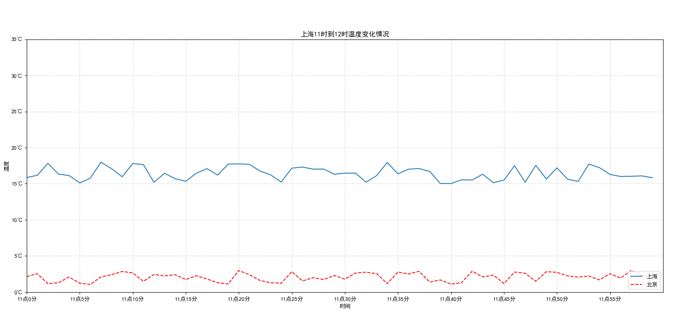
plt.grid(True, linestyle="--", alpha=0.5)添加描述信息
# 添加描述信息
plt.xlabel("时间")
plt.ylabel("温度")
plt.title("上海11时到12时温度变化情况")
添加另一条线(另一个城市的温度变化)
# 添加另一个城市的温度变化情况
y_beijing = [random.uniform(1, 3) for i in x]
plt.plot(x, y_beijing, color='r', linestyle="--", label="北京")
显示图例
# 配合plot()方法中的lable属性 显示图例
# 默认右上
# plt.legend()
# 左下
# plt.legend(loc="lower left")
# 右下
plt.legend(loc=4)
完整代码
import matplotlib
import matplotlib.pyplot as plt
import random

if __name__ == "__main__":
    # plt.figure()
    # plt.plot([1, 0, 9], [4, 5, 6])
    # plt.show()

    # plt.figure(figsize=(20, 8), dpi=80)
    # plt.plot([1, 2, 3, 4, 5, 6, 7], [10, 4, -2, -5, 6, 9, 8])
    # plt.savefig("test.png")
    # plt.show()  # 调用后会释放figure资源

    # 0、修改支持中文的字体
    plt.rcParams["font.sans-serif"] = ["SimHei"] # 设置字体
    plt.rcParams["axes.unicode_minus"] = False # 解决图像中 "-" 负号乱码问题

    # 1、准备数据
    x = range(60)
    y_shanghai = [random.uniform(15, 18) for i in x]
    y = range(40)
    # 2、创建画布
    plt.figure(figsize=(20, 8), dpi=80)
    # 2.1 绘制刻度
    plt.xlim(0, 60) # 设置刻度范围
    plt.ylim(0, 35)
    # plt.xticks(range(60)[::5]) # 设置刻度
    # plt.yticks(range(40)[::5])
    x_lable = ["11点{}分".format(i) for i in x]
    y_lable = ["{}℃".format(i) for i in y]
    plt.xticks(x[::5], x_lable[::5])
    plt.yticks(y[::5], y_lable[::5])
    # 3、绘制图像
    plt.plot(x, y_shanghai, label="上海")

    # 显示网格
    # linestyle 网格线
    # 透明度
    plt.grid(True, linestyle="--", alpha=0.5)

    # 添加描述信息
    plt.xlabel("时间")
    plt.ylabel("温度")
    plt.title("上海11时到12时温度变化情况")

    # 添加另一个城市的温度变化情况
    y_beijing = [random.uniform(1, 3) for i in x]
    plt.plot(x, y_beijing, color='r', linestyle="--", label="北京")

    # 配合plot()方法中的lable属性 显示图例
    # 默认右上
    # plt.legend()
    # 左下
    # plt.legend(loc="lower left")
    # 右下
    plt.legend(loc=4)

    # 4、显示图像
    plt.show()
效果如下:
本文来自博客园,作者:correct,转载请注明原文链接:https://www.cnblogs.com/correct/p/17139325.html

 浙公网安备 33010602011771号